
Dashboard COMPRIME_COMPRI_MOv: Multiscalar Spatio-Temporal Monitoring of the COVID-19 Pandemic in Portugal


Institute of Geography and Spatial Planning, Universidade de Lisboa, 1600-276 Lisbon, Portugal
*
Author to whom correspondence should be addressed.
Future Internet 2021, 13(2), 45; https://0-doi-org.brum.beds.ac.uk/10.3390/fi13020045
Submission received: 17 January 2021
/
Revised: 6 February 2021
/
Accepted: 9 February 2021
/
Published: 12 February 2021
(This article belongs to the Special Issue Data Science and Knowledge Discovery)
Abstract
:Due to its novelty, the recent pandemic of the coronavirus disease (COVID-19), which is associated with the spread of the new severe acute respiratory syndrome coronavirus (SARS-CoV-2), triggered the public’s interest in accessing information, demonstrating the importance of obtaining and analyzing credible and updated information from an epidemiological surveillance context. For this purpose, health authorities, international organizations, and university institutions have published online various graphic and cartographic representations of the evolution of the pandemic with daily updates that allow the almost real-time monitoring of the evolutionary behavior of the spread, lethality, and territorial distribution of the disease. The purpose of this article is to describe the technical solution and the main results associated with the publication of the COMPRIME_COMPRI_MOv dashboard for the dissemination of information and multi-scale knowledge of COVID-19. Under two rapidly implementing research projects for innovative solutions to respond to the COVID-19 pandemic, promoted in Portugal by the FCT (Foundation for Science and Technology), a website was created. That website brings together a diverse set of variables and indicators in a dynamic and interactive way that reflects the evolutionary behavior of the pandemic from a multi-scale perspective, in Portugal, constituting itself as a system for monitoring the evolution of the pandemic. In the current situation, this type of exploratory solutions proves to be crucial to guarantee everyone’s access to information while simultaneously emerging as an epidemiological surveillance tool that is capable of assisting decision-making by public authorities with competence in defining control policies and fight the spread of the new coronavirus.
1. Introduction
In December 2019, several cases of pneumonia of unknown origin appeared in China. Earlier that year, the World Health Organization (WHO) had published a list of ten major global threats, including pandemics associated with respiratory diseases [1]. Later, in January 2020, a new severe acute respiratory syndrome coronavirus (SARS-CoV-2) was identified and recognized as responsible for the spread of the COVID-19 disease. The first records of infection by SARS-CoV-2, initially circumscribed in the Chinese territory, quickly spread, with a progressive increase in the number of infected by the new coronavirus and its spread to dozens of countries.
Due to the rapid progression of the disease, the increase in the number of deaths associated with it, and its widespread expansion, the WHO declared COVID-19 as a pandemic on 11 March 2020. By this date, more than 100,000 people were infected in 114 countries, and the number of deaths was already 4000 [2]. Nine months later, the number of confirmed cases in the world has exceeded 60 million, and the number of deaths is over 1.5 million [3], attesting to the high transmissibility of the disease.
Already in a pandemic situation, the WHO requested several countries with cases of infection to maintain an open policy of communication and dissemination of information about the situation in their countries. This request resulted from the fact that during the last SARS epidemic (severe acute respiratory syndrome), an emerging disease caused from infection by the SARS coronavirus, in 2003, the lack of transparent and updated disclosure of the number of cases made it difficult to control and manage the epidemic, thus evidencing that “transparency is the best policy” [4]. Following this request, the WHO itself set an example by providing a dashboard that gathers a set of data on the evolution of the pandemic situation in the world [3].
In this framework, health authorities in the various affected countries have communicated the evolution of the pandemic situation by making data available to the public. At this juncture, also the public interest for access to information has been high, as shown by the study REACT COVID—Survey on Food and Physical Activity in the Context of Social Contention [5], where it was found that almost 80% of respondents in Portugal seek information on health care and more than 94% have accessed information on COVID-19. However, about 56% state that they have difficulty understanding it. This last finding is an indication of the need to develop simpler representations capable of transmitting information on the pandemic situation to the population with different levels of health literacy. The use of exploratory data methods, such as dashboards applied to monitoring the coronavirus pandemic, has been developed by several authors, for their versatility, speed of analysis, and ease of understanding by decision makers and the general public. For Boulos and Geraghty, dashboards became an essential source of information during the COVID-19 outbreak, contributing to the protection and reduction of its harmful effects [6].
The main objective of this article is to present the dashboard COMPRIME_COMPRI_MOv technical solution and data analytics results for monitoring the evolution of the COVID-19 disease situation in Portugal. The dashboard was published online in order to be a means of dissemination of multi-scale information and knowledge but also a support for analysis of the main time trends and territorial patterns of SARS-CoV-2 contagion in Portugal, and it allows access to multiple indicators and interactive exploration of graphics and dynamic maps. The research path was based on the information collected from the project’s stakeholders, namely the dashboard purpose, dashboard users, functional functionalities, design features, and how it could support the decision process.
The development of the dashboard was associated with two research projects, both of them rapid implementation projects for innovative solutions in response to the pandemic of COVID 19 under the exceptional funding line “RESEARCH 4 COVID-19” of the FCT (Portuguese Foundation for Science and Technology) (https://www.fct.pt/apoios/research4covid19/edicao_1/index.phtml.pt) (accessed on 9 February 2021), which aims to support research and development projects and initiatives that meet the needs of the National Health Service:
- COMPRIME—COnhecer Mais PaRa Intervir MElhor (Get to Know More for Intervention)—has as its main objective to identify the propagation dynamics of SARS-CoV-2, in its relations with the demographic and socioeconomic profiles of the territories, at the municipality scale, identifying the determining factors of this propagation;
- COMPRI_MOv—COnhecer Mais PaRa Intervir melhor no contexto da Mobilidade (Get to Know More for Intervention in the context of mobility)—aims to characterize the mobility of populations given the intensity, motivation, and geographical pattern of the flows and, associating these dynamics with epidemiological data, assess the risk of propagation associated with mobility. The project intends to propose a monitoring system to support the decision and present the basis of a model for the simulation of propagation based on mobility.
Thus, within these projects, we developed the dashboard, which is structured in four components corresponding to the scales of analysis: international, national, regional, and municipal. The dashboard is published online at the following address: https://www.comprime-compri-mov.com/dashboards.html (accessed on 9 February 2021), with an English version at the following address: https://www.comprime-compri-mov.com/dashboardsenglish.html (accessed on 9 February 2021). The information used in the dashboard is merely an evolutionary follow-up based on official information from the Directorate General of Health [7] in the form of daily epidemiological reports, based on which several metrics were calculated. Thus, the COMPRIME_COMPRI_MOv dashboard does not include any output or conclusions obtained in the scope of the projects or information of predictive character, being its function to represent the evolution of the epidemiological situation based on official information.
This article is organized in six parts. The first corresponds to this introduction, which is followed by a brief contextualization of the importance and contributions of using dashboards for the study of COVID-19. The third part concerns the methodologies used, dividing itself between the background, architecture, and the data. The following shows the technical solution designed and briefly describes the main processes and trends of propagation of COVID-19 in Portugal, making it possible to withdraw from the dashboard. In the fifth part, the results achieved with the dashboard are discussed, and in the last part, the conclusions are presented.
2. Use of Dashboards in the Context of the Pandemic
The use of spatial analysis in tracking and understanding the spread of infectious diseases using cartography is an old process. One of the most widespread examples of analysis in the literature is the map of physician John Snow, who in the nineteenth century identified the origin of an outbreak of cholera through the spatial relationships between the occurrences of deaths by disease and the location of water wells in the city of London [8]. With the development of Geographic Information Systems (GIS), the possibilities of analyzing, visualizing, and detecting disease patterns have increased significantly, as proved by the growing number of publications [9]. Using examples at different scales, Zhou et al. analyzed the contribution of GIS and big data in combating the pandemic, with the visualization of information constituting one of the challenges in the response to the pandemic [10]. In addition, Franch-Pardo et al. present several studies using spatial analysis and other GIS techniques to study the geographical dimension of COVID-19, some of which the authors add in the category of web-based mapping as they are cartographic representations of the pandemic situation available online [11]. In the context of a pandemic, the forms of representation of the disease situation have multiplied, with dashboards being the predominant solution. As Sarfo and Karuppannan point out, making data available on interactive dashboards in real time, or near real time, has become a useful tool by which many countries present specific information on COVID-19 [12]. In this sense, Boulos and Geraghty present several examples of WebGIS and dashboards to track the spread of the new coronavirus with the aim of discussing additional ways these tools contribute to combating outbreaks of infectious diseases and epidemics [6]. This type of solution is crucial by facilitating transparent access to information to the entire population in a simple way, ensuring the monitoring of the situation evolution from an epidemiological surveillance point of view, not only regarding the number of new infections but also other parameters and at various scales, also allowing the health authorities a rigorous monitoring. WHO and Johns Hopkins University were pioneers in representing the pandemic situation in various graphic and cartographic ways, with the Center for Systems Science and Engineering (CSSE) dashboard at Johns Hopkins University [13] being used as an official source of international information. Other examples could be given, and there are even published studies by researchers such as Fernandez-Lozano and Cedron [14] that have developed an interactive and dynamic dashboard for monitoring COVID-19 to support the epidemiological study of the disease in Spain, or Barone et al. [15], who propose a set of ways to explore and analyze epidemiological data of COVID-19 from a spatio-temporal perspective with explorative and non-inferential metrics. Without neglecting the importance that these solutions have for epidemiological monitoring and surveillance, it is crucial to address others that add a predictive component to the evolution and that naturally have a greater weight in helping make decisions regarding the control of contagions. In this sense, Florez and Singh [16] combine international monitoring of the evolution of the number of cases and deaths associated with COVID-19 with the prediction of the evolution of these indicators using quadratic equations. Despite the simple projection using purely mathematical models, ignoring other variables and geographical differentiations of the phenomenon diffusion with importance for a more rigorous estimation, this is still a positive contribution toward the analysis and evaluation of risk of future infection.
In the European context, the European Centre for Disease Control and Prevention (ECDC) has developed its own solution for monitoring developments [17] in the European Union and the European Economic Area, by countries and regions, while maintaining the international situation monitoring.
In Portugal, the national health authority official online service is the DGS (Direção-Geral da Saúde – Directorate-General of Health) interactive platform [18]. This platform reproduces the official reports published daily [7] at national, regional, and municipal level (weekly), but no other metrics and indicators are available with the official information. The National Institute of Statistics (INE) has also designed a solution of the same kind, with special focus on municipalities and where it makes available, for each analysis unit, statistical variables, and indicators from its database in an attempt to complement the reading of the epidemiological situation [19].
The “COVID-19 Insight” platform [20] is one of the most complete proposals for multi-scale and multi-thematic epidemiological monitoring which, in addition to including a municipal risk index, allows monitoring and forecasting the impacts on the economy and changes in mobility, as well as epidemiological estimation models of various relevant indicators.
Finally, and with the same type of architecture as the DGS and INE solutions, the Portuguese Association of Geographers (APG) partially replicates the most relevant national information by monitoring in greater detail the evolution of cases per municipality, providing the absolute variation in the number of new cases and the accumulated per inhabitant [21].
3. Materials and Methods
3.1. Background
The transformation of large volumes of data into information using dashboards is a practice in several domains. From the typical dashboards associated with management [22], through its adoption in the context of smart cities [23,24] or in health [25], several examples can be found in the literature. Although there are several dashboard definitions [23,24], they all share the fact that it constitutes a communication mechanism to support decision making. In this article, the definition of Yigitbasioglu and Velcu was adopted, where a “dashboard can be regarded as a data-driven decision support system, which provides information in the particular format to the decision maker” [22]. Another important aspect in the construction of a dashboard, is related to the type of use. In this respect, Stephen Few’s Information Dashboard Design [26] establishes a useful taxonomy, proposing three categories: strategic, operational, and analytical. Taking into account the objectives associated with the research project, it was considered that the COMPRIME_COMPRI_MOv dashboard fit into the operational typology [27], providing descriptive measurements using indicators based on original data and other related data, in order to provide multi-temporal and multi-scale information.
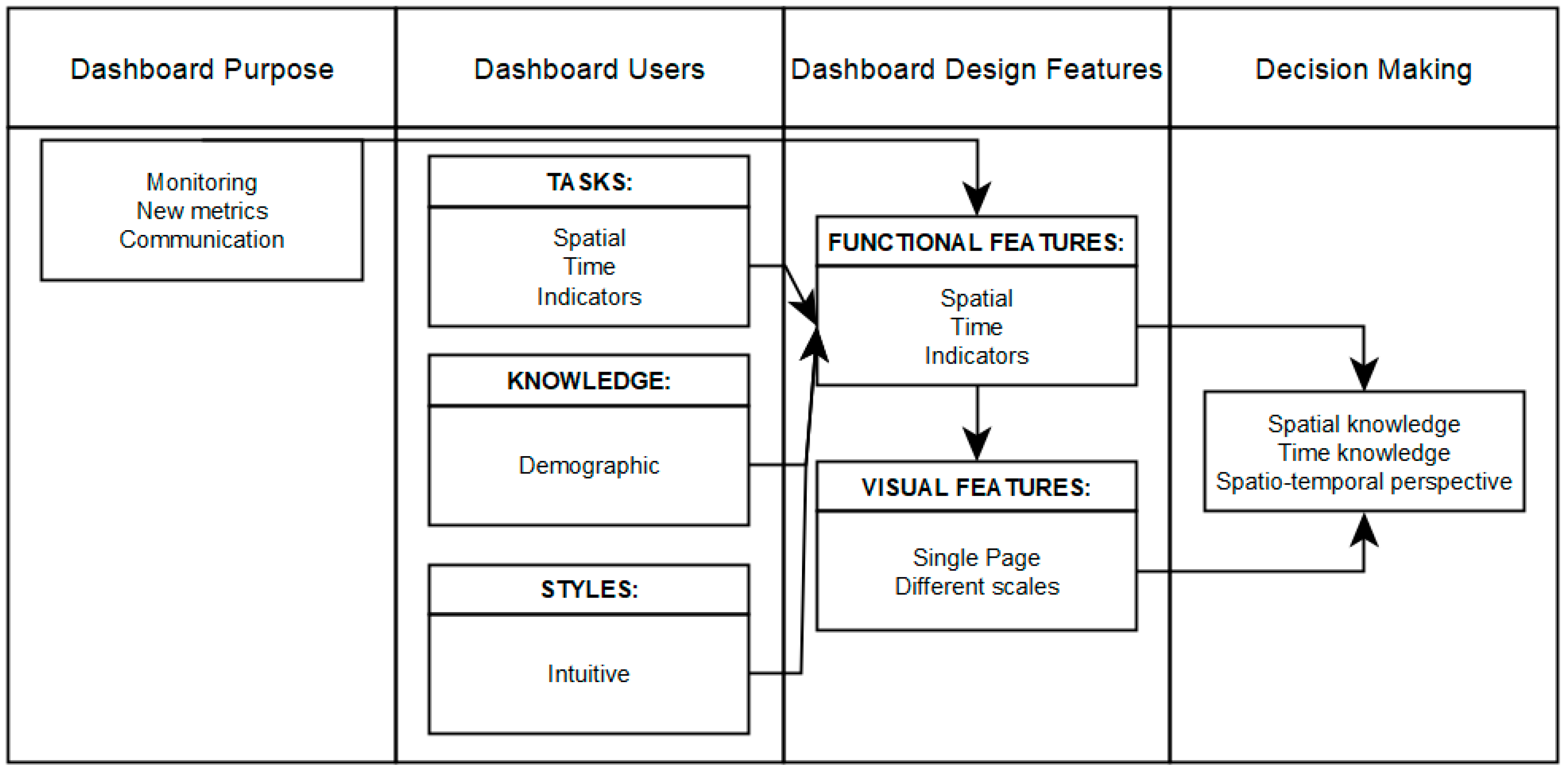
The research methodology was adapted from Yigitbasioglu and Velcu [22], organizing in the following conceptual relationships: purpose, users, design features, and decision-making (Figure 1). The implementation of concepts and relationships between entities was based on discussion and analysis among the stakeholders involved in the project. Firstly, the entities involved established the main objective of the dashboard to monitor cases of infection and to calculate indicators using auxiliary information to allow understanding/explaining the spread of the virus in the territory. The first step was the assembly of appropriate time series data and geographic information. Based on the number of cases and auxiliary demographic information, the indicators that make up the dashboard are calculated. The calculation of indicators (e.g., confirmed cases per 10,000 inhabitants by municipality, risk classification) allows establishing the relationship between the pandemic situation and the socio-economic context.
The functional features identified by the project’s stakeholders were the visualization of information through maps, the use of simple and dynamic graphics, and the visualization of the big statistical numbers associated with the number of cases. The principles of visualizing data identified by the project stakeholders were the visualization on a one-page style and drilldown style containing all the maps and graphs (Figure 2). The screen is organized by geographic scales, and each level includes elements such as maps, graphs, and indicators. Based on the requirements defined by the stakeholders and the purpose of the dashboard, the integration of the map and other elements assumed the map as part of the Graphic User Interface (GUI) [23]. The interactive spatio-temporal exploration, and spatio-temporal information decoding constitutes the support for decision-making.
In order to provide an interactive exploration of spatiotemporal data, the time sliders were developed to make a web maps depicting time series information using proportional symbols [28] and choropleth maps.
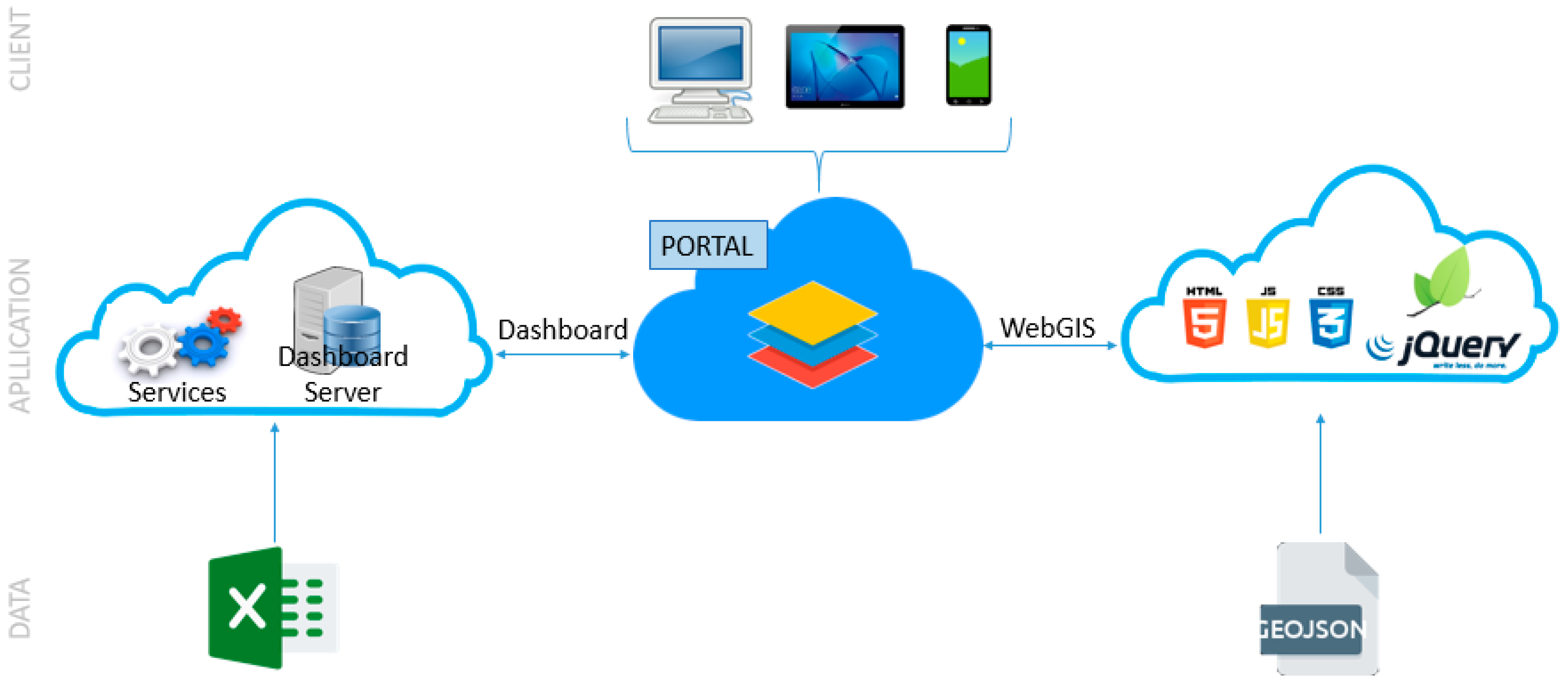
3.2. Architecture
To integrate data and the logic from various systems and derive new functionalities, such as multi-temporal and multi-scale management, a combined approach based on Esri’s ArcGIS Online technology was chosen (Figure 3). All existing graphical elements, except external incorporations and cartography, were developed from ArcGIS Online dashboard functionalities.
WebGIS cartography was developed using the Leaflet map library and jQuery function library, in a solution that combines HTML (HyperText Markup Language), CSS (Cascading Style Sheets) and JS (JavaScript), for allowing greater development freedom, interactivity and query speed. The cartography was developed combining the Leaflet map library and some of its plugins such as Leafet.migrationLayer (for viewing imported case flows) with the jQuery library. Both the proportional circle maps and the choropleths present in the dashboard allow the user to set the date of the data series to be represented by a time slider from jQuery.
Due to the external cartographic development, the cartography was published online on a hosting platform and then incorporated into the dashboard.
3.3. Data
The data for the national territory come from the daily reports [7] and dashboard of DGS [18]. Despite the work developed by DGS for the daily preparation of epidemiological newsletters and their availability to the public, the information is made available exclusively in Portable Document Format and dashboard, i.e., it is not provided in a format that could be easily manipulated and submitted to analysis and modeling tasks or can be integrated into a GIS, which is a limitation to the use of the data. Therefore, the use of the information for analysis tasks requires the manual collection of the information, subject of course to errors. It was also necessary to edit and correct the series when they represent reductions in the number of accumulated cases due to recounts. This edition was imperative for a proper representation of the graphic and cartographic information. Various changes that have occurred in the information made available in the daily reports should also be noted. That information no longer includes imported cases, which limits the knowledge of the geographical origin of new cases associated with international contacts. It should also be noted that historical corrections in the series made by DGS sometimes occur due to delays in reporting by laboratories or due to incorrect allocation of cases to territorial units, but the correction process is not made available by DGS. The main consequence is that the accumulated numbers of some variables do not match with the sum of daily values. Whenever this happens, data are updated as much as possible from the available information. In addition, the information on a municipal scale is no longer disclosed with a fixed periodicity, and the disclosure of accumulated cases per municipality has been discontinued. Now, it provides at 14 days the cumulative incidence per 100,000 inhabitants. These changes also constitute constraints to the maintenance and update of the information present in the dashboards.
The data on the international scale are based on information from the WHO dashboard [3] and the portal “Coronavirus Pandemic (COVID-19)”, which compiles a set of data from the ECDC [29]. Due to the use of these two sources for monitoring the situation at an international level, it is sometimes possible that there is not a complete matching of the quantities recorded by both.
The information regarding dashboard charts and graphs has been structured in Excel files, due to its ease of import and daily update in ArcGIS Online. Regarding WebGIS cartography, the information is structured in GeoJSON format that contains all the associated data series, topology, and coordinates.
4. Results
This dashboard ensures the monitoring of the evolution of COVID-19 at various scales, in a close articulation between the geographic and temporal dimensions. The interactivity and dynamism of the various graphic elements (Figure 4a, b) is a guarantee of ease of consultation and access to all available information. The production of dynamic WebGIS cartography with time control ensures the representation of variables in a spatio-temporal perspective (Figure 4c–f), proving to be of great contribution to the interpretation of processes and trends of evolution of the phenomenon and its propagation in space and over time.
Since the publication of the dashboard in October 2020 until the month of November 2020, there were about 600 visits and 1191 page views, corresponding to a daily average of 10 visits.
The dashboard is structured in four components, each representing a different scale of analysis (international, national, regional, and municipal).
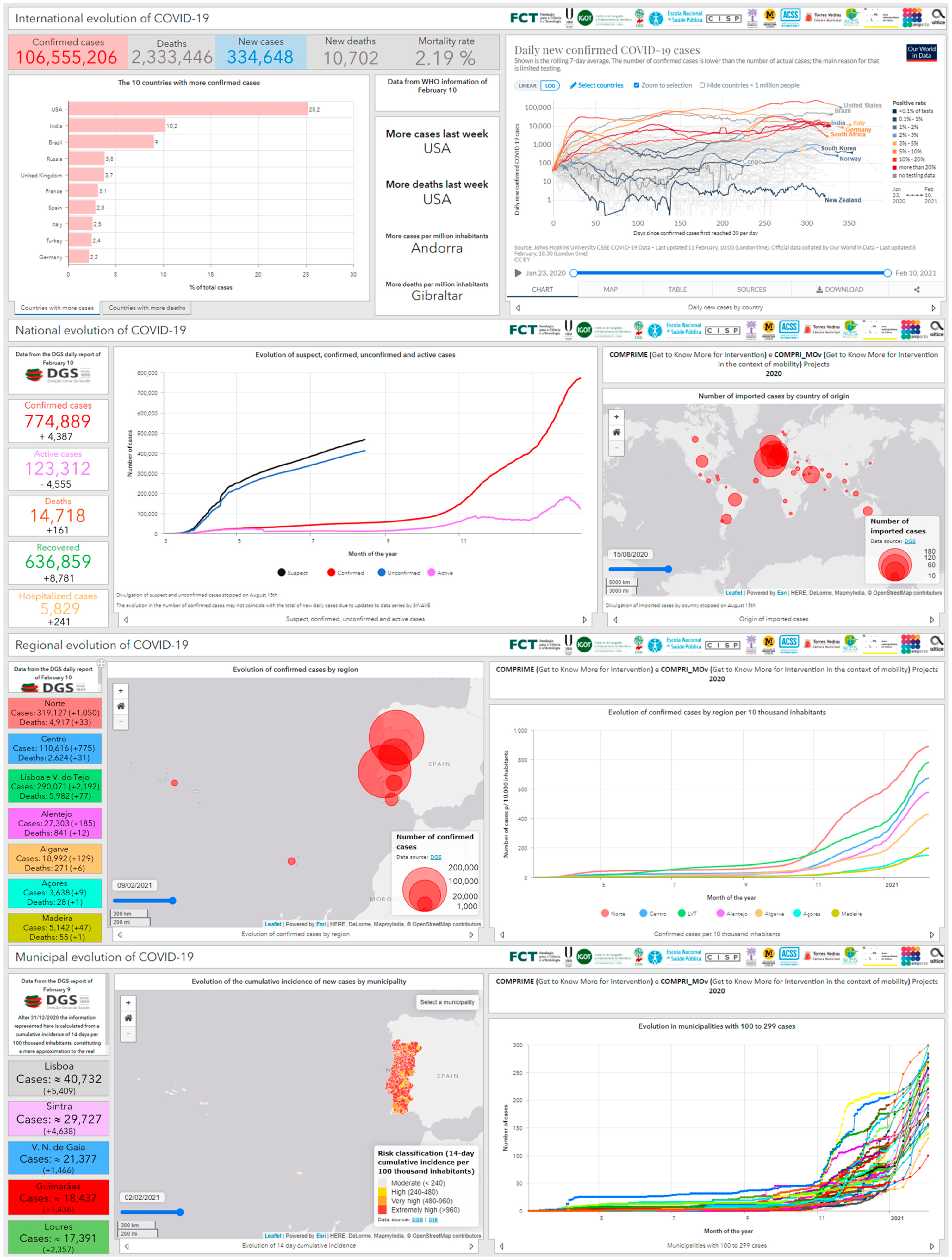
4.1. International Scale
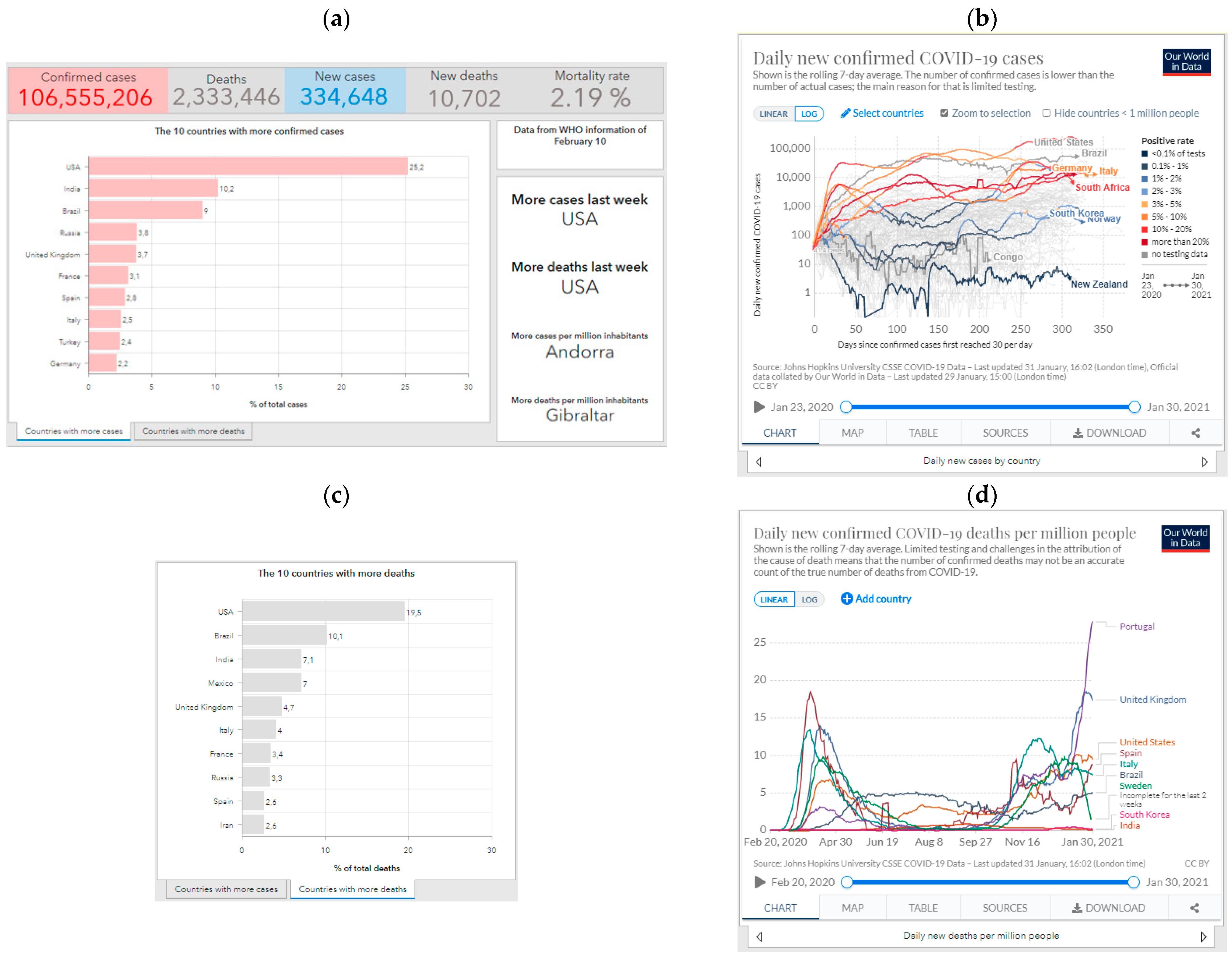
In monitoring the situation on an international scale (Figure 5), the dashboard is divided into two parts:
- The left half that results from the WHO data collection [3] in which the main figures (confirmed cases, deaths, new cases, new deaths, and mortality rate) and the countries that register a rapid increase in them in absolute terms and by their population are highlighted. The proportions of cases and deaths in the world context are also represented for the 10 most affected countries (Figure 5a,c).
- The right half where six external elements are incorporated: daily variation of new confirmed cases per country (Figure 5b), new cases per million inhabitants, new deaths per million inhabitants (Figure 5d), evolution of the total number of cases and deaths in the world, evolution of vaccination doses administered and, finally, the WHO dashboard.
In the context of the international component, the option of incorporating the external elements mentioned, as opposed to their collection and subsequent editing and representation, results from the slowness of constant updating of the situation for all countries with incidence of the disease. Moreover, the incorporation of these elements allows the user to access a vast amount of information published in these sources, contributing to the access to more information on the phenomenon.
4.2. National Level
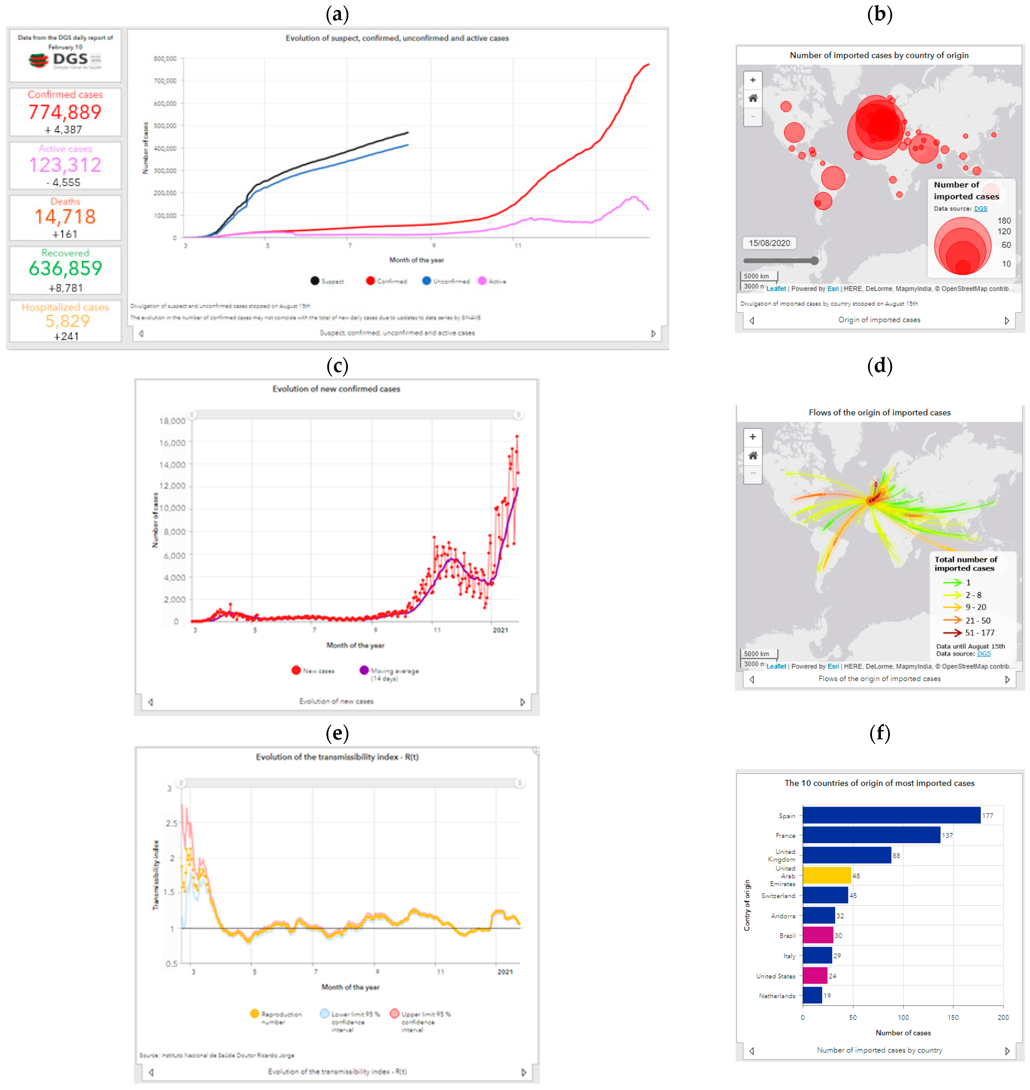
As for the national context, particular importance is given to the large numbers (confirmed cases, active, deaths, recovered, and hospitalized) using 11 line graphs to represent the evolution of the main variables made available in the DGS daily bulletins. Metrics calculated from the information in the DGS reports were also included, such as the average of new infections in the last 14 days and the confirmed and active cases per 10,000 inhabitants. It also includes two interactive maps (one of flows and one of proportional circles), representing the origin of imported cases (with temporal variation), which is accompanied by two horizontal bar graphs expressing the number and relative percentage of the 10 countries of origin of the most cases imported into Portugal, and also two vertical bar graphs stacked at 100% with the distribution of confirmed cases and deaths by age.
The metrics and indicators available at the national scale (Figure 6) are indicative of the evolution of the main variables, such as the number of confirmed, active, recovered, and death cases.
The evolution of confirmed cases (Figure 6a) depends on the number of new cases per day (Figure 6c) which, in turn, depends on the testing that is performed. In the first months of known spread of the new coronavirus in Portugal (March and April), high values of infection were reached with the number of accumulated cases exceeding 20,000. Later, and in the context of general confinement (March to May), a slowdown is observed, but the numbers increase again in the beginning of September, with the return to schools and face-to-face work after vacations, reaching in the months of October and November values of contagion much higher than those recorded at the beginning of the pandemic. The average of new 14-day infections in November was seven times higher than the maximum registered in the first wave (5587 against 800). The variation from September shows that the first wave (March, April, and May) was very circumscribed in time and of low magnitude, with consecutive maximums of new infections in October and November, with the number of confirmed cases doubled in less than 1 month (101,860 cases at 18 October 2020 and 204,664 at 12 November 2020, reaching 300,462 at 30 November 2020). In the end of December, this second wave showed signals of being under control; however, after Christmas and New Year’s Eve festivities, the number of new cases increased as never seen before, being 15 times higher than the first wave and more the double the second. January was the worst month, representing about 30% of the accumulated cases since the beginning of the pandemic in Portugal. The evolution of the disease’s transmissibility index (Figure 6e) reveals a complex trajectory that does not always coincide with the evolution of new cases, but at the time of higher incidence of new cases, it was higher than 1. The number of recovered patients has always evolved favorably with an exponential increase in recent months, as has the number of cases. The number of hospitalizations has also been increasing, as have intensive care unit admissions, putting great pressure on health care and revealing the severity and magnitude of this new phase. The fatality of the disease as a proportion of those infected was especially high in the first phase, and it decreased during and after the period of national confinement in a clear trend of control and maturation. However, the current number of daily deaths is much higher than in the first and second waves, successively reaching record mortality rates. January was also the worst month relative to COVID-19 deaths with almost 6000 deaths. It took nine months of the pandemic to reach the same number. Fatal cases occur mainly in the older age groups, and there are no substantial differences in proportions between males and females. The same is not true for confirmed cases in which, in a very short initial period, men were the most affected, and since the end of March, women have been the most affected. As far as testing is concerned, the daily variation varies substantially, yet the general trend is one of continuous increase, reaching the maximum number of tests ever performed. With the positive rate increasing, it reveals that the increase in the number of cases in recent months is not exclusively the result of more testing. On this scale, a map is also available with the number of imported cases per country of origin (Figure 6b), a map representing the flows per country of origin (Figure 6d), and a graph with the top 10 countries of origin (Figure 6f).
4.3. Regional Level
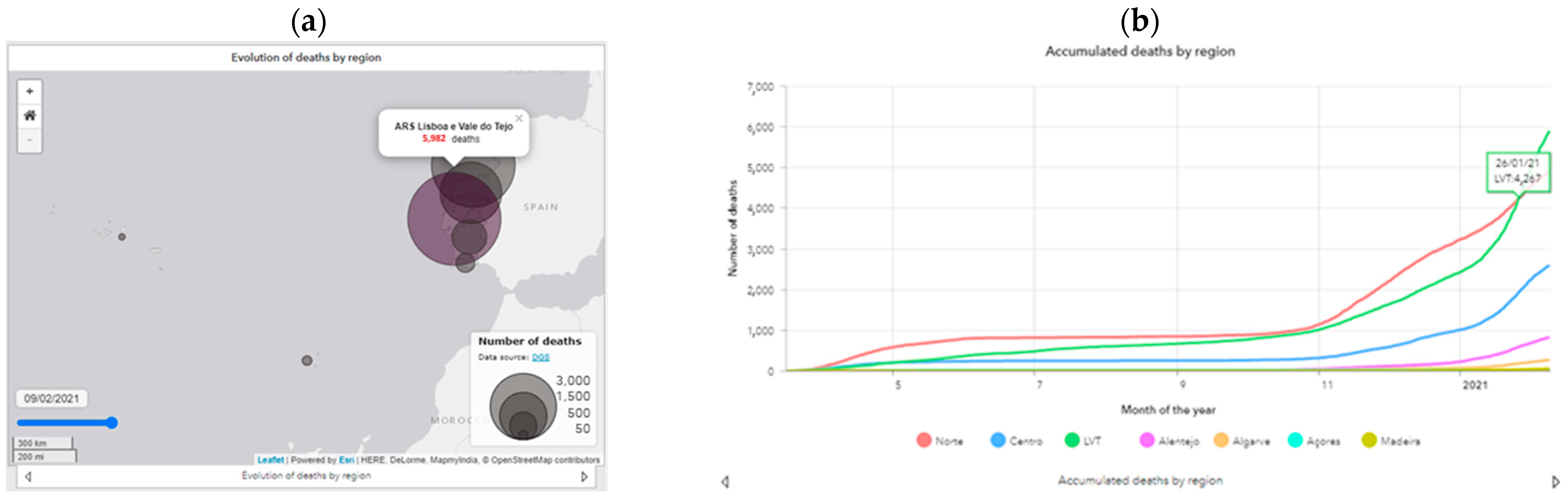
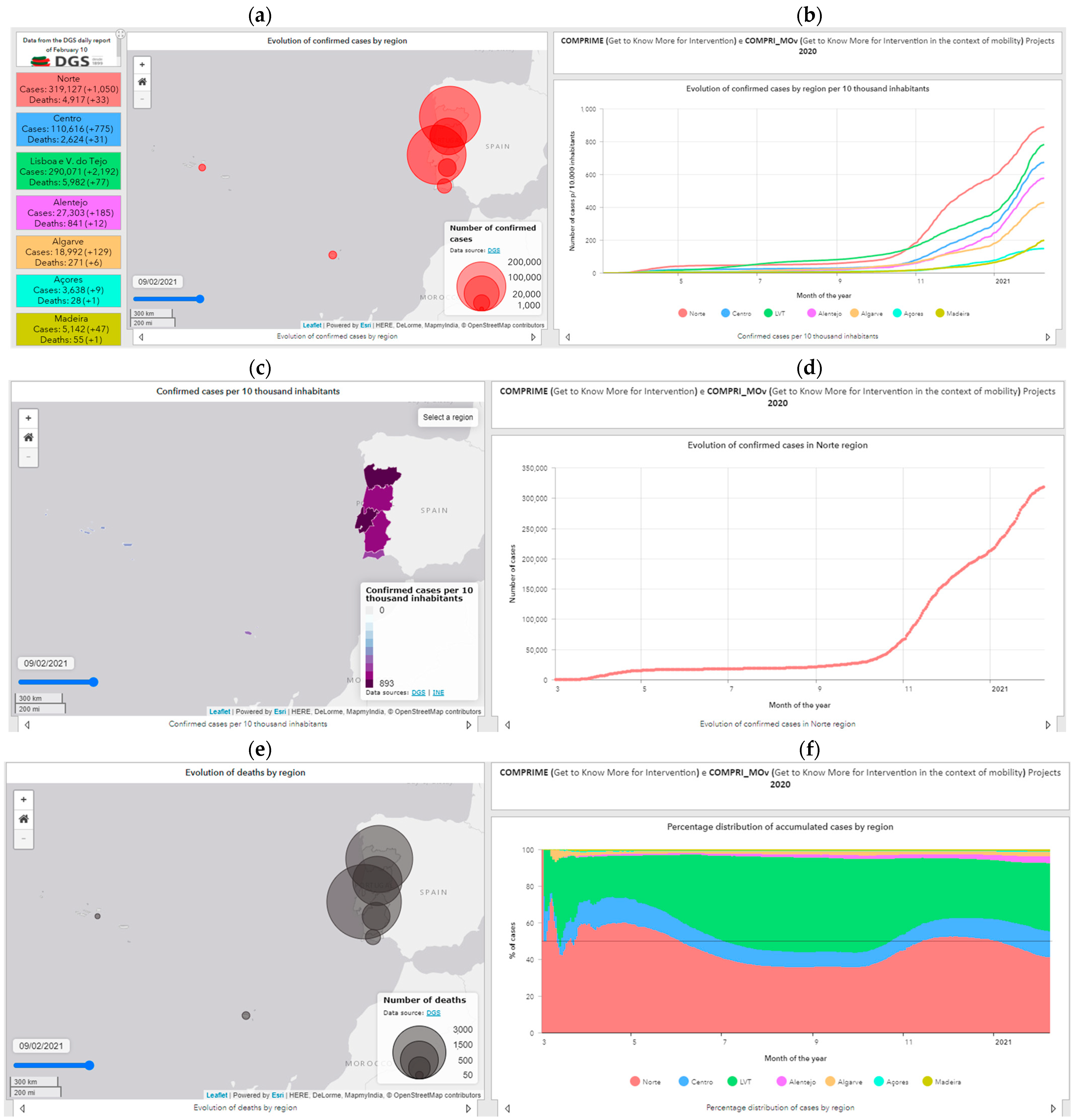
At the regional scale, the cases and deaths are differentiated by a region on the interactive maps, which allows changing the date represented (Figure 7a,c,e). Seventeen graphs were elaborated to show the evolutionary behavior of the virus propagation at the regional scale, highlighting the accumulated curves individualized by Regional Health Administration (RHA), the number of new cases per region, as well as the average evolution (Figure 7b,d,f). In addition to the number of cases, graphs by the RHA referring to deaths are presented with the representation of their accumulated number (information also mapped) and the mortality rate.
The spatial spread of the disease started in the Norte RHA and Lisboa e Vale do Tejo (LVT) RHA, since these administrative units include the metropolitan areas of Lisbon and Porto. The phenomenon quickly spread to the Centro RHA, and only at a later stage was there a higher incidence in Alentejo and Algarve. Subsequently, the LVT overcame the Norte region in daily and accumulated cases, becoming the main focus of contagion in the national territory, while the remaining regions showed a situation of control and low contagion. In a more recent period (October), the Norte region again reached daily incidence values higher than any other unit in the country, in a clear repetition of the initial trend of the pandemic, currently registering more confirmed cases than all the other RHAs together. With the beginning of the third wave, the LVT RHA far surpassed the incidence registered in Norte. The index of transmissibility of the disease presents several “peaks” due to the occurrence of large outbreaks and localized outbreaks of infection by COVID 19, especially in the Alentejo RHA.
The Madeira and Azores RHA are characterized by its own evolution of greater stability, which is not strange its insularity, with the number of new contagions very residual and practically zero in the period of confinement. From July onwards, there was a more expressive increase, although it was quite controlled, maintaining these two regions as the two with the lowest number of cases per 10,000 inhabitants. After January, they seem to show the same trajectory of the rest of country trajectory with record incidences.
Regarding deaths, the mortality rate has been decreasing considerably in all RHA, remaining below 5% in all territorial units, with the Norte LVT accumulating the highest number of fatal cases, closely followed by the Norte RHA.
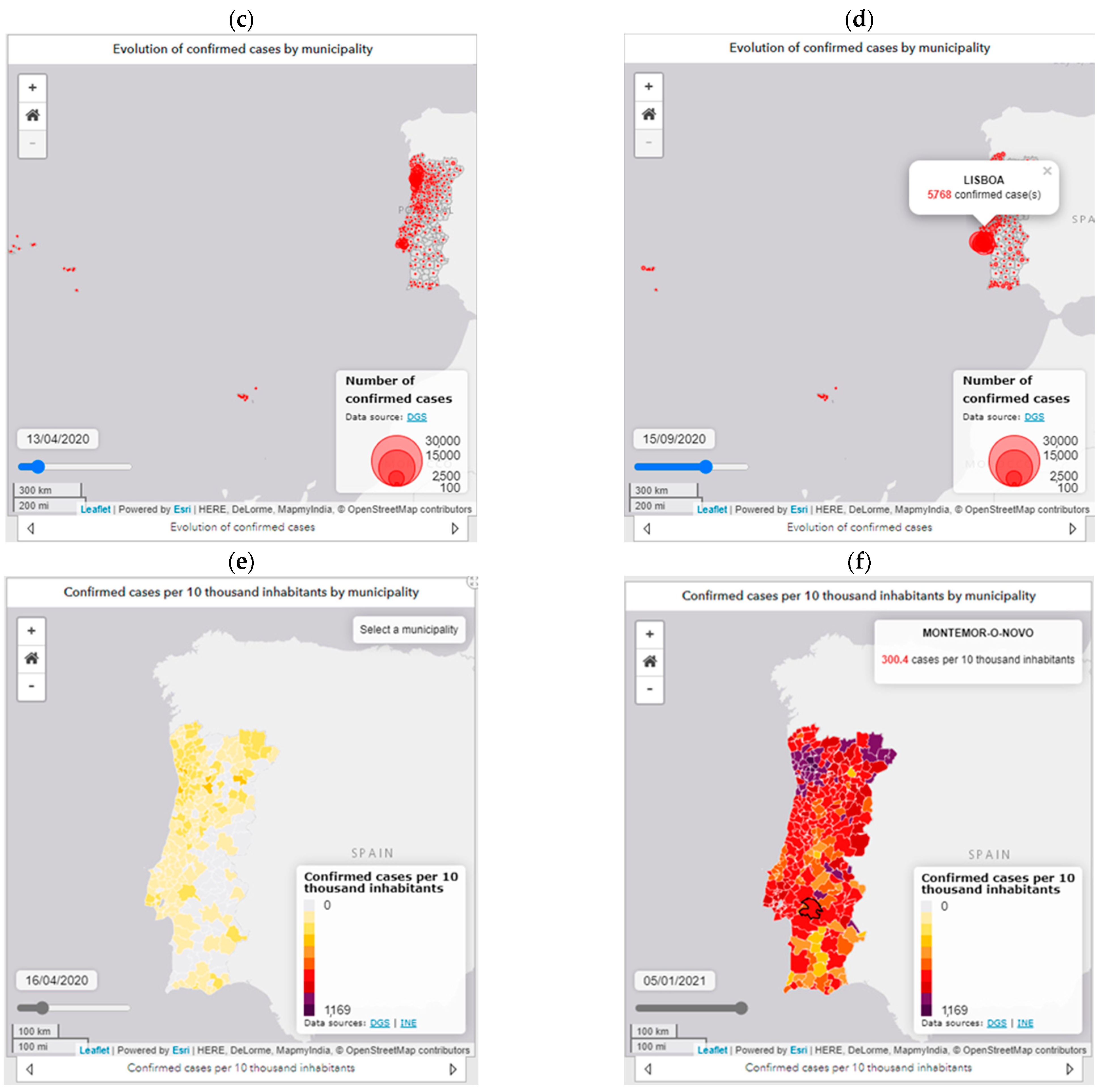
4.4. Municipal Level
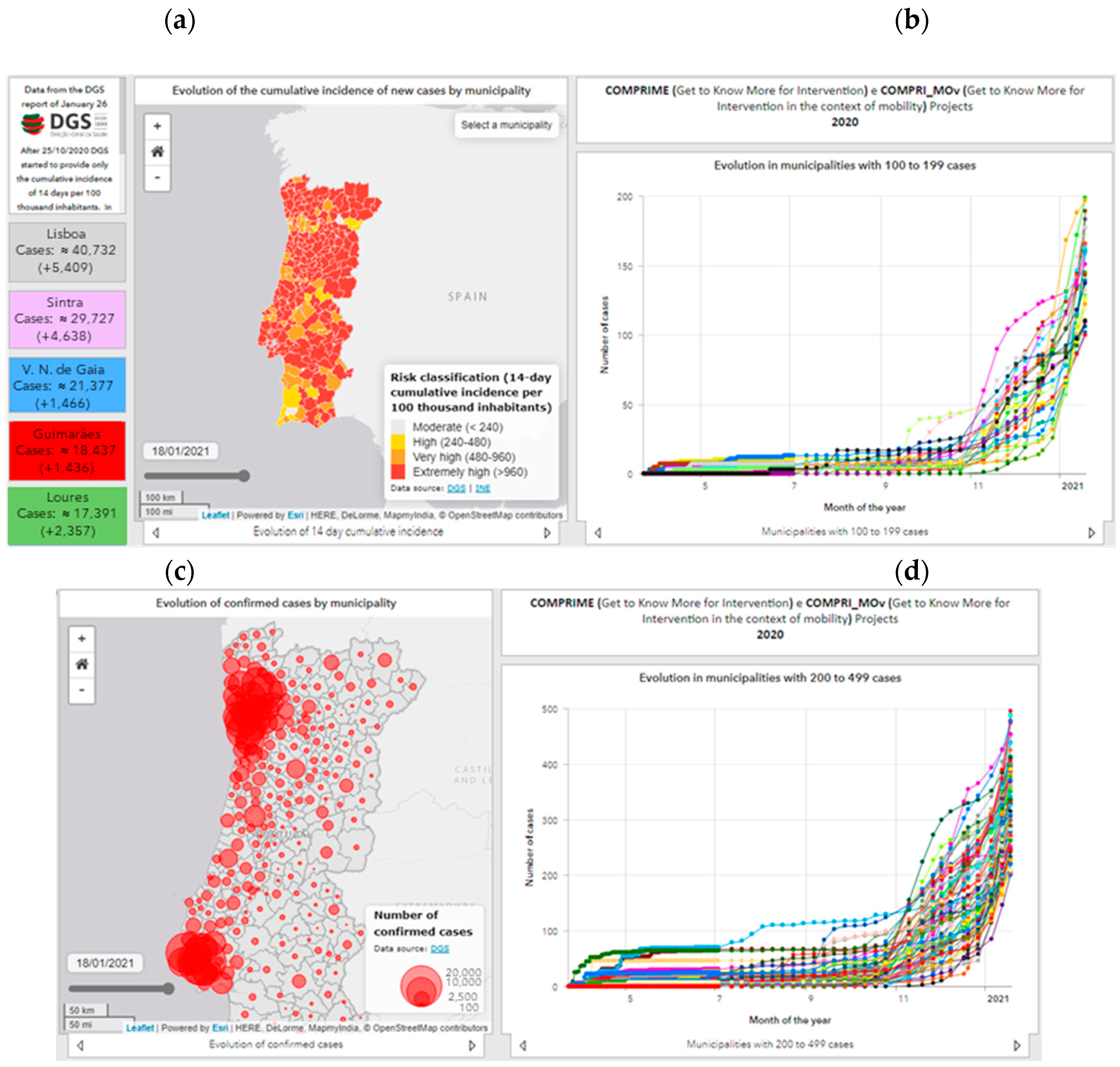
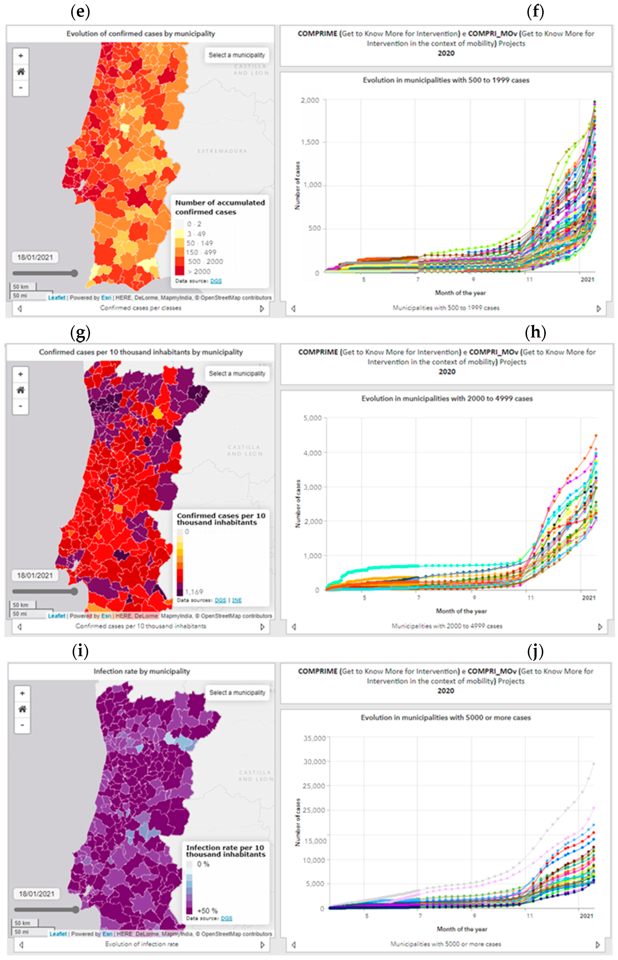
Given the municipal context, the dashboard (Figure 8) highlights the municipalities with the highest number of confirmed cases. In parallel, the municipalities are represented in a WebGIS through six variables with the option of temporal change: risk classification based on the cumulative incidence of new cases at 14 days per 100,000 inhabitants (Figure 8a); number of confirmed cases (Figure 8c); number of cases per classes (Figure 8e); confirmed cases per 10,000 inhabitants (Figure 8g); infection rate per 10,000 inhabitants (Figure 8i).
The representation of these variables on a municipal scale, associated with a timeline, allows identifying different geographical patterns, as well as spatio-temporal trends in an interactive way. The cartography is accompanied by five graphs of the evolution of the number of confirmed cases, allowing interpreting the different timings of contagion and the epidemic phase of the municipalities: municipalities with 100 to 199 cases (Figure 8b); municipalities with 200 to 499 cases (Figure 8d); municipalities with 500 to 1999 cases (Figure 8f); (iv) municipalities with 2000 to 4999 cases (Figure 8h); and municipalities with 5000 or more cases (Figure 8j).
5. Discussion
The high number of accesses to the dashboard allows us to state that the use of exploratory data methods is an approach that facilitates the understanding of the main epidemiological patterns and trends.
The cartography available on the dashboard allows a temporal analysis of the evolution of the propagation of new cases, noting that in the first moment (March to early April), the evolution of the number of infections was higher in municipalities with higher population density and associated with concentrations of employment, as is the case of municipalities in metropolitan areas [30]. The spatial spread of the phenomenon in mainland Portugal occurred from metropolitan areas to non-metropolitan coastal municipalities, particularly in the northern and central regions first, followed by the spread from the coast to the interior from the main cities and urban axes of the coast [31].
Later, the phenomenon reaches territories with lower population density and an older population, with outbreaks also occurring, mainly in nursing homes, leading to a significant increase in the number of outbreaks of infection dispersed throughout the municipalities of the interior in the Norte and Centro regions and, later, the municipalities of the Oeste e Médio Tejo [30].
Another component responsible for the dispersed and random number of new cases results from the visit of emigrants to Portugal, which caused some contagions in the regions Norte and Centro [31].
While in the first wave, the phenomenon expanded practically to the entire national territory, both through hierarchical diffusion and by contagion, the second phase started in September, which demonstrates not only the further geographical expansion of the phenomenon, with virtually all municipalities registering cases of infection by COVID-19, but also a substantial increase in the values of confirmed cases in the most urban municipalities and their nearest functional dependencies, proving not only the growth of territorial diffusion but also the consolidation of spatial dispersion of the disease.
Thus, we can state that the diffusion of COVID-19 in Portugal is strongly related to the hierarchy of the urban network, spreading the infection from the main urban centers to those closest to them, and with the concentration of employment and industrial production. Industrial companies with a high number of workers have been the scene of large outbreaks of infection, often with high geographical extent. Social facilities such as nursing homes and senior residences have been associated with large localized outbreaks of contagion in a dispersed and localized pattern and explain the high number of cases in the older territorial units [32].
Dashboards can improve transparency and accountability; however, there are various risks and challenges related [33]. The greatest limitations to the development of the dashboard are related to data access. For example, information on a municipal scale is no longer disclosed at a fixed periodicity, and the disclosure of accumulated cases per municipality has been discontinued. These changes are constraints to the maintenance of the data series of the various indicators, requiring various calculations in order to guarantee the continuity of the series. Moreover, in the municipal case, due to these calculations, only approximate values represent the actual information, with no public access to the real number of cases per municipality. Another aspect refers to the fact that the data are not made available in a format that is easily manipulated (human-readable and machine-readable), that can be submitted to analysis and modeling tasks, or that can be integrated in a GIS, which is a limitation to the data use.
The main benefit for citizenship after implementing the dashboard is the involvement of citizens and the possibility of knowing the consequences of public policies and behaviors that influence the evolution of the pandemic. In this way, citizens will have the opportunity to know the spatio-temporal evolution and discuss the results. Future problems in the use and exploration of the dashboard are the lack of resources, maintenance, and updating, leading citizens to lose trust and to abandon the use of the dashboard.
The evolution of the dashboard is expected to integrate predictive models supported by mobility data, and the limitations associated with real-time data availability will be overcome through the provision of webservices by the national health authority.
6. Conclusions
Geographic information systems in general and web technologies in particular are indispensable tools in the provision and sharing of pandemic information in real time to understand the processes of contagion and support decision-making. The dashboard elaborated and presented in this article allows monitoring “almost in real time” the evolution of the COVID-19 disease at different scales and according to different perspectives, making available in a dynamic and interactive way the main indicators and variables that synthesize the pandemic situation from an exploratory and not inferential point of view.
The possibility of combining the cartographic representation of various indicators with their temporal differentiation allows a clear understanding of the dynamics and processes of virus spread throughout the national territory at regional and municipal scales. This is the main advantage of the solution developed compared to similar ones, and it is possible to consult information regarding several indicators for all the dates when official data are available.
Although the existing knowledge about the spread of the disease is not yet sufficient to control it, the tools for surveillance and epidemiological control, such as dashboards, continue to have an added importance in monitoring infections from a spatio-temporal perspective. The availability of this type of platform, which is an aggregator of official information providing it in an accessible, interactive, and transparent way, contributes to amplifying the dissemination of knowledge, providing important insights on the spread in space and time of the disease, supporting the population and other entities with detailed information so they can make as informed decisions as possible.
Author Contributions
Project administration, N.M.d.C.; funding acquisition, N.M.d.C.; supervision, N.M.d.C.; formal analysis N.M.d.C.; writing—review and editing, N.M.d.C.; Conceptualization, N.M.; methodology, N.M.; supervision, N.M.; writing—review and editing, N.M.; writing—original draft preparation, A.A.; software, A.A.; data curation, A.A. All authors have read and agreed to the published version of the manuscript.
Funding
This work was supported by national funds from FCT-Foundation for Science and Technology (RESEARCH 4 COVID-19): Project COMPRIME (Get to Know More for Intervention)-ID: 596685735 and Project COMPRI_MOv (Get to Know More for Intervention in the context of mobility)-ID: 613765655.
Data Availability Statement
The original data used in the dashboard study is available in the following URL: https://covid19.min-saude.pt/relatorio-de-situacao/. The processed data used in the dashboard is available in the following URL: https://www.comprime-compri-mov.com.
Conflicts of Interest
The authors declare no conflict of interest.
References
- WHO—World Health Organization. Ten Threats to Global Health in 2019. 2019. Available online: https://www.who.int/news-room/feature-stories/ten-threats-to-global-health-in-2019 (accessed on 19 September 2020).
- WHO—World Health Organization. WHO Director-General’s Opening Remarks at the Media Briefing on COVID-19–11 March 2020. 2020. Available online: https://www.who.int/dg/speeches/detail/who-director-general-s-opening-remarks-at-the-media-briefing-on-covid-19---11-march-2020 (accessed on 10 October 2020).
- WHO—World Health Organization. Coronavirus Disease (COVID-19) Outbreak Situation, 2020. WHO, 2020. Available online: https://covid19.who.int/ (accessed on 6 December 2020).
- WHO—World Health Organization. SARS: How a Global Epidemic Was Stopped; World Health Organization Western Pacific Region: Geneva, Switzerland, 2006. [Google Scholar]
- DGS—Direção-Geral da Saúde. REACT-COVID: Inquérito sobre Alimentação e Atividade Física em Contexto de Contenção Social. 2020. Available online: https://nutrimento.pt/noticias/react-covid/ (accessed on 9 February 2021).
- Boulos, K.; Geraghty, E. Geographical tracking and mapping of coronavirus disease COVID 19/severe acute respiratory syndrome coronavirus 2 (SARS CoV 2) epidemic and associated events around the world: How 21st century GIS technologies are supporting the global fight against outbreaks and epidemics. Int. J. Health Geogr. 2020, 19, 8. [Google Scholar] [CrossRef] [Green Version]
- DGS—Direção-Geral da Saúde. Relatório de Situação. Lisboa: Ministério da Saúde—Direção Geral da Saúde. 2020. Available online: https://covid19.min-saude.pt/relatorio-de-situacao/ (accessed on 9 February 2021).
- Cliff, A.; Haggett, P. Atlas of disease Distributions: Analytic Approaches to Epidemiological Data; Blackwell Publishers: Oxford, UK, 1993. [Google Scholar]
- Lyseen, A.K.; Nøhr, C.; Sørensen, E.M.; Gudes, O.; Geraghty, E.M.; Shaw, N.T.; Bivona-Tellez, C. A review and framework for categorizing current research and development in health related geographical information systems (GIS) studies. Yearb Med. Inform. 2014, 23, 110–124. [Google Scholar] [CrossRef] [Green Version]
- Zhou, C.; Su, F.; Pei, T.; Zhang, A.; Du, Y.; Luo, B.; Cao, Z.; Wang, J.; Yuan, W.; Zhu, Y.; et al. COVID-19: Challenges to GIS with Big Data. Geogr. Sustain. 2020, 1. [Google Scholar] [CrossRef]
- Franch-Pardo, I.; Napoletano, B.M.; Rosete-Verges, F.; Billa, L. Spatial analysis and GIS in the study of COVID-19. A review. Sci. Total Environ. 2020, 739, 140033. [Google Scholar] [CrossRef] [PubMed]
- Sarfo, A.; Karuppannan, S. Application of Geospatial Technologies in the COVID-19 Fight of Ghana. Trans. Indian Natl. Acad. Eng. 2020, 5. [Google Scholar] [CrossRef]
- Dong, E.; Du, H.; Gardner, L. An interactive web-based dashboard to track COVID-19 in real time. Lancet Infect. Dis. 2020, 20, 533–534. [Google Scholar] [CrossRef]
- Fernandez-Lozano, C.; Cedron, F. Shiny Dashboard for Monitoring the COVID-19 Pandemic in Spain. Proceedings 2020, 54, 23. [Google Scholar] [CrossRef]
- Barone, S.; Chakhunashvili, A.; Comelli, A. Building a statistical surveillance dashboard for COVID-19 infection worldwide. Qual. Eng. 2020, 32, 754–763. [Google Scholar] [CrossRef]
- Florez, H.; Singh, S. Online dashboard and data analysis approach for assessing COVID-19 case and death data. F1000Research 2020, 9, 1–13. [Google Scholar] [CrossRef] [PubMed]
- ECDC—European Centre for Disease Prevention and Control (2020). Situation Updates on COVID-19. Available online: https://www.ecdc.europa.eu/en/covid-19/situation-updates (accessed on 11 October 2020).
- DGS—Direção-Geral da Saúde & Esri. Coronavírus (COVID-19): Prevenção Através de Dashboards. 2020. Available online: https://www.esri-portugal.pt/pt-pt/landing-pages/covid19 (accessed on 9 February 2021).
- INE—Instituto Nacional de Estatística. Dashboard COVID-19: COVID-19 | Contexto e Impacto. 2020. Available online: https://ine-pt.maps.arcgis.com/apps/opsdashboard/index.html#/7af78fbbbdd9456397317f822dac503d (accessed on 9 February 2021).
- COTEC e NOVA IMS—Information Management School da Universidade Nova de Lisboa. COVID 19 Insights. 2020. Available online: https://insights.cotec.pt/ (accessed on 9 February 2021).
- APG—Associação Portuguesa de Geógrafos. Acompanhamento da Pandemia COVID-19 pela APG. Available online: http://www.apgeo.pt/acompanhamento-da-pandemia-covid-19-pela-apg (accessed on 9 February 2021).
- Yigitbasioglu, O.; Velcu, O. A review of dashboards in performance management: Implications for design and research. Int. J. Account. Inf. Syst. 2012, 13, 41–59. [Google Scholar] [CrossRef]
- Jing, C.; Du, M.; Li, S.; Liu, S. Geospatial Dashboards for Monitoring Smart City Performance. Sustainability 2019, 11, 5648. [Google Scholar] [CrossRef] [Green Version]
- Kourtit, K.; Nijkamp, P. Big data dashboards as smart decision support tools for i-cities—An experiment on Stockholm. Land Use Policy 2018, 71, 24–35. [Google Scholar] [CrossRef]
- Simms, R.; Ping, A.; Yelland, A.; Beringer, A.; Fox, R.; Draycott, T. Development of maternity dashboards across a UK health region; current practice, continuing problems. Eur. J. Obstet. Gynecol. Reprod. Biol. 2013, 170, 119–124. [Google Scholar] [CrossRef] [PubMed]
- Few, S. Information Dashboard Design: The Efective Visual Communication of Data; O’Reilly Media: Boston, MA, USA, 2006. [Google Scholar]
- Pappas, L.; Whitman, L. Riding the technology wave: Efective dashboard data visualization. In Symposium on Human Interface; Springer: Berlin/Heidelberg, Germany, 2011; pp. 249–258. [Google Scholar]
- Donohue, R.; Sack, C.; Roth, R. Time Series Proportional Symbol Maps with Leaflet and jQuery. Cartogr. Perspect. 2013, 43–66. [Google Scholar] [CrossRef] [Green Version]
- Roser, M.; Ritchie, H.; Ortiz-Ospina, E.; Hasell, J. Coronavirus Pandemic (COVID-19). 2020. Available online: https://ourworldindata.org/coronavirus (accessed on 9 February 2021).
- Marques da Costa, E.; Marques da Costa, N. A Pandemia de COVID-19 em Portugal Continental—uma análise geográfica da evolução verificada nos meses de março e abril. Hygeia Rev. Bras. Geogr. Médica Saúde 2020, 72–79. [Google Scholar] [CrossRef]
- Marques da Costa, E.; Marques da Costa, N. O processo pandémico da Covid-19 em Portugal Continental. Análise geográfica dos primeiros 100 dias. Finisterra 2020, 115, 11–18. [Google Scholar] [CrossRef]
- Sá Marques, T.; Santos, H.; Honório, F.; Ferreira, M.; Ribeiro, D.; Barbosa, M. O Mosaico Territorial do Risco ao Contágio e à Mortalidade por COVID-19 em Portugal Continental. Finisterra 2020, 115, 19–26. [Google Scholar] [CrossRef]
- Matheus, R.; Janssen, M.; Maheshwari, D. Data science empowering the public: Data-driven dashboards for transparent and accountable decision-making in smart cities. Gov. Inf. Q. 2020, 37, 101284. [Google Scholar] [CrossRef]
Figure 1.
Dashboard research paths.

Figure 2.
Dashboard design.

Figure 3.
Dashboard architecture.

Figure 4.
Interactivity of the dashboard elements. Source: https://www.comprime-compri-mov.com (accessed on 9 February 2021).
Figure 4.
Interactivity of the dashboard elements. Source: https://www.comprime-compri-mov.com (accessed on 9 February 2021).


Figure 5.
Example of dashboard elements for the international scale. Source: https://www.comprime-compri-mov.com (accessed on 9 February 2021).
Figure 5.
Example of dashboard elements for the international scale. Source: https://www.comprime-compri-mov.com (accessed on 9 February 2021).

Figure 6.
Example of dashboard elements for the national scale. Source: https://www.comprime-compri-mov.com (accessed on 9 February 2021).
Figure 6.
Example of dashboard elements for the national scale. Source: https://www.comprime-compri-mov.com (accessed on 9 February 2021).

Figure 7.
Example of dashboard elements for the regional scale. Source: https://www.comprime-compri-mov.com. (accessed on 9 February 2021).
Figure 7.
Example of dashboard elements for the regional scale. Source: https://www.comprime-compri-mov.com. (accessed on 9 February 2021).

Figure 8.
Example of dashboard elements for the municipal scale. Source: https://www.comprime-compri-mov.com (accessed on 9 February 2021).
Figure 8.
Example of dashboard elements for the municipal scale. Source: https://www.comprime-compri-mov.com (accessed on 9 February 2021).


Publisher’s Note: MDPI stays neutral with regard to jurisdictional claims in published maps and institutional affiliations. |
© 2021 by the authors. Licensee MDPI, Basel, Switzerland. This article is an open access article distributed under the terms and conditions of the Creative Commons Attribution (CC BY) license (http://creativecommons.org/licenses/by/4.0/).
Share and Cite
MDPI and ACS Style
Marques da Costa, N.; Mileu, N.; Alves, A. Dashboard COMPRIME_COMPRI_MOv: Multiscalar Spatio-Temporal Monitoring of the COVID-19 Pandemic in Portugal. Future Internet 2021, 13, 45. https://0-doi-org.brum.beds.ac.uk/10.3390/fi13020045
AMA Style
Marques da Costa N, Mileu N, Alves A. Dashboard COMPRIME_COMPRI_MOv: Multiscalar Spatio-Temporal Monitoring of the COVID-19 Pandemic in Portugal. Future Internet. 2021; 13(2):45. https://0-doi-org.brum.beds.ac.uk/10.3390/fi13020045
Chicago/Turabian StyleMarques da Costa, Nuno, Nelson Mileu, and André Alves. 2021. "Dashboard COMPRIME_COMPRI_MOv: Multiscalar Spatio-Temporal Monitoring of the COVID-19 Pandemic in Portugal" Future Internet 13, no. 2: 45. https://0-doi-org.brum.beds.ac.uk/10.3390/fi13020045
Note that from the first issue of 2016, this journal uses article numbers instead of page numbers. See further details here.