Evaluation Methods for Citizen Design Science Studies: How Do Planners and Citizens Obtain Relevant Information from Map-Based E-Participation Tools?


Abstract
: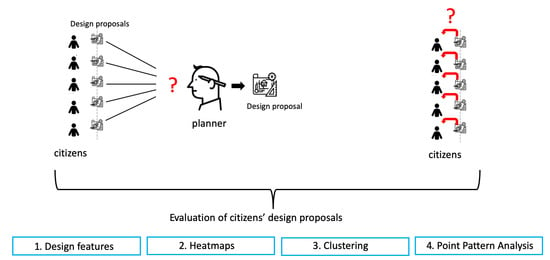
1. Introduction
2. Related Work
2.1. (E-)Participation in Urban Planning
2.2. Map-Based Participation
2.3. Data Evaluation of Map-Based (e-)Participation
3. Tool and Data Description
3.1. Tool Description
3.2. Study Site
3.3. Exercise
3.4. Data Analysis
4. Methods
4.1. Analysis 1: Design Features
4.1.1. Frequency of Placed Objects
4.1.2. Design Parameters
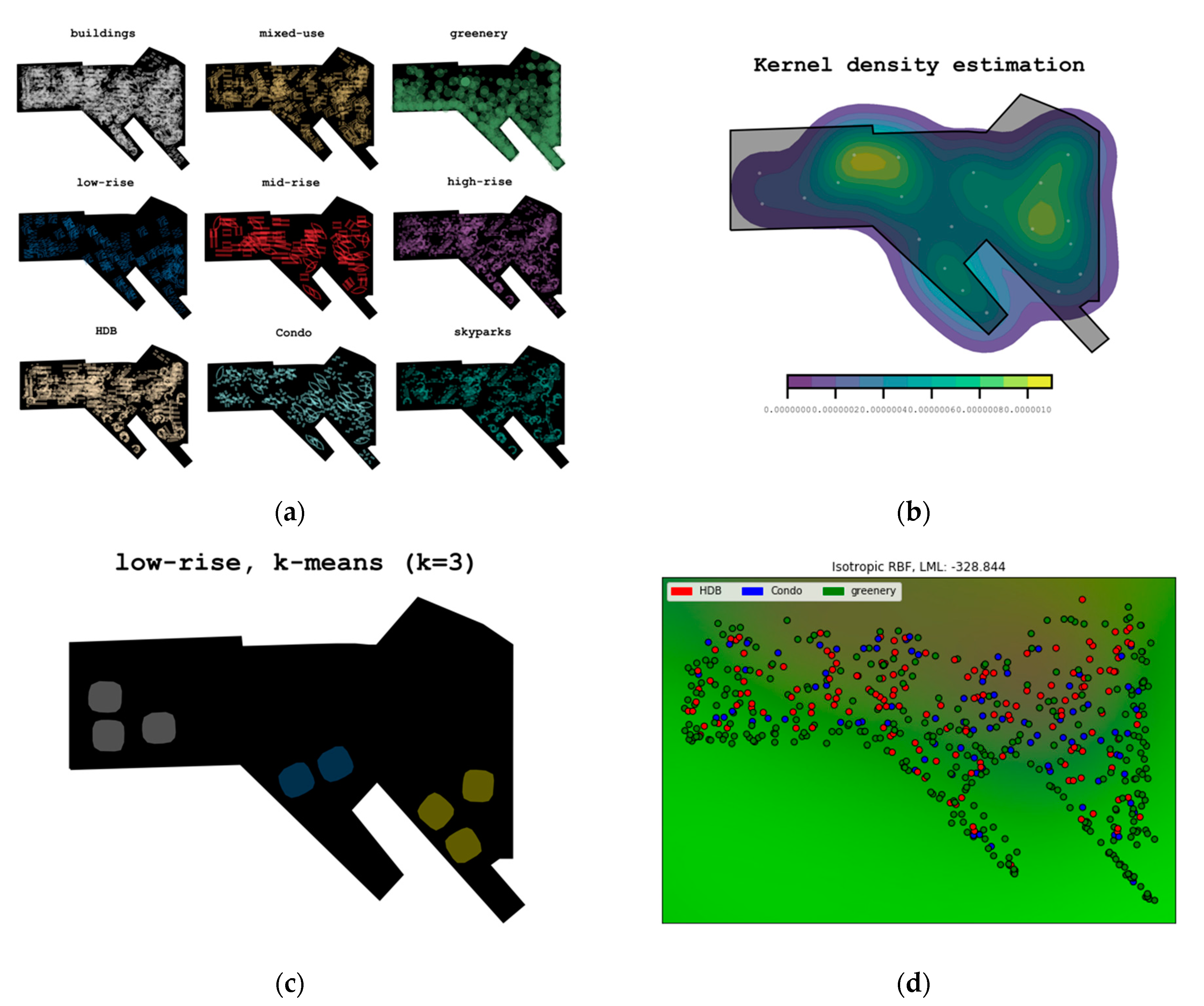
4.2. Analysis 2: Heatmaps
4.2.1. Qualitative Data: Heatmaps and Kernel Density Estimation
4.2.2. Quantitative Data: Kernel Density Estimation (KDE)
4.3. Analysis 3: Clustering
4.3.1. Non-Hierarchical Clustering (e.g., k-Means Clustering)
4.3.2. Gaussian Process Clustering
4.3.3. Spatial Autocorrelation Statistics
4.4. Analysis 4: Point Pattern Analysis
4.4.1. Diversity Indices
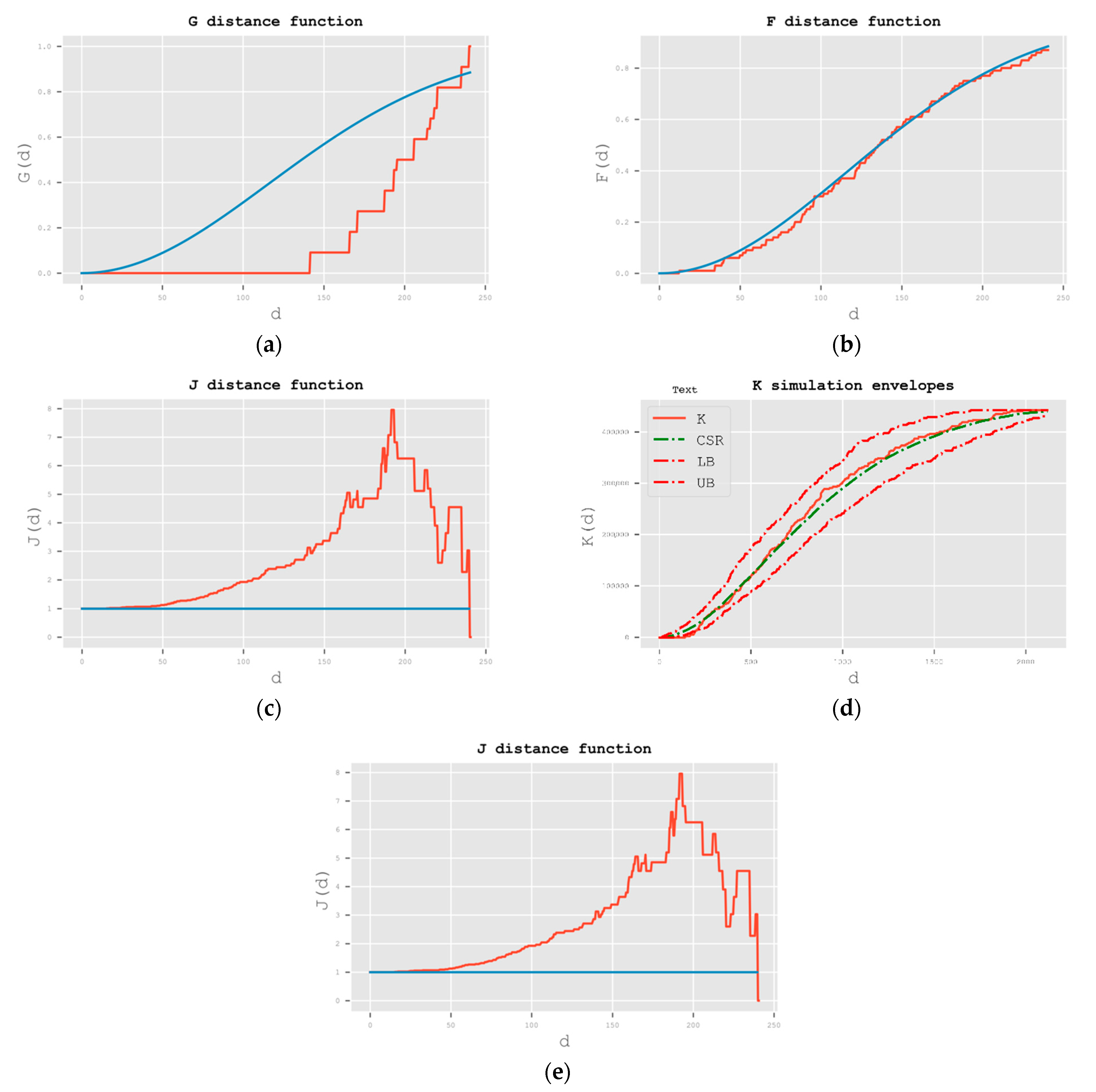
4.4.2. Common Second-Order Statistics
Compare the Value of the Two Functions
5. Results
5.1. Analysis 1: Design Features
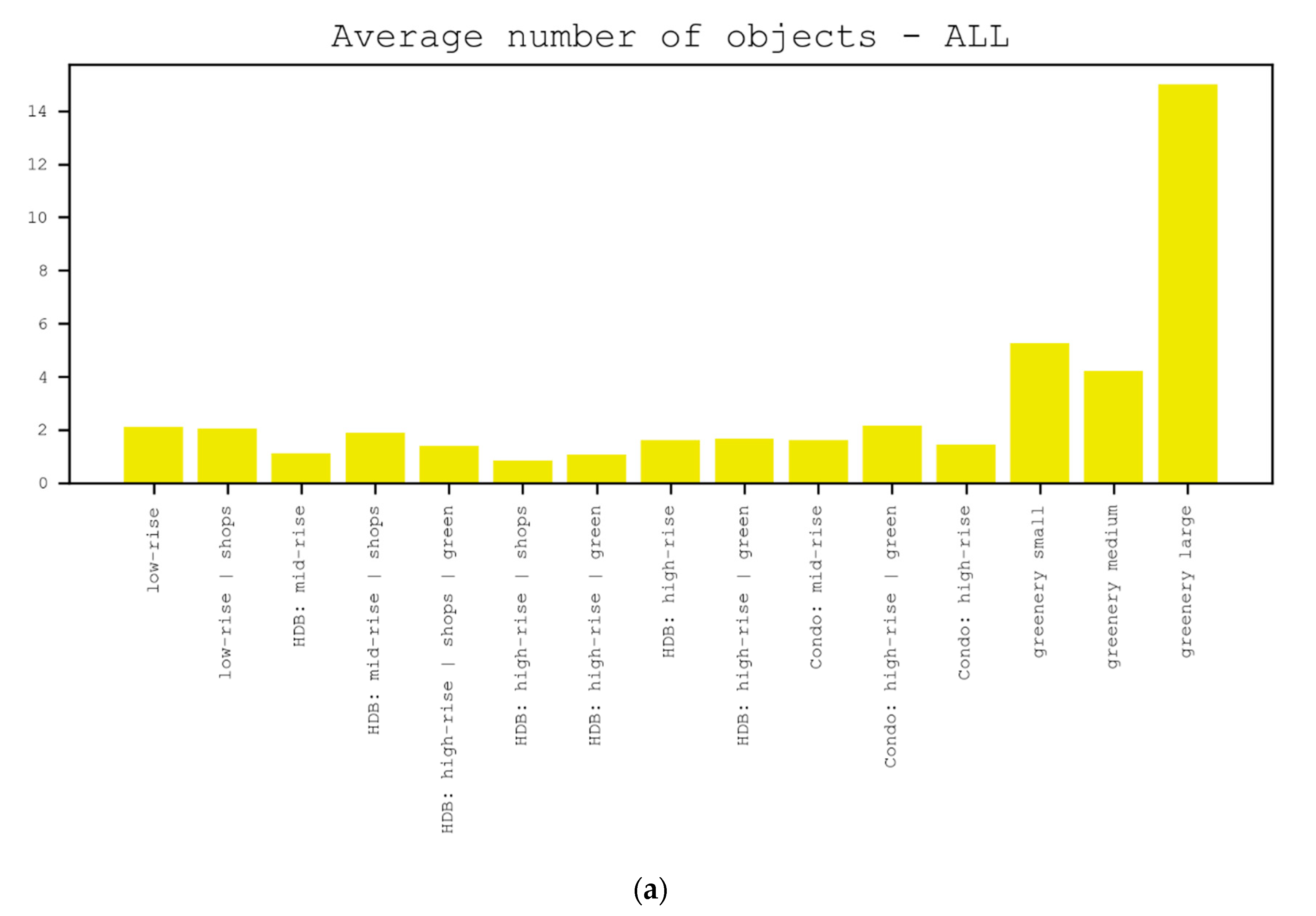
5.1.1. Frequency of Placed Objects
5.1.2. Design Parameters
5.2. Analysis 2: Heatmaps
5.2.1. Qualitative Data: Heatmaps and Kernel Density Estimation
5.2.2. Quantitative Data: Kernel Density Estimation (KDE)
5.3. Analysis 3: Clustering
5.3.1. Non-Hierarchical Clustering (e.g., k-Means Clustering)
5.3.2. Gaussian Process Clustering
5.3.3. Spatial Autocorrelation Statistics
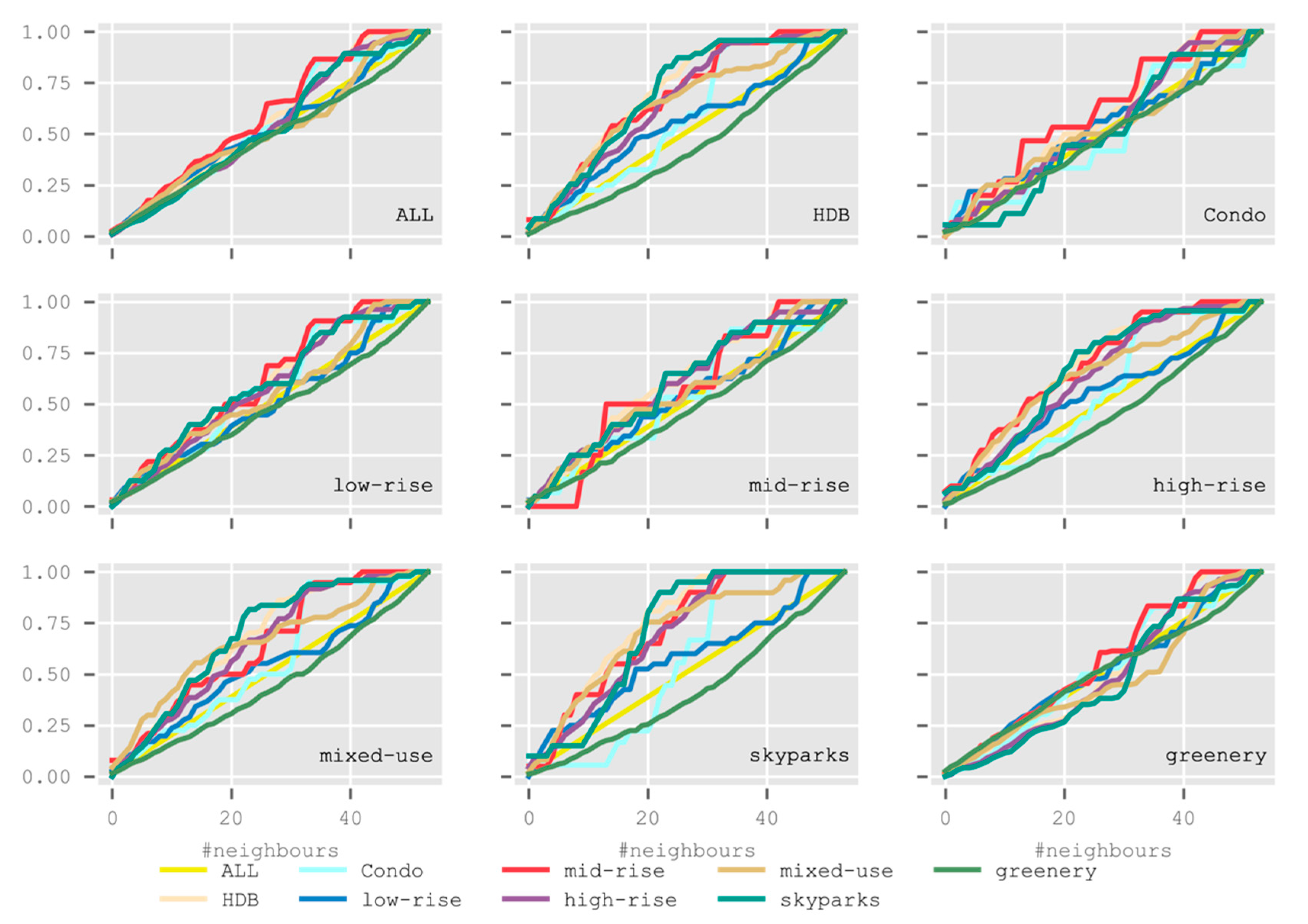
5.4. Analysis 4: Point Pattern Analysis
5.4.1. Diversity Indices
5.4.2. Common Second-Order Statistics
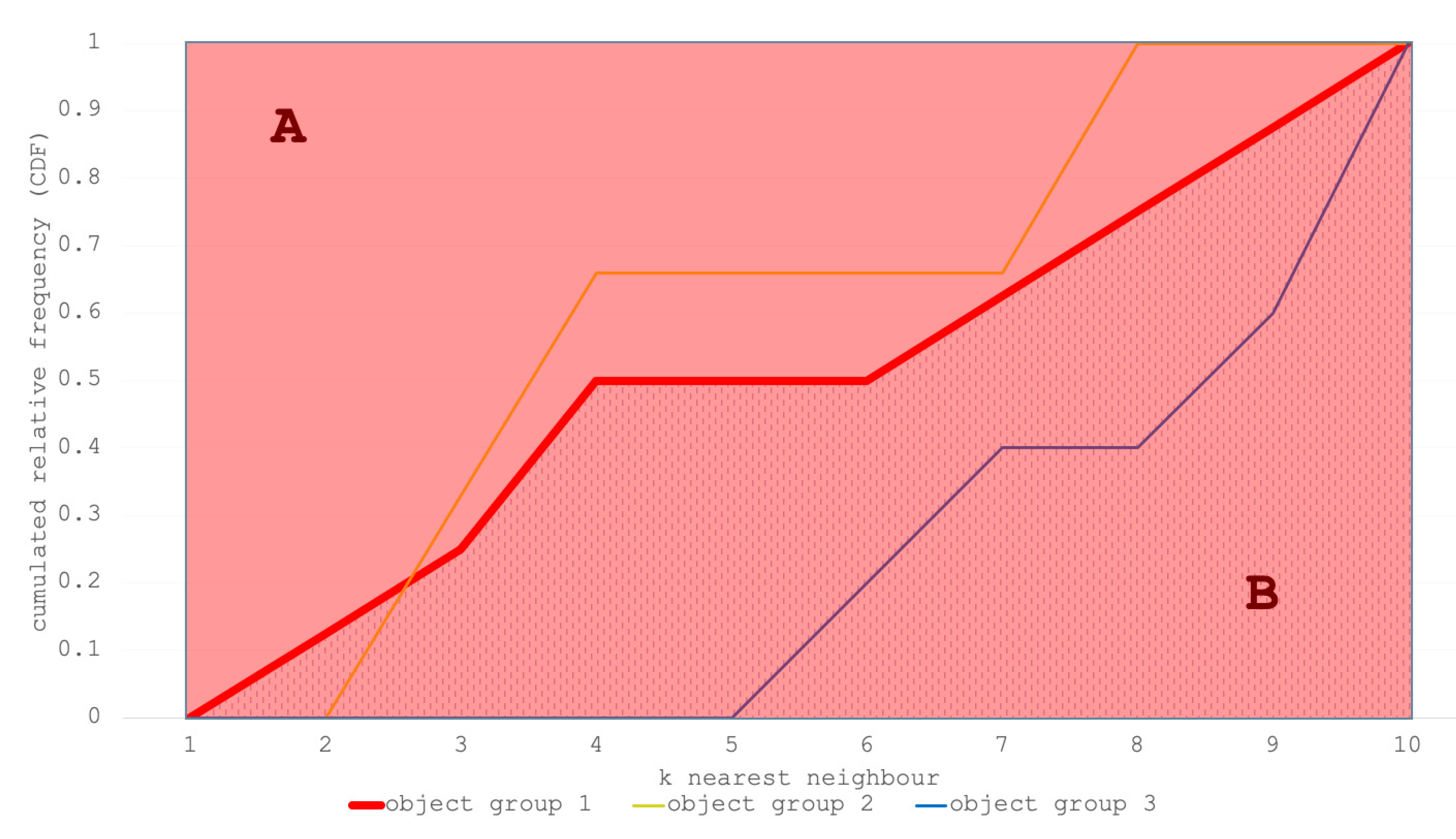
5.4.3. Spatial Dispersion Index for Multivariate Point Patterns
6. Discussion
7. Conclusions
Funding
Institutional Review Board Statement
Informed Consent Statement
Data Availability Statement
Acknowledgments
Conflicts of Interest
References
- United Nations. Sustainable Development Goals: Goal 11. 2020. Available online: https://www.un.org/sustainabledevelopment/cities/ (accessed on 1 December 2020).
- Cope, M.; Elwood, S. Qualitative GIS: A Mixed Methods Approach; Sage: London, UK, 2009. [Google Scholar]
- McCall, M.K.; Martinez, J.; Verplanke, J. Shifting boundaries of volunteered geographic information systems and modalities: Learning from PGIS. Int. J. Crit. Geogr. 2015, 14, 791–826. [Google Scholar]
- Goodchild, M.F. Citizens as voluntary sensors: Spatial data infrastructure in the world of Web 2.0. Int. J. Spat. Data Infrastruct. Res. 2007, 2, 24–32. [Google Scholar]
- Zook, M.; Graham, M.; Shelton, T.; Gorman, S. Volunteered Geographic Information and Crowdsourcing Disaster Relief: A Case Study of the Haitian Earthquake. SSRN Electron. J. 2010, 2, 7–33. [Google Scholar] [CrossRef]
- Brown, G.; Raymond, C.M. Methods for identifying land use conflict potential using participatory mapping. Landsc. Urban. Plan. 2014, 122, 196–208. [Google Scholar] [CrossRef]
- Tulloch, D.L. Is VGI participation? From vernal pools to video games. GeoJournal 2008, 72, 161–171. [Google Scholar] [CrossRef]
- Mueller, J.; Lu, H.; Chirkin, A.; Klein, B.; Schmitt, G. Citizen Design Science: A strategy for crowd-creative urban design. Cities 2018, 72, 181–188. [Google Scholar] [CrossRef]
- Goodchild, M.F. Citizens as sensors: The world of volunteered geography. GeoJournal 2007, 69, 211–221. [Google Scholar] [CrossRef] [Green Version]
- Arnstein, S.R. A Ladder of Citizen Participation. J. Am. Inst. Plan. 1969, 35, 216–224. [Google Scholar] [CrossRef] [Green Version]
- Tang, Z.; Liu, T. Evaluating Internet-based public participation GIS (PPGIS) and volunteered geographic information (VGI) in environmental planning and management. J. Environ. Plan. Manag. 2016, 59, 1073–1090. [Google Scholar] [CrossRef]
- Soudunsaari, L.; Nuojua, J.; Juustila, A.; Räisänen, T.; Kuutti, K. Exploring Web-Based Participation Methods for Urban Planning; University of Oulu: Oulu, Finland, 2008. [Google Scholar]
- Hanzl, M. Information technology as a tool for public participation in urban planning: A review of experiments and potentials. Des. Stud. 2007, 28, 289–307. [Google Scholar] [CrossRef]
- Krek, A. Games in urban planning: The power of a playful public participation. In Proceedings of the 13th International Conference on Urban Planning, Regional Development and Information Society, Dubai, UAE, 22–23 March 2008; pp. 669–683. [Google Scholar]
- Hudson-Smith, A.; Evans, S.; Batty, M.; Batty, S. Online Participation: The Woodberry Down Experiment; CASA Working Papers 60; CASA: London, UK, 2002. [Google Scholar]
- Bugs, G.; Granell, C.; Fonts, O.; Huerta, J.; Painho, M. An assessment of Public Participation GIS and Web 2.0 technologies in urban planning practice in Canela, Brazil. Cities 2010, 27, 172–181. [Google Scholar] [CrossRef]
- Verplanke, J.; McCall, M.K.; Uberhuaga, C.; Rambaldi, G.; Haklay, M. (Muki) A Shared Perspective for PGIS and VGI. Cartogr. J. 2016, 53, 308–317. [Google Scholar] [CrossRef] [Green Version]
- Kahila-Tani, M.; Kyttä, M.; Geertman, S. Does mapping improve public participation? Exploring the pros and cons of using public participation GIS in urban planning practices. Landsc. Urban Plan. 2019, 186, 45–55. [Google Scholar] [CrossRef]
- Kahila-Tani, M.; Broberg, A.; Kyttä, M.; Tyger, T. Let the citizens map—public participation GIS as a planning support system in the Helsinki master plan process. Plan. Pract. Res. 2016, 31, 195–214. [Google Scholar] [CrossRef]
- Jankowski, P.; Czepkiewicz, M.; Młodkowski, M.; Zwoliński, Z. Geo-questionnaire: A Method and Tool for Public Preference Elicitation in Land Use Planning. Trans. GIS 2016, 20, 903–924. [Google Scholar] [CrossRef]
- Dennis, S.F. Prospects for Qualitative GIS at the Intersection of Youth Development and Participatory Urban Planning. Environ. Plan Econ. Space 2006, 38, 2039–2054. [Google Scholar] [CrossRef]
- Levin, N.; Lechner, A.M.; Brown, G. An evaluation of crowdsourced information for assessing the visitation and perceived importance of protected areas. Appl. Geogr. 2017, 79, 115–126. [Google Scholar] [CrossRef] [Green Version]
- Sun, Y.; Fan, H.; Helbich, M.; Zipf, A. Analyzing Human Activities through Volunteered Geographic Information: Using Flickr to Analyze Spatial and Temporal Pattern of Tourist Accommodation. In Progress in Location-Based Services; Krisp, J., Ed.; Lecture Notes in Geoinformation and Cartography; Springer: Berlin/Heidelberg, Germany, 2013; pp. 57–69. [Google Scholar]
- Kulldorff, M. A spatial scan statistic. Commun. Stat. Theory Methods 1997, 26, 1481–1496. [Google Scholar] [CrossRef]
- Guerrero, P.; Møller, M.S.; Olafsson, A.S.; Snizek, B. Revealing cultural ecosystem services through Instagram images: The potential of social media volunteered geographic information for urban green infrastructure planning and governance. Urban Plan. 2016, 1, 1–17. [Google Scholar] [CrossRef]
- Mülligann, C.; Janowicz, K.; Ye, M.; Lee, W.-C. Analyzing the Spatial-Semantic Interaction of Points of Interest in Volunteered Geographic Information. In Proceedings of the Mining Data for Financial Applications; Springer: Berlin/Heidelberg, Germany, 2011; pp. 350–370. [Google Scholar]
- Acedo, A.; Painho, M.; Casteleyn, S.; Roche, S. Place and City: Toward Urban Intelligence. ISPRS Int. J. Geo-Inf. 2018, 7, 346. [Google Scholar] [CrossRef] [Green Version]
- Evans, A.J.; Waters, T. Mapping vernacular geography: Web-based GIS tools for capturing’fuzzy’or’vague’entities. Int. J. Technol. Policy Manag. 2007, 7, 134–150. [Google Scholar] [CrossRef]
- Carver, S.; Watson, A.; Waters, T.; Matt, R.; Gunderson, K.; Davis, B. Developing Computer-Based Participatory Approaches to Mapping Landscape Values for Landscape and Resource Management. In The GeoJournal Library; Springer: Dordrecht, The Netherlands, 2009; pp. 431–448. [Google Scholar]
- Kitchin, R.M.; Fotheringham, A.S. Aggregation Issues in Cognitive Mapping. Prof. Geogr. 1997, 49, 269–280. [Google Scholar] [CrossRef] [Green Version]
- Su, S.; Lei, C.; Li, A.; Pi, J.; Cai, Z. Coverage inequality and quality of volunteered geographic features in Chinese cities: Analyzing the associated local characteristics using geographically weighted regression. Appl. Geogr. 2017, 78, 78–93. [Google Scholar] [CrossRef]
- Resch, B.; Summa, A.; Sagl, G.; Zeile, P.; Exner, J.P. Urban emotions—Geo-semantic emotion extraction from technical sensors, human sensors and crowdsourced data. In Progress in Location-Based Services 2014; Gartner, G., Huang, H., Eds.; Springer International Publishing: New York, NY, USA, 2015; pp. 199–212. ISBN 978-3-319-11878-9. [Google Scholar]
- ESRI. What’s New in ArcGIS Urban. 2020. Available online: https://www.esri.com/arcgis-blog/products/urban/announcements/whats-new-in-urban-june-2020/ (accessed on 21 June 2020).
- Maptionnaire. Maptionnaire Community Engagement Platform. 2020. Available online: https://maptionnaire.com/product (accessed on 26 October 2020).
- Urban Redevelopment Authority Singapore. Master Plan—Planning for Singapore’s Future. 2019. Available online: https://www.ura.gov.sg/Corporate/Planning/Master-Plan/Introduction (accessed on 16 January 2021).
- Chirkin, A.M.; König, R. Concept of Interactive Machine Learning in Urban Design Problems. In Proceedings of the SEACHI 2016 on Smart Cities for Better Living with HCI and UX, San Jose, CA, USA, 7–12 May 2016; ACM: New York, NY, USA, 2016; pp. 10–13. [Google Scholar]
- Mueller, J.; Asada, S.; Tomarchio, L. Engaging the Crowd: Lessons for Outreach and Tool Design from a Creative Online Participatory Study. Int. J. E-Plan. Res. 2020, 9, 1–14. [Google Scholar] [CrossRef] [Green Version]
- Low, S.P. Dealing with Density. 2019. Available online: https://issuu.com/designandarchitecture/docs/04_05_d_a_109_issuu (accessed on 16 January 2021).
- Tomarchio, L.; Hasler, S.; Herthogs, P.; Mueller, J.; Tunçer, B.; He, P. Using an Online Participation Tool to Collect Relevant Data for Urban Design’. In Proceedings of the CAADRIA 2019 Intelligent Informed, Wellington, New Zealand, 15–18 April 2019; Volume 2, pp. 747–756. [Google Scholar]
- von Richthofen, A.; Knecht, K.; Miao, Y.; König, R. The ‘Urban Elements’ method for teaching parametric urban design to professionals. Front. Archit. Res. 2018, 7, 573–587. [Google Scholar] [CrossRef]
- Miao, Y.; Koenig, R.; Knecht, K.; Konieva, K.; Buš, P.; Chang, M.-C. Computational urban design prototyping: Interactive planning synthesis methods—A case study in Cape Town. Int. J. Arch. Comput. 2018, 16, 212–226. [Google Scholar] [CrossRef]
- Treyer, L.; Klein, B.; König, R.; Meixner, C.; Koenig, R. Lightweight urban computation interchange (LUCI): A system to couple heterogeneous simulations and views. Spat. Inf. Res. 2016, 24, 291–302. [Google Scholar] [CrossRef] [Green Version]
- Chirkin, A. Evaluating Symmetry and Order in Urban. Design: A Computational Approach to Predicting Perception of Order Based on Analysis of Design Geometry; ETH Zurich: Zurich, Switzerland, 2019. [Google Scholar]
- Kim, H.-C.; Lee, J. Clustering Based on Gaussian Processes. Neural Comput. 2007, 19, 3088–3107. [Google Scholar] [CrossRef]
- Grubesic, T.H.; Wei, R.; Murray, A.T. Spatial Clustering Overview and Comparison: Accuracy, Sensitivity, and Computational Expense. Ann. Assoc. Am. Geogr. 2014, 104, 1134–1156. [Google Scholar] [CrossRef]
- Wiegand, T.; Moloney, K.A. Handbook of Spatial Point-Pattern Analysis in Ecology; CRC Press: Ames, IA, USA, 2013. [Google Scholar]
- Illian, J.; Penttinen, A.; Stoyan, H.; Stoyan, D. Statistical Analysis and Modelling of Spatial Point Patterns; Wiley: Chichester, UK, 2008; Volume 70. [Google Scholar]
- Simpson, E. Measurement of Diversity. Nature 1949, 163, 688. [Google Scholar] [CrossRef]
- Shannon, C.E. A mathematical theory of communication. Bell Syst. Tech. J. 1948, 27, 379–423. [Google Scholar] [CrossRef] [Green Version]
- Ripley, B.D. The second-order analysis of stationary point processes. J. Appl. Probab. 1976, 13, 255–266. [Google Scholar] [CrossRef] [Green Version]
- Inaba, M.; Katoh, N.; Imai, H. Applications of weighted Voronoi diagrams and randomization to variance-based k-clustering. In Proceedings of the Tenth Annual Symposium on Computational Geometry—SCG ’94, New York, NY, USA, 6–8 June 1994; pp. 332–339. [Google Scholar]
- Thompson, H.R. Distribution of Distance to Nth Neighbour in a Population of Randomly Distributed Individuals. Ecology 1956, 37, 391–394. [Google Scholar] [CrossRef]
- Pielou, E.C. Segregation and Symmetry in Two-Species Populations as Studied by Nearest- Neighbour Relationships. J. Ecol. 1961, 49, 255. [Google Scholar] [CrossRef]
- Judge, S.; Harrie, L. Visualizing a Possible Future: Map Guidelines for a 3D Detailed Development Plan. J. Geovis. Spat. Anal. 2020, 4, 7. [Google Scholar] [CrossRef]
- Flacke, J.; Shrestha, R.; Aguilar, R. Strengthening Participation Using Interactive Planning Support Systems: A Systematic Review. ISPRS Int. J. Geo-Inform. 2020, 9, 49. [Google Scholar] [CrossRef] [Green Version]
- Münster, S.; Georgi, C.; Heijne, K.; Klamert, K.; Noennig, J.R.; Pump, M.; Stelzle, B.; Van Der Meer, H. How to involve inhabitants in urban design planning by using digital tools? An overview on a state of the art, key challenges and promising approaches. Procedia Comput. Sci. 2017, 112, 2391–2405. [Google Scholar] [CrossRef]
- Konieva, K.; Knecht, K.; Koenig, R. Collaborative Large-Scale Urban Design with the Focus on the Agent-Based Traffic Simulation. In Proceedings of the 24th CAADRIA Conference, Wellington, New Zealand, 15–18 April 2019; Volume 2. [Google Scholar]


| HDB | Condo | Low-Rise | Mid-Rise | High-Rise | Mixed-Use | Sky-Parks | Greenery | Buildings | ALL | |
|---|---|---|---|---|---|---|---|---|---|---|
| HDB | 0.708 | 0.580 | 0.551 | 0.683 | 0.662 | 0.651 | 0.698 | 0.437 | 0.624 | 0.509 |
| Condo | 0.583 | 0.502 | 0.542 | 0.616 | 0.540 | 0.537 | 0.504 | 0.480 | 0.556 | 0.509 |
| Low-rise | 0.600 | 0.575 | 0.520 | 0.618 | 0.582 | 0.554 | 0.599 | 0.472 | 0.568 | 0.509 |
| Mid-rise | 0.620 | 0.548 | 0.538 | 0.578 | 0.605 | 0.558 | 0.600 | 0.467 | 0.575 | 0.509 |
| High-rise | 0.689 | 0.567 | 0.553 | 0.689 | 0.639 | 0.640 | 0.665 | 0.442 | 0.616 | 0.509 |
| Mixed-use | 0.679 | 0.572 | 0.536 | 0.645 | 0.648 | 0.656 | 0.686 | 0.447 | 0.607 | 0.509 |
| Sky parks | 0.754 | 0.561 | 0.576 | 0.714 | 0.695 | 0.706 | 0.715 | 0.418 | 0.653 | 0.509 |
| Greenery | 0.511 | 0.524 | 0.521 | 0.568 | 0.494 | 0.477 | 0.474 | 0.503 | 0.517 | 0.509 |
| Buildings | 0.643 | 0.567 | 0.539 | 0.646 | 0.611 | 0.594 | 0.627 | 0.457 | 0.591 | 0.509 |
| ALL | 0.562 | 0.541 | 0.528 | 0.598 | 0.539 | 0.522 | 0.533 | 0.485 | 0.546 | 0.509 |
| Analysis 1: Design features | 1.1. Frequency of placed objects |
| Python package: collections Computation time: Low Composite analysis possible: Yes Usefulness for non-expert and expert: Revealing the percentage of objects and object categories which can, in some cases, be interpreted as an object’s popularity. | |
| 1.2. Design parameters | |
| Python package: geopandas, fiona, shapely Computation time: Low Composite analysis possible: Yes Usefulness for non-expert: Design parameters need to be presented with a short explanation which indirectly supports education of the study participants; comparison of the parameters to existing districts helps to locate own design proposal (e.g., in terms of density). Usefulness for expert: Extracting design indicators from non-experts’ proposals. | |
| Analysis 2: Heatmaps | 2.1. Qualitative data: Heatmaps and Kernel density estimation |
| Python package: geopandas, fiona, shapely Computation time: Low Composite analysis possible: Yes Usefulness for non-expert/expert: Quick visual assessment of spatial distribution of objects and object groups. | |
| 2.2. Quantitative data: Kernel density estimation (KDE) | |
| Python package: Seaborn.kdeplot Computation time: Low Composite analysis possible: Yes Usefulness for non-expert/expert: Quick visual assessment of spatial distribution of quantitative data (e.g., number of units). | |
| Analysis 3: Clustering | 3.1. Non-hierarchical clustering |
| Python package: Sklearn.cluster, pysal Computation time: Low Composite analysis possible: Yes, but not advisable Usefulness for non-expert: No, heatmaps are the more intuitive alternative. Usefulness for expert: Clustering reveals more insightful patterns than heatmaps or KDE. | |
| 3.2. Gaussian process clustering | |
| Python package: Sklearn.gaussian_process Computation time: High Composite analysis possible: Yes Usefulness for non-expert: No, because the method requires some explanations; though the output can be visualized, it is not applicable for a quick assessment due to the high computation time. Usefulness for expert: Planners need to be familiar with the interpretation of the visual output, which is similar to heatmaps. | |
| 3.3. Spatial autocorrelation statistics | |
| Python package: pysal Computation time: Low Composite analysis possible: Yes Usefulness for non-expert: No, as the method only works for count data, and object counts are commonly too small for individual submissions. Usefulness for expert: The method works best when being applied as a composite analysis; it reveals an overall preference for locations of objects and object groups. | |
| Analysis 4: Point Pattern Analysis | 4.1. Diversity indices |
| Python package: pointpats Computation time: Low Composite analysis possible: Yes, but not advisable Usefulness for non-expert/expert: The common diversity indices need explanation; they indicate the diversity of the appearance of objects but do not exploit information of their spatial distribution. | |
| 4.2. Common second-order statistics | |
| Python package: pointpats Computation time: Medium Composite analysis possible: No Usefulness for non-expert: No, as the method would require too much explanation. Usefulness for expert: The method quantifies the spatial relation of objects and object groups towards each other. | |
| 4.3. Spatial dispersion index for multivariate point patterns | |
| Python package: pointpats Computation time: Low Composite analysis possible: Yes, but only for the indices, not for the graphs. Usefulness for non-expert/expert: The method requires a short introduction to the interpretation of the indices; the knowledge revealed is similar to that from the common second-order statistics. |
Publisher’s Note: MDPI stays neutral with regard to jurisdictional claims in published maps and institutional affiliations. |
© 2021 by the author. Licensee MDPI, Basel, Switzerland. This article is an open access article distributed under the terms and conditions of the Creative Commons Attribution (CC BY) license (http://creativecommons.org/licenses/by/4.0/).
Share and Cite
Müller, J. Evaluation Methods for Citizen Design Science Studies: How Do Planners and Citizens Obtain Relevant Information from Map-Based E-Participation Tools? ISPRS Int. J. Geo-Inf. 2021, 10, 48. https://0-doi-org.brum.beds.ac.uk/10.3390/ijgi10020048
Müller J. Evaluation Methods for Citizen Design Science Studies: How Do Planners and Citizens Obtain Relevant Information from Map-Based E-Participation Tools? ISPRS International Journal of Geo-Information. 2021; 10(2):48. https://0-doi-org.brum.beds.ac.uk/10.3390/ijgi10020048
Chicago/Turabian StyleMüller, Johannes. 2021. "Evaluation Methods for Citizen Design Science Studies: How Do Planners and Citizens Obtain Relevant Information from Map-Based E-Participation Tools?" ISPRS International Journal of Geo-Information 10, no. 2: 48. https://0-doi-org.brum.beds.ac.uk/10.3390/ijgi10020048