Article

An Open Source GIS Application for Spatial Assessment of Health Care Quality Indicators

1
Institute of Earth Sciences, Faculty of Sciences, University of Porto, Rua do Campo Alegre, 4169-007 Porto, Portugal
2
Department of Geosciences, Environment and Spatial Planning, Faculty of Sciences, University of Porto, Rua do Campo Alegre, 4169-007 Porto, Portugal
3
Department of Community Medicine, Information and Health Decision Sciences (MEDCIDS), Faculty of Medicine, University of Porto, 4200-450 Porto, Portugal
4
Center for Health Technology and Services Research (CINTESIS), Faculty of Medicine, University of Porto, 4200-450 Porto, Portugal
5
Public Health Unit, Local Health Unit of Baixo Alentejo, 7801-849 Beja, Portugal
*
Author to whom correspondence should be addressed.
ISPRS Int. J. Geo-Inf. 2021, 10(4), 264; https://0-doi-org.brum.beds.ac.uk/10.3390/ijgi10040264
Submission received: 19 February 2021 / Revised: 3 April 2021 / Accepted: 12 April 2021 / Published: 14 April 2021

Abstract

:
Prevention quality indicators (PQIs) constitute a set of measures that can be combined with hospital inpatient data to identify the quality of care for ambulatory care sensitive conditions (ACSC). Geographical information system (GIS) web mapping and applications contribute to a better representation of PQI spatial distribution. Unlike many countries in the world, in Portugal, this type of application remains underdeveloped. The main objective of this work was to facilitate the assessment of geographical patterns and trends of health data in Portugal. Therefore, two innovative open source applications were developed. Leaflet Javascript Library, PostGIS, and GeoServer were used to create a web map application prototype. Python language was used to develop the GIS application. The geospatial assessment of geographical patterns of health data in Portugal can be obtained through a GIS application and a web map application. Both tools proposed allowed for an easy and intuitive assessment of geographical patterns and time trends of PQI values in Portugal, alongside other relevant health data, i.e., the location of health care facilities, which, in turn, showed some association between the location of facilities and quality of health care. However, in the future, more research is still required to map other relevant data, for more in-depth analyses.

1. Background

Nowadays, Geographical information systems (GIS) have become a crucial tool in all contexts that deal with geographic data, in the public or private sector, and it can be applied in several areas, especially in health management, environment, natural resources exploration, urban planning, etc. [1]. The Free and open source software (FOSS) continues to be an important frontier of information systems, having an impact on society, business, education, and research [2]. FOSS has been used all over the world, increasing day by day. In the GIS domain, the widespread use of FOSS applied to several areas is apparent, including health [3]. The FOSS term represents the free and open source software, meaning that users have the four essential freedoms, namely, (i) to run the program, (ii) to study and change the program in source code form, (iii) to redistribute exact copies, and (iv) to distribute modified versions [4]. FOSS software is accomplished with the GNU General Public License (GNU GPL or simply GPL) operating system so that users can have freedom in their computing. Additionally, FOSS philosophy believes that the program’s users should be free to take advantage of them, not solely its developer [4]. FOSS software has been used and developed in several areas, including health studies. For instance, Jayawardhana and Gorsevski [5] implemented Fluwitter, a spatiotemporal web-based prototype framework for pseudo-real-time detection of influenza outbreaks using Twitter and integrating the PostgreSQL database server with PostGIS spatial extension.
Prevention quality indicators (PQIs) constitute a set of measures developed by the Agency for Healthcare Research and Quality (AHRQ) to assess the quality of care for common ambulatory care sensitive conditions (ACSC), generally represented by the number of hospitalizations per 100,000 inhabitants. ACSC is composed of conditions for which good outpatient care can prevent the need for hospitalization or early intervention to prevent complications or more severe diseases [6].
PQIs are commonly used in studies that assess the quality of outpatient health care and as a proxy for primary health care (PHC) quality [7,8,9].
The study of geographical variation in disease risk or incidence can be defined as spatial epidemiology [10]. The growth of digital technologies and increased access to geospatial information all over the world contribute to the development of collaborative environments such as WebGIS [11]. Maps became available on the web, changing the way they were perceived and used. The first web mapping applications were composed of simple tools that allowed browsing, zooming, panning, and turning on/off layers. Nowadays, web mapping applications are integrated with a great range of functionalities combined with desktop GIS [11].
In the study of the most recent pandemic, COVID-19, the study of spatiotemporal dynamics is essential and involves health and social geography, environmental variables, data mining, and web-based mapping [12].
GIS offer tools capable of spatially locating health needs, associate them with services and programs, and even identify new geographic gaps [13]. It can also have the potential to assess patterns of health care and consequently identify regions that need better access to primary care [14]. In this context, open source software has a high potential to improve GIS research, and web mapping is a very promising tool in human geography and social sciences [1]. GIS also allows for the identification of health trends, because it can contain information on health and disease for specific regions and environmental and population data, connections between a population’s living area and their state of health can be made in a more integrated manner when compared to the use of traditional paper-based maps [15]. As a result, GIS technology in health studies can improve the quality of epidemiological research and its impact on health care delivery and accessibility since conclusions can be made about a region’s care, services, inequalities, and overall health. GIS combined with remote sensing data has also been used in health studies [16]. Therefore, GIS can be extremely helpful to policymakers and health care providers.
In recent years, the number of web mapping users has been increasing due to easy access, diversity, and more integrated and intelligent geospatial applications in a web GIS environment, providing an online collaborative environment to support users and applications [11]. There are GIS public health web mapping applications all over the world. For instance, in the United States of America (USA), there are 24 web mapping applications such as the Chronic Disease GIS Exchange (CDC), the Diabetes County Data and Maps (DCDC), the EnviroAtlas (US EPA), etc. [17]. Another example is the National Center for Chronic Disease Prevention and Health Promotion, where there is an interactive map. In this map, the user can choose the indicator, select the year, the view (by gender, overall, or race), and the data type [18]. However, the database used is specifically adapted to the USA.
In Portugal, applications based on geographical patterns of health data remain underdeveloped. There is GEOSAUDE [19], a web GIS that offers interactive maps of several health-related indicators and options to filter the information by local and regional administrative units; PORDATA [20], which presents statistical (health and nonhealth related) data in the form of numerical statistics, graphs, and indicators; Statistics Portugal (INE) [21], which is the national statistical office that collects comprehensive (health and nonhealth) data and also presents health data in the form of numerical statistics, graphs, and indicators; BI-CSP (Bilhete de Identidade dos Cuidados de Saúde Primários—Identity Card of Primary Health Care) [22], which is a tool to monitor the primary health care public system, providing tables and graphs of a comprehensive list of indicators; the benchmarking hospitals [23], which is a tool to monitor and benchmark the quality of public hospitals and provides tables and graphs of a list of indicators; and Transparency [24], a website aimed at sharing health information with the citizen that disseminates data on access, quality, and efficiency of the Portuguese National Health Service (NHS). In the five examples above, GEOSAUDE is the only application that provides spatial visualization of health indicators, with interactive maps, allowing to choose one indicator from four groups, namely, (i) National Health Plan 2012–2016, (ii) National Health Plan 2004–2010, (iii) characterization of indicators of Agrupamento de Centros de Saúde–Health Center Group (ACES), and (iv) priority health programs. Several indicators can be accessed from these four groups; even though the spatial representation of PQI values is possible in GEOSAUDE, it is not completely ready for use. In the other applications, spatial information is limited to the distribution of indicators’ values, and it is not possible to cross-map other information such as the location of hospitals or primary care units, and the distribution of environmental variables and other health risk factors (including socioeconomic factors). Based on the underdevelopment of GEOSAUDE’s functionalities, a tool that allows for assessing the geographical distribution of health indicators and its relationship with environmental data is of crucial importance in Portugal.
The case of Portugal is of particular interest when it comes to health inequalities when compared to other European Union countries since Portugal has considerably high inequalities and risk of poverty [25], with recent evidence showing a substantial impact of socioeconomic factors on health [26,27]. Therefore, mapping solutions allowing for a comprehensive and simple assessment of all these data are essential tools for decision makers in public health and for health system planning.
For those reasons, we focus our study on the need for (and easy access to) spatial representations of healthcare information and indicators, namely, PQI values, in addition to other relevant sociodemographic information. Simultaneously, this work intends to promote open source through a web-based mapping, contributing to the improvement of the Portuguese health care system’s information quality and, consequently, the decision-making process in the public health domain, leading to more informed and data-based decisions/policies and tailored interventions. The main objective of this work was to perform the geospatial assessment of geographical patterns of health data in Portugal (PQI values, among others), their trend analysis, and their spatial representation in maps. To achieve that, two innovative open source applications were developed—(i) a GIS open source application, developed under QGIS, a GIS open source software, and (ii) a GIS web map prototype, developed using Leaflet library and Geoserver, for health facilities mapping along with the spatial distribution of PQI values.

2. Materials and Methods

2.1. Database

A database was built containing the PQI values computed from a numerator estimated from hospital administrative data, and a denominator mostly defined from the population projections estimates between 2014 and 2017 [21], according to the AHRQ specifications and stratified by year and geographical region [28,29] using the R software.
The AHRQ specifications implemented include 17 indicators. The database attribute PQI was defined to identify each of these PQIs (Table 1).
The hospital administrative data were obtained from the Administração Central da Saúde, IP (Health Central Administration (ACSS)) and comprised information on hospitalizations occurring in mainland Portugal public hospitals, including demographic and clinical information, i.e., age, gender, residence, diagnoses, procedures, and the patient disposition after discharge, etc. [30,31]. Diagnoses and procedures in the ACSS’s data are coded using the International Classification of Diseases, Ninth Revision, Clinical Modification (ICD-9-CM), which has been replaced by the International Classification of Diseases, 10th Revision, Clinical Modification/Procedure Coding System (ICD-10-CM/PCS). The ICD-9-CM is based on the World Health Organization’s Ninth Revision, International Classification of Diseases (ICD-9), which has been developed to assign codes to diagnoses and procedures associated with hospital utilization in the United States. In Portugal, the transition between ICD-9-CM and ICD-10-CM/PCS occurred during 2016 and 2017, initially only by a few pilot hospitals and, as of 2017, all public hospitals were instructed to code according to the ICD-10-CM/PCS, even if hospitals episodes reported to 2016. Therefore, 2016 is a transitional year in which the two clinical classification systems can coexist. Our database includes a dichotomous attribute, named Codificação (codification), to indicate which coding system the PQI partial value refers to. For example, in 2016, there were a total of 21,662 PQI93-related hospitalizations (20,896 coded in ICD-9-CM and 766 in ICD-10-CM) from patients residing in the Lisbon district.
Other types of data, for instance, socioeconomic data obtained from Statistics Portugal (INE) or PORDATA will be considered in the future. As mentioned, PORDATA [20] presents statistical (health and nonhealth related) data in the form of numerical statistics, graphs, and indicators. These data will be considered to incorporate in the web map application. Statistics Portugal (INE) [21] is the national statistical office that collects comprehensive (health and nonhealth) data, presents health data in the form of numerical statistics, graphs, and indicators. PORDATA [20] presents statistical (health and nonhealth related) data in the form of numerical statistics, graphs, and indicators. These data will be considered to incorporate in the web map application. Additionally, the PQI values will be updated according to new definitions. For instance, Sarmento et al. [32] developed a list of ACSC for Portugal. Other studies can be considered, such as, for instance, Ramalho et al. [33] that analyzed the results of the DMage-sex-adjusted PQI, by groups of health centers (ACES), distributed in the Portuguese territory and the evaluation of the PQI for diabetes mellitus (DM) in Portugal using contemporary data and explores their variability according to PHC quality indicators. The advantage of a web application is that it is open source, and therefore, it can be updated.
Four spatial levels of analysis are presented in the database—an older administrative division of the territory called a district (dividing the mainland territory into 18 regions) and the nomenclature of territorial units for statistics (NUTS I, NUTS II, and NUTS III) [34]. To develop this tool, attributes for gender and age were defined in the database. Even though the PQI has not been computed by gender or age subgroups, this provides a more flexible database that can accommodate filters by gender and age in the future. The chronological segmentation (e.g., yearly, monthly) and the computation of the PQI values are also attributes of the database. Thus, there is one row per PQI, chronological segmentation unit (e.g., year), coding system, gender group, age stratum, and geographic region within a specific geographic segmentation.
PostGIS (version 3.0.0) was used to store and query variables in the GIS application [35]. PostGIS is an open source extension to the PostgreSQL database (version 12) that provides spatial objects, allowing location queries and mapping using Structured Query Language (SQL) [35]. The database was manually added to the PostGIS and the SQL queries were implemented under the GIS application, as explained in the following sections.

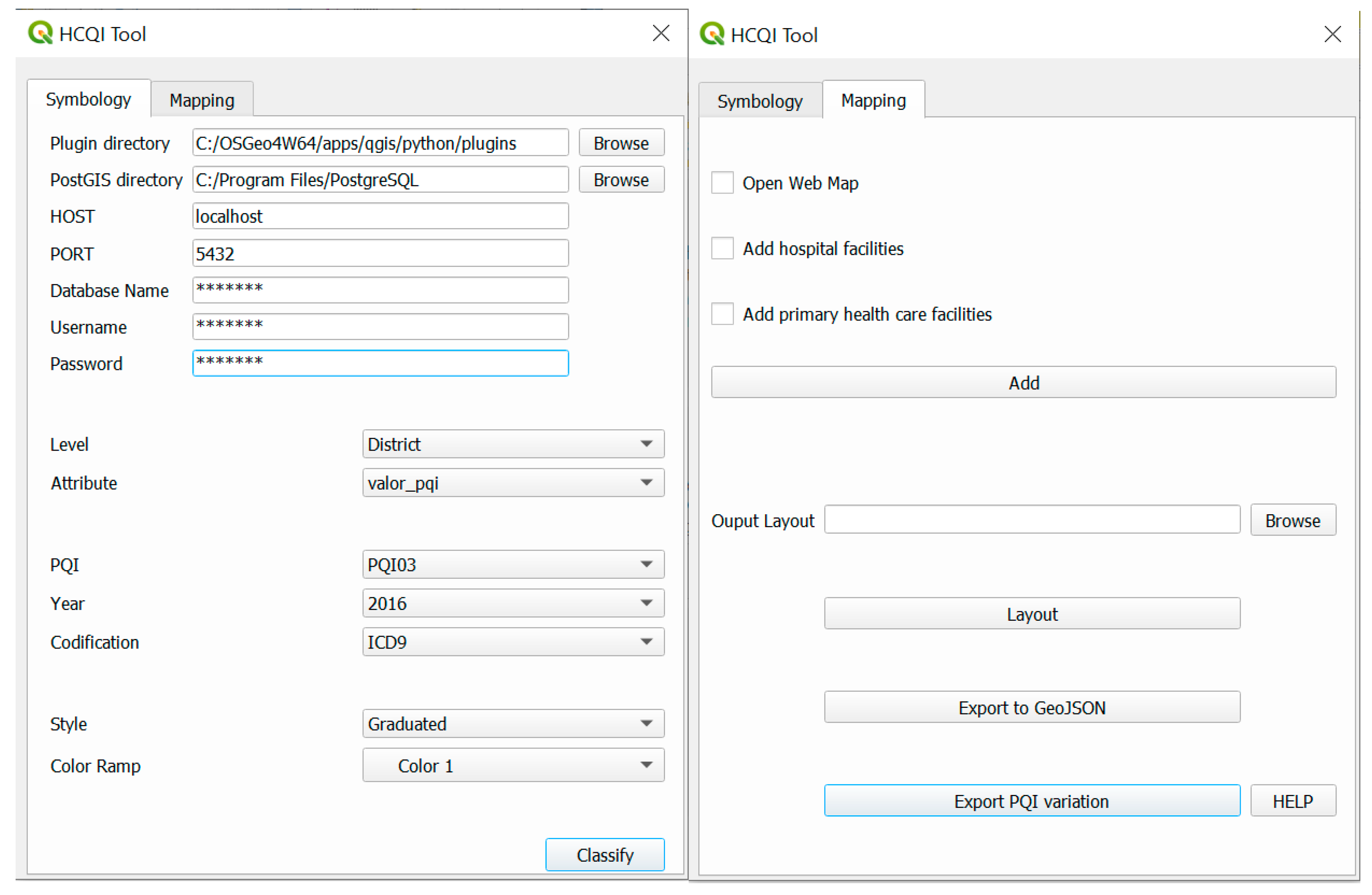
2.2. Health Care Quality Indicators (HCQIs) GIS Application

The first version of a GIS open source application was developed under QGIS version 3.10 software [36,37]. In this work, the GIS application was substantially improved, and a new version was created. To develop the application, several libraries and Application Programming Languages (APIs) such as QGIS API, Qt API [38], and PyQGIS API [39], were used. Figure 1 presents the class diagram implemented in this application.
The main graphic user interface (GUI) is composed of two tabs—Symbology and Mapping (Figure 2). The first tab allows the user to define the parameters to create the PQI distribution on each district, NUTS I, II, or III, while the second one allows accessing additional information to overlap with the PQI values, such as base aerial maps and hospital and PHC facilities’ locations. The GIS application allows the connection to a PostGIS database that contains the information about the PQI values.
To connect to the PostGIS database, the user must insert the PostGIS software directory, the hostname, the port number, and the database name (Figure 2). The data are then used in symbology_categorized (self, layer) and symbology_graduated (self, layer) functions. Both functions allow the application of symbology to the layers according to parameters defined by the user in the GUI (Figure 2), which links to the data in PostGIS through the code lines presented in Supplementary Materials.
The result of the selection of PQI code, year, and codification is presented in World Geodetic System 1984 (WGS84) coordinate system (EPSG:4326). However, the application projects automatically the output to European Terrestrial Reference System 1989 Portugal Transverse Mercator 2006 (ETRS89-PTTM06) coordinate system. This coordinate system was adopted because it was legally adopted in Portugal [34].
In the Mapping tab, besides the options to open an aerial map (through OpenLayers plugin from QGIS) and to add hospital and PHC facilities markers to the map, two more GUI were created to export a shapefile to Geographic JavaScript Object Notation (GeoJSON) format and create a bar plot with the information about PQI along the years.
In the Export PQI Variation functionality, the user must choose the district (or NUTS) and the PQI code (PQI Code) for which pretends to analyze the PQI values. The application uses matplotlib [40] functions to create a graph/plot with the years in the x-axis and the PQI values in the y-axis. In the case of PQI values reporting to 2016 or later, due to the different coding systems in place (ICD-9-CM and ICD-10-CM/PCS), the PQI value is the sum of the partial values related to each coding system. Years are sorted using Python functions and the filters applied are based on SQL conditions. In the Generate Plot button, the graph is created. This result can be exported/saved in image format (.tif, .png, .jpg, etc.).
The Export GeoJSON button allows exporting the shapefile in the GeoJSON format. GeoJSON format is one of the indispensable elements of the Leaflet library and it is widely used especially in web mapping [41]. GeoJSON is the geographical variant of JavaScript Object Notation (JSON), a common and much-easier-to-use standard used for exchanging data between web and mobile clients and back-end services [42]. GeoJSON, as a special case of JSON, is easily parsed and processed with JavaScript and it has the advantage of being the only supported format by JavaScript web-mapping libraries and platforms, such as Leaflet. Additionally, it is simple and human readable. For these reasons, the GeoJSON format was implemented as output format in the GIS application. This procedure was created using the ogr2ogr command from GDAL/OGR [36].

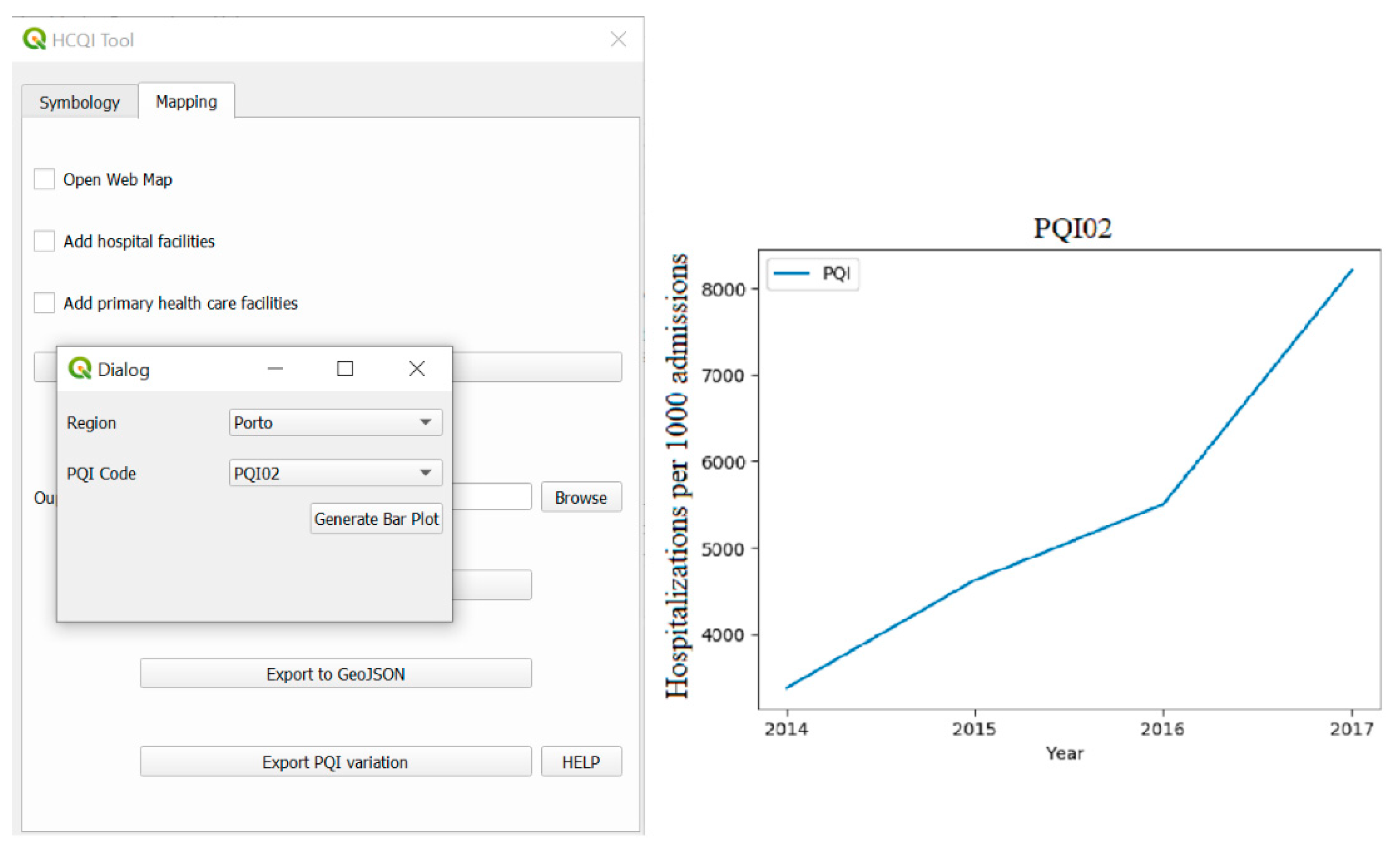
2.3. Web Map Development

Some studies also used open source tools to create web GIS applications [41].
Web programming applications have been used in several contexts. Leaflet, JavaScript, HyperText Markup Language (HTML) and Cascading Style Sheet (CSS) have been integrated with GIS to build web technologies [43,44,45,46].
JavaScript and HTML language were used in the creation of the web map prototype. JavaScript is a structured interpreted programming language, high-level script with light typing and multiparadigm (prototypes, object oriented, imperative, and functional) [47]. It can be combined with HTML and CSS, and it allows the creation of interactive web pages and therefore is an essential part of web applications.
The Leaflet is one of the most used web mapping libraries [48]. The Leaflet is an open source JavaScript library for mobile-friendly interactive maps. It is simple and very used due to the efficiency of desktop and mobile platforms. It is composed of an easy-to-use and well-documented API and tutorials that help to develop the web map [49]. The Leaflet was used in this work to develop the web map.
The layers in shapefile format were added to the web map application as GeoJSON format, a JavaScript object that contains geographic data.
GeoServer is a free and open source server for sharing geospatial data [50]. GeoServer supports several formats such as standard Open Geospatial Consortium (OGC) protocols such as Web Feature Service (WFS), Web Map Service (WMS), and Web Coverage Service (WCS), shapefile, GeoTIFF, Comma-Separated Values (CSV), and Keyhole Markup Language (KML). It supports also databases such as PostGIS, Oracle, and Microsoft SQL Server.
GeoServer 2.16.2 was used to connect to Leaflet and PostGIS so that the web map application can handle the data.
In the GeoServer configuration, the database used in the GIS application (and presented in the PostGIS) was connected to GeoServer. The layers already stored in this database can now be accessed through GeoServer.
The web map application prototype was created based on Javascript and HTML language, using Leaflet library, connected to a GeoServer where the data were stored in PostGIS. This means that the database presented in the PostGIS was created and published in the GeoServer. Therefore, to create the web map application, the relation PostGIS—GeoServer—Leaflet was used. The web map application prototype was created based on open source tools (Leaflet, GeoServer, and PostGIS).
In the web map creation, two base maps were added, based on OpenStreetMap (OSM)—OSM Streets and OSM Satellite [51]. In addition to the base maps, more layers were also added from the connection to GeoServer: hospital and the existent PHC facilities in Portugal (this information was added as point file), and PQI information as a polygon file for each district.
Some basic functionalities were also added, such as (i) a control layer that groups all the layers, allowing users to control which layers they want to see on the map; (ii) a numerical scale, i.e., a scale control presenting the scale of the current center of the screen in metric (m/km) and imperial (mi/ft) systems, integrated also as control; (iii) a polyline measure, which is based on a Leaflet plugin to measure distances of simple lines as well as complex polylines; (iv) a standard zoom in and zoom out controls; (v) a popup when clicking in a polygon with the information about the PQI value in each district; (vi) popups in each point with some information regarding hospitals and PHC facilities; and (vii) the possibility to change the visualization between the different layers, containing the legend referring to PQI values by district (hospitalizations per 100,000 inhabitants). Additionally, some actions in the mouse button were implemented, such as the click action under a point, a popup is showed with the information regarding the name of Unidade Funcional (UF); Functional Unit) name, in the case of primary health facilities and the name of Centro Hospitalar (Hospital Center), and the type of emergency care services available.

2.4. Ethical Statement/Considerations

Data regarding hospital and PHC localization are publicly available. The PQIs are aggregated health data, which pose a minimal risk of patient privacy breach. Any PQIs generated from a numerator smaller than 10 hospitalizations will not be presented to further safeguard patients’ privacy. Hospitalization data used for PQI estimation are anonymized at the patient level, not requiring a complete review by the ethics committee. Confirmation that the data are anonymous is given by the Portuguese Central Authority for Health Services at the time of their assignment.

3. Results

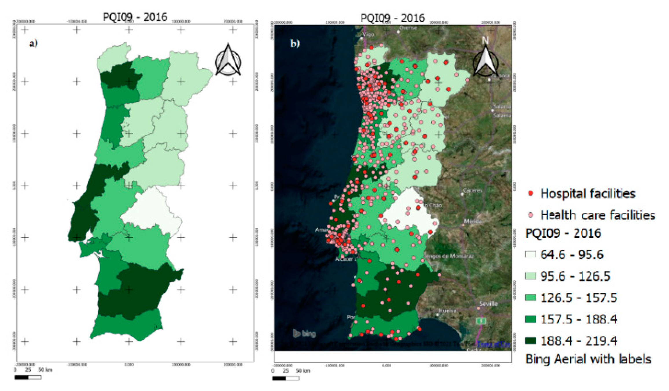
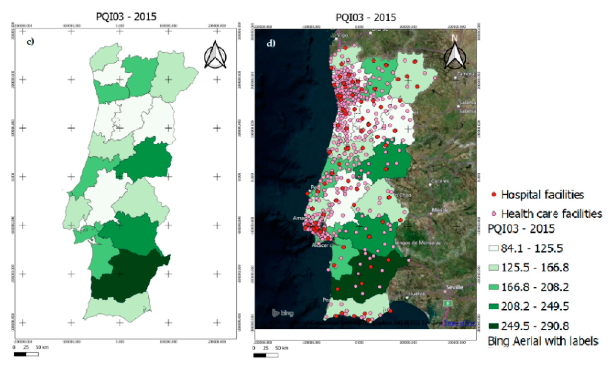
3.1. GIS Open Source Application
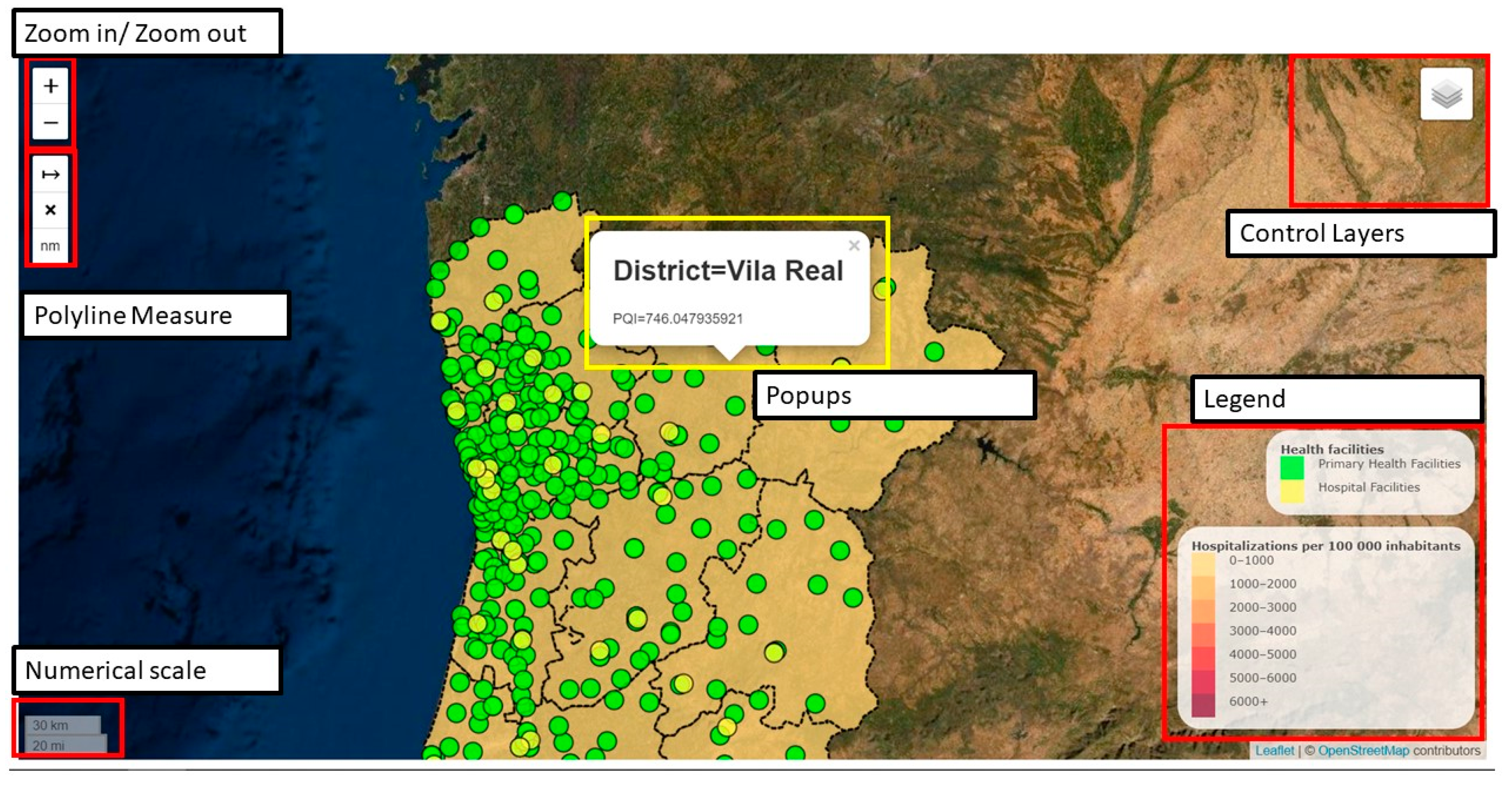
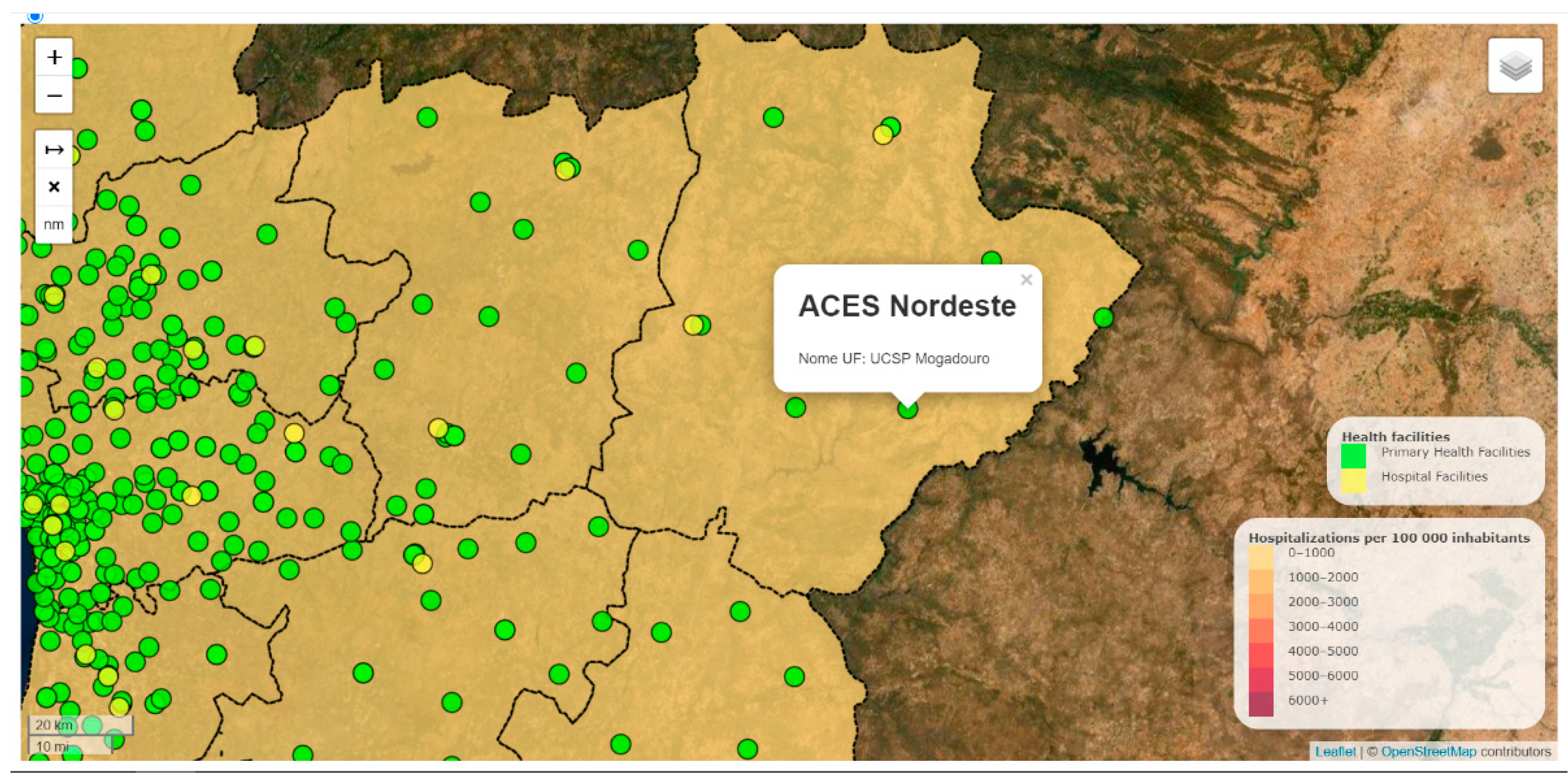
The developed GIS application allows a quick and easy assessment of PQI values’ spatial distribution and time trends alongside other relevant health data. Some examples of thematic maps, outputs of the GIS application, are presented in this section, depicting different PQI values and considering the parameter options available in both applications, to illustrate results.
As an example, and considering geographical distributions, Figure 3 presents maps with the spatial representation of different PQI values. Figure 3a presents PQI09 (low birth weight) values in 2016, considering ICD9 codification. It reveals that the districts of Beja, Lisboa, and Braga had the highest PQI09 rates in 2016, indicating that in that year low birth weight was higher in these districts. Figure 3b represents the overlapping of these data with other relevant information, namely, the number and location of PHC, hospital facilities, and an aerial satellite base map. This map shows that there may be an association between these high values and insufficient prenatal care in these regions, possibly as a result of a low number and density of PHC. Another example was tested selecting PQI03 (diabetes long-term complications; Figure 3c). In this map, it is possible to see that in 2015, hospitalizations due to diabetes long-term complications were the highest in Beja. As we saw earlier, Beja has a quite low density of PHC facilities, which could lead to a lack of access and, therefore, higher PQI03 rates. These spatial representations are potentially extremely useful in guiding health experts and officials in the design of specific interventions and/or policies. Figure 3d presents the overlap with the location of PHC and hospitals.
The GIS application also allows the evaluation of PQI time trends in a specific period. The Export Bar Variation functionality allows the user to create a plot based on the chosen district and PQI, over time. In this example, Porto and PQ02 (perforated appendix) were chosen (Figure 4), respectively.
In Figure 4a, Porto district and PQI02 were selected for visualization. Figure 4b shows the PQI02 trend in the Porto district between 2014 and 2017. We can observe that there was a continuous increase in hospitalizations due to perforated appendix, most notably in 2017. This trend could potentially indicate that appendicitis is not being detected early enough in a PHC setting, leading to illness progression and appendix rupture at a later, and more severe, stage. Clearly, this is important information for the elaboration of evidence-based interventions and policies to address this issue. The maps generated with the GIS application can be also saved in shapefile or GeoJSON format, which can also be exported and opened in an open source platform.

3.2. Web Map

In this section, the information hosted in the web map application and the functionalities added are presented.
Figure 5 presents the result of the web map prototype containing the different functionalities described before. Figure 6 presents the popup of PHC facilities.
The web map application is still under development since this work is dynamic in time and needs to be constantly updated, and there are planned to incorporate more functionalities.

4. Discussion

Considering the spatial analysis of PQI values, proprietary software, such as ArcGIS [52] can also handle a database and spatially represent the PQI values [33]. However, according to the literature consulted, no application is specifically developed in proprietary software that allows us to spatially represent and analyze the PQI values. Given the fact that ArcGIS (or other proprietary software) is not open source, i.e., the code is not accessible to any user, the FOSS software presents a strong advantage in the context of this work because it allowed us to create two applications that easily provide the possibility to analyze the health indicators, contributing to FOSS technologies in the health care context. Additionally, no application is developed in GIS open source software or even freeware software that allows us to perform the procedures presented in this study. Therefore, in this work, two open source and free applications were developed.
A simple and intuitive GIS application integrating Portuguese health indicators’ databases and allowing for representations of time and geographical trends can be extremely useful for data analysis and monitoring in health care planning. PQI values, in particular, are extremely useful as important metrics to monitor and evaluate the access, quality, coordination, and efficiency of PHC services [53], especially in areas outside the great metropolitan areas, most afflicted by low access to PHC and poor-quality health care.
Despite similar platforms already available in Portugal, none allowed for the spatial representation and time trend analysis of PQI values. In that regard, this application is a clear breakthrough. The fact that it can also map other health data such as PHC and hospital locations addresses several questions such as are health care facilities adequately distributed to meet the needs of our community? What are the geographic regions most in need of primary care access? Are there large variations in PHC quality across regions? What are the determinants (e.g., population level, health care provider level) of variability in health care quality? Which conditions (PQIs) show signs of low health care quality? Which has seen an improvement/decline in health care quality over time? Additionally, which are associated with larger geographic disparities? [14].
The developed GIS desktop application provides an easy way to generate plots with PQI variation over time, a useful tool to monitor its evolution and, therefore, monitor the quality of primary care and the health system itself [8]. It also lets the user create new maps and select/add new parameters easily, while also overlapping them with base maps and data on the location of hospital and PHC facilities, facilitating comparisons. The mapping of PQI with both hospital and PHC facilities information supports the analysis of the quality of access to health care and possible inequalities [54]. This is useful information for community health profiling, which can “identify the geographical strengths and weaknesses of a specific community to make decisions about their health services to justify the placement of new ones” [55]. Indeed, the distance from the PHC unit and/or proximity to a hospital may have a considerable impact on the accessibility and utilization preferences of health care services [56].
For instance, Figure 3a,b shows the mapping of PQI09 (low birth weight) in 2016. Partially in line with the results found by Santos et al. [57], it is possible to observe that the Lisboa and Beja districts presented some of the highest levels of low birth weight in 2016. Figure 3b shows the overlapping of these values with health care facility information (number, location, and density per district). After adding the health care facility layer to the map, we can see that in some of these areas there is indeed a considerable geographical dispersion when it comes to PHC units, especially the Beja district. These high PQI09 rates could be associated with insufficient prenatal care in these districts, possibly as a result of low access to PHC services, poor quality of care, or a low ratio of health professionals. However, other factors could play a part here, namely, demographic and socioeconomic factors, such as maternal age, maternal level of education/literacy, household monthly income, the existence of private clinics, etc. [18]. On the other hand, Figure 3b also reveals that the Portalegre district, an area in the countryside such as Beja, had the lowest prevalence of low birth weight in that year, while also having few and sparse PHC facilities. The potential role of other factors is clear, and it would be important to map that data as well, for a fuller picture.
In the case of Figure 4b, which shows the PQI02 trend in the Porto district between 2014 and 2017, there was a continuous increase in hospitalizations due to perforated appendix, which could potentially indicate that appendicitis is not being detected early enough in a PHC setting, leading to illness progression and appendix rupture at a later, and more severe, stage, with worse outcomes for the patient and higher related costs (longer hospital stay, surgical and pharmacological costs). Similar to the case above, this apparent association can occur due to poor quality of care at a PHC level as well as other demographic and socioeconomic factors (e.g., age, comorbidities, etc.); in-depth research could identify more detailed associations and root causes.
Additionally, like presented in the previous section, this web map allows users to visualize indicators’ time trends—a significant advantage over the GEOSAUDE web map, which does not allow it.
Clearly, this application and the spatial and time trend visualizations it provides are extremely valuable tools for health care administrations, public health officials, policymakers and decision makers when it comes to guidance for research and targeted evidence-based interventions/policies.
Additional technical strengths of the application include the possibility of applying different filters, such as the clinical codification system, which stands out as a particularly interesting feature since it can help to identify some regional variations and difficulties associated with the transition between coding systems ICD9-CM to ICD10-CM/PCS [58].
One of the main drawbacks of the GIS application, however, is the fact that it is highly dependent on the amount and quality of data for the regions studied—a common drawback of all GIS applications [59]. If enough quality data are not available, GIS analysis may not be credible, and researchers/policymakers should not depend completely on them for decision making [15]. Other complexities include the great variation of GIS software applications available, which makes it hard to compare research results [60]. Regarding, for instance, the fact that the filter for sex and age have not been implemented, since the PQI database has not yet been populated with PQI values by sex and age group. The latter could be useful as different indicators are problematic in different ways depending on sex and age, and the potential for informing truly targeted interventions is lost. Other complex functionalities, such as hospitalizations for ACSC per district/region, type of PHC facility (family health unit vs. personalized health care units), and the number of health professionals per district/region, have not been implemented yet but could be useful under the premise that regions with less access to quality health care may have more hospitalizations due to poor disease control, in line with conclusions in [56,61]. However, many authors suggest that, despite evidence that increased physician supply and density of PHC are associated with lower rates of hospitalizations for ACSC, socioeconomic characteristics may play a key role, with a substantial financial burden for the national health system [26], which highlights the need for mapping these characteristics as well.
Regarding the web map application itself, its main strengths include (i) not requiring QGIS software installation, (ii) the possibility of overlapping PQI values with the base maps (in integration with the application), (iii) incorporation of other functionalities to manipulate the map and visualize data, (iv) easy access, (v) versatility due to being able to be modified/complemented to present more indicators, and (vi) being open source. On the other hand, some problems are (i) lack of sex and age-group stratification and other more complex functionalities, such as hospitalizations for ACSC, and (ii) a web-based application requires constant updating of the information retrieved and the functionalities must be working well. This is a barrier for this kind of application, but given the relevance in the health care context in Portugal, this application will be continuously monitored. The spatial visualization of the data itself does not require GIS software installation, which makes it very easy to use. It can have a strong potential for health experts to obtain instantaneous conclusions about health indicators.
The web application developed in this study attempts to answer requirements from health experts. However, analysis tools such as the easy visualization and comparison of indicators over time, between different regions, and for different levels and abstraction must be considered in a future version of the web application. Their importance cannot be understated, and they are planned to be implemented in the near future.
Both applications are designed for public health officials, decision makers, policymakers, and health experts, contributing to quick and easy access to the existent data.
Lastly, ethical issues are of significant importance in this context, as loss of confidentiality may be an intrinsic limitation of GIS [62]. It is very difficult to maintain confidentiality when geographic data are presented in small regions/villages/counties since it may become possible to identify the affected individuals with minimal additional information. Researchers and developers are working on ways to address these concerns [63].

5. Conclusions

The absence of a working platform allowing for spatial PQI representation and time trend analyses in Portugal led us to the development of a GIS open source application and a web application specially designed for public health officials, decision makers, policymakers, and health experts.
Allowing for the visualization of PQI time trends and geographical patterns in Portugal while at the same time allowing for the overlapping with other health data, i.e., health care facilities’ location information, this application can be tremendously useful in health states analyses of the Portuguese population and the identification of regional/local variations and inequalities, regarding health states and access to health care. It can certainly contribute to the improvement of the health care quality information system and the strengthening of the data-driven decision-making process in the public health domain.
As more functionalities are added, more information can be mapped, and more in-depth analyses can be performed.
We believe that our application can have a positive impact on the health care quality information system in the public health dimension through the identification of areas with fewer and more dispersed primary healthcare facilities, fewer health professionals, and type of primary healthcare unit, and through the identification of demographic and socioeconomic characteristics that can lead to worse health outcomes (aging population, lower income, lower educational attainment level, etc.). Data and research on the distribution of disease considering all these characteristics are relatively scarce and not easily available in a convenient manner to public health officials and decision makers. Therefore, our aim was to address this issue and create an application that would promote research and inform evidence-based decision making and tailored policies/interventions.
In the future, more functionalities will be added, such as (i) the possibility to click on each district and have access to a graph with the variation of PQI values (such as the application). This will be performed based on SQL conditions connected to GeoServer; (ii) a chronological slider bar will be added to the web map regarding the years and the different PQI codification so that the user can verify the variation of PQI values in all districts; (iii) the database will be updated (when we have authorization); (iv) new filter regarding PQI values and years will be added to the web map; (v) other important information will also be incorporated in the web map, for instance, the hospitals and primary centers locations (already provided); (vi) we will provide more helpful and intuitive analysis tools under the web map, such as the possibility to manage the indicators and the way they are presented; and vii) the possibility to add an additional set of indicators, for instance, in a given medical contact (e.g., diabetes, mental health). At this stage, our objective was to provide the spatial visualization for PQI data, by district, as proof of concept but we aim to improve the user web map interface, creating a more flexible and intuitive map. As time goes by, we expect more updated and complete data for better and more useful visualizations.
Although this tool has been developed for the Portuguese reality, it can be easily adapted to the reality of other countries, with the necessary changes in fields and rules. This is one of the greatest advantages of all procedures having been implemented in open source software, facilitating the adaptation and optimization of this type of application.

Supplementary Materials

The web GIS is available online at http://cicge.synology.me/pqiwebmap/ (accessed on 12 April 2021) and the GIS application code is available at https://github.com/liaduarte/HCQI.git (accessed on 12 April 2021).

Author Contributions

Conceptualization, Lia Duarte, Ana Cláudia Teodoro; methodology, Alberto Freitas, João Viana, Mariana Lobo; software, Lia Duarte; validation, Vera Pinheiro, Mariana Lobo; formal analysis, investigating on the geographic distribution of PQI in these countries; investigation, Lia Duarte; resources, Alberto Freitas, Mariana Lobo, João Viana; data curation, Alberto Freitas, Mariana Lobo, João Viana; writing—original draft preparation, Lia Duarte, Ana Cláudia Teodoro; writing—review and editing, Ana Cláudia Teodoro, Alberto Freitas, Vera Pinheiro, Mariana Lobo; supervision, Ana Cláudia Teodoro. All authors have read and agreed to the published version of the manuscript.

Funding

The work was supported by the Portuguese Foundation for Science and Technology (FCT) project UIDB/04683/2020-ICT (Institute of Earth Sciences). It was also supported by FEDER (Fundo Europeu de Desenvolvimento Regional) funds through the COMPETE 2020 Operacional Programme for Competitiveness and Internationalisation (POCI), and by Portuguese funds through FCT (Fundação para a Ciência e a Tecnologia) in the framework of the project POCI-01-0145-FEDER-030766 (“ First IndiQare–Quality indicators in primary health care: validation and implementation of quality indicators as an assessment and comparison tool”).

Institutional Review Board Statement

Not applicable.

Informed Consent Statement

Not applicable.

Data Availability Statement

The data presented in this study are available in Supplementary Materials.

Acknowledgments

The work was supported by the Portuguese Foundation for Science and Technology (FCT) project UIDB/04683/2020-ICT (Institute of Earth Sciences). It was also supported by FEDER –(Fundo Europeu de Desenvolvimento Regional) funds through the COMPETE 2020 Operacional Programme for Competitiveness and Internationalisation (POCI), and by Portuguese funds through FCT (Fundação para a Ciência e a Tecnologia) in the framework of the project POCI-01-0145-FEDER-030766 (“First IndiQare—Quality indicators in primary health care: validation and implementation of quality indicators as an assessment and comparison tool”). The authors also thank Observatório Astronómico for letting us use a server to host the web map application. The authors also thank Dalmiro Maia and Bruno Morgado for helping us host the web application on the server.

Conflicts of Interest

The authors declare no conflict of interest.

References

  1. Muenchow, J.; Schäfer, S.; Krüger, E. Reviewing qualitative GIS research—Toward a wider usage of open-source GIS and reproducible research practices. Geogr. Compass 2019, 13, e12441. [Google Scholar] [CrossRef]
  2. Khan, M.A.; UrRehman, F. Free and Open Source Software: Evolution, Benefits and Characteristics. Int. J. Emerg. Trends Technol. Comput. Sci. 2012, 1, 1–7. [Google Scholar]
  3. Chand, J. Free and Open Source Software’s for Geographic Information System (GIS). Available online: https://1library.net/document/y4386v9z-free-open-source-software-s-geographic-information-gis.html?utm_source=related_list (accessed on 30 March 2021).
  4. Richard Satllman. Available online: https://stallman.org/ (accessed on 30 March 2021).
  5. Jayawardhana, U.K.; Gorsevski, P.V. An ontology-based framework for extracting spatio-temporal influenza data using Twitter. Int. J. Digit. Earth 2017, 12, 2–24. [Google Scholar] [CrossRef]
  6. AHRQ Quality Indicators. Guide to Prevention Quality Indicators: Hospital Admission for Ambulatory Care Sensitive Conditions. Available online: https://www.qualityindicators.ahrq.gov/modules/pqi_overview.aspx (accessed on 10 January 2020).
  7. Helmer, D.A.; Tseng, C.-L.; Brimacombe, M.; Rajan, M.; Stiptzarov, N.; Pogach, L. Applying diabetes-related Prevention Quality Indicators to a national cohort of veterans with diabetes. Diabetes Care 2003, 26, 3017–3023. [Google Scholar] [CrossRef] [Green Version]
  8. Manzoli, L.; Flacco, M.E.; De Vito, C.; Arcà, S.; Carle, F.; Capasso, L.; Marzuillo, C.; Muraglia, A.; Samani, F.; Villari, P. AHRQ prevention quality indicators to assess the quality of primary care of local providers: A pilot study from Italy. Eur. J. Public Health 2014, 24, 745–750. [Google Scholar] [CrossRef] [Green Version]
  9. Rocha, J.V.M.; Nunes, C.; Santana, R. Avoidable hospitalizations in Brazil and Portugal: Identifying and comparing critical areas through spatial analysis. PLoS ONE 2019, 14, e0219262. [Google Scholar] [CrossRef] [PubMed]
  10. Kelen, P.T.V.; Downs, J.A.; Stark, L.M.; Loraamm, R.W.; Andreson, J.H.; Unnasch, T.R. Spatial epidemiology of eastern equine encephalitis in Florida. Int. J. Health Geogr. 2012, 11, 47. [Google Scholar] [CrossRef] [Green Version]
  11. Veenendaal, B.; Brovelli, M.A.; Li, S. Review of Web Mapping: Eras, Trends and Directions. ISPRS Int. J. Geo Inf. 2017, 6, 317. [Google Scholar] [CrossRef]
  12. Franch-Pardo, I.; Napoletano, B.M.; Rosete-Verges, F.; Billa, L. Spatial analysis and GIS in the study of COVID-19. A review. Sci. Total Environ. 2020, 739, 140033. [Google Scholar] [CrossRef]
  13. Dubowitz, T.D.; Williams, M.; Steiner, E.D.; Weden, M.M.; Miyashiro, L.; Jacobson, D.; Lurie, N. Using Geographic Infor-mation Systems to Match Local Health Needs With Public Health Services and Programs. Am. J. Public Health 2011, 101, 1664–1665. [Google Scholar] [CrossRef]
  14. Dulin, M.F.; Ludden, T.M.; Tapp, H.; Blackwell, J.; de Hernandez, B.U.; Smith, H.A.; Furuseth, O.J. Using Geographic Infor-mation Systems (GIS) to Understand a Community’s Primary Care Needs. J. Am. Board Family Med. 2010, 23, 13–21. [Google Scholar] [CrossRef] [PubMed]
  15. Shaw, N.; McGuire, S. Understanding the use of geographical information systems (GIS) in health informatics research: A review. J. Innov. Health Inf. 2017, 24, 228–233. [Google Scholar] [CrossRef]
  16. Alvarez-Mendoza, C.I.; Teodoro, A.C.; Torres, N.; Vivanco, V. Assessment of Remote Sensing Data to Model PM10 Estimation in Cities with a Low Number of Air Quality Stations: A Case of Study in Quito, Ecuador. Environments 2019, 6, 85. [Google Scholar] [CrossRef] [Green Version]
  17. GIS & Mapping for Public Health: Mapping Websites & Applications. Available online: https://guides.lib.berkeley.edu/publichealth/phgis/mapping (accessed on 1 July 2020).
  18. Centers for Disease Control and Prevention. Available online: https://nccd.cdc.gov/cdi/rdPage.aspx?rdReport=DPH_CDI.ExploreByTopic&islTopic=AST&islYear=9999&go=GO (accessed on 1 July 2020).
  19. GEOSAUDE. Available online: http://www.geosaude.dgs.pt/ (accessed on 1 July 2020).
  20. PORDATA. Available online: https://www.pordata.pt/ (accessed on 1 July 2020).
  21. Instituto Nacional de Estatística (INE). Available online: Ine.pt (accessed on 1 July 2020).
  22. BI-CSP. Available online: https://bicsp.min-saude.pt/pt/Paginas/default.aspx (accessed on 1 July 2020).
  23. Administração Central do Sistema de Saúde, IP. Available online: https://benchmarking-acss.min-saude.pt/ (accessed on 1 July 2020).
  24. Serviço Nacional de Saúde (Health Nacional Service). Available online: https://www.sns.gov.pt/transparencia/ (accessed on 30 March 2021).
  25. Eurostat. Income Poverty Statistics. Available online: https://ec.europa.eu/eurostat/statistics-explained/index.php?title=Income_poverty_statistics (accessed on 1 July 2020).
  26. Campos-Matos, I.; Russo, G.; Perelman, J. Connecting the dots on health inequalities—A systematic review on the social determinants of health in Portugal. Int. J. Equity Health 2016, 15, 26. [Google Scholar] [CrossRef] [Green Version]
  27. Dimitrovová, K.; Costa, C.; Santana, P.; Perelman, J. Evolution and financial cost of socioeconomic inequalities in ambulatory care sensitive conditions: An ecological study for Portugal, 2000–2014. Int. J. Equity Health 2017, 16, 1–11. [Google Scholar] [CrossRef] [PubMed] [Green Version]
  28. AHRQ. Agency for Healthcare Research and Quality, “Prevention Quality Indicators Technical Specifications Updates—Version 6.0 (ICD-9-CM). Available online: https://www.qualityindicators.ahrq.gov/Archive/PQI_TechSpec_ICD09_v60.aspx (accessed on 10 April 2020).
  29. AHRQ. Agency for Healthcare Research and Quality, “Prevention Quality Indicators Technical Specifications Updates—Version v2018.0.1. Available online: https://www.qualityindicators.ahrq.gov/Archive/PQI_TechSpec_ICD10_v60.aspx (accessed on 10 April 2020).
  30. ACSS. Administração Central do Sistema de Saúde. Available online: http://www.acss.min-saude.pt/ (accessed on 1 March 2020).
  31. Freitas, A.; Gaspar, J.; Rocha, N.; Marreiros, G.; Da Costa-Pereira, A. Quality in Hospital Administrative Databases. Appl. Math. Inf. Sci. 2014, 8, 1–6. [Google Scholar] [CrossRef] [Green Version]
  32. Sarmento, J.; Rocha, J.V.M.; Santana, R. Defining ambulatory care sensitive conditions for adults in Portugal. BMC Health Serv. Res. 2020, 20, 1–12. [Google Scholar] [CrossRef]
  33. Ramalho, A.; Lobo, M.; Duarte, L.; Souza, J.; Santos, P.; Freitas, A. Landscapes on Prevention Quality Indicators: A Spatial Analysis of Diabetes Preventable Hospitalizations in Portugal (2016–2017). Int. J. Environ. Res. Public Health 2020, 17, 8387. [Google Scholar] [CrossRef]
  34. DGT. Direção Geral do Território. Available online: http://www.dgterritorio.pt/ (accessed on 10 March 2020).
  35. PostGIS. Spatial and Geographic Objects for PostgreSQL. Available online: https://postgis.net/ (accessed on 10 January 2020).
  36. QGIS. Welcome to the QGIS Project! Qgis. 2016. Available online: http://www.qgis.org/ (accessed on 25 September 2020).
  37. Duarte, L.; Lobo, M.; Viana, J.; Freitas, A.; Teodoro, A. A GIS Open Source Application to Perform the Spatial Distribution of Prevention Quality Indicators (PQIs). In Proceedings of the 6th International Conference on Geographical Information Systems Theory, Applications and Management, Prague, Czech Republic, 7–9 May 2020; Volume 1, pp. 129–134. [Google Scholar]
  38. Qt Documentation. Available online: https://doc.qt.io/qt-5/reference-overview.html (accessed on 23 March 2020).
  39. PyQGIS Developer Cookbook. Available online: https://docs.qgis.org/testing/en/docs/pyqgis_developer_cookbook/ (accessed on 23 March 2020).
  40. MatPlotLib. Available online: https://matplotlib.org/ (accessed on 25 September 2020).
  41. Bhatia, T.S.; Singh, H.; Litoria, P.K.; Pateriya, B. Web GIS Development using Open Source Leaflet and Geoserver Toolkit. IJCST 2018, 9, 29–33. [Google Scholar]
  42. Horbiński, T.; Lorek, D. The use of Leaflet and GeoJSON files for creating the interactive web map of the preindustrial state of the natural environment. J. Spat. Sci. 2020, 1–17. [Google Scholar] [CrossRef]
  43. Apeh, O.I.; Nwaka, O.C.; Ndukwu, R.I.; Maduako, I.; Arilewola, O. E-beacon: A web-based survey control finder application. S. Afr. J. Geomat. 2019, 8, 178–190. [Google Scholar]
  44. Kim, J. Web-based Geovisualization System of Oceanographic Information using Dynamic particles and HTML5. J. Coast. Res. 2018, 85, 1491. [Google Scholar] [CrossRef]
  45. Olyazadeh, R.; Sudmeier-Rieux, K.; Jaboyedoff, M.; Derron, M.-H.; Devkota, S. An offline–onlineWeb-GIS Android application for fast data acquisition of landslide hazard and risk. Nat. Hazards Earth Syst. Sci. 2017, 17, 549–561. [Google Scholar] [CrossRef] [Green Version]
  46. Tayebi, A.; Gomez, J.; De Adana, F.S.; Gutierrez, O.; De Sevilla, M.F. Development of a Web-Based Simulation Tool to Estimate the Path Loss in Outdoor Environments using OpenStreetMaps [Wireless Corner]. IEEE Antennas Propag. Mag. 2019, 61, 123–129. [Google Scholar] [CrossRef]
  47. JavaScript. Available online: https://www.javascript.com/ (accessed on 10 March 2020).
  48. Farkas, G. Applicability of open-source web mapping libraries for building massive Web GIS clients. J. Geogr. Syst. 2017, 19, 273–295. [Google Scholar] [CrossRef]
  49. Leaflet. Leaflet—A JavaScript Library for Interactive Maps. Available online: http://leafletjs.com/ (accessed on 25 September 2020).
  50. Geoserver. Geoserver. Available online: http://geoserver.org/ (accessed on 14 March 2020).
  51. Switch2OSM. Available online: https://switch2osm.org/using-tiles/getting-started-with-leaflet/ (accessed on 23 March 2020).
  52. ArcGIS. Available online: https://www.esri.com/en-us/arcgis/about-arcgis/overview (accessed on 23 March 2021).
  53. WHOROE (World Health Organization Regional Office for Europe). Assessing Health Services Delivery Performance with Hospitalizations for Ambulatory Care Sensitive Conditions. Available online: https://www.euro.who.int/__data/assets/pdf_file/0010/305875/Assessing-HSD-performance-with-ACSH.pdf (accessed on 1 July 2020).
  54. McLafferty, S.L. GIS and Health Care. Annu. Rev. Public Health 2003, 24, 25–42. [Google Scholar] [CrossRef]
  55. Jack, K.; Holt, M. Community profiling as part of a health needs assessment. Nurs. Stand. 2008, 22, 51–56. [Google Scholar] [CrossRef] [PubMed]
  56. Carneiro, C. Hospitalisation of ambulatory care sensitive conditions and access to primary care in Portugal. Public Health 2018, 165, 117–124. [Google Scholar] [CrossRef]
  57. Santos, J.V.; Viana, J.; Souza, J.; Lobo, M.; Ramalho, A.; Gonçalves-Pinho, M.; Freitas, A. Time trends of primary care quality across Portuguese regions: Using prevention quality indicators. Eur. J. Public Health 2019, 29, ckz186–ckz383. [Google Scholar] [CrossRef] [Green Version]
  58. Alonso, V.; Santos, J.V.; Pinto, M.; Ferreira, J.; Lema, I.; Lopes, F.; Freitas, A. Problems and Barriers in the Transition to ICD-10-CM/PCS: A Qualitative Study of Medical Coders’ Perceptions. In Proceedings of the World Conference on Information Systems and Technologies; Springer: Cham, Switzerland, 2019; pp. 72–82. [Google Scholar] [CrossRef]
  59. Paramasivam, C. Merits and Demerits of GIS and Geostatistical Techniques. Available online: https://www.researchgate.net/publication/333510563_Merits_and_Demerits_of_GIS_and_Geostatistical_Techniques (accessed on 23 March 2021).
  60. Stevens, R.; Ahmedzai, S.H.; Hughes, P.; Noble, B.; Ahmed, N. Geographical Information Systems (GIS) in Palliative Care: A Systematic Review; University of Sheffield: Sheffield, UK, 2010. [Google Scholar]
  61. Van Loenen, T.; Berg, M.J.V.D.; Westert, G.P.; Faber, M.J. Organizational aspects of primary care related to avoidable hospitalization: A systematic review. Fam. Pract. 2014, 31, 502–516. [Google Scholar] [CrossRef]
  62. Olvingson, C.; Hallberg, J.; Timpka, T.; Lindqvist, K. Ethical issues in public health informatics: Implications for system design when sharing geographic information. J. Biomed. Inf. 2002, 35, 178–185. [Google Scholar] [CrossRef] [Green Version]
  63. Tranmer, M.; Pickles, A.; Fieldhouse, E.; Elliot, M.; Dale, A.; Brown, M.; Martin, D.; Steel, D.; Gardiner, C. The case for small area microdata. J. R. Stat. Soc. Ser. A Stat. Soc. 2004, 168, 29–49. [Google Scholar] [CrossRef]
Figure 1. Class diagram of health care quality indicator (HCQI) application.
Ijgi 10 00264 g001
Figure 2. HCQI application graphic user interface (GUI).
Ijgi 10 00264 g002
Figure 3. (a) Low birth weight (PQI09)–2016 spatial representation, by district; (b) PQI09–2016 overlapped with aerial map, primary health care (PHC), and hospital locations, by district; (c) diabetes long-term complications (PQI03)–2015 spatial representation, by district; and (d) PQI03–2015 overlapped with aerial map, PHC, and hospital locations, by district.
Ijgi 10 00264 g003aIjgi 10 00264 g003b
Figure 4. (left): Perforated appendix (PQI02) variation GUI in Porto district and (right): PQI02 variation plot in Porto district.
Ijgi 10 00264 g004
Figure 5. Web map elements such as zoom in/zoom out, polyline measure, numerical scale, popups, control layers, and legend.
Ijgi 10 00264 g005
Figure 6. PHC facilities properties.
Ijgi 10 00264 g006
Table 1. Prevention quality indicators (PQIs) code description.
PQI CodeDescription
PQI01Diabetes Short-Term Complications
PQI02Perforated Appendix
PQI03Diabetes Long-Term Complications
PQI05COPD or Asthma in Older Adults
PQI07Hypertension
PQI08Heart Failure
PQI09Low Birth Weight
PQI10Dehydration
PQI11Bacterial Pneumonia
PQI12Urinary Tract Infection
PQI14Uncontrolled Diabetes
PQI15Asthma in Younger Adults
PQI16Lower-Extremity Amputation Among Patients with Diabetes
PQI90Prevention Quality Overall Composite
PQI91Prevention Quality Acute Composite (PQI11, PQI12)
PQI92Prevention Quality Chronic Composite (PQI1, PQI3, PQI5, PQI7, PQI8, PQI14, PQI15, PQI16)
PQI93Prevention Quality Diabetes Composite (PQI1, PQI3, PQI14, PQI16)
Publisher’s Note: MDPI stays neutral with regard to jurisdictional claims in published maps and institutional affiliations.

