Better Rating Scale Scores with Information–Based Psychometrics


1
Department of Psychology, McGill University, 2748 Howe St., Ottawa, ON H3A 0G4, Canada
2
Neuroscience Program, Ottawa Hospital Research Institute, Ottawa, ON K1H 8L6, Canada
3
Department of Statistics, USBE, Umeå University, 901 87 Umeå, Sweden
*
Author to whom correspondence should be addressed.
Psych 2020, 2(4), 347-369; https://0-doi-org.brum.beds.ac.uk/10.3390/psych2040026
Submission received: 14 October 2020
/
Revised: 25 November 2020
/
Accepted: 26 November 2020
/
Published: 15 December 2020
(This article belongs to the Special Issue Learning from Psychometric Data)
Abstract
:Diagnostic scales are essential to the health and social sciences, and to the individuals that provide the data. Although statistical models for scale data have been researched for decades, it remains nearly universal that scale scores are sums of weights assigned a priori to question choice options (sum scores), respectively. We propose several modifications of psychometric testing theory that together demonstrate remarkable improvements in the quality of rating scale scores. Our model represents performance as a space with a metric structure by transforming probability into surprisal or information. The estimation algorithm permits the analysis of data from tens and hundreds of thousands of test takers in a few minutes on consumer level computing equipment. Standard errors of performance estimates are shown to be as small as a quarter of those of sum scores. Open access software resources are presented.

1. Introduction
Tens of thousands of self-report rating scales are devised each year in the health and social sciences in order to provide numerical summaries of the status of people with respect to some experiential property. The designers of these scales usually offer a sequence of choices, each choice being among a set of options that are intended to be seen as ordered. The option order is usually conveyed to the respondent in terms of a set of integers and/or labels. The final numerical summary is almost always the sum of the integers attached to the chosen options, and we refer to this as the sum score. Psychometricians often refer to these scales as polytomous ordered response scales, but a more common term is rating scale.
The example used in this paper is the Symptom Distress Scale [1], widely used in nursing practice and research to assess the degree of distress felt by patients undergoing treatment for cancer. The scale requires the rating of the intensity of the 13 types of distress indicated in Table 1. The levels of distress are given numerical weights 0, 1, 2, 3 and 4 corresponding to the intensity or frequency of the distress, so that the minimum and maximum possible scores are 0 and 52, respectively. The manual for the scale contains a review of reliability studies for the scale containing 33 estimates of Cronbach’s alpha correlation coefficient, mostly from small samples of 60 or so for specific patient populations. The two studies with larger sample sizes of 434 and 436 report values of 0.80 and 0.81, and another with 162 respondents reports 0.86. By the usual standards this short scale would be considered fairly high in performance.
The data that we use in this paper are from administrations of the Symptom Distress Scale to 473 patients in the cancer clinic in the medical school of the University of Manitoba. Figure 1 reveals that the symptom distress sum scores are mostly in the mild to medium range of distress, with a maximum observed value of 37 out of a possible maximum of 52. The vertical dashed lines indicate, for example, that only 25% of the respondents achieved sum scores of about 15 or more, indicating that in the lower 75% of the respondents most of the distress ratings were only 0 or 1. This is of course fortunate for the nursing staff, who can consequently focus almost all of their attention of those experiencing severe distress. But the relatively small number of patients with more severe distress will inevitably hamper our goal of understanding how the scale interacts with these respondents.
The sum score is obviously a successful device, and especially because it is so easy to understand and compute. But can we do better? Consider some of the things that the sum score does not do for assessing cancer patient misery.
- The scale designer forces the respondent to use integers, which implies that for all respondents a move from 0 to 1 is the same experience as moving from 3 to 4. In fact, most respondents are apt to consider the first step as expected and tolerable, whereas the other step is apt to be an urgent cry for immediate help.
- All 13 experiences are treated as equal in importance, whereas intensity of pain seems unlikely to be on a par with, say, deterioration of appearance.
- For a specific cancer patient, some symptoms are apt to be much more important than others, but which depends on the nature of the disease.
- Questions can vary in quality. That is, the words used to describe an experience may not be understood by some patients. What precisely does “outlook on life” mean, for example?
- Questions also vary in usefulness from one respondent to another. If most of a respondent’s ratings are 4, for example, the odd rating of 0 or 1 should not be considered as important for gauging that person’s overall stress level. We call this an interaction between patient and question.
We would like that the analysis of the data clarify some of these issues and offer a numerical summary that could be shown to be as accurate as possible.
Item response theory (IRT) has primarily focussed on models for the right answer for academic performance data of the multiple choice type. A thorough treatment of test scoring is [2]. We have applied a version of the methodology we describe in this paper in [3,4], and earlier forerunners of our work are [5,6,7]. However, IRT for rating scale data has necessarily to model how all choices vary as a function of the experience being assessed. Accounts of the two most popular current models for scales are [8,9]. It is puzzling that the efforts of psychometricians to model both scale and test data and to use these models to improve scale scores have been so widely ignored in practice, even by the large scale testing agencies. In this paper we will contribute some new techniques to IRT methodology, with our primary goal being to dislodge the sum score as the indicator of the intensity of experiences like symptom stress. However, we do not compare the merits of our model to these two or any other IRT models. Instead, our main claim is that all IRT models are likely to improve on the efficiency of the sum score, and we leave any inter-IRT model comparisons to future papers.
A novelty in our approach is to model what is called surprisal rather than probability as it evolves over what IRT calls the latent variable underlying scale choices. The next Section explains what surprisal is and why we consider it a better medium for summarizing respondents’ scale data. In Section 3 we propose a explicit continuous indexing variable along with boundary stipulations that replace the notion of a latent variable, an sketch out using only minimal mathematical detail an analysis that defines surprisal curves for each of the 78 possible choices (including nonresponse). Section 4 then takes up the procedure for estimating each respondent’s distress level. Section 5 describes a space curve in surprisal space that has a fixed unit, the information theory quantity bit. Section 6 displays a variety of results, including the arc length scale curve that defines a true metric–based measure of distress. Section 7 presents the remarkable improvement in accuracy in terms of point-wise standard error, bias and root-mean-squared error that is attainable for the Symptom Distress Scale data. In Section 8 we also briefly describe an application that is either freely available in stand alone version, on line via a web server or as an R package.
2. From Probability to Surprisal
2.1. The Multinomial Probability Vector
Let M denote the number of choices presented to a respondent in an item. In reality, respondents often do not make a choice, or indicate a choice in a way that is not interpretable. In order to cover all possible responses, we add to the five levels of the Symptom Distress Scale a sixth response, “missing or uninterpretable” with a weight of 0, so that in this paper for all questions. Two distress symptoms, nausea intensity and pain intensity, had unusually large numbers of missing responses: 79 and 43, respectively. The remaining 11 symptoms had numbers of missing responses of 10 or less.
The multinomial vector of length M contains the probabilities , which we assume are all positive. Discrete data modellers such as [10,11] have often defined using sets of M real numbers by the transformation
We see in this formulation two actions: (1) the exponential transform that ensures that the probability will be positive, and (2) the normalization by dividing by in order to ensure that the probability values sum to one. In the numerical analysis literature normalization is often called a retraction operation since it pulls the ’s in the space of positive real vectors into the space of probability vectors.
When a probability is defined by (1), we see that does not change if we add any constant to all the . If we define matrix transformation where is an by matrix with linearly independent columns, each of which sums to zero and is an unconstrained -dimensional vector, then we see that a multinomial vector is really only of dimension . There are a number of ways in which matrices can be defined.
Figure 2 plots a two-dimensional multinomial (2-D) surface within a 3-D cube. We generated this surface by beginning with a 21 by 21 table of the possible pairs of the values . We transformed each coordinate pair into a three-dimensional multinomial vector using transformation (1), and then plotted these points as a surface, as seen in the Figure 2. We also plotted the points on the central row and column of the table, which are on the X- and Y-coordinate lines in the initial plane. The result is a flat triangle within the 3-D unit cube with vertices at (1,0,0), (0,1,0) and (0,0,1), and we see that the Y-coordinate plots as a straight line but the X-coordinate plots as a curve.
IRT requires that vary smoothly over an indexing variable so that each question i has a set of probability functions . The two most popular models are the partial credit model [12] and the heterogeneous graded Response model [9]. Both of these define probability curves in terms of the exponentials of the two-parameter linear transform for curve m. The partial credit model replaces in (1) by and the graded response employs a slightly different formulation. The partial credit function is a special case of the more general spline expansion that is described below in Section 2.3, and derived from the work of [10,11].
2.2. The Surprisal Transform
A transform of probability into information, or what we call surprisal, plays a key role in our model. The surprisal transform for probability P is . Surprisal has a simple interpretation if the logarithm has the base 2: the average number of coin tosses of heads in a row required to have probability P. For probability values , the corresponding surprisal values are ; and for and , S = 4.3 and 6.2, respectively. The surprisal of is 0 and of is ∞.
Since surprisal is a count, surprisal values can be added, subtracted, and multiplied by positive constants. Moreover, surprisal has a natural unit, namely the bit, which corresponds to the probability of choosing at random a designated outcome on a single try. The conventional bit used in computing jargon, can be called the “2-bit”, and the surprisal of throwing a, say, six with a die can be called the “6-bit”. The M-bit value one corresponds to the probability of getting a designated integer from 1 to M for a single generation of a random value of one of these integers. These information theoretical M-bit units are like the units in physical quantities like kilogram for mass, so that we are able to call surprisal values “measurements” in the strictest sense of the word.
2.3. The Multinomial Surprisal Vector
The surprisal transform of a multinomial vector of length M is where is the logarithm to base M. The inverse transform from probability to surprisal is . Because transforms like these preserve dimensionality, a surprisal vector of length M is also within an dimensional surface, but which is curved. An arbitrary surprisal vector can be defined in terms of an M-dimensional vector as
Adding the second term in the retraction transform that pulls into surprisal space, and the second term on the right side can be viewed as measuring the distance between a positive real vector and its nearest surprisal relative. If, on the other hand, the values are already surprisal values, the second term in (2) vanishes since the value logged to the basis M is exactly one. The value is unchanged if is reflected. We see that as probability decreases, surprisal increases at an exponential rate; and when surprisal goes to zero, probability approaches one.
Figure 3 displays two views of the 2-D surprisal surface defined by transforming the same 21 by 21 table used for the multinomial surface using, instead, the surprisal transform (2). The curved 2D surprisal surface hugs the planar boundaries of the positive three-dimensional orthant but never touches them. Both of the coordinate lines are now curved, although each coordinate curve is within a plane. Their junction point, (0,0) in the initial plane, is the point on the surface closest to the 3-D origin (0,0,0). What is now striking in the right panel is that the square mesh in the initial plane is preserved within the surprisal surface, as opposed to the convergent mesh lines in the multinomial surface. This geometrical property translates into the idea that distance within the surface can be measured in the same way that we measure movement in our familiar 3-D space. This is the metric property of surprisal space, which the multinomial space does not possess.
An important reason for working with surprisals instead of probabilities is that it is much easier to estimate positive vectors by standard statistical operations such as linear regression than it is to estimate doubly-bounded probability vectors. We shall replace these parametric models by linear combinations of spline basis functions .
where the coefficients blend together the basis functions. The linear combination is called a spline function. Figure 4 displays 13 spline basis functions, each of which is a cubic polynomial between pairs of adjacent vertical dashed lines indicating knot locations. The order of a polynomial is one greater than a polynomial’s degree and equals the number of polynomial coefficients required to define it, which in this example is four. When a given order four spline function crosses a knot, the polynomial changes, but in a way that preserves two levels of derivatives. Each of these basis functions is only nonzero over at most four adjacent inter-knot intervals. Spline functions which can be made arbitrarily flexible by either adding more knots or by making their order higher. They can be computed extremely rapidly and defined to be as smooth and as differentiable as is required. Further information on splines and curve estimating with spline can be found in [13,14]. A comparison of results using two-parameter logistic curves and using splines curves for correct responses for a large-scale multiple choice test is [15].
The bottom panel of Figure 8 displays the surprisal curves in 5-bit units for a heterogeneous graded response model corresponding to the probability curves in the top panels.
3. Index Sets and Surprisal Curves
3.1. The Percentile Index
The classic one-dimensional IRT model proposes that the values of a probability vector vary over a one-dimensional continuum, values on which are usually denoted by . Psychometric tradition favours the whole real line as the continuum, but this choice raises two practical problems. First, the public at large to whom scales are administered and the health and social sciences that use their data tend to be reluctant to work with negative index values; and, second, the concept of infinity used to define the lowest and highest index values is illegitimate in computing environments and also not intuitive for non-mathematicians. By contrast, it is the nature of what scales measure that there is a state of zero intensity that the respondent expects to be reported as such, and almost always a maximally intense experience that seems logical to associate with finite positive constant.
We abandon the real-line tradition in favour the interval 0 to 100, or the percentile, for a number of reasons. Percentiles can be compared between scales with differing numbers of questions, and are already familiar in media reports of properties like voter choice, weather, examination results, and so forth. The real line has favoured the standard normal distribution, but over closed intervals it is preferable to use a uniform distribution as, at least, a starting point for further refinement. Working over closed intervals like [0,100] also greatly widens the range of mathematical models at our disposal, and in our work allows us to work with models often described (inappropriately) as “nonparametric”. We comment further on these issues below.
With the index in place, we now define a surprisal curve for a question as an M-dimensional surprisal function with values . By “smooth” in this paper we mean that the multinomial function has a first derivative with respect to everywhere in the open interval (0,100). We allow that our -estimation process will consign certain response pattens to either 0 or 100, so that the distribution of is quite likely to be discontinuous at the boundaries.
Our algorithm for curve estimation involves iterative refinement, and consequently requires an initial estimate of for each respondent. We construct this as follows. First, the usual scale sum score is constructed. These sum scores contain large numbers of ties because of their dependency on integer option scores. In order to avoid any systematic biases that might arise due to ties, we add a small random perturbation that does not exceed 0.5 to each score, a process referred to in statistical graphics as jittering. Finally, we assign to each respondent the value that is the percentage of respondents whose jittered scores are at or below the respondent’s. These percentages are uniformly distributed over (0,100), but quite likely discontinuous at the boundaries. The next step is to partition these percentages into a set of bins, each of which approximately contains a pre-set number of percentages. Given the relatively modest number 473 of the cancer patients, we aimed at about 25 percentages for each of 18 bins.
3.2. The Surprisal Curve Estimation
A surprisal curve was constructed for a specific option as follows. For each bin, a surprisal value is computed from the proportion of respondents in the bin who chose that option. In the event that a proportion is zero, a fixed large surprisal value is allocated, the size of which is dependent on the number respondents per bin. The surprisal value for a bin is positioned horizontally at the bin centre. The result is a set of data points which are then subjected to spline smoothing to yield a smooth curve. However, the missing/illegal choice curves are far more likely to contain zeros, and the estimated curves for these are consequently horizontal lines positioned at the average of the surprisal values across bins.
An additional retraction operation is required once all surprisal curves have been estimated by spline smoothing because, for any question and specific value of , the curve values may not satisfy the constraint that the corresponding probabilities sum to one. This is achieved by the retraction in (2) from each of a fine mesh of curve values, and applying a second curve approximation to these corrected values. Typically the corrections were small.
Figure 5 displays two sets of bin surprisal values along with their associated surprisal curves for the intensity of pain. The blue curve is fit to the data for the rating of zero, and indicates low surprisal for respondents with low percentiles and high surprisal for high percentiles. The red curve is for the highest surprisal rating (4) and, as we would expect, is low for respondents with high percentiles. That is, surprisal is low where would expect the score choice to match the overall distress level of the respondent.
The number K of basis functions to use depends on the number of bins used to estimate probabilities of option choices. We find that about 25 respondents per bin is a lower bound for the successful use of the surprisal curve estimation strategy that we employed with the Symptom Distress Scale data, and using this value for the 473 respondents resulted in 18 bins. We suggest that K be considerably less than the number bins in order to ensure not over-fitting the data, and we used for our analyses. As a rough guide, and 50 respondents per bin would be reasonable choices for . By contrast, for example, for the 55,000 examinees in the testing data that we analyzed in [4], we used 53 bins with about 1000 examinees per bin, and were thereby obtained highly accurate estimates of curve values.
We suggest using order five splines, which are piece-wise quartic polynomials, because the first derivatives of the surprisal curves play a pivotal role in our analyses and this order ensures a smooth first derivative. The number of knots, counting the boundaries as knots, is equal to the number of basis functions minus the order plus 2, so that using seven basis functions implies two knots within the interior of the interval [0,100]. A roughness penalty on the third derivative multiplied by a penalty coefficient of 10,000 is also used routinely in our work, but this has little impact when only seven basis functions are involved.
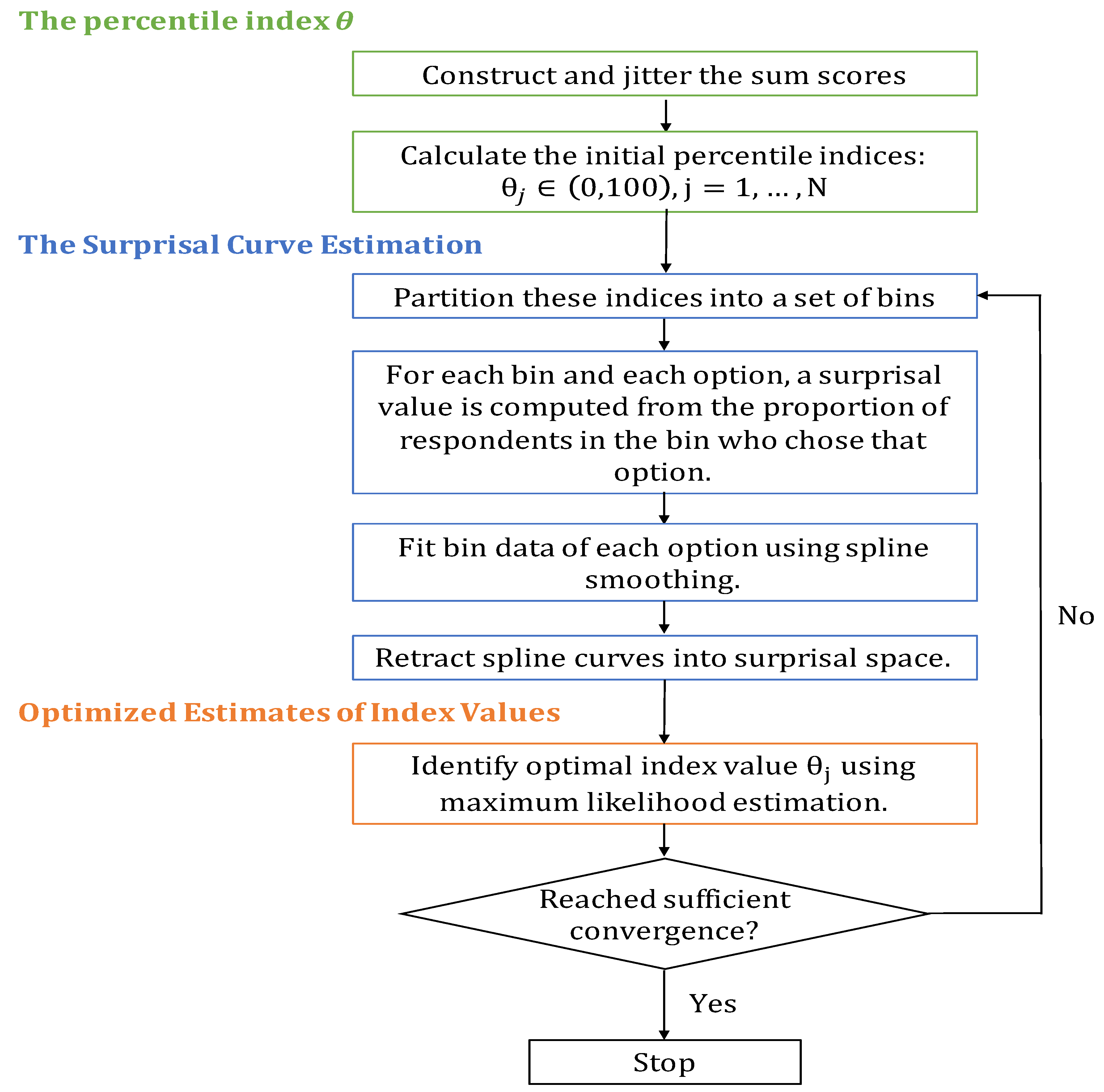
4. Optimized Estimates of Index Values
The results in Figure 5 are only initial surprisal curve estimates since we computed them using percentiles calculated from the very sum score values that we criticized in the Section 1. Our overall estimation strategy is to cycle back and forth between surprisal curve estimation and index estimation. Earlier in our research we used a global optimization technique that involved optimizing jointly with respect to both surprisal curve coefficients and respondent index value [3]. We noted that sufficient convergence occurred in ten or so iterations, but the time required for each iteration would be considered prohibitive for applications to large data sets.
The index estimation method that we describe in this section accomplishes thousands of optimal index estimations per second, and the entire set of surprisal curves, even for tests with large numbers of items, can be computed in a fraction of a second. Cycling between the estimations for ten or so cycles accomplishes about the same level of joint optimality far faster.
We use maximum likelihood estimation for identifying the optimal index value given the current status of the surprisal curves. For respondent j, question i and option m, let if the chosen option is m and 0 otherwise. Negative log likelihood is essentially proportional to surprisal, and the use of surprisal curves rather than probability results in a remarkably simple fitting criterion and gradient equation:
The interpretation of these equations is easy to explain, if we keep in mind that only the chosen options contribute to the summations. Using the simpler notation for the slope of surprisal curve at , if the slope of at is increasing, this is evidence that should be larger; and correspondingly if decreasing, indicates a lower value. The optimal value of is the point at which all the evidence from the n chosen options sums to 0, so that positive and negative indications balance out. In short, it is the slope of the surprisal curve, no matter what it’s magnitude, that contributes the signal that defines the optimal index value.
The equation implies that the first derivative of surprisal is the sole model information required to define the index value that is most consistent with the data, a property that is called sufficiency. The surprisal transform was essential to achieve this neat result, which does not hold for probability curves. We call a sensitivity curve.
5. The Scale Curve
The 78 surprisal curves jointly define a smooth curve in the 78-dimensional vector space, but with possibly multiple respondents at either boundary. There is no reason to suppose that the curve will be linear. Strictly speaking, the true dimensionality is only 65 since surprisal vectors lose a dimension due to the constraint
This one-dimensional curve, which can refer to as the scale curve (or “distress curve for our example”), resides within surprisal space, and we noted that each dimension of surprisal space has a unit of measurement, the -bit. The length along the curve inherits this unit, and the distance along the curve from its beginning to index location , often called arc length and measured in 6-bits, is
A fixed change in position along the scale curve means the same thing everywhere on the curve. But the bit-metric is only of mathematical interest, and there is no reason why the length of the scale curve cannot be rescaled to be 100, using the alternative unit percentile, for purposes of communicating with respondents and scale users.
While a graphical display of the complete shape of the scale curve is impossible, in our experience almost all of the shape of the curve can be viewed in two or three dimensions by using principal component analysis. We will illustrate this process in the next section.
The index set can be used to compute the expected sum score. Letting denote the pre-assigned weights that the test designer assigns to the choices for item i, the expected sum score is
where corresponds to the surprisal value computed for a patient with percentile index value . We will show below that it is a far more accurate estimate of the true sum score than the sum score itself.
Figure 6 details the steps required to initialize the analysis and those within each cycle.
6. Results for the Symptom Distress Scale
We judged that eight cycles provided sufficient convergence in the various results that were produced, and the average value of the N fitting functions decreased by 5.8%. The computing time was about 8 s on a desktop computer.
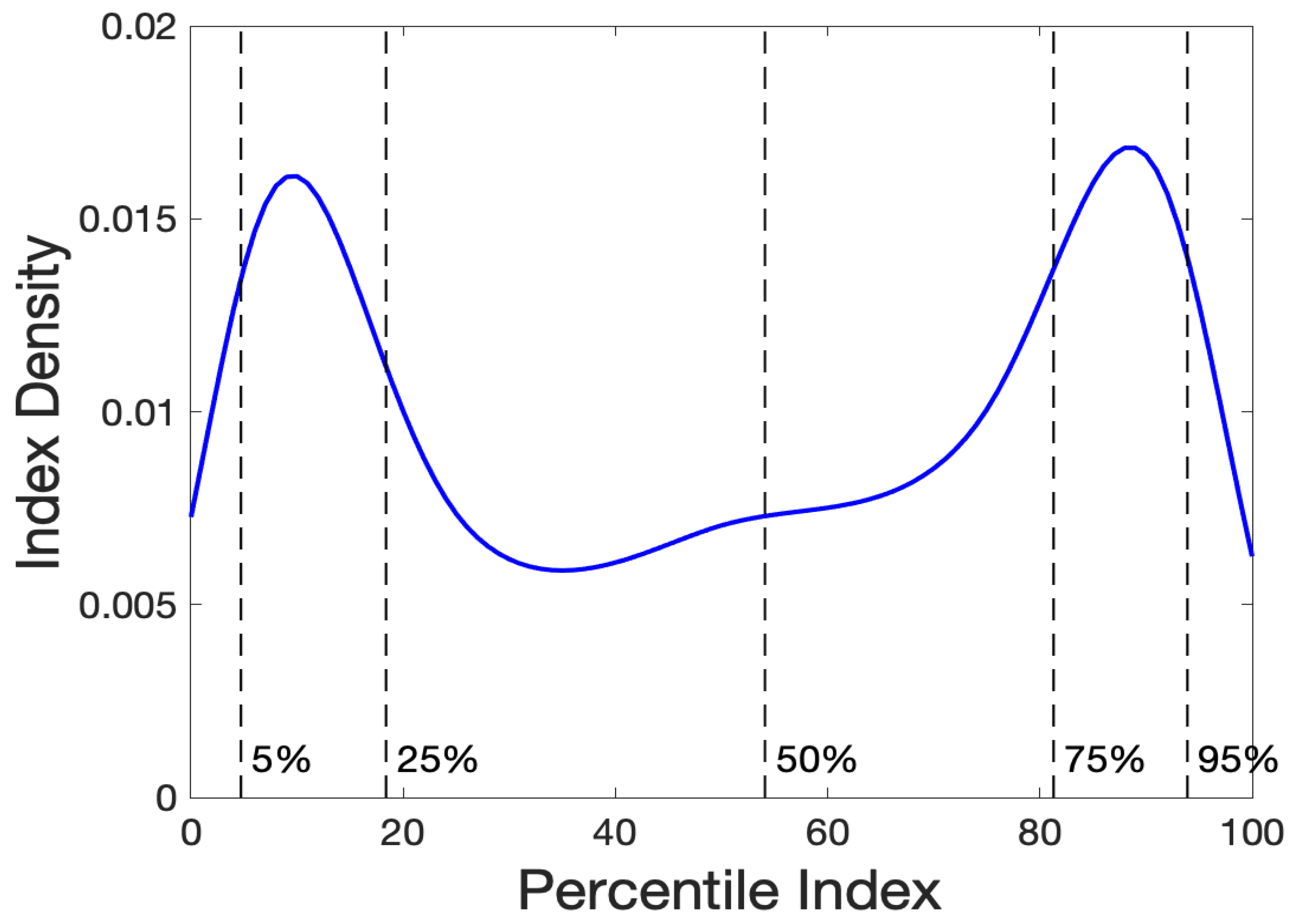
Initially, there were 18 and 14 patients with percentile index scores of 0 and 100, respectively; and by the 8th cycle these numbers had changed to 30 and 11, respectively. Figure 7 shows the probability density function for those patients not estimated to be on the boundary. After eight cycles, these index values are no longer strictly percentiles because they are not uniformly distributed. We see that the index values now tend to cluster into two groups, each containing about 25% of the respondents: very low and very high distress.
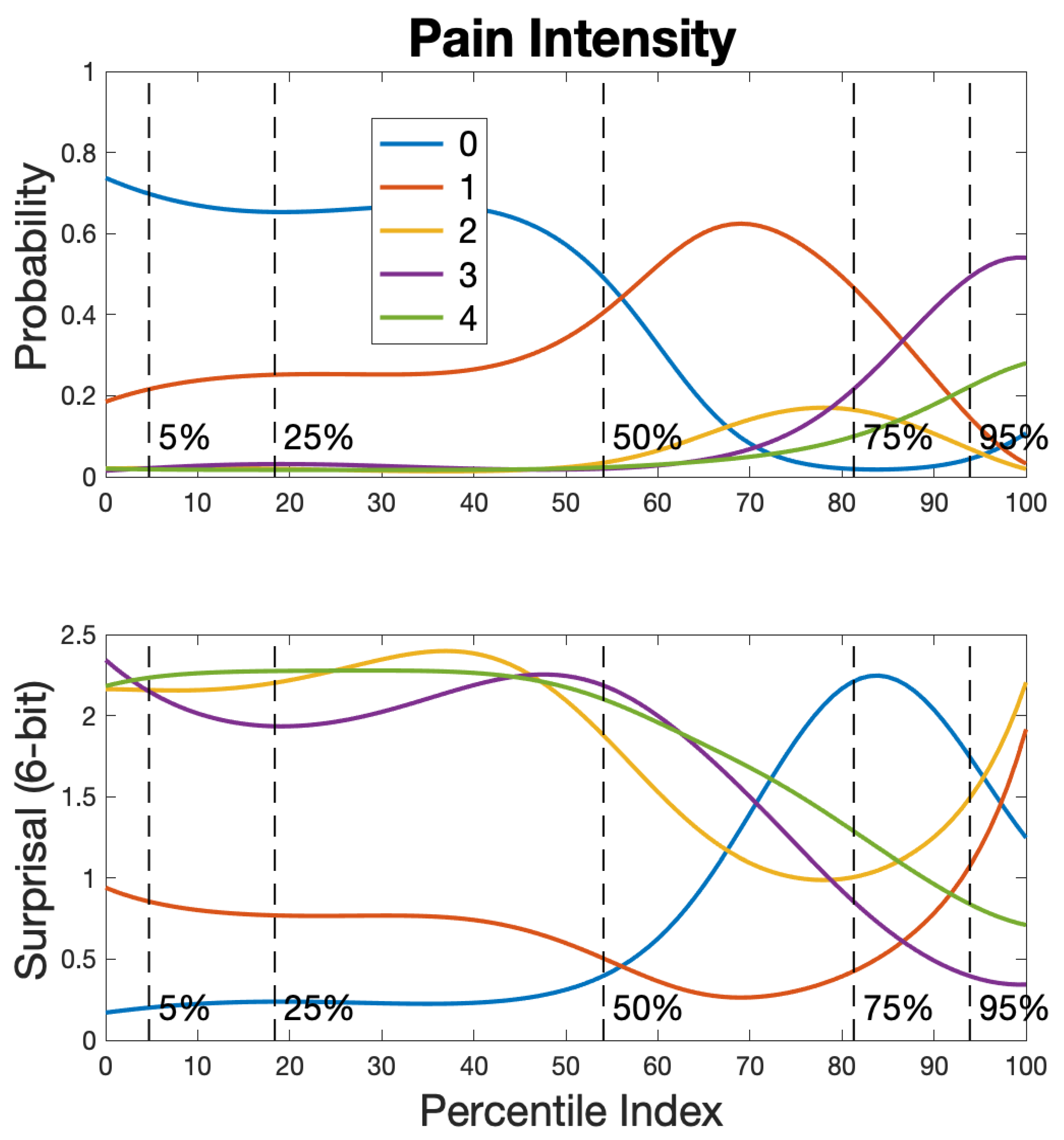
We displayed the initial estimate of surprisal curves for pain intensity for the lowest and highest levels in Figure 5. Figure 8 displays in the top panel the five pain intensity probability curves at convergence, and the bottom panel contains the corresponding surprisal curves. We now see roughly half the patients reported zero pain. This seems not unreasonable since there are cancer types that are considerably distressing overall, but are not associated with much actual pain. However, scores 2 and 4 are seldom chosen, and the score 3 is chosen exclusively by the most distressed patients.
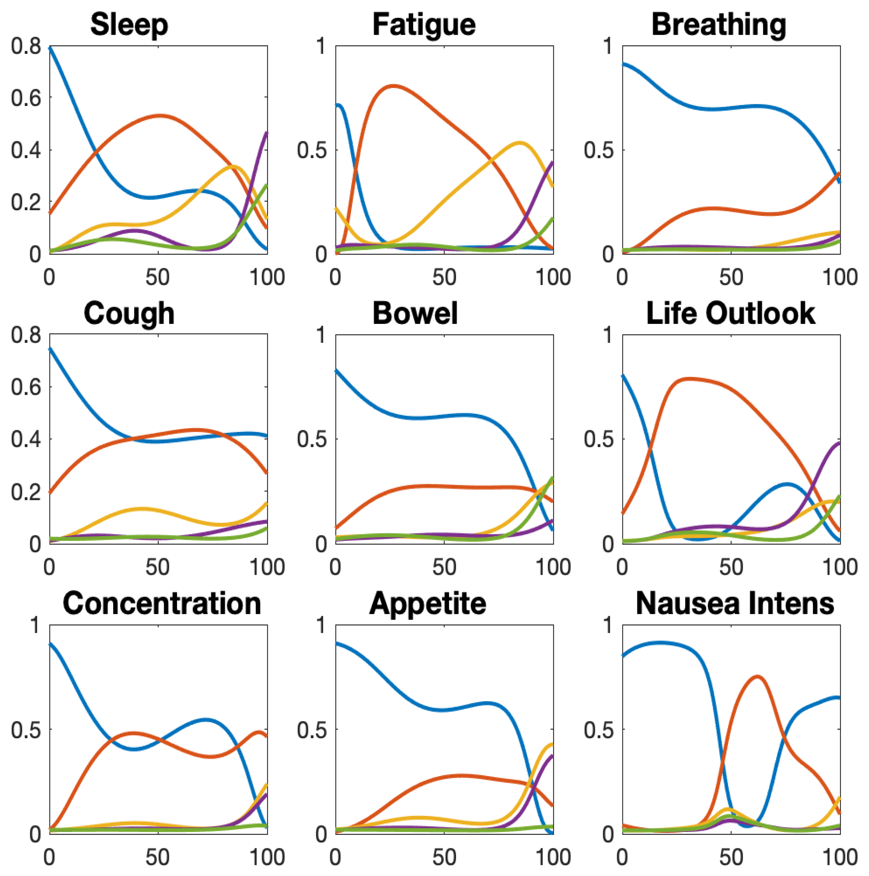
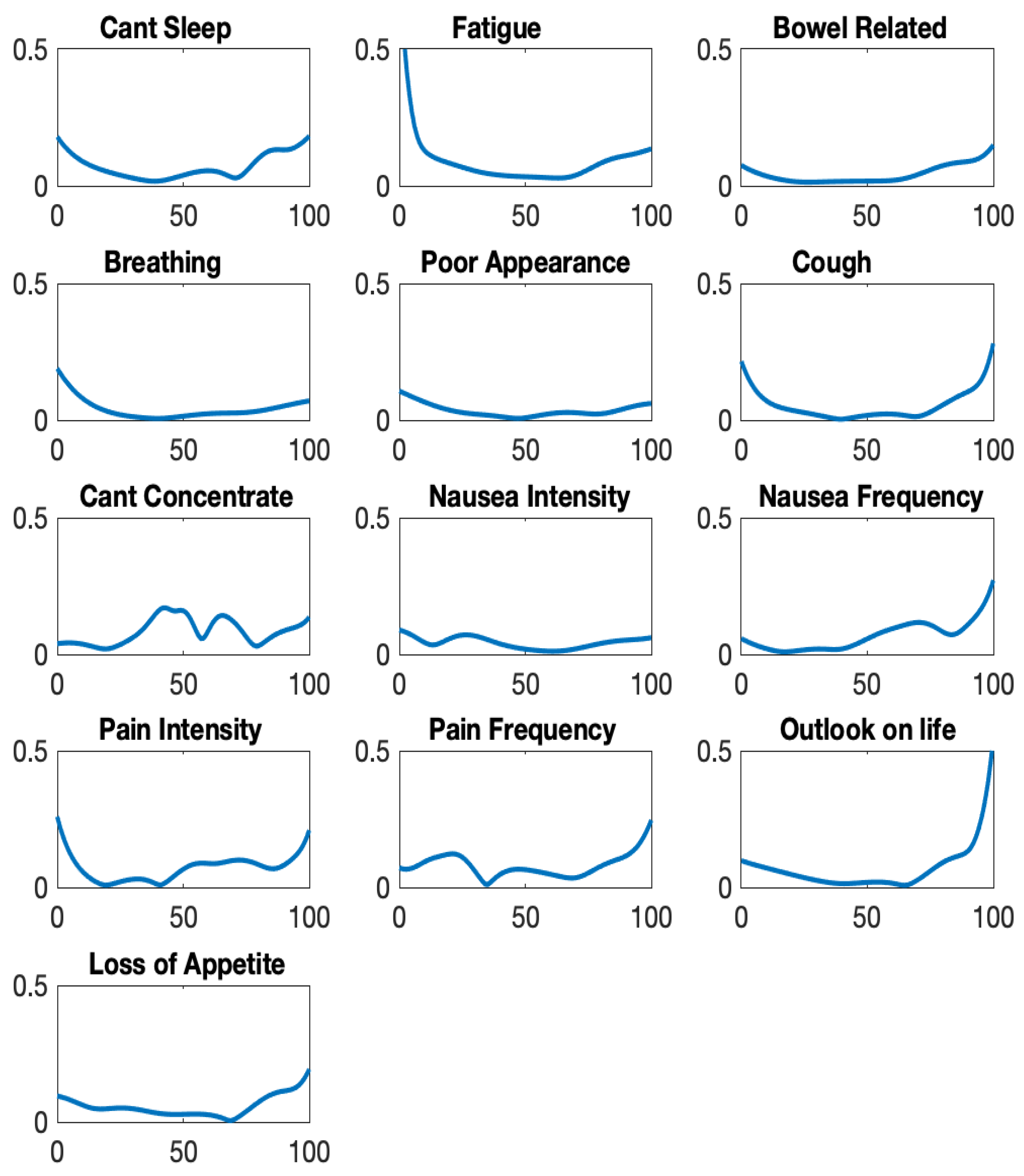
We selected nine of the 13 symptoms to provide a broad overview of how the probability curves vary across symptoms. Figure 9 shows that the first option with score 0 generally declines as the scale index increases, but displays more complex behaviour in case of the intensity of nausea. We note that the options scored 2 and 3 are seldom chosen except for rating sleep and fatigue, suggesting that the three options scored 0, 1 and 4 probably would suffice for the other items and for this patient population. The complexity of the shape variations argues strongly for preferring the flexibility of spline curves over most of the parametric proposals in the psychometric literature.
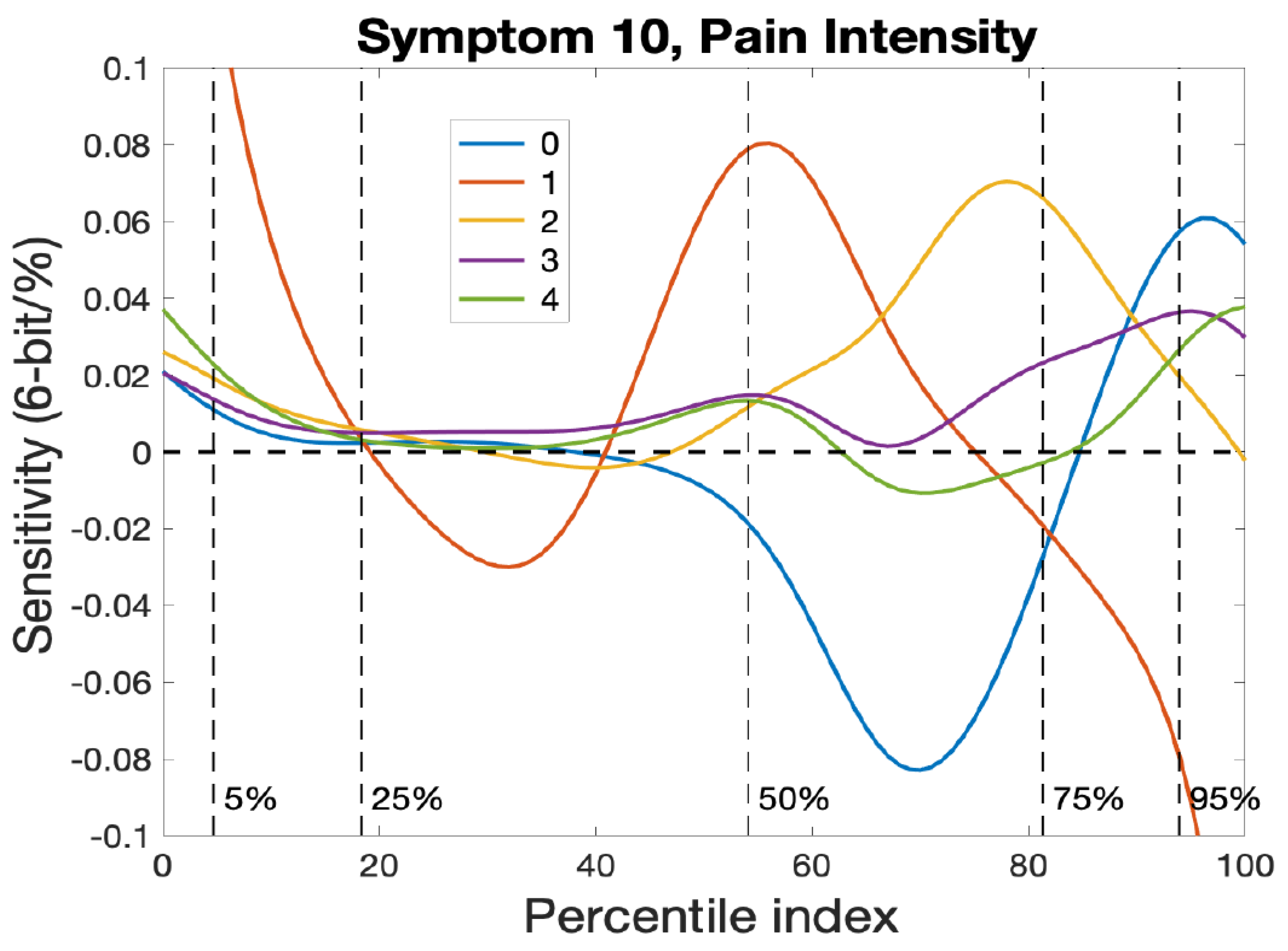
The sensitivity curves, , for pain intensity are displayed in Figure 10, where we see that the most important options for locating those with scores of 0, 1 and 3. The blue curve with score 0 indicates a decrease over the 50% to 75% interval and an increase at the 95% marker. The red curve (weight 1) suggests a score increase at 5% and 50% and a decrease beyond 75%, and is the only curve providing much location information over the entire bottom 50%. The yellow curve indicates an increase over the 75% marker and the green curve signals an increase for the top 95%. The unit is 6-bits per percentile, so that the maximum of the red curve represents a shift of about one 6-bit over 100 percentiles on the basis of the rating of 1 for pain intensity.
The sensitivity curve displays where an option is most effective in determining the location of a respondent on the axis. We also want to display the effectiveness of an entire question across possible values of . We can do this by what the question speed curve:
This measures in bits per percentile the rate of increase the position along the space curve defined for only a single question at location . Its integral
measures the distance along the question curve to position in the same way that we measure length along the entire scale curve to .
Figure 11 displays the speed curves for the 13 questions. We again see that the Symptom Distress Scale is, for most questions, best at locating respondent positions at the low and high ends of the percentile index continuum, and only the symptom “can’t concentrate” seems to be more informative for those in the 50% zone. Overall a speed of about 0.3 6-bits per percentile can be considered a high level of information about symptom distress. The symptoms most informative at the highest distress level are “cough”, “nausea intensity”, “pain frequency”, “outlook on life”, and “loss of appetite”.
The scale curve is a central concept in this paper because it alone among the four total scale scores has a metric that allows the comparison of differences across different locations. We used principal components analysis to rotate the scale curve into the most accurate two-dimensional image, which is shown in Figure 12. This displayed 98.5% of the shape variation of the curve. The curve was 30.3 6-bits long, or about 2.3 6-bits per question, again suggesting respondents were more often using only three levels rather than the five that were offered. The points indicate percentages of patients located at or below locations on the curve for patients not allocated to the boundaries. Visualized lengths do not correspond to 6-bit lengths since the distance between 5% and 25% substantially smaller than the distance between 75% and 95%. This display provides a vivid display of how severe distress really is for those in the high ranges. The equal spacings between assigned scores are not consistent with experience. Note that the scale curve changes direction between 25% and 75%, suggesting that severe symptom distress are associated with qualitatively different types of cancer–related experience.
7. Assessing Score Accuracy
We want to see how well the Symptom Distress Scale does its job as a measure of true distress. We now have four measures to choose from, each of which achieves a measure of accuracy. But what do we mean by “accuracy?” Whatever we mean, we are hardly surprised that it will vary over whatever measure we are assessing, simply because the data at hand are not distributed equally across the score ranges; we have much more data about measures for low-distress patients than about the upper 25% of patients. Moreover the structural details of each measure determine how it will be have at, say, the boundaries, as we saw for the two types of sum scores versus the percentile indices and scale curve distances. Percentile indices can pile up at both boundaries, while the scale curve distance must by its nature be zero at its left boundary. Consequently, we want to treat accuracy as itself a function of score value, that is, as a curve.
At any point accuracy must be expressed in two ways: first, in terms of its size and direction of its systematic deviation from the true value, and, second, in terms of how widely estimated values are dispersed around their mean over a large number of sets of data. The first component, the average of the estimate minus the true value, is bias and the second component is sampling variance. These are two structurally independent measures of accuracy. Mean-squared-error (MSE) is equal to the square of the bias plus the sampling variance, and a measure of total error expressed in the units of observation is root-mean-squared error (RMSE).
There are two ways to approach accuracy assignment: by mathematical analysis and by data simulation. The latter approach is in general safer in the sense of being more accurate, but simulation suffers from the computational overhead required to generate and analyze each set of random data. However, we can usually greatly decrease this overhead by assuming that the surprisal curves are known, and estimating the measures conditionally. This is relatively safe if we have a reasonably large number of respondents, and our experiments suggest that is sufficient. The simulation proceeds by selecting a mesh of true values of the percentile index, such as , and then simulating respondent choices at each of these values, followed by smoothing the results in order to produce reasonably accurate curves.
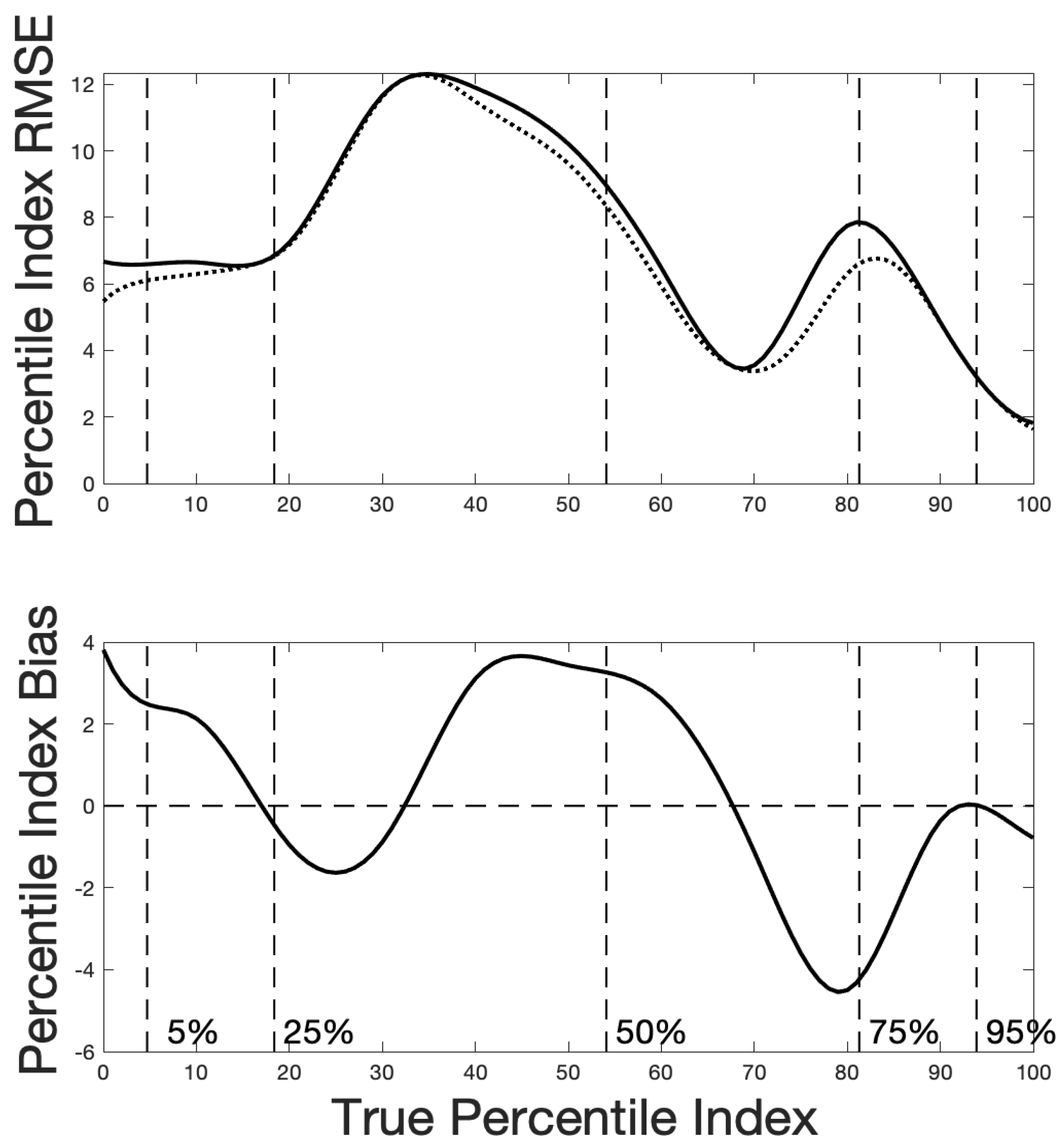
Figure 13 is based on 1000 simulated samples for each percentile index value constructed assuming that the surprisal curves were as we estimated them after eight cycles from the real data. The simulation and analysis took about ten minutes. The upper panel displays the RMSE of estimation of the percentile index as a solid curve, and the standard error as a dotted line. The latter is necessarily not larger than the RMSE, and in this case is very close to the RMSE for all index values. These curves display the same peaks that we saw in the distribution of estimated values as well as in observed and expected sum scores. On the whole the RMSE is about a tenth of the size of the interval [0,100], and this seems quite satisfactory given how short the scale is.
The bottom panel of Figure 13 displays the bias in the estimation of the percentile index. The bias curve for the sum score oscillates about zero as it should since it is known to be an unbiassed estimate. Although the expected score bias appears large in places, the upper panel indicates that the sampling variance is nearly equal to the RMSE, and therefore the squared bias is a small component of RMSE, and can be safely ignored.
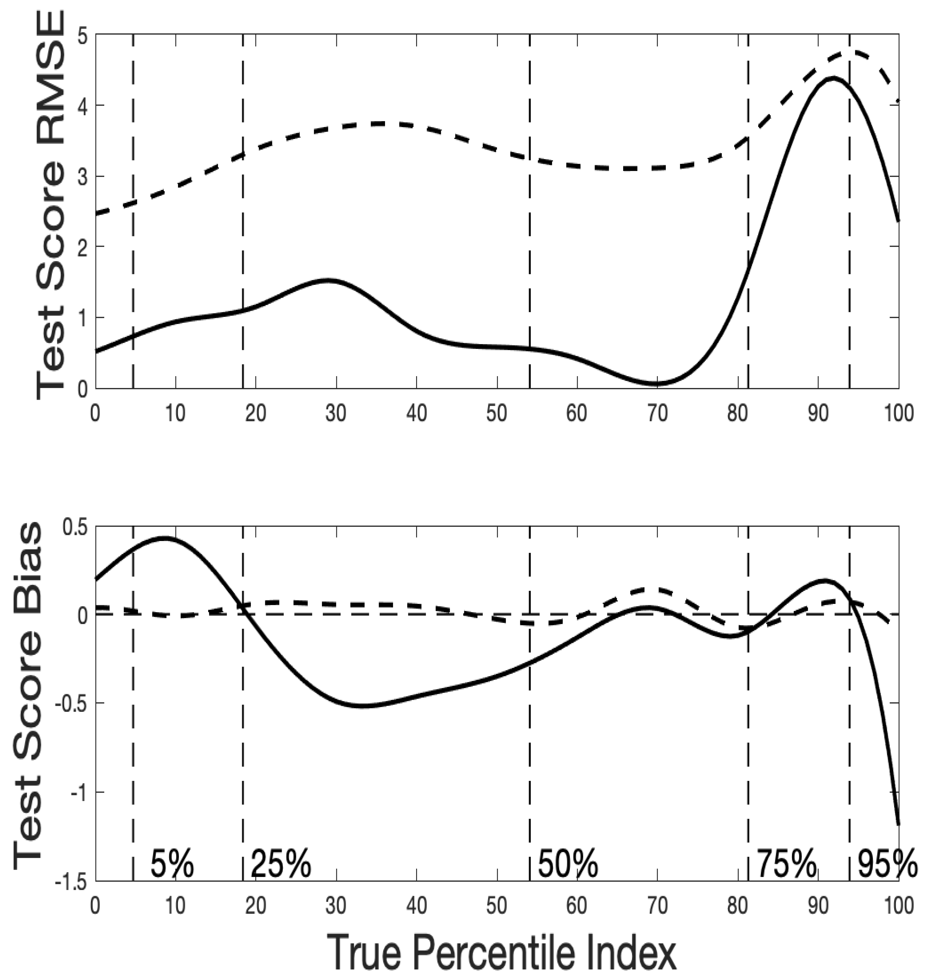
Figure 14 compares the accuracy of the observed sum score and its expected counterpart, plotted over the percentile index values that define each respondent’s expected score. In the upper panel we see that the expected sum score is far more accurate than the observed sum score for all but the top 25% of patients. Within the top 25% the expected score RMSE approaches more closely that of the sum score, which we explain by recalling from Figure 1 that there are relatively fewer patients in this distress level. The average ratio of RMSE for the sum and expected scores over the first 75% is around 4 to 1, respectively. As a rule in data analysis the mean squared error (MSE) tends to increase in proportion to sample size, and this implies that a scale having a observed sum score accuracy equal to that of this scale’s expected score accuracy would have to be about 16 times as long. Since the expected score is a function of , the RMSE and bias curves in Figure 13 can consequently be considered of high quality.
Figure 15 offers a direct comparison of the four score options. Each score has been normalized by dividing by an appropriate maximum value and multiplying by 100, a process we call “percentile-normalization. The horizontal axis is percentile-normalized scale curve distance, and its metric property implies, for example, that the meaning of moving from 0 to 20 is the same as that for moving from 80 to 100. The percentile index exhibits only minor departures from the metric, but the expected sum score severely underestimates experience over the upper 80% and over-estimates experience near zero. The observed sum score does a terrible job, being both extremely noisy, and systematically mis-representing all three of the other scores. Clearly it should not be used.
8. Software Notes
The run-times quoted, the simulations and all of the graphics in this paper are for code in Matlab [16], and the code itself is available by ftp from www.functionaldata.org along with the Symptom Distress Scale data. At the time of writing a package in R, TestGardenerR, is being prepared which will also contain demonstration analyses and data.
Our principal form of dissemination is via the web site http://testgardener2019.azurewebsites.net. From there a stand-alone application called TestGardener coded in C++ can be downloaded. Also available is an extensive manual, and a manuscript on the psychometric theory written for readers possessing only a secondary school level of mathematics. The web site also contains a web-based version of TestGardener that can be used to analyze small to medium-sized data sets.
The software and resources were develop with academic testing data in mind, but this paper aims to show that there is essentially no difference between the structures of testing and rating scales, and the performance improvements over sum-scored instruments are even more impressive for the type of relatively short rating scales that one sees in practice.
9. Discussion and Conclusions
Surprisal is hardly a new idea. In mathematical information theory, a recent text being [17], the central concept is entropy, a measure of uncertainty. Entropy is just the average or expectation of surprisal, , and therefore measured strictly in 2-bits. The term surprisal was first introduced by the physicist [18] in a text on thermodynamics, where it is now widely used. In mathematical psychology theory of choice as represented by [11], it is referred to as the “strength” of a choice. The log-odds ratio and negative log likelihood are statistical quantities that are, in effect, surprisal values. The Kullback-Leibler distance, , is the loss in information or surprisal if the probabilities are assumed to be when they are really [19] went so far as to argue for the replacement of probability theory by information theory as the bedrock of statistical reasoning. We think that he had it right: probability is a ratio that removes the measurement property from surprisal. That is, probability should be seen as a (usually unnecessary) simplification or degradation of a more useful and fundamental quality.
Working with surprisal instead of probability as a data and model object dramatically simplified the mathematics and its interpretation. It also changed the troublesome task of obeying the 0/1 constraints on multinomial vectors into what is essentially a mildly nonlinear least squares curve-fitting problem that permitted estimating hundreds of curves on each cycle in a second or so. Surprisal also considerably accelerated the optimization of negative log likelihood, itself a surprisal, for estimating the best percentile index value for each respondent. The computational overhead of scale analysis using TestGardener for even hundreds of thousands of respondents is essentially negligible from a practical perspective, and therefore on a par with simple sum scoring.
There is a similar degradation relationship between correlational measures such as Cronbach’s coefficient and . Correlation is a ratio that removes any measurement properties in the two quantities being compared. Even worse, it also ignores, by reducing the comparison to a single number, the possibility that two measured quantities should be compared point-wise because the communality of their properties varies over . The interpretation of a correlation is vague; what actually does mean? Like the hypothesis testing threshold , its status is decided solely by the subjectively determined consensus that gets established within communities that lack better tools. We learn far more from plots like Figure 13, Figure 14 and Figure 15.
The improvements in scale score accuracy that we have demonstrated are due to a number of factors. The decision to represent scale scores over a familiar closed interval not only brings interpretational and computational benefits, but also represents what we think is a realistic view of what a rating scale assesses, namely that respondents can be usefully located on a continuum that provides not only rank order, but also some indication of whether two respondents are close to each other or far apart. Also, that there are respondents who fall off the scale on one side or the other, and consequently should receive boundary scores. The flexibility and the speed of computation of spline curves fit naturally with this closed interval representation and effectively eliminated any great concern over curve bias.
The only role that the pre-assigned option scores values 0 to 4 played in our analyses was to provide an initial set of N percentile index values. Expressed in terms of the scale curve that we were able to estimate, the sum scores provisional ordering and orientation of the curve that we were able to then refine over several cycles, along with respondent’s locations. Once the cycles commenced, the option weights ceased to be used. Moreover, it became obvious that the equal spacing between weights did not hold in terms of locations on the space curve. Any similarly ordered weights could served the analysis just as well, including just binary “distressed/not distressed” designations.
The optimization strategy used in this paper appears to work well for sample sizes as large as 1000 in the sense that convergence to a stable value is smooth and fast. Our comparisons with the joint optimization of surprisal curves and respondent scores using parameter cascading used in [3] suggest that alternating optimization achieves the same level of fit for sample sizes in this range. However, we need to understand better what happens with sample sizes of below 500, and how we might improve both optimization approaches so as to yield qualities of estimation that improve on sum scoring.
Switching from terminology like “latent variable” to “index” may seem uninteresting from a mathematical perspective, but is profound for communicating with scale users and respondents. Indexing systems can be chosen in an infinite number of ways to meet various communication objectives, but the term “variable” conveys a rigid inevitable choice, and thus has been a source of much confusion in the interface between statistical/mathematical jargon and street-level language.
Which score should we use? Figure 14 taken by itself might be taken as sufficient evidence that the expected score is the best choice. However, its behaviour at the extremes seems implausible, and neither does the reliance on standard choices of option weights such as integers 0 to 4. On the other hand, Figure 15 reveals, along with our experience with other data sets, that the percentile index and arc length are highly co-linear, and have the appropriate boundary comportment. We like the bit-measure for what are probably essentially technical reasons, and re-normalizing arc length to be a percentile index might work just fine when communicating on a non-mathematical level.
When we have curve representations for two or more sets of data, the comparison of curves is done using curve registration. In psychometrics we use test equating methods. For traditional methods see [20], for model-based kernel equating refer to [21] and on how to perform the most common methods refer to [22].
We acknowledge that it would be useful to have a comparison of the estimation performance of our approach to that of parametric models, such as the heterogeneous graded response and the partial credit models. Our main objective is to demonstrate the large gains in accuracy of curve and intensity estimates are achievable by the use of IRT. The lower dimensional curves defined by models such as the two-parameter graded response and partial credit models have the interpretational advantage of having the parameters a and b that directly reflect what we call sensitivity and location, but the disadvantage of being unable to capture more complex variation such as we see in Figure 8 and Figure 9. We believe, however, that these and other simple IRT models would also deliver significant improvement in intensity estimation accuracy over that provided by the sum score, and have already reported on this in in the multiple choice testing context in [15].
The design, execution and report for a simulation-based comparison of models is significant undertaking, and would need to based on data from real-life scales with much larger numbers of respondents. We are about to acquire such datasets and will report these model comparisons in forthcoming publications.
Author Contributions
Conceptualization, J.R. and M.W.; methodology, J.R.; software, J.L. and J.R.; validation, J.L., J.R. and M.W.; formal analysis, J.L., J.R. and M.W.; investigation, J.L., J.R. and M.W.; resources, J.L., J.R. and M.W.; data curation, J.L., J.R., and M.W.; writing–original draft preparation, J.R.; writing–review and editing, J.L., J.R. and M.W.; visualization, J.L., J.R. and M.W.; supervision, J.R.; project administration, J.R.; funding acquisition, M.W. All authors have read and agreed to the published version of the manuscript.
Funding
This research was partially funded by Swedish Wallenberg MMW 2019.0129 grant.
Acknowledgments
We are greatly indebted to Lisa Lix in the Department of Nursing for supplying us with these data.
Conflicts of Interest
The author declare no conflict of interest. The funders had no role in the design of the study; in the collection, analyses or interpretation of data; in the writing of the manuscript, or in the decision to publish the results.
References
- McCorkle, R.; Young, K. Development of a symptom distress scale. Cancer Nurs. 1978, 1, 373–378. [Google Scholar] [CrossRef] [PubMed]
- Thissen, D.; Wainer, H. (Eds.) Test Scoring; Lawrence Erlbaum Associates: Mahwah, NJ, USA, 2001. [Google Scholar]
- Ramsay, J.O.; Wiberg, M. A strategy for replacing sum scoring. J. Educ. Behav. Stat. 2017, 42, 282–307. [Google Scholar] [CrossRef]
- Ramsay, J.O.; Li, J.; Wiberg, M. Full information optimal scoring. J. Educ. Behav. Stat. 2020, 45, 297–315. [Google Scholar] [CrossRef]
- Ramsay, J.O. Kernel smoothing approaches to nonparametric estimation of item characteristic functions. Psychometrika 1991, 56, 611–630. [Google Scholar] [CrossRef]
- Ramsay, J.O. A geometrical approach to item response theory. Behaviormetrika 1996, 23, 3–17. [Google Scholar] [CrossRef] [Green Version]
- Rossi, N.; Ramsay, J.O.; Wang, X. Nonparametric item response function estimation estimates with the EM algorithm. J. Educ. Behav. Stat. 2002, 27, 291–317. [Google Scholar] [CrossRef] [Green Version]
- Muraki, E.; Muraki, M. Generalized partial credit model. In Handbook of Item Response Theory, Volume 1, Models; van der Linden, W., Ed.; CRC Press: Boca Raton, FL, USA, 2016. [Google Scholar]
- Samejima, F. Graded response models In Handbook of Item Response Theory, Volume 1, Models; van der Linden, W., Ed.; CRC Press: Boca Raton, FL, USA, 2016. [Google Scholar]
- Bock, R.D. Estimating item parameters and latent ability when responses are scored in two or more nominal categories. Psychometrika 1972, 37, 29–51. [Google Scholar] [CrossRef]
- Luce, R.D. Individual Choice Behavior: A Theoretical Analysis; Wiley: New York, NY, USA, 1959. [Google Scholar]
- Masters, G.N. Partial credit model. In Handbook of Item Response Theory, Volume 1, Models; van der Linden, W., Ed.; CRC Press: Boca Raton, FL, USA, 2016. [Google Scholar]
- Ramsay, J.O.; Silverman, B.W. Functional Data Analysis; Springer: New York, NY, USA, 2005. [Google Scholar]
- Ramsay, J.O.; Hooker, G.; Graves, S. Functional Data Analysis in R and Matlab; Springer: New York, NY, USA, 2009. [Google Scholar]
- Wiberg, M.; Ramsay, J.O.; Li, J. Optimal scores—An alternative to parametric item response theory and sum scores. Psychometrika 2019, 84, 310–322. [Google Scholar] [CrossRef] [PubMed]
- The Mathworks, Inc. MATLAB Version 9.7.0.1190202 (R2019b); Mathworks: Natick, MA, USA, 2019. [Google Scholar]
- Cover, T.M.; Thomas, J.A. Elements of Information Theory; Wiley-Interscience: New York, NY, USA, 2006. [Google Scholar]
- Tribus, M. Thermodynamics and Thermostatistics: An Introduction to Energy, Information and States of Matter, with Engineering Applications; Van Nostrant ReinHold: New York, NY, USA, 1961. [Google Scholar]
- Kullback, S. Information Theory and Statistics; Wiley: New York, NY, USA, 1959. [Google Scholar]
- Kolen, J.J.; Brennan, R.L. Test Equating, Scaling and Linking Methods and Practices, 3rd ed.; Springer: New York, NY, USA, 2014. [Google Scholar]
- Von Davier, A.A.; Holl, P.W.; Thayer, D.T. The Kernel Method of Test Equating; Springer: New York, NY, USA, 2004. [Google Scholar]
- Gonzalez, J.; Wiberg, M. Applying Test Equating Methods Using R; Springer: Cham, Switzerland, 2017. [Google Scholar]
Figure 1.
The stepped line shows the proportion of the patients who received each of the observed score values for the Symptom Distress Scale. The solid smooth curve is a smooth fit to to these proportions. The vertical dashed lines in this and subsequent plots indicate horizontal axis values below which the indicated percents of the respondents fall.

Figure 2.
The two-dimensional probability surface defined by the retraction (1) of a three-dimensional lattice constructed from 21 equally-spaced numbers between −3 and 3. The curved and straight curves are the the plots of the transformed X and Y coordinate lines, respectively, within the 2D plane.

Figure 3.
Two views of the two dimensional surprisal surface defined by the retraction (2) of a three-dimensional lattice constructed from 21 equally-spaced numbers between −3 and 3. The red lines contain the transformed points on the coordinate lines in the original surface. These coordinate lines are curved in the 3-D ambiant space, but contained within planes.

Figure 4.
The order 4 spline basis functions defined by the knot locations indicated by vertical dotted lines.
Figure 4.
The order 4 spline basis functions defined by the knot locations indicated by vertical dotted lines.

Figure 5.
The surprisal curves and surprisal data values for intensity of pain for the option scored 0 and for the option scored 4. Surprisal values corresponding to zero bin proportions are plotted at value 2.21. These results are for the initial estimate of surprisal curves.
Figure 5.
The surprisal curves and surprisal data values for intensity of pain for the option scored 0 and for the option scored 4. Surprisal values corresponding to zero bin proportions are plotted at value 2.21. These results are for the initial estimate of surprisal curves.

Figure 6.
The flowchart for the steps in the analysis of the Symptom Distress Scale data.

Figure 7.
The distribution of percentile index values after eight cycles of curve/index estimation for those patients not assigned to one of the boundaries.
Figure 7.
The distribution of percentile index values after eight cycles of curve/index estimation for those patients not assigned to one of the boundaries.

Figure 8.
The top panel displays the probability curves and bottom panel displays the surprisal curves for pain intensity.
Figure 8.
The top panel displays the probability curves and bottom panel displays the surprisal curves for pain intensity.

Figure 9.
The five probability curves for nine of the symptoms. The horizontal axis is the percentile index and the vertical axis is the probability .
Figure 9.
The five probability curves for nine of the symptoms. The horizontal axis is the percentile index and the vertical axis is the probability .

Figure 10.
The sensitivity curves for pain intensity.

Figure 11.
The speed curves for all 13 symptoms. The horizontal axis is the percentile index and the vertical axis is the rate of change of location along each question space curve in 6-bits per percentile.
Figure 11.
The speed curves for all 13 symptoms. The horizontal axis is the percentile index and the vertical axis is the rate of change of location along each question space curve in 6-bits per percentile.

Figure 12.
The scale curve displayed in the two dimensions that contain 98.5% of its shape variation. The points indicate percentages of patients not allocated to the boundaries whose distress level falls at or below a location.
Figure 12.
The scale curve displayed in the two dimensions that contain 98.5% of its shape variation. The points indicate percentages of patients not allocated to the boundaries whose distress level falls at or below a location.

Figure 13.
The top panel displays by a solid curve the RMSE relative to the true values of the percentile index. The standard error is shown as a dotted curve, which necessarily is not larger that RMSE. The bottom panel displays the bias curve.
Figure 13.
The top panel displays by a solid curve the RMSE relative to the true values of the percentile index. The standard error is shown as a dotted curve, which necessarily is not larger that RMSE. The bottom panel displays the bias curve.

Figure 14.
The top panel displays the RMSE of the expected score (solid curve) and of the sum score (dashed curve). The bottom panel displays the two bias curves.
Figure 14.
The top panel displays the RMSE of the expected score (solid curve) and of the sum score (dashed curve). The bottom panel displays the two bias curves.

Figure 15.
A comparison of percentile index, observed and sum scores against the benchmark of scale score distance or arc length. The scale score distance and expected scores have been “percentile-normalized” by dividing them by their respective maximum values and then multiplying them by 100. Observed sum scores were normalized by the expected score normalization.


Table 1.
The distress experiences in the Symptom Distress Scale.
| 1. Inability to sleep | 5. Coughing | 9. Intensity of pain |
| 2. Fatigue | 6. Inability to concentrate | 10. Frequency of pain |
| 3. Bowel-related symptoms | 7. Intensity of nausea | 11. General outlook on life |
| 4. Breathing-related symptoms | 8. Frequency of nausea | 12. Loss of appetite |
| 13. Deterioration of appearance |
Publisher’s Note: MDPI stays neutral with regard to jurisdictional claims in published maps and institutional affiliations. |
© 2020 by the authors. Licensee MDPI, Basel, Switzerland. This article is an open access article distributed under the terms and conditions of the Creative Commons Attribution (CC BY) license (http://creativecommons.org/licenses/by/4.0/).
Share and Cite
MDPI and ACS Style
Ramsay, J.; Li, J.; Wiberg, M. Better Rating Scale Scores with Information–Based Psychometrics. Psych 2020, 2, 347-369. https://0-doi-org.brum.beds.ac.uk/10.3390/psych2040026
AMA Style
Ramsay J, Li J, Wiberg M. Better Rating Scale Scores with Information–Based Psychometrics. Psych. 2020; 2(4):347-369. https://0-doi-org.brum.beds.ac.uk/10.3390/psych2040026
Chicago/Turabian StyleRamsay, James, Juan Li, and Marie Wiberg. 2020. "Better Rating Scale Scores with Information–Based Psychometrics" Psych 2, no. 4: 347-369. https://0-doi-org.brum.beds.ac.uk/10.3390/psych2040026