Why Not a Single Image? Combining Visualizations to Facilitate Fieldwork and On-Screen Mapping


1
Research Centre of the Slovenian Academy of Sciences and Arts, Novi trg 2, 1000 Ljubljana, Slovenia
2
Centre of Excellence for Space Sciences and Technologies, Aškerčeva 12, 1000 Ljubljana, Slovenia
*
Author to whom correspondence should be addressed.
Remote Sens. 2019, 11(7), 747; https://0-doi-org.brum.beds.ac.uk/10.3390/rs11070747
Submission received: 28 February 2019
/
Accepted: 20 March 2019
/
Published: 27 March 2019
(This article belongs to the Special Issue Archaeological Remote Sensing in the 21st Century: (Re)Defining Practice and Theory)
Abstract
:Visualization products computed from a raster elevation model still form the basis of most archaeological and geomorphological enquiries of lidar data. We believe there is a need to improve the existing visualizations and create meaningful image combinations that preserve positive characteristics of individual techniques. In this paper, we list the criteria a good visualization should meet, present five different blend modes (normal, screen, multiply, overlay, luminosity), which combine various images into one, discuss their characteristics, and examine how they can be used to improve the visibility (recognition) of small topographical features. Blending different relief visualization techniques allows for a simultaneous display of distinct topographical features in a single (enhanced) image. We provide a “recipe” and a tool for a mix of visualization techniques and blend modes, including all the settings, to compute a visualization for archaeological topography that meets all of the criteria of a good visualization.
1. Introduction
Many advanced visualization techniques for presenting high-resolution elevation data, such as airborne laser scanning (ALS)-derived elevation models, have been developed specifically for archaeological purposes or have been adapted from other scientific fields. Their usefulness for detection and interpretation of a variety of topographic forms has been demonstrated in several scientific papers and day-to-day practices, though the choices of visualizations are largely based on intuitive personal preferences.
Currently there is a lack of explicit workflows, conventions, and frameworks for visualizing remote sensing data for archaeological exploration. Some scientific fields have already experienced this requirement for optimization, transparency, and reproducibility of visualization methods. Medical diagnostics, for example, has been facing difficulties of integrating spatial information obtained from imaging data for many years, which finally led to the development of standardizations [1,2]. Hence, it makes sense to strive for unification of visualization methods also in archaeology and cultural heritage management, as well as other disciplines (e.g., geomorphology, geology, natural resource management, glaciology) that use visualized airborne laser scanning data. The need for common practice is becoming more pressing with increasing availability of national lidar datasets and resulting large-scale (national) mapping projects, where there is a need for homogeneous, reliable, and comparable results from multiple interpreters. This also raises the issue of effective training which benefits from clear objectives and standards, competent instructors, and supported by appropriate data, methods, and tools. We suggest that archaeological applications of ALS-derived visualizations often suffer from a lack of rigor and explicitness in choices of visualization method, with little consideration of theoretical grounding, thorough review, or systematic testing on-screen and in the field. Indeed, there is a tendency to default to using ‘as many techniques as possible’, which is a difficulty as this is resource intensive and the cost/benefits for information return are not quantified. These issues are exacerbated by the proliferation of available methods, a sample of which is described in Section 2.2.
In this paper, we show that while different visualizations determine each information layer, image fusion with blend modes may maximize combined information. We also argue that different blend modes enhance the visibility (recognition) of small topographical features on the final combined visualization. We describe a method that uses blend mode techniques for combining visualizations into a single, enhanced image—a visualization for archaeological topography (Figure 1)—that preserves the positive characteristics of input images, while keeping information loss at a minimum. This is in line with the arguments of Borland and Russell [3], who reason that if the aim of a visualization is to effectively convey information to viewers, then we should also aim to ensure visualizations intended for scientific use are accurate, unbiased, and comparable.
The authors recognize the importance of exploration in research and are not arguing against the need to ‘see more than one image’—on the contrary, we support that premise but believe that the properties and utility of visualizations for tasks at hand should be properly understood. In support of this, we discuss the properties of a good visualization and propose a theoretical and practical framework for how such properties could be achieved. However, in setting out our proposed visualization for archaeological topography, we put it forward as a contribution to developing efficient and comparable outputs from archaeological mapping from ALS derivatives. Indeed, we do not believe that it should become the ‘go to’ choice before it has been more thoroughly discussed and compared with other similar ‘hybrid’ visualizations. The framework, however, provides a starting point for discussion. We believe that archaeological and historical management practices will benefit from a best-practice workflow that will ensure at least basic comparison of mapping results across different research groups, between regions, and internationally. This requires a set of guidelines on what works and what does not, and for conventions for visualizations that do not simply reflect ‘local’ personal or institutional preferences.
The paper first provides some background on why we have decided to use simple two-dimensional (2D) terrain representations, i.e., raster elevation models (Section 2.1). This is followed by information on how recognition of small-scale features can be enhanced with various visualization methods (Section 2.2), which provides the background to explaining why blend modes to combine information from different visualizations are useful (Section 2.3). In Section 3.1, we describe our case study areas, ALS data, and their processing procedures. We proceed with the description of visualization methods (Section 3.2) and blend modes (Section 3.3). The effects of blend modes on ALS data visualizations are described in Section 4.1 and this knowledge is then used to construct the visualization for archaeological topography, explained in Section 4.2. We discuss the results in Section 5 and provide conclusions in Section 6.
2. Background
2.1. The Logic Behind Using Two-Dimensional Terrain Representations
It is beyond the scope of this paper to deeply explore the benefits and drawbacks of mapping in a two- or three-dimensional environment. We chose to focus on 2D terrain representations (i.e., raster elevation models), because the products computed from a raster elevation model, especially various visualizations, still form the basis of most archaeological and geomorphological inquires of lidar data—even if they are later displayed in a seemingly 3D environment. Potree [4] and similar viewers now enable fast and reliable display of a lidar point cloud and the properties of single points, including, for example, RGB colors rendered from a photo camera, in a seemingly 3D environment. However, it is still beyond the average practitioner to successfully investigate or map from a large lidar dataset in 3D.
The preference for either 3D or 2D is neither obvious nor definite, but depends on the dataset, task, and context [5,6,7]. 3D visualization comes with increased complexity, where one of the most obvious issues is occlusion [5,8,9]; some parts of terrain (or structures) make it difficult to view others that are partially or completely hidden behind them. If the image is static rather than interactive, which does not make it possible to rotate the view point, the occluded data is effectively lost [8]. Even if people can move their viewpoint, there are issues of projection and perceptual ambiguity. Additionally, pseudocoloring in a 3D environment and simultaneous use of shading can interfere with each other [9,10], making visualizations harder to read or, worse, cause incorrect data analysis [8]. While 2D visualizations are simpler in certain regards, their main advantage is that they allow all the data to be seen at once. Numerous studies have confirmed that 2D visualizations are more comprehensible, accurate, and efficient to interpret than 3D representations for tasks involving spatial memory, spatial identification, and precision [5,11,12]. For these reasons, while we recognize the desirability of working in 3D environments, we believe that routine practice will remain heavily dependent on 2D representations for some time yet.
2.2. Enhancing Visibility of Small-Scale Features With Visualizations
Logical and arithmetical operations, classification, visibility analysis, overlaying procedures, and moving window operations can be used to enhance the edges of features or otherwise improve their recognition. Multiple studies compare the various visualization techniques (see e.g., References [13,14,15,16,17]), including the visualization guidelines by Kokalj and Hesse [18]. Some techniques are simple to compute, e.g., analytical hillshading and slope gradient, while others are more complex, e.g., sky-view factor [13], local relief model [19], red relief image map [20], multidirectional visibility index [21], or multiscale integral invariants [22]. While the first set of techniques focus on small-scale topographical forms, the latter consider topographic change of varying size and express it in a single image, similar to multiscale relief model [23]. An interesting approach uses a combination of a normalized digital surface model (nDSM) or a canopy height model (CHM) and shaded relief or a grayscale orthophoto image that help evaluate the immediate environment of archaeological features, especially when covered by forest. An approach that is especially effective in visualizing hydrological networks was proposed by Kennelly [24] who combined relief hillshading and curvature. In addition, a number of image processing local filters can be applied to the elevation model in order to detect high frequency variation (e.g., Laplacian, Sobel’s, Robert’s filters, unsharpen mask). The simplest is the Laplacian filter, specifically designed for local edge detection, i.e., emphasizing sharp anomalies [15]. Because edge detection filters emphasize noise, they are often applied to images that have been first smoothed to a limited extent—e.g., Laplacian-of-Gaussian. Because so many methods exist, there are even studies that propose techniques to analytically assess the efficacy of various visualizations [25]. Among the dozens of techniques that can be applied to visually represent terrain characteristics, not all are easily interpretable, some introduce artifacts or give very different results in different areas. Some are intended to improve detection rates of new features and therefore visually exaggerate the small differences, while others strive for comparability between different areas and therefore for uniform representation of features with similar characteristics. We have to consider that the basic concepts of visualizations, their characteristics, advantages, and disadvantages must be understood by the user to successfully apply them. This is especially important because many processing methods are increasingly available as free tools or collections of tools [26,27] and a great variety of image manipulation functionality is likely to confuse or overwhelm the untrained or uncritical user. We believe there is a need to enhance the existing 2D visualizations and create meaningful image combinations that preserve relevant (positive) characteristics of individual techniques. Bennett et al. [14] have found that among the techniques they reviewed, no single one recorded more than 77% of features, whereas interpretation from a group of any three visualizations recorded more than 90%. Similarly, studies from various research fields showed images or visualizations are often easier to interpret if different visualizations of the same study subject are fused or layered one over another [28,29], combining their information.
2.3. Combining Information From Different Visualizations with Blend Modes
Image fusion is a process of combining information from multiple images into a single composite image [30]. Verhoeven et al. [31] report on the various pixel-based image fusion approaches, e.g., blend modes (methods), pan-sharpening, distribution fitting, and others, that are implemented in the Toolbox for Archaeological Image Fusion (TAIFU). Filzwieser et al. [32] describe their use for integrating images from various geophysical datasets for archaeological interpretation and especially for targeted examination of buried features. They report that interpretation of combined (fused) geophysical imagery enables more explicit observation of the extent of archaeological remains and is more revealing than any of the individual input datasets.
Blend modes are relatively simple to comprehend and implement, do not require a multitude of adjustable parameters, and may be efficient and reliable. They are, therefore, used to enhance images for visual interpretation in a variety of scientific applications, in archaeology [31,32,33], cartography [34], medicine [35], and mineralogy [36], where blending enhances images with subtle colors or increases the edge contrast, and thus improves visual interpretability. Extensive research has been done on fusion of medical images from different data sources—such as computed tomography (CT), positron emission tomography (PET), and magnetic resonance imaging (MRI). Image fusion algorithms used in medical imaging closely resemble the blending functionality available in image editing software (e.g., simple fusion algorithm with maximum method [37] is equivalent to the lighten blend mode in Photoshop software [38]). In medicine, fusion of images of different modalities has been thoroughly tested and shown to improve interpretability of results, reliability of localization (e.g., of tumor sites), and overall diagnostic accuracy [39,40,41,42,43,44,45,46].
Encouraged by these examples, we combine multiple elevation model visualizations of a historic landscape in order to improve visibility of diverse topographical forms and enhance the interpretability of ALS data.
3. Data and Methods
3.1. Study Areas, Data, and Data Processing
We present three distinct study areas. The main one is the area of Chactún, one of the largest Maya urban centers known so far in the central lowlands of the Yucatan peninsula (Figure 2 and Figure 3). The area is characterized by low hills with constructions and surrounding seasonal wetlands (bajos). Two additional areas, selected to demonstrate very flat and very steep terrain, are, respectively, Veluwe in the central Netherlands (Figure 4) and the Julian Alps in Slovenia (Figure 5). Figure 8 shows additional examples, illustrating various historical anthropogenic terrain modifications and natural landscape features on diverse terrain types.
Chactún is located in the northern sector of the depopulated Calakmul Biosphere Reserve in Campeche, Mexico, and is completely covered by tropical semi-deciduous forest. Its urban core, composed of three concentrations of monumental architecture, was discovered in 2013 by prof. Šprajc and his team [47]. It has a number of plazas surrounded by temple pyramids, massive palace-like buildings, and two ball-courts. A large rectangular water reservoir lies immediately to the west of the main groups of structures. Ceramics collected from the ground surface, the architectural characteristics, and dated monuments, indicate that the center started to thrive in the Preclassic period, reaching its climax during the Late Classic (c. A.D. 600–1000), and had an important role in the regional political hierarchy [47,48].
Airborne laser scanning data of an area covering 230 km2 around Chactún was collected at the end (peak) of the dry season in May 2016. Mission planning, data acquisition, and data processing were done with clear archaeological purposes in mind. NCALM was commissioned for data acquisition and initial data processing (conversion from full-waveform to point cloud data; ground classification) [49,50], while the final processing (additional ground classification; visualization) was done by ZRC SAZU. The density of the final point cloud and the quality of derived elevation model proved excellent for detection and interpretation of archaeological features (Table S1) with very few processing artifacts discovered. Ground points were classified in Terrascan software and algorithm settings were optimized to remove only the vegetation cover but leave remains of past human activities as intact as possible (Table S2). Ground points, therefore, also include remains of buildings, walls, terracing, mounds, chultuns (cisterns), sacbeob (raised paved roads), and drainage channels. The average density of ground returns from a combined dataset comprising information from all flights and all three channels is 14.7 pts/m2—enough to provide a high-quality digital elevation model (DEM) with a 0.5 m spatial resolution. The rare areas with no ground returns include aguadas (artificial rainwater reservoirs) with water.
The second, much briefer, case study is of Veluwe in the Netherlands, an area that consists of ice-pushed sandy ridges formed in the Saale glacial period (circa 350,000 to 130,000 years ago), and subsequently blanketed with coversand deposits during the Weichselian glacial period (circa 115,000 to 10,000 years ago; [51]). We used the Dutch national lidar dataset (Actueel Hoogtebestand Nederland - AHN2), acquired in 2010 (Table S3) [52] of a flat terrain Section that contains a part of a large Celtic field system, preserved under forest in a relatively good condition, despite being crisscrossed by numerous tracks and marked by heather clearances (Figure 4) [53,54].
The third case study, also briefly presented, is in the Julian Alps, the biggest and highest Alpine mountain chain in Slovenia, rising to 2864 m at Mount Triglav. The ridge between the mountains of Planja (1964 m) and Bavški Grintavec (2333 m) are a testament to the powerful tectonic processes in the Cenozoic that have shifted the limestone strata almost vertically. These now lie almost 2 km above the valley floor and the underlying rock is still not exposed [55]. The location nearby Vrh Brda (1952 m) is known as Ribežni (‘slicers’) because of the exposed strata, which are beautifully shown on the visualization for archaeological topography despite the very steep and rugged terrain (Figure 5b). The Slovenian national ALS data has the lowest resolution in the mountains [56] (Table S4).
3.2. Visualization Methods
Because visual interpretation is based on contrast, the latter is very often enhanced by histogram manipulation and scale exaggeration, or otherwise artificially introduced; a good example is the well-known analytical shading. Consequently, the extent and shape of features being recorded can be, and usually is, altered. It is therefore necessary to know how different visualization techniques work and how to use them to best advantage according to the characteristics of data, the general morphology of the terrain, and the scale and preservation (i.e., surface expression) of features in question. When a certain technique is chosen for detection or interpretation, it is particularly important to know what the different settings do and how to manipulate them. Of course, the existing techniques are complementary to a great extent, but none is perfect. Because techniques show various objects in different ways, emphasizing edges, circular, or linear forms differently, a combination of methods is usually required. While there is no ideal visualization that would be effective in all situations, a good visualization should meet the following criteria:
- -
- Small-scale features must be clearly visible;
- -
- The visualization must be intuitive and easy to interpret, i.e., the users should have a clear understanding of what the visualization is showing them;
- -
- The visualization must not depend on the orientation or shape of small topographic features;
- -
- The visualization should ‘work well’ in all terrain types;
- -
- Calculation of the visualization should not create artificial artifacts;
- -
- It must be possible to calculate the visualization from a raster elevation model;
- -
- It must be possible to study the result at the entire range of values (saturation of extreme values must be minimal even in extreme rugged terrain);
- -
- Color or grayscale bar should be effective with a linear histogram stretch, manual saturation of extreme values is allowed; and
- -
- Calculation should not slow down the interpretation process.
Producing a universal solution that incorporates these criteria is difficult and has not been tackled successfully yet, especially regarding the transferability of the method across regions and ease of understanding. We believe image fusion can provide an answer and blend modes are its most simple and comprehensible techniques. Below, we briefly present the techniques that we blended (combined, fused) into a combination—which we refer to as ‘a visualization for archaeological topography’—that we argue meets the criteria described above.
Relief shading (also known as hillshading or shaded relief) provides the most ‘natural’, i.e., intuitively readable, visual impression of all techniques (Figure 7b). The method developed by Yoëli [57] has become a standard feature in most GIS software. It is easy to compute and straightforward to interpret even by non-experts without training and is a wonderful exploratory technique. Direct illumination restricts the visualization in dark shades and brightly lit areas, where no or very little detail can be perceived. A single light beam also fails to reveal linear structures that lie along it, which can be problematic in some applications, especially in archaeology, or can completely change (inverse) the appearance of the landscape (i.e., false topographic perception).
An RGB composite image from hillshading in three directions overcomes these issues; because hillshadings from nearby angles are highly correlated, we advocate using consecutive angles of about 68° (e.g., azimuth 315° for red, 22.5° for green, and 90° for the blue band). The convexities and concavities, as well as orientations, are clearly and unambiguously depicted (Figure 6a and Figure 7a).
Slope severity (gradient) is the first derivative of a DEM and is aspect independent. It represents the maximum rate of change between each cell and its neighbors. If presented in an inverted grayscale (steep slopes are darker), slope severity retains a very plastic representation of morphology (Figure 7c). However, additional information is needed to distinguish between positive/convex (e.g., banks) and negative/concave (e.g., ditches) features because slopes of the same gradient (regardless of rising or falling) are presented with the same color.
Sky-view factor (SVF) is a geophysical parameter that measures the portion of the sky visible from a certain point [13]. Locally flat terrain, ridges, and earthworks (e.g., building walls, cultivation ridges, burial mounds) which receive more illumination are highlighted and appear in light to white colors, while depressions (e.g., trenches, moats, plough furrows, mining pits) are dark because they receive less illumination (Figure 7g).
Positive openness is a proxy for diffuse relief illumination [58]. Because it considers the whole sphere for calculation, the result is an image devoid of general topography—a kind of trend-removed image (Figure 7e). It has the same valuable properties for visualization as sky-view factor with the added benefit of more pronounced local terrain features, although the visual impression of the general topography is lost.
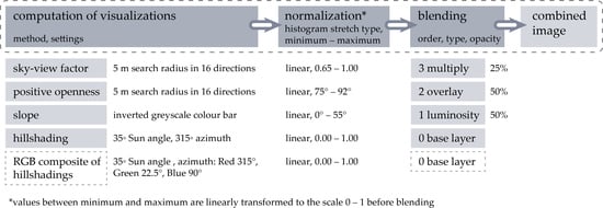
All of the visualizations have proved their usefulness in archaeological interpretation in various environmental settings and at diverse scales, (see e.g., References [59,60,61,62,63,64,65,66,67]) and were computed using the relief visualization toolbox (RVT) created by ZRC SAZU [27]. Because we strive to preserve comparability between different geographical areas, the visualizations are presented with a minimum-maximum histogram stretch, usually with a saturation of minimum, maximum, or both. The displayed range of values is given in Figure 1.
3.3. Blend Modes
Blend modes (methods) in digital image editing and computer graphics determine how multiple image layers, one on top of another, are blended together (combined) into a single image. For blend modes to work, at least two layers (referred to as top and bottom or base layers) are needed, which can contain either two different images or the same image duplicated. Every blend mode is defined by an equation that takes values at coinciding pixels of top and bottom layer images as inputs to calculate the fused image. The blend mode is defined for the top layer. Finally, the opacity value controls translucency of the blended top image, allowing the bottom image to show through. The fundamental blend modes can be found in professional image editing software, but there is a lack of such functionality in GIS and remote sensing software. While QGIS supports some of the blend modes for display [34], ArcGIS provides only the normal blend mode, which only controls opacity.
Stacking more than two image layers in our implementation follows the convention used in Photoshop [68]. When multiple layers and blend modes are stacked, the effects are applied in order from the bottom layer of the stack upwards. Changes made to the lower layers propagate up through the stack, changing outputs all the way to the final blended image on the top most layer [69]. Using as many layers as possible is not always very efficient nor desired, because information can be lost if too many layers are used, and the user will not be able to comprehend it.
Blend modes are categorized into six groups, according to the type of effect they exert on the images:
- -
- Normal: Only affects opacity;
- -
- Lighten: Produces a lighter image;
- -
- Darken: Produces a darker image;
- -
- Contrast: Increases contrast, gray is less visible;
- -
- Comparative: Calculates difference between images;
- -
- Color: Calculations with different color qualities.
We describe five blend modes that we consider the most useful based on our experiences, one from each group (with the exception of the comparative group). We suggest pre-determined blend modes based on their theoretical performance with selected visualizations and our experiments. We hope that additional combinations will arise through the work of the research community following the publication of this article, as we recognize the need for critique and development in this field.
In equations that describe selected blend modes in following Sections, the letter A refers to the image on the top layer, while B refers to the image on the bottom layer. Before calculating blends with RGB images, the color values are normalized to fit onto the interval 0.0—1.0, where black corresponds to 0.0 and white to 1.0. We have implemented these blend modes in version 2.0 of relief visualization toolbox where they can be applied directly to the computed visualizations.
Normal (normal group) is the default mode, where no special blending takes place—it keeps the top layer and hides the bottom layer (Figure 6c). The only effect achieved is by changing the opacity value of the top layer so that the bottom layer can be seen through (Equations (1) and (2)).
Normal(A, B) = A
Opacity(A, B) = A ∙ Opacity + B ∙ (1 − Opacity)
Opacity defines the “strength” of blending—to what degree the blend mode is considered. The lower the opacity, the more we allow the bottom layer to uniformly show through. When the top layer is fully opaque, the bottom layer is invisible (Figure 6b,c). It can be used in combination with any blend mode but is always applied after a blend result is calculated. Thus, when applying opacity there is already a blended image on the top layer while the bottom layer remains unchanged. The generalized opacity Equation (3), which we implemented for use with each of the blend modes described in this paper, is:
Opacity(Blend(A, B), B) = Blend(A, B) ∙ Opacity + B ∙ (1 − Opacity).
Screen (lighten group) treats every color channel separately, multiplies the inverse values of the top and bottom layer and, in a last step, inverts the product (Figure 6d). The result is always a lighter image. Screening with black leaves the color unchanged, while screening with white produces white. The Equation (4) is commutative, so switching the top and bottom layer order does not affect the result.
Screen(A, B) = 1 − (1 − A) ∙ (1 − B)
Multiply (darken group) is the opposite of screen. Multiply treats every color channel separately and multiplies the bottom layer with the top layer (Figure 6e). The result is always a darker image; the effect is similar to drawing on an image with marker pens. Multiplying any color with black produces black and multiplying any color with white keeps the color unchanged. The Equation (5) is commutative.
Multiply(A, B) = A ∙ B
Overlay (contrast group) combines multiply and screen blend modes to increase the contrast (Figure 6f). Overlay determines if the bottom layer color is brighter or darker than 50% gray, then applies multiply to darker colors and screen to lighter, thus preserving the highlights as well as shadows. The Equation (6) is non-commutative, meaning the layer order influences the result.
Luminosity blend mode (color group) keeps the luminance (the perceived brightness based on the spectral sensitivity of a human eye) of the top layer and blends it with hue and saturation components of the bottom layer [69]. This results in colors of the underlying layer replacing the colors on the top layer, while shadows and texture of the top layer stay the same (Figure 6g). Contrary to the blend modes we described so far, luminosity is not obtained by a straightforward pixel-wise calculation. The complete luminosity algorithm we implemented follows the methodology described in Adobe specification [70] (pp. 326–328) and is composed of several equations. Its core calculation is in the luminance Equation (7) where Ared, Agreen, and Ablue are the red, green, and blue channel in the RGB color space.
Luminance(A) = 0.3 ∙ Ared + 0.59 ∙ Agreen + 0.11 ∙ Ablue
4. Results
4.1. Effect of Blend Modes on Visualizations
The aim of using blend modes with DEM visualizations is to visually enhance the existing images and to improve visibility of various topographic structures. Blending different visualizations together combines distinct topographical features emphasized on individual images. Depending on what visual features we want to enhance, we need to select relevant visualizations and appropriate blend modes to achieve the desired result. The ability of some of the most frequently used grayscale visualizations to capture small- and micro-relief, as well as the type of topographical features that are highlighted or shadowed on each particular visualization, is described in Table 1. It is important to keep highlighting and shadowing in mind when considering how different blend modes affect lighter and darker tones. The effect of blend modes on combining a color image (the RGB composite of hillshading from three directions) and a grayscale image of rectangles ranging from black to white is shown in Figure 6. The following descriptions in this subSection are based on theoretical knowledge of blend modes and visualizations.
Normal blend mode is the most intuitive and straightforward because only uniform transparency takes effect with changing opacity. Screen renders black transparent, which means it is ideal to make darker colors disappear and to keep the whites. Multiply makes white transparent and is thus the most suitable choice to make lighter colors disappear while keeping the darker colors. Overlay makes 50% gray transparent, amplifying the contrast as a result. This is especially useful for improving the readability of images with subtle nuances. Luminosity works on color components of the images. It blends the luminance (a grayscale representation) of the top layer image, with the color (saturation and hue) from the bottom layer image. This is why luminosity only functions when a color image, e.g., hillshading from multiple directions or a composite of a principal components analysis, is used as a bottom layer, otherwise the result is the same as in blending with the normal blend mode. A color or monochromatic image can be used as the top layer. Because monochrome images do not have hue and saturation components, the luminance of a monochrome image is the monochrome image itself.
Opacity can be adjusted for any of the blend modes. The lower the opacity, the more transparent the result of blending will be. What shows through the transparent blend is the image from the bottom of the two layers. If blending multiple layers, merging is consecutive from the bottom layer to the top one. Therefore, the order of layers, not just the images and blend modes by themselves, greatly affects the final result of blending. This is because applying blend modes and opacity to a stack of layers propagate through the whole stack and because certain blend mode calculations are non-commutative (normal, overlay, luminosity).
Blending can also be used to enhance a single visualization, producing a so-called self-blend, but will have no effect when luminosity or normal blend mode is used. While screen, multiply, and overlay self-blends will either lighten or darken parts of the image, similar effects can be achieved with a histogram stretch applied to the original visualization.
The histogram stretch and saturation of minimum and maximum values (i.e., clipping) are useful to fine-tune individual visualizations. In this way, we can manipulate the visual effect to increase the visibility of the features we want to emphasize. For example, to improve the contrast we use a linear histogram stretch with clipping the minimum and maximum value of positive openness. The minimum cut-off was set at an angle of 75°, a value up to which all (smaller) values are represented with black. Similarly, the maximum cut-off was set at an angle of 92°, a point above which all values are represented with white (Figure 1). Angles between minimum and maximum cut-off values are assigned darker to lighter gray tones.
Histogram stretch methods, other than linear stretch, e.g., standard deviation, equalization, and Gaussian, distort relative relations among values. These can be used to enhance detectability of unknown features and further increase visibility of known ones, because they become more pronounced, but it ruins the comparability of features between different areas. A feature of the same physical characteristics can be displayed completely differently depending on the type of terrain, position, orientation etc. This is also true if clipping uses percentage rather than absolute minimum and maximum thresholds.
4.2. Visualization for Archaeological Topography
We can now use the knowledge on how blend modes affect the color and tone of images to blend various visualizations described in Section 3.2 into a single combined visualization that retains the advantages of individual technique—the visualization for archaeological topography. The whole process of building the combined visualization is sketched in Figure 1, while Figure 7 shows the results of individual steps. Visualization for archaeological topography can have a hillshading or an RGB composite of hillshadings as a base layer, with preference for the former, while the other layers and blend modes are predetermined. We propose different calculation settings for ‘normal’ (complex) and very flat terrain (see discussion Section). We have selected the visualization methods based on their complementary positive characteristics, and the specific blending modes because they amplify these particular characteristics. They also work uniformly with varied data and the visualizations of different areas are therefore directly comparable.
Hillshading and the RGB composite of hillshading from three directions are a good base layer (bottom image) because they give a sense of general topography and are very intuitive to read. To provide a more plastic feel to the image, i.e., a more “three-dimensional” impression, we blend hillshading with slope, using luminosity with 50% opacity (Figure 7d). As described above, luminosity only has an effect if the bottom layer has colors (e.g., as in Figures 6g and 10), but is the same as normal blend mode if the bottom layer is monochromatic (e.g., as in Figures 7 and 9). The clipping of maximum values for slope depends on the type of terrain and structures of interest. For very flat terrain it should be lower (e.g., about 15°) while it should be higher for steep or complex terrain (e.g., about 60°). In our case, the terrain is neither very complex nor steep, but we had to set the maximum value to 55° nevertheless, because of high and steep pyramidal structures that would otherwise appear completely black. It is impossible to set strict general threshold values for minimum and maximum, because such diversities exist in almost every image (i.e., a larger study area). Kokalj and Hesse [18] (pp. 16–27) give guidelines for various visualization methods and terrain types. Similarly, the threshold values for opacity are arbitrary and depend on the terrain type, structures we want to highlight, and the overall desired effect. We defined the opacity thresholds for individual layers based on our own research and experience. We observed the effect of different opacity settings in increments of 25% and found that proposed numbers give good results.
In the next step, we focus on emphasizing the small-scale structures. Among the suitable visualization techniques are, for example, positive and negative openness, multiscale integral invariants, local dominance, local relief model, and Laplacian-of-Gaussian. We chose the first because it is easy to interpret and is complementary to sky-view factor in that it shows depressions as dark and exposed areas as bright. Another reason is that the most demanding part of the computation code for positive openness is the same as for sky-view factor; therefore, the calculation takes minimal additional time. Adding positive openness with 50% opaque overlay improves the contrast of the image by highlighting the small convexities (e.g., small ridges, edges, banks, peaks) and shadowing concavities (e.g., channels, ditches, holes), thus increasing the prominence of minute relief roughness (Figure 7f). Because openness is a trend removal method, the sense of general topography is completely lost and to some degree this effect is reflected in the combined image. Blending sky-view factor with 25% opaque multiply recovers some perception of the larger geomorphological forms as well as further enhancing the visibility of micro topography (Figure 7h).
Figure 8 shows applicability of the visualization for diverse archaeological and natural features and the environment they are a part of. The features are of varied scale, height, orientation, and form, they are convex and concave, and sit on terrain that ranges from extremely flat to very steep. The ALS data has been collected either intentionally to study these forms or as a part of a national (or regional) campaign, and therefore varies in scanning density and processing quality.
The calculation of the visualization for archaeological topography as well as blending of other visualization methods with the described blend modes is supported in the new version of Relief Visualization Toolbox [27].
5. Discussion
Slope, openness, and sky-view factor are all direction independent, which means they highlight structures irrespective of their orientation. This also means that, in contrast to shading techniques based on directional illumination such as hillshading, features visualized by slope, openness, and sky-view factor do not contain any horizontal displacements. The selected visualization techniques also do not introduce artificial artifacts (e.g., non-existent ditches).
Figure 9 shows that details, such as edges of the looting trenches in the buildings at the center and center left, are clearly recognizable on all four combinations. Whereas with normal blending more detail can be observed on the very steep, south-eastern slopes of pyramidal structures, the overall image appears flat (Figure 9, left column). Normal blending gives a big preference to the top layers over the lower ones (with the same opacity settings); therefore, because the effect of hillshading is almost lost, little perception of general topography remains. This is not desirable for interpretation; hence, the loss of detail on the sides of the largest and steepest pyramidal structures on the visualization for archaeological topography was intentional. The effect can be reduced by setting different saturation (clipping) thresholds. Blending with normal blend mode in an alternative order gives preference to other layers, but the key point here is that compromises have to be made on the visibility of certain layers (visualizations) and thus their useful characteristics. This is even more evident when we want to preserve colors, e.g., from hillshading from different directions. The normal blend mode does not preserve colors, because they are reduced to various extent regardless of the order and opacity setting (Figure 9c). The visualization for archaeological topography shows slopes with various orientations in distinct colors (Figure 9d). Figure 10a demonstrates the color of slopes of various orientation on a round, sharp-edged, shallow depression (top) and protrusion (bottom). The colors for slopes facing different directions are: N—green-yellow; NE—cyan; E—light blue; SE—dark blue, S—violet, SW—dark red; W—light red; NW—orange. It is important that the colors remain the same across different datasets and locations if comparability is required.
Good representation of color is important because it provides a new visual dimension. Using color hue to display quantitative data is discouraged, because it can be misleading or difficult to discern (see e.g., Reference [16]). Using color lightness (luminance) is more appropriate to display such data [3,74]. Despite this, we argue that color hue can be used for detection when the interpretation is not dependent on the exact quantitative value (e.g., azimuth of slope 85°; elevation 235 m a.m.s.l.), but rather provides a clue to the approximate value or difference (e.g., eastern slope; low elevation). Other base layers that provide color can be used in different combinations of visualizations. Examples include elevation, height of trees, water drainage, multiscale topographic position, [75,76] etc.
Even something as simple as the use of color can be an argument that supports the need for more generally accepted (and used) conventions for the sake of accuracy and comparability. What is often overlooked when visualizing any scientific data is that carefully selected, perceptually appropriate color maps lead to substantially fewer mistakes in analysis and interpretation [5]. Many color maps are inappropriate for scientific visualizations [77] due to confusing luminosity intensities (e.g., non-sequential luminosity for sequential data), introduction of false borders or artifacts in the data, or disregard for colorblind viewers. One of the biggest such offenders is the rainbow color map, which is still widely used, despite being perceptually unsuitable [3]. Scientists and professionals that are aware of its disadvantages still use it due to simplicity and inertia (the rainbow color map is often the default setting in software), as well as for aesthetic reasons [10,78]. A study by Borkin [5] revealed that even the scientists who claim to have adapted to reading the rainbow map still perform diagnostic tasks significantly worse when relying on the rainbow map instead of perceptually suitable color maps.
However, presuming a suitable color map is selected, there is no definitive answer to the question of whether a color scale necessarily performs better than grayscale for terrain visualizations. The utility of a map comes from its ability to display the ridges, valleys, cusps, and other relevant features [79] and this is similar in historic landscape visualizations. While color palettes perform better in some of the studies [12,28], others show that the human eye luminance channel (grayscale presentation) processes shape and stereoscopic depth more effectively than the chromatic channels (color presentation) [79]. Hence, a grayscale visualization can be just as effective as, and less biased than, a color one.
Additional benefits of the combined visualization are that a single visualization conserves disk space and displays faster. This is especially important in the field where data is accessed with tablets and smart phones or even as hard-copy sheets.
The visualization for archaeological topography meets all of the criteria for a good visualization set in Section 3.2. Because it is based on slope, openness, and sky-view factor, small-scale features are clearly visible and no artificial artifacts are introduced. For the same reason it shows small topographic features in the same way irrespective of their orientation or shape, and therefore we can judge their height and amplitude. The visualization can be calculated from a raster elevation model, which is the most frequent distribution format of ALS data. The calculation takes less than 20 seconds per km2 of 0.5 m resolution lidar data (Table 2), depending on the size of the area to be calculated. This should not slow down the interpretation process, because it takes an individual longer to examine such an area. It is therefore suitable for small-scale studies as well as national deployment. For testing, we used a computer running Microsoft Windows 10 (64 bit) with 2.8 GHz Intel i7 processor and 20 GB of RAM. Not all RAM was used.
Saturation of extreme values is completely customizable with manual setting of the minimum and maximum threshold values for each individual input visualization and a linear stretch is used for all. It is therefore possible to study the result at the entire range of values. We advise some saturation if readability in important areas is not impeded, because contrast makes identification of features easier. The visualization has been tested by experts and beginners, in the field and for desktop analysis of various archaeological features in diverse landscapes. It has been found very intuitive to interpret. Banaszek et al. [80] report that to produce coherent standardized mapping result on a national scale, beginners in interpretation of remote sensing data would need additional training in reading the ALS derived visualizations, which would be simpler with a single visualization to consider.
A good visualization depends on the dataset and context. Because distribution of data values is shifted for each terrain type, visualizing them in exactly the same way might obscure important relief features. The visualization for archaeological topography with default settings (Figure 1) works well on most terrain types (Figure 8), even on the extremely steep slopes of the Alps (Figure 5), but it fails to portray effectively some of the broader, very subtle features on very flat terrain (Figure 4b). This can be avoided by changing the settings for sky-view factor and openness to include a wider area while disregarding the proximity, e.g., setting the search radius from 5 m to 10 m while disregarding the first 4 m of the neighborhood from the calculation. The histogram stretch has to be amended accordingly, in our case to 0°–35° for slope, 85°–92° for openness, and 0.95–1.00 for sky-view factor. In this way, subtle structures in flat terrain become more easily recognizable (Figure 4c). A lower sun elevation angle for hillshading can further enhance visibility of such structures. This is an example of how a few different sets of visualization parameters could be used to fine-tune historic landscape visualization according to terrain type. We propose using a custom set of parameters at least for ‘normal’ (complex) and flat terrain. The extent to which these parameters can be fine-tuned and still constitute a standard custom set, remains to be investigated.
There is a question of the importance of using various visualization techniques and assessing their characteristics in view of ever more present computational approaches to detection of archaeological feature. The potential to find archaeological traces, and in future possibly classify them, with methods such as deep learning is increasingly accepted by the archaeological community (see e.g., References [81,82,83,84,85]. Despite this, or because of this, we believe there are still two fundamental benefits of having the best possible visualization for visual inspection:
- -
- Deep learning requires a database of a large number of known and verified archaeological sites as learning samples—in the first instance these still have to come from visual interpretation and field observation;
- -
- Large-scale results of deep learning have to be verified and the most straightforward ‘first check’ is visual inspection.
6. Conclusions
Combining results of various visualization techniques in a meaningful and deliberate way builds upon their strengths. Not only can we play with different histogram stretches and color tables, but also vary the degree of transparency and mathematical operations to combine layers. The word ‘play’ was deliberately left out of brackets in the sentence above, as we know that the process of creating an expressive visualization is indeed as much art as it is a technical outcome.
The process involves many decisions that all have an important effect on the final appearance of the visualization. The choice of visualizations, their individual computation settings, the type of histogram stretch, saturation of minimum and maximum values, blending methods, order of blending, and opacity settings have to be documented. Replicating the appearance is only possible if this information is stored in an accessible way or printed with the combined visualization. The archaeological mapping results equipped with such information can in future be assessed according to their confidence.
Having a single combined visualization to consider has advantages as well as potential pitfalls. The more important benefits are better representation of structures in a larger range of terrain types, conservation of disk space, and faster display. Using a single visualization that conserves the location of edges as well as relative perception of the height of archaeological structures can help with comparison of mapping results across environmental and archaeological areas. There is a risk that using a single visualization might miss potentially important traces in the landscape, as has been the case with other visualization techniques. However, combining specific positive characteristics of more methods into a single image reduces this risk more than hoping time-pressed practitioners and scientists would consider using more than one or two visualizations in their quest to map larger areas. The visualization for archaeological topography that we constructed and presented in this paper has already been used for pedestrian surveys in various environments, from semi-deciduous tropical forests of Mexico to the largely open heather and scrub ground of western Scotland and the Mediterranean karstic rough terrain. It has been deemed practical and informative. Its benefits are:
- -
- It highlights the small-scale structures and is intuitive to read,
- -
- It does not introduce artificial artifacts,
- -
- It preserves the colors of the base layer well,
- -
- The visual extent and shape of recorded features are not altered,
- -
- It shows small topographic features in the same way irrespective of their orientation or shape, allowing us to judge their height and amplitude
- -
- Results from different areas are comparable,
- -
- The calculation is fast and does not slow down the mapping process.
Thorough experimentation involving control tests with multiple observers, areas, and diverse visualizations, although much needed, has not been done in this study. Controlled testing of the different effectiveness of various visualizations in respect of time needed for interpretation and agreement between different observers’ interpretations requires a huge experiment that has to be set up by the archaeological community involved in interpretation of ALS data. This issue has been evident more than a decade, but only a few experiments have been done so far, e.g., by Filzwieser et al. [32] and Banaszek et al. [80]. More generally, there is a notable lack of accountability and explicit documentation of processes in many projects and this lack of information about how archaeological interpretation and mapping are progressed is undesirable for wider comparability and reliable research outputs [86]. Therefore, there is a need to develop explicit protocols for more clarity about object identification/mapping process, including the categorization of the reliability of data and findings. In presenting our protocols for blended visualizations, and implementing them through our RVT toolkit, we recognize that we are not solving this problem in this paper but present our approach to open up debate.
Supplementary Materials
The following are available online at https://0-www-mdpi-com.brum.beds.ac.uk/2072-4292/11/7/747/s1: Airborne laser scanning data acquisition and processing parameters.
Author Contributions
Ž.K. conceived and designed the research. M.S. implemented the blend modes and analyzed the results. Both authors participated in the drafting and editing of the paper text, the review of the experimental results, and in creating the Figures.
Funding
This research was partly funded by the Slovenian Research Agency core funding No. P2-0406, and by research projects No. J6-7085 and No. J6-9395.
Acknowledgments
We are grateful for the technical support of Klemen Zakšek, Krištof Oštir, Peter Pehani, and Klemen Čotar, who helped with programming the first versions of RVT. We would like to acknowledge the work of prof. Ivan Šprajc, whose dedicated field verification and encouragement has helped us produce a better product. We appreciate the constructive comments and suggestions by editors and the anonymous reviewers.
Conflicts of Interest
The authors declare no conflict of interest. The funders had no role in the design of the study; in the collection, analyses, or interpretation of data; in the writing of the manuscript, and in the decision to publish the results.
References
- Zhuge, Y.; Udupa, J.K. Intensity standardization simplifies brain MR image segmentation. Comput. Vis. Image Underst. 2009, 113, 1095–1103. [Google Scholar] [CrossRef]
- Fujiki, Y.; Yokota, S.; Okada, Y.; Oku, Y.; Tamura, Y.; Ishiguro, M.; Miwakeichi, F. Standardization of Size, Shape and Internal Structure of Spinal Cord Images: Comparison of Three Transformation Methods. PLoS ONE 2013, 8, e76415. [Google Scholar]
- Borland, D.; Russell, M.T.I. Rainbow Color Map (Still) Considered Harmful. IEEE Comput. Graph. Appl. 2007, 27, 14–17. [Google Scholar] [PubMed]
- Schuetz, M. Potree: Rendering Large Point Clouds in Web Browsers. Bachelor’s Thesis, Vienna University of Technology, Vienna, Austria, 2016. [Google Scholar]
- Borkin, M.; Gajos, K.; Peters, A.; Mitsouras, D.; Melchionna, S.; Rybicki, F.; Feldman, C.; Pfister, H. Evaluation of Artery Visualizations for Heart Disease Diagnosis. IEEE Trans. Vis. Comput. Graph. 2011, 17, 2479–2488. [Google Scholar] [PubMed] [Green Version]
- Kjellin, A.; Pettersson, L.W.; Seipel, S.; Lind, M. Evaluating 2D and 3D Visualizations of Spatiotemporal Information. ACM Trans. Appl. Percept. 2008, 7, 19:1–19:23. [Google Scholar]
- Kaya, E.; Eren, M.T.; Doger, C.; Balcisoy, S. Do 3D Visualizations Fail? An Empirical Discussion on 2D and 3D Representations of the Spatio-temporal Data. In Proceedings of the EURASIA GRAPHICS 2014; Paper 05; Hacettepe University Press: Ankara, Turkey, 2014; p. 12. [Google Scholar]
- Szafir, D.A. The Good, the Bad, and the Biased: Five Ways Visualizations Can Mislead (and How to Fix Them). Interactions 2018, 25, 26–33. [Google Scholar] [CrossRef]
- Gehlenborg, N.; Wong, B. Points of view: Into the third dimension. Nat. Methods 2012, 9, 851. [Google Scholar]
- Moreland, K. Why We Use Bad Color Maps and What You Can Do About It. Electron. Imaging 2016, 2016, 1–6. [Google Scholar] [CrossRef]
- Cockburn, A.; McKenzie, B. Evaluating the Effectiveness of Spatial Memory in 2D and 3D Physical and Virtual Environments. In Proceedings of the SIGCHI Conference on Human Factors in Computing Systems, Minneapolis, MN, USA, 20–25 April 2002; ACM: New York, NY, USA, 2002; pp. 203–210. [Google Scholar]
- Tory, M.; Sprague, D.; Wu, F.; So, W.Y.; Munzner, T. Spatialization Design: Comparing Points and Landscapes. IEEE Trans. Vis. Comput. Graph. 2007, 13, 1262–1269. [Google Scholar] [CrossRef]
- Zakšek, K.; Oštir, K.; Kokalj, Ž. Sky-view factor as a relief visualization technique. Remote Sens. 2011, 3, 398–415. [Google Scholar]
- Bennett, R.; Welham, K.; Hill, R.A.; Ford, A. A Comparison of Visualization Techniques for Models Created from Airborne Laser Scanned Data. Archaeol. Prospect. 2012, 19, 41–48. [Google Scholar]
- Štular, B.; Kokalj, Ž.; Oštir, K.; Nuninger, L. Visualization of lidar-derived relief models for detection of archaeological features. J. Archaeol. Sci. 2012, 39, 3354–3360. [Google Scholar] [CrossRef]
- Kokalj, Ž.; Zakšek, K.; Oštir, K. Visualizations of lidar derived relief models. In Interpreting Archaeological Topography—Airborne Laser Scanning, Aerial Photographs and Ground Observation; Opitz, R., Cowley, C.D., Eds.; Oxbow Books: Oxford, UK, 2013; pp. 100–114. ISBN 978-1-84217-516-3. [Google Scholar]
- Inomata, T.; Pinzón, F.; Ranchos, J.L.; Haraguchi, T.; Nasu, H.; Fernandez-Diaz, J.C.; Aoyama, K.; Yonenobu, H. Archaeological Application of Airborne LiDAR with Object-Based Vegetation Classification and Visualization Techniques at the Lowland Maya Site of Ceibal, Guatemala. Remote Sens. 2017, 9, 563. [Google Scholar]
- Kokalj, Ž.; Hesse, R. Airborne Laser Scanning Raster Data Visualization: A Guide to Good Practice; Prostor, kraj, čas; Založba ZRC: Ljubljana, Slovenia, 2017; ISBN 978-961-254-984-8. [Google Scholar]
- Hesse, R. LiDAR-derived Local Relief Models—A new tool for archaeological prospection. Archaeol. Prospect. 2010, 17, 67–72. [Google Scholar] [CrossRef]
- Chiba, T.; Kaneta, S.; Suzuki, Y. Red Relief Image Map: New Visualization Method for Three Dimension Data. Int. Arch. Photogramm. Remote Sens. Spat. Inf. Sci. 2008, 37, 1071–1076. [Google Scholar]
- Podobnikar, T. Multidirectional Visibility Index for Analytical Shading Enhancement. Cartogr. J. 2012, 49, 195–207. [Google Scholar] [CrossRef]
- Mara, H.; Krömker, S.; Jakob, S.; Breuckmann, B. GigaMesh and gilgamesh: 3D multiscale integral invariant cuneiform character extraction. In Proceedings of the 11th International conference on Virtual Reality, Archaeology and Cultural Heritage, Paris, France, 21–24 September 2010; Eurographics Association: Paris, France, 2010; pp. 131–138. [Google Scholar]
- Orengo, H.A.; Petrie, C.A. Multi-scale relief model (MSRM): A new algorithm for the visualization of subtle topographic change of variable size in digital elevation models. Earth Surf. Process. Landf. 2018, 43, 1361–1369. [Google Scholar] [CrossRef] [PubMed]
- Kennelly, P.J. Terrain maps displaying hill-shading with curvature. Geomorphology 2008, 102, 567–577. [Google Scholar]
- Mayoral Pascual, A.; Toumazet, J.-P.; François-Xavier, S.; Vautier, F.; Peiry, J.-L. The Highest Gradient Model: A New Method for Analytical Assessment of the Efficiency of LiDAR-Derived Visualization Techniques for Landform Detection and Mapping. Remote Sens. 2017, 9, 120. [Google Scholar] [CrossRef]
- Hesse, R. Visualisierung hochauflösender Digitaler Geländemodelle mit LiVT. In Computeranwendungen und Quantitative Methoden in der Archäologie. 4. Workshop der AG CAA 2013; Lieberwirth, U., Herzog, I., Eds.; Berlin Studies of the Ancient World; Topoi: Berlin, Germany, 2016; pp. 109–128. [Google Scholar]
- Kokalj, Ž.; Zakšek, K.; Oštir, K.; Pehani, P.; Čotar, K.; Somrak, M. Relief Visualization Toolbox; ZRC SAZU: Ljubljana, Slovenia, 2018. [Google Scholar]
- Alcalde, J.; Bond, C.; Randle, C.H. Framing bias: The effect of Figure presentation on seismic interpretation. Interpretation 2017, 5, 591–605. [Google Scholar]
- Canuto, M.A.; Estrada-Belli, F.; Garrison, T.G.; Houston, S.D.; Acuña, M.J.; Kováč, M.; Marken, D.; Nondédéo, P.; Auld-Thomas, L.; Castanet, C.; et al. Ancient lowland Maya complexity as revealed by airborne laser scanning of northern Guatemala. Science 2018, 361, eaau0137. [Google Scholar]
- Mitchell, H.B. Image Fusion: Theories, Techniques and Applications; Springer-Verlag: Berlin/Heidelberg, Germany, 2010; ISBN 978-3-642-11215-7. [Google Scholar]
- Verhoeven, G.; Nowak, M.; Nowak, R. Pixel-Level Image Fusion for Archaeological Interpretative Mapping; Lerma, J.L., Cabrelles, M., Eds.; Editorial Universitat Politècnica de València: Valencia, Spain, 2016; pp. 404–407. [Google Scholar]
- Filzwieser, R.; Olesen, L.H.; Verhoeven, G.; Mauritsen, E.S.; Neubauer, W.; Trinks, I.; Nowak, M.; Nowak, R.; Schneidhofer, P.; Nau, E.; et al. Integration of Complementary Archaeological Prospection Data from a Late Iron Age Settlement at Vesterager-Denmark. J. Archaeol. Method Theory 2018, 25, 313–333. [Google Scholar] [CrossRef]
- Mark, R.; Billo, E. Application of Digital Image Enhancement in Rock Art Recording. Am. Indian Rock Art 2002, 28, 121–128. [Google Scholar]
- Tzvetkov, J. Relief visualization techniques using free and open source GIS tools. Pol. Cartogr. Rev. 2018, 50, 61–71. [Google Scholar]
- Wang, S.; Lee, W.; Provost, J.; Luo, J.; Konofagou, E.E. A composite high-frame-rate system for clinical cardiovascular imaging. IEEE Trans. Ultrason. Ferroelectr. Freq. Control 2008, 55, 2221–2233. [Google Scholar] [CrossRef]
- Howell, G.; Owen, M.J.; Salazar, L.; Haberlah, D.; Goergen, E. Blend Modes for Mineralogy Images. U.S. Patent US9495786B2, 15 November 2016. [Google Scholar]
- Krishnamoorthy, S.; Soman, K.P. Implementation and Comparative Study of Image Fusion Algorithms. Int. J. Comput. Appl. 2010, 9, 24–28. [Google Scholar] [CrossRef]
- Ma, Y. The mathematic magic of Photoshop blend modes for image processing. In Proceedings of the 2011 International Conference on Multimedia Technology, Hangzhou, China, 26–28 July 2011; pp. 5159–5161. [Google Scholar]
- Giesel, F.L.; Mehndiratta, A.; Locklin, J.; McAuliffe, M.J.; White, S.; Choyke, P.L.; Knopp, M.V.; Wood, B.J.; Haberkorn, U.; von Tengg-Kobligk, H. Image fusion using CT, MRI and PET for treatment planning, navigation and follow up in percutaneous RFA. Exp. Oncol. 2009, 31, 106–114. [Google Scholar]
- Faulhaber, P.; Nelson, A.; Mehta, L.; O’Donnell, J. The Fusion of Anatomic and Physiologic Tomographic Images to Enhance Accurate Interpretation. Clin. Positron Imaging Off. J. Inst. Clin. PET 2000, 3, 178. [Google Scholar]
- Förster, G.J.; Laumann, C.; Nickel, O.; Kann, P.; Rieker, O.; Bartenstein, P. SPET/CT image co-registration in the abdomen with a simple and cost-effective tool. Eur. J. Nucl. Med. Mol. Imaging 2003, 30, 32–39. [Google Scholar] [CrossRef]
- Antoch, G.; Kanja, J.; Bauer, S.; Kuehl, H.; Renzing-Koehler, K.; Schuette, J.; Bockisch, A.; Debatin, J.F.; Freudenberg, L.S. Comparison of PET, CT, and dual-modality PET/CT imaging for monitoring of imatinib (STI571) therapy in patients with gastrointestinal stromal tumors. J. Nucl. Med. Off. Publ. Soc. Nucl. Med. 2004, 45, 357–365. [Google Scholar]
- Sale, D.; Joshi, D.M.; Patil, V.; Sonare, P.; Jadhav, C. Image Fusion for Medical Image Retrieval. Int. J. Comput. Eng. Res. 2013, 3, 1–9. [Google Scholar]
- Schöder, H.; Yeung, H.W.D.; Gonen, M.; Kraus, D.; Larson, S.M. Head and neck cancer: Clinical usefulness and accuracy of PET/CT image fusion. Radiology 2004, 231, 65–72. [Google Scholar] [CrossRef] [PubMed]
- Keidar, Z.; Israel, O.; Krausz, Y. SPECT/CT in tumor imaging: Technical aspects and clinical applications. Semin. Nucl. Med. 2003, 33, 205–218. [Google Scholar] [CrossRef]
- James, A.P.; Dasarathy, B.V. Medical image fusion: A survey of the state of the art. Inf. Fusion 2014, 19, 4–19. [Google Scholar] [CrossRef] [Green Version]
- Šprajc, I. Introducción. In Exploraciones arqueológicas en Chactún, Campeche, México; Šprajc, I., Ed.; Prostor, kraj, čas; Založba ZRC: Ljubljana, Slovenia, 2015; pp. 1–3. ISBN 978-961-254-780-6. [Google Scholar]
- Šprajc, I.; Flores Esquivel, A.; Marsetič, A. Descripción del sitio. In Exploraciones Arqueológicas en Chactún, Campeche, México; Šprajc, I., Ed.; Prostor, kraj, čas; Založba ZRC: Ljubljana, Slovenia, 2015; pp. 5–24. ISBN 978-961-254-780-6. [Google Scholar]
- Fernandez-Diaz, J.C.; Carter, W.E.; Shrestha, R.L.; Glennie, C.L. Now You See It… Now You Don’t: Understanding Airborne Mapping LiDAR Collection and Data Product Generation for Archaeological Research in Mesoamerica. Remote Sens. 2014, 6, 9951–10001. [Google Scholar] [CrossRef] [Green Version]
- Fernandez-Diaz, J.; Carter, W.; Glennie, C.; Shrestha, R.; Pan, Z.; Ekhtari, N.; Singhania, A.; Hauser, D.; Sartori, M.; Fernandez-Diaz, J.C.; et al. Capability Assessment and Performance Metrics for the Titan Multispectral Mapping Lidar. Remote Sens. 2016, 8, 936. [Google Scholar] [CrossRef]
- Berendsen, H.J.A. De Vorming van Het Land; Van Gorcum: Assen, The Netherlands, 2004. [Google Scholar]
- van der Sande, C.; Soudarissanane, S.; Khoshelham, K. Assessment of Relative Accuracy of AHN-2 Laser Scanning Data Using Planar Features. Sensors 2010, 10, 8198–8214. [Google Scholar] [CrossRef] [Green Version]
- Kenzler, H.; Lambers, K. Challenges and perspectives of woodland archaeology across Europe. In Proceedings of the 42nd Annual Conference on Computer Applications and Quantitative Methods in Archaeology; Giligny, F., Djindjian, F., Costa, L., Moscati, P., Robert, S., Eds.; Archaeopress: Oxford, UK, 2015; pp. 73–80. [Google Scholar]
- Arnoldussen, S. The Fields that Outlived the Celts: The Use-histories of Later Prehistoric Field Systems (Celtic Fields or Raatakkers) in the Netherlands. Proc. Prehist. Soc. 2018, 84, 303–327. [Google Scholar] [CrossRef]
- Planina, J. Soča (Slovenia). A monograph of a village and its surroundings (in Slovenian). Acta Geogr. 1954, 2, 187–250. [Google Scholar]
- Triglav-Čekada, M.; Bric, V. The project of laser scanning of Slovenia is completed. Geoderski Vestn. 2015, 59, 586–592. [Google Scholar]
- Yoëli, P. Analytische Schattierung. Ein kartographischer Entwurf. Kartographische Nachrichten 1965, 15, 141–148. [Google Scholar]
- Yokoyama, R.; Shlrasawa, M.; Pike, R.J. Visualizing topography by openness: A new application of image processing to digital elevation models. Photogramm. Eng. Remote Sens. 2002, 68, 251–266. [Google Scholar]
- Doneus, M.; Briese, C. Full-waveform airborne laser scanning as a tool for archaeological reconnaissance. In From Space to Place: 2nd International Conference on Remote Sensing in Archaeology: Proceedings of the 2nd International Workshop, Rome, Italy, 4–7 December 2006; Campana, S., Forte, M., Eds.; Archaeopress: Oxford, UK, 2006; pp. 99–105. [Google Scholar]
- Doneus, M. Openness as visualization technique for interpretative mapping of airborne LiDAR derived digital terrain models. Remote Sens. 2013, 5, 6427–6442. [Google Scholar] [CrossRef]
- Moore, B. Lidar Visualisation of the Archaeological Landscape of Sand Point and Middle Hope, Kewstoke, North Somerset. Master’s Thesis, University of Oxford, Oxford, UK, 2015. [Google Scholar]
- Schneider, A.; Takla, M.; Nicolay, A.; Raab, A.; Raab, T. A Template-matching Approach Combining Morphometric Variables for Automated Mapping of Charcoal Kiln Sites. Archaeol. Prospect. 2015, 22, 45–62. [Google Scholar] [CrossRef]
- de Matos Machado, R.; Amat, J.-P.; Arnaud-Fassetta, G.; Bétard, F. Potentialités de l’outil LiDAR pour cartographier les vestiges de la Grande Guerre en milieu intra-forestier (bois des Caures, forêt domaniale de Verdun, Meuse). EchoGéo 2016, 1–22. [Google Scholar] [CrossRef]
- Krasinski, K.E.; Wygal, B.T.; Wells, J.; Martin, R.L.; Seager-Boss, F. Detecting Late Holocene cultural landscape modifications using LiDAR imagery in the Boreal Forest, Susitna Valley, Southcentral Alaska. J. Field Archaeol. 2016, 41, 255–270. [Google Scholar] [CrossRef]
- Roman, A.; Ursu, T.-M.; Lăzărescu, V.-A.; Opreanu, C.H.; Fărcaş, S. Visualization techniques for an airborne laser scanning-derived digital terrain model in forested steep terrain: Detecting archaeological remains in the subsurface. Geoarchaeology 2017, 32, 549–562. [Google Scholar] [CrossRef]
- Holata, L.; Plzák, J.; Světlík, R.; Fonte, J.; Holata, L.; Plzák, J.; Světlík, R.; Fonte, J. Integration of Low-Resolution ALS and Ground-Based SfM Photogrammetry Data. A Cost-Effective Approach Providing an ‘Enhanced 3D Model’ of the Hound Tor Archaeological Landscapes (Dartmoor, South-West England). Remote Sens. 2018, 10, 1357. [Google Scholar] [CrossRef]
- Stott, D.; Kristiansen, S.M.; Lichtenberger, A.; Raja, R. Mapping an ancient city with a century of remotely sensed data. Proc. Natl. Acad. Sci. USA 2018, 201721509. [Google Scholar] [CrossRef] [PubMed]
- Williams, R.; Byer, S.; Howe, D.; Lincoln-Owyang, J.; Yap, M.; Bice, M.; Ault, J.; Aygun, B.; Balakrishnan, V.; Brereton, F.; et al. Photoshop CS5; Adobe Systems Incorporated: San Jose, CA, USA, 2010. [Google Scholar]
- Valentine, S. The Hidden Power of Blend Modes in Adobe Photoshop; Adobe Press: Berkeley, CA, USA, 2012. [Google Scholar]
- ISO 32000-1:2008. Document Management—Portable Document Format—Part 1: PDF 1.7; ISO: Geneva, Switzerland, 2008; p. 747. [Google Scholar]
- Lidar Data Acquired by Plate Boundary Observatory by NCALM, USA. PBO Is Operated by UNAVCO for EarthScope and Supported by the National Science Foundation (No. EAR-0350028 and EAR-0732947). 2008. Available online: http://opentopo.sdsc.edu/datasetMetadata?otCollectionID=OT.052008.32610.1 (accessed on 22 March 2019).
- Lidar Data Acquired by the NCALM at the University of Houston and the University of California, Berkeley, on behalf of David E. Haddad (Arizona State University) as Part of an NCALM Graduate Student Seed Grant: Geologic and Geomorphic Characterization of Precariously Balanced Rocks. 2009. Available online: http://opentopo.sdsc.edu/datasetMetadata?otCollectionID=OT.102010.26912.1 (accessed on 22 March 2019).
- Grohmann, C.H.; Sawakuchi, A.O. Influence of cell size on volume calculation using digital terrain models: A case of coastal dune fields. Geomorphology 2013, 180–181, 130–136. [Google Scholar] [CrossRef]
- Wong, B. Points of view: Color coding. Nat. Methods 2010, 7, 573. [Google Scholar] [CrossRef] [PubMed]
- Lindsay, J.B.; Cockburn, J.M.H.; Russell, H.A.J. An integral image approach to performing multi-scale topographic position analysis. Geomorphology 2015, 245, 51–61. [Google Scholar] [CrossRef]
- Guyot, A.; Hubert-Moy, L.; Lorho, T.; Guyot, A.; Hubert-Moy, L.; Lorho, T. Detecting Neolithic Burial Mounds from LiDAR-Derived Elevation Data Using a Multi-Scale Approach and Machine Learning Techniques. Remote Sens. 2018, 10, 225. [Google Scholar] [CrossRef]
- Niccoli, M. Geophysical tutorial: How to evaluate and compare color maps. Lead Edge 2014, 33, 910–912. [Google Scholar] [CrossRef]
- Zhou, L.; Hansen, C.D. A Survey of Colormaps in Visualization. IEEE Trans. Vis. Comput. Graph. 2015, 22, 2051–2069. [Google Scholar] [CrossRef] [PubMed] [Green Version]
- Ware, C. Color sequences for univariate maps: Theory, experiments and principles. IEEE Comput. Graph. Appl. 1988, 8, 41–49. [Google Scholar] [CrossRef]
- Banaszek, Ł.; Cowley, D.C.; Middleton, M. Towards National Archaeological Mapping. Assessing Source Data and Methodology—A Case Study from Scotland. Geosciences 2018, 8, 272. [Google Scholar] [CrossRef]
- Cowley, D.C. In with the new, out with the old? Auto-extraction for remote sensing archaeology. In Proceedings of the SPIE 8532; Bostater, C.R., Mertikas, S.P., Neyt, X., Nichol, C., Cowley, D., Bruyant, J.-P., Eds.; SPIE: Edinburgh, UK, 2012; p. 853206. [Google Scholar]
- Bennett, R.; Cowley, D.; Laet, V.D. The data explosion: Tackling the taboo of automatic feature recognition in airborne survey data. Antiquity 2014, 88, 896–905. [Google Scholar] [CrossRef]
- Kramer, I.C. An Archaeological Reaction to the Remote Sensing Data Explosion. Reviewing the Research on Semi-Automated Pattern Recognition and Assessing the Potential to Integrate Artificial Intelligence. Master’s Thesis, University of Southampton, Southampton, UK, 2015. [Google Scholar]
- Trier, Ø.D.; Zortea, M.; Tonning, C. Automatic detection of mound structures in airborne laser scanning data. J. Archaeol. Sci. Rep. 2015, 2, 69–79. [Google Scholar] [CrossRef]
- Traviglia, A.; Cowley, D.; Lambers, K. Finding common ground: Human and computer vision in archaeological prospection. AARGnews 2016, 53, 11–24. [Google Scholar]
- Grammer, B.; Draganits, E.; Gretscher, M.; Muss, U. LiDAR-guided Archaeological Survey of a Mediterranean Landscape: Lessons from the Ancient Greek Polis of Kolophon (Ionia, Western Anatolia). Archaeol. Prospect. 2017, 24, 311–333. [Google Scholar] [CrossRef] [PubMed]
Figure 1.
A schematic workflow illustrating the steps, variables, and their settings in producing the visualization for archaeological topography. Either hillshading or an RGB composite of hillshadings from three directions can be used as a base layer. Figure 6 illustrates the results of the blending steps.

Figure 2.
The Maya city of Chactún as seen on (a) an orthophoto image (CONABIO 1995–1996) and (b) a visualization for archaeological topography. As well as a number of plazas surrounded by temple pyramids, massive palace-like buildings, and two ball-courts, also visible on (b) are quarries, water reservoirs, and sacbeob (raised paved roads). The area is entirely covered by forest, the exploitation of which ceased when the Biosphere Reserve was declared in 1989.

Figure 3.
A view of a palace with two turrets and an adjacent ball court, located in the Chactún’s south-eastern group. Typical vegetation cover is broad-leafed, semi-deciduous tropical forest. For a sense of scale, note a hardly visible human figure (prof. Ivan Šprajc) in the lower left corner. Photo by Žiga Kokalj.

Figure 4.
The Celtic fields on the Veluwe in central Netherlands as seen on (a) an orthophoto image (Landelijke Voorziening Beeldmateriaal 2018). (b) The combined visualization with default settings fails to portray the broader, very subtle features on flat terrain. (c) Changing the settings for sky-view factor and openness to include a wider area while disregarding the proximity (e.g., setting the search radius from 5 m to 10 m while disregarding the first 4 m) makes such structures very distinct. 0.5 m resolution ALS data © PDOK.

Figure 5.
Dachstein limestone strata and scree fields exposed at Vrh Brda (1952 m) as seen on (a) an orthophoto image (GURS 2017) and (b) the visualization for archaeological topography. The top of the ridge is highlighted in white and the intricate geomorphological details are clearly visible. 1 m resolution ALS data © ARSO.

Figure 6.
The effect of various blend modes. (a) The bottom (base) layer for blending shows the north-eastern complex in Chactún with two pyramidal structures. (b) The top layer is composed of rectangles with a varied degree of blackness. (c) Normal blend mode makes the foreground transparent (50% opacity). (d) Screen lightens the image. Black is neutral, white is opaque. (e) Multiply multiplies the luminance levels of the top layer’s pixels with the pixels in the layers below. Black is opaque, white is transparent. (f) Overlay enhances visibility of dark and bright areas. 50% gray is neutral. (g) Luminosity keeps the luminance of the top layer and blends it with the color of the combined view of the layers below. On a good grayscale printer, (b) and (g) should look the same.

Figure 7.
The results of individual steps of building the visualization for archaeological topography. A detail of Chactún south-eastern group is shown with (a) an RGB composite of hillshadings from three directions, (b) shaded relief, (c) slope, (e) positive openness, (g) sky-view factor. The latter three are consecutively added to (blended with) the (b), (d) and (f) in the right column to form the final combination (h). The (c) blends hillshading with slope using luminosity blend mode with 50% opacity, the (f) adds openness using overlay with 50% opacity, and the (h) adds sky-view factor using multiply with 25% opacity. The result of combining (a) as a base layer is shown in Figure 9d.

Figure 8.
Various historical anthropogenic terrain modifications (a–o) and natural landscape features (j,m,o–s) on diverse terrain types as displayed by the visualization for archaeological topography. (a) Overgrown remains of the abandoned village of Novi Breg (Naubacher), Slovenia, surrounded by dolines. (b) Ajdovščina above Rodik hillfort in Slovenia is a prehistoric and Roman settlement, with visible massive ramparts, gates, and walls of individual houses. (c) A half-ploughed, 18th-century village of earth lodges at Biesterfeldt Site, North Dakota, USA. The unploughed part is under forest. (d) Early Iron Age barrow cemetery at Pivola, Slovenia. (e) A ring fort and a barrow on Hill of Tara, Ireland. (f) Entrance earthworks at Maiden Castle Iron Age hillfort, United Kingdom. (g) Alpine terraces at Rodine, Slovenia. (h) Small stone quarries at Vnanje Gorice, Slovenia. (i) Limekilns and dolines at Dečja vas, Slovenia. (j) Terraces and a landslide near Jeruzalem, Slovenia. (k) Ridge and furrow south of Harlaston, Staffordshire, United Kingdom. (l) A drywall enclosure north of Kobarid, Slovenia. (m) Hollow ways and headstreams near Rova, Slovenia. (n) Three different types of World War I trenches with shelters on the gentle NE slopes of Črni hribi, near Renče, Slovenia. (o) Remains of a palaeochannel and irrigation trenches in an agricultural landscape south of Staro selo, Slovenia. (p) Exposed bedrock and large granite boulders eroded into rounded bumpy and unusual shapes. Granite Dells geological feature north of Prescott, Arizona, USA. (r) Sand dunes at Guaiuba, Santa Catarina, Brazil. (s) The alluvial fan’s apex and the upper part of the apron. Teakettle junction, California, USA. Data in (a), (c), (k), and (r) have 1 m spatial resolution, (e) has 0.2 m, (p) has 0.25 m, and others have 0.5 m spatial resolution. ALS data © (c) North Dakota State Water Commission, (e) Discovery Programme, (f, k) Environment Agency, (l, o) Walks of peace in the Soča river foundation, (m) Municipality Domžale, (p, s) NCALM [71,72], (r) FAPESP grant 2009/17675-5 [73], others ARSO.

Figure 9.
The left column, i.e., plates (a) and (c), shows two combinations of visualizations based on normal blend mode. The right column, i.e., images (b) and (d), shows two examples of the visualization for archaeological topography, which is based on blending with different blend modes. The opacity of the layers is the same for all plates. The layers that were combined are sky-view factor, positive openness, slope, and for (a) and (b) hillshading, while for (c) and (d) an RGB composite image of hillshading from three directions. Plates (b) and (d) use the same blend modes as used in Figure 7h.

Figure 10.
Different opacity settings and blend modes enable better representation of underlying colors. A combination of visualizations based on sky-view factor (25% opacity, multiply), positive openness (50% opacity, overlay), slope (50% opacity, luminosity), and an RGB composite image of hillshading from three directions. It is possible to see orientation of slopes from this image as demonstrated from the effect of the combination on a round, sharp-edged, shallow depression (top) and protrusion (bottom). The same combination is shown on Figure 9d.


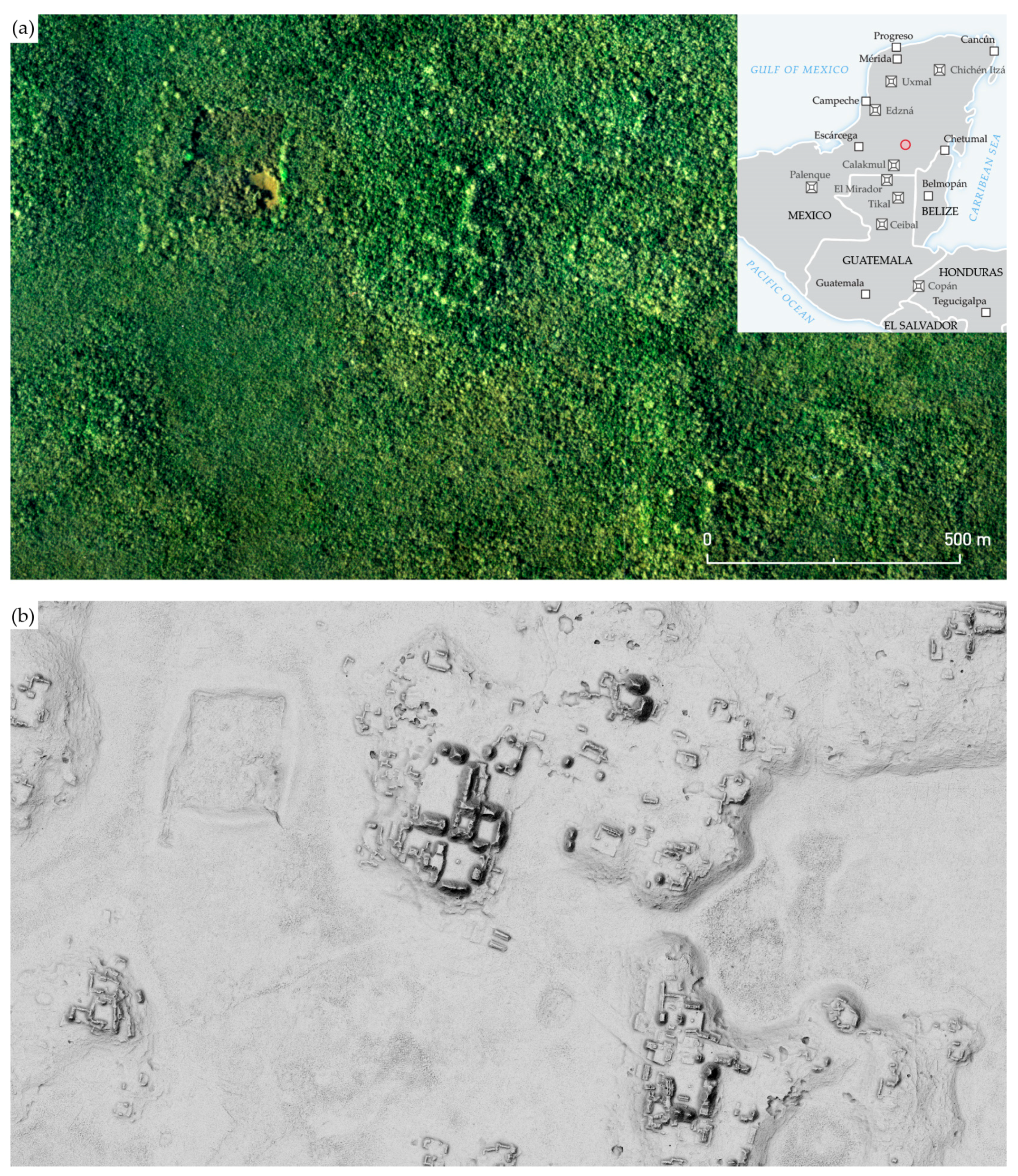
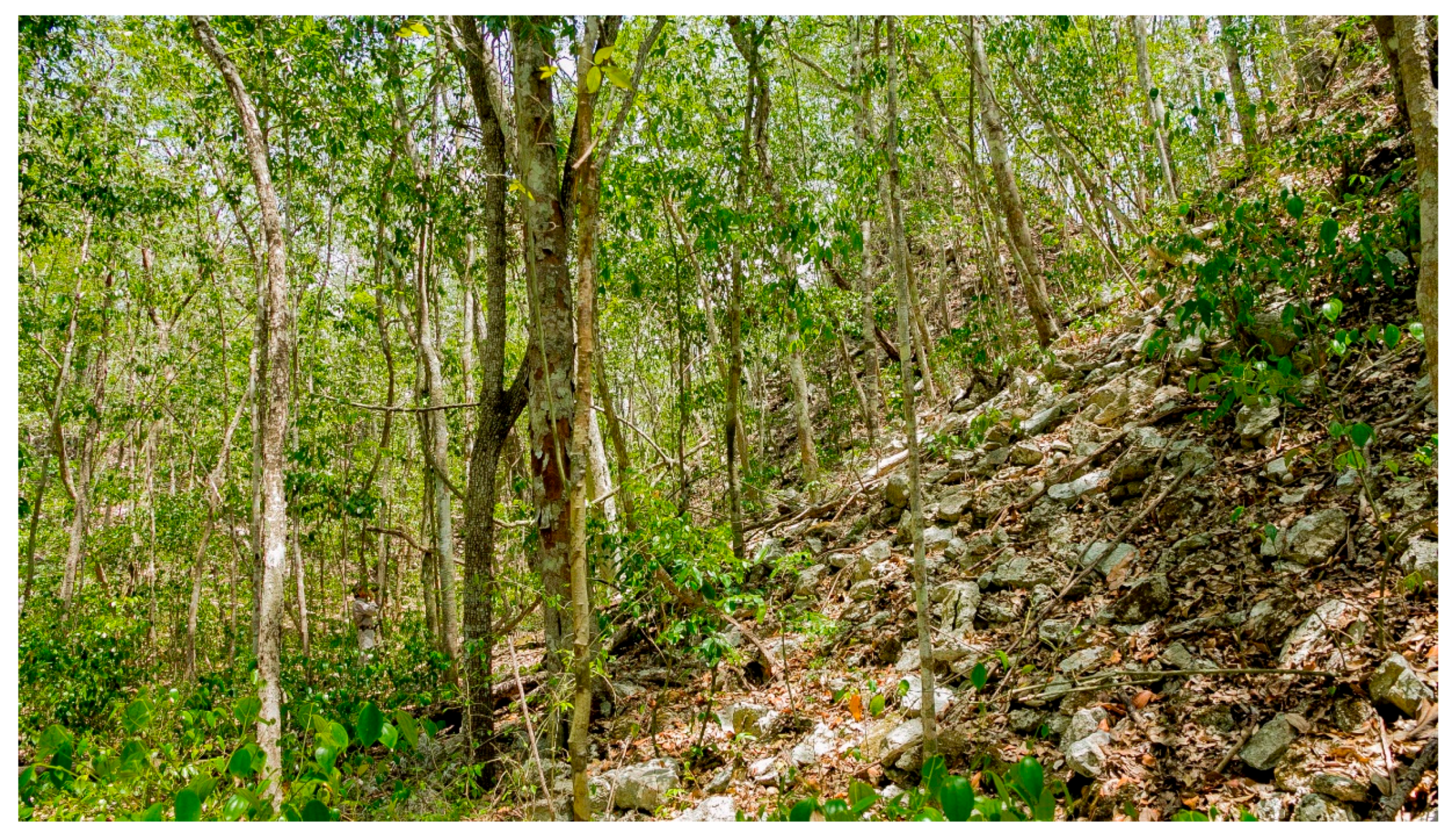
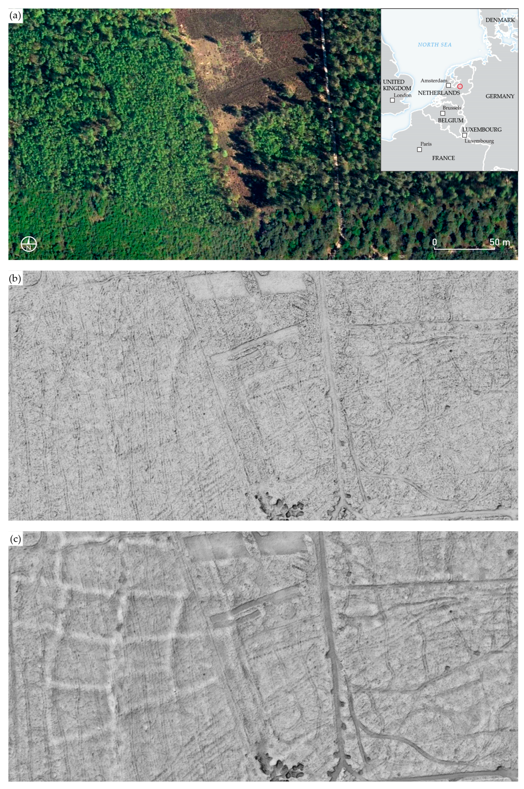
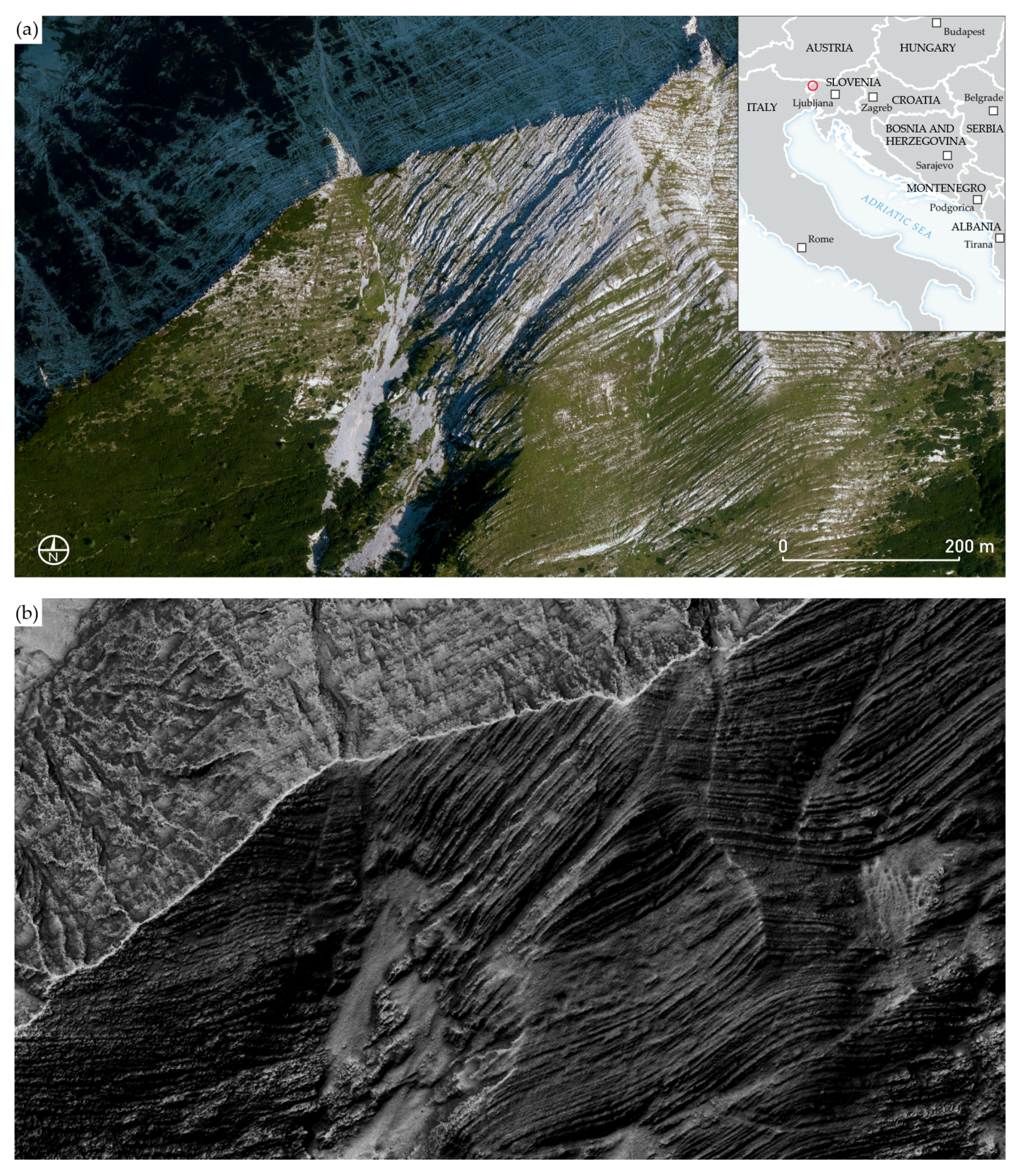
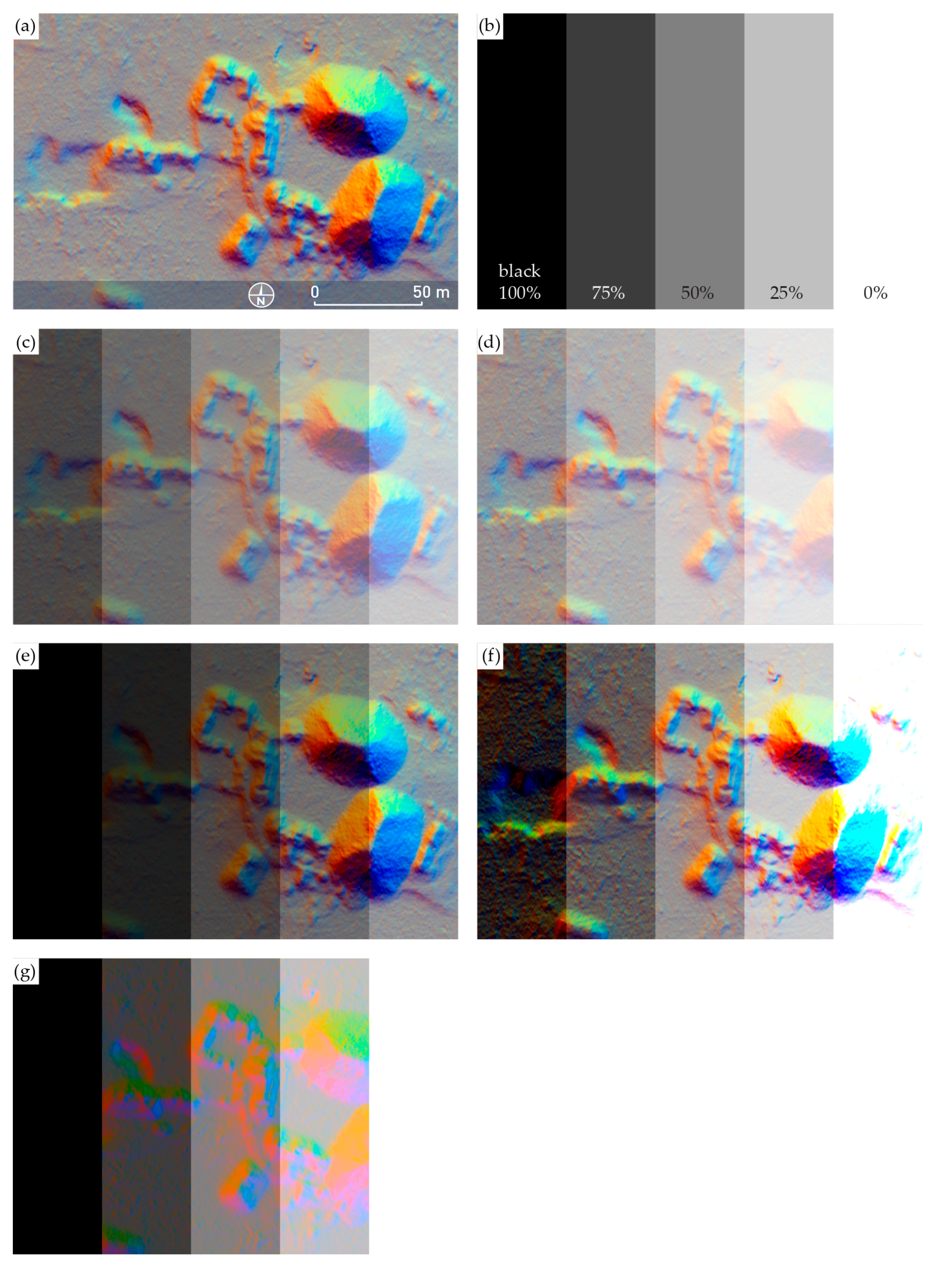
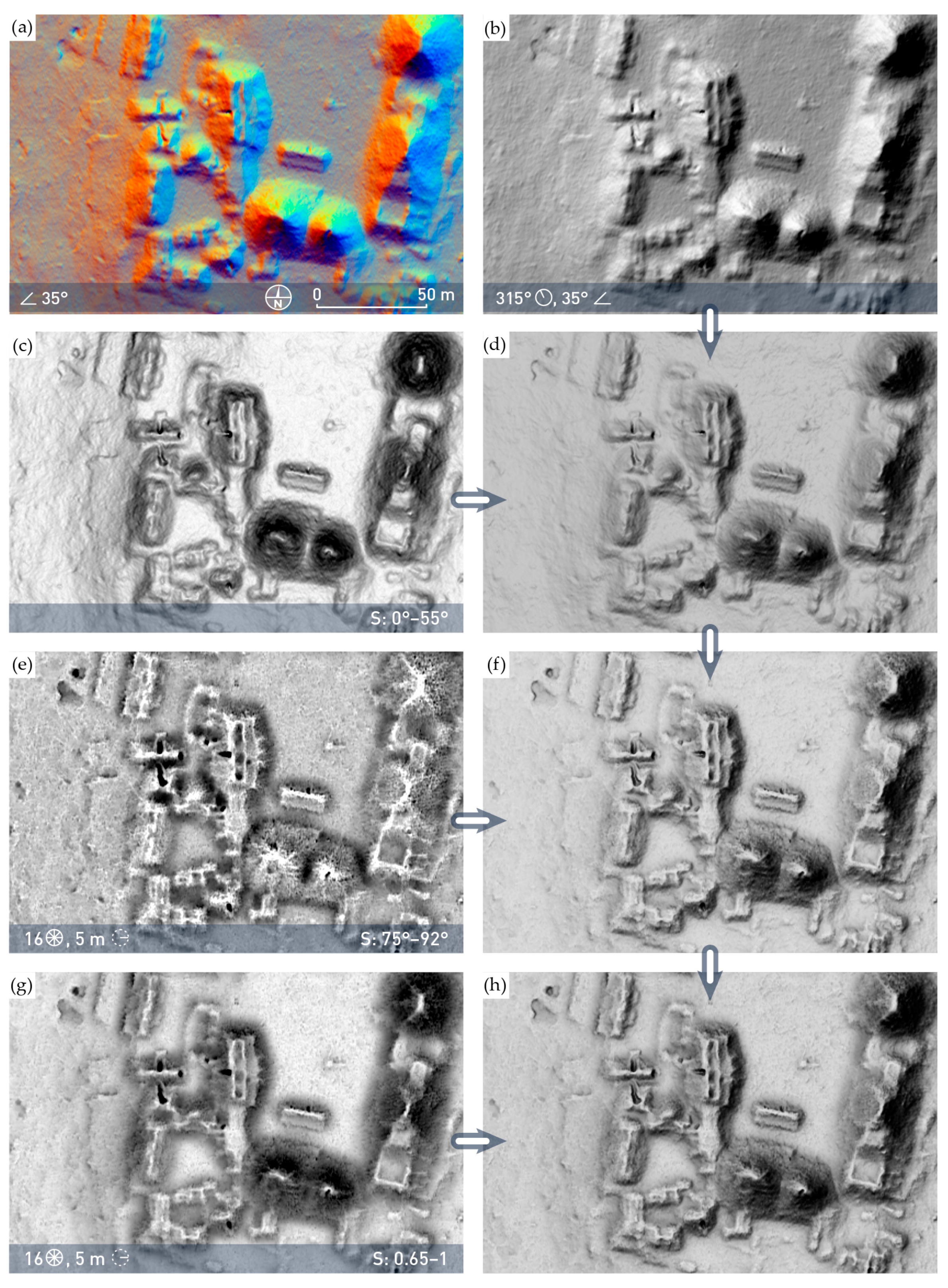
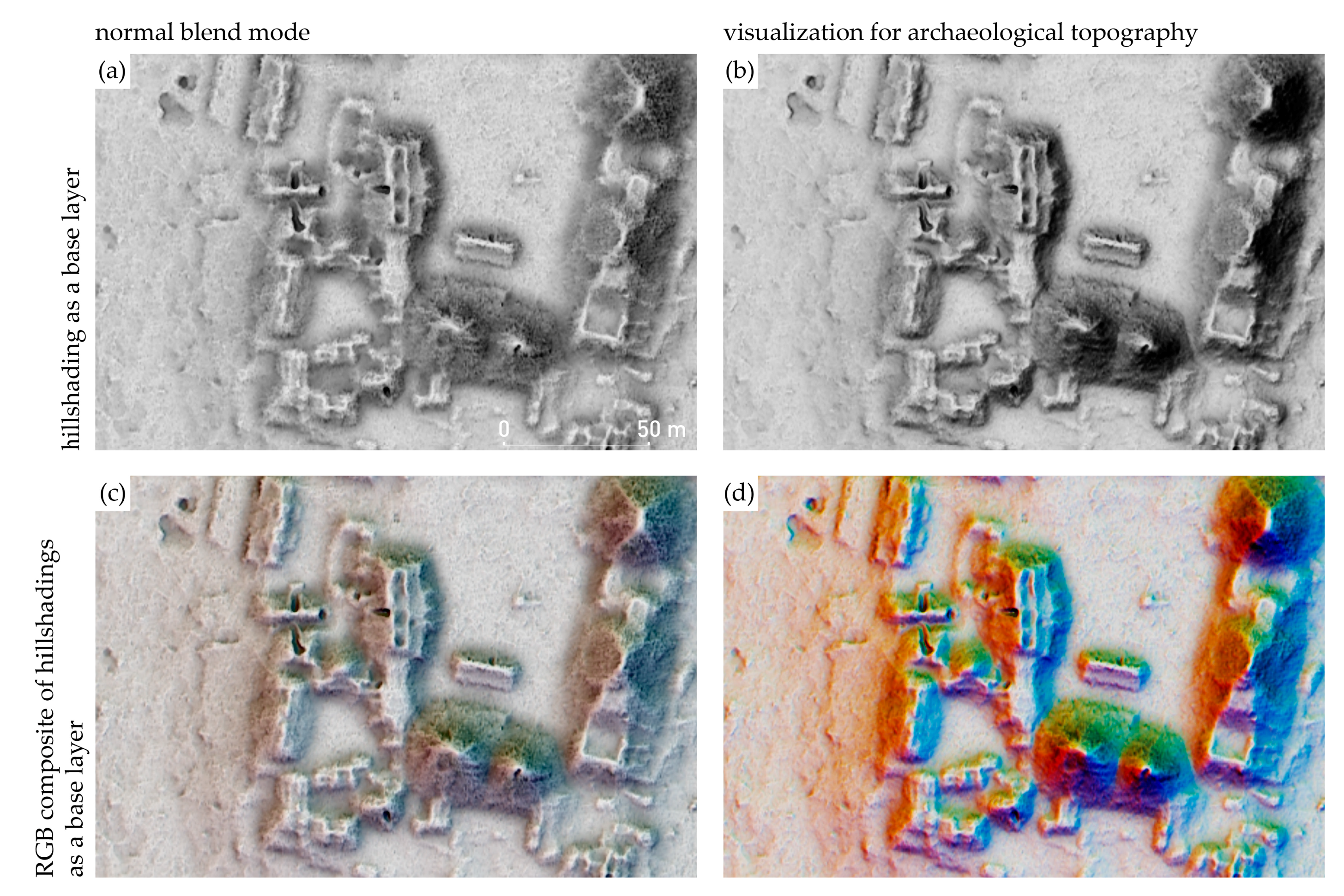
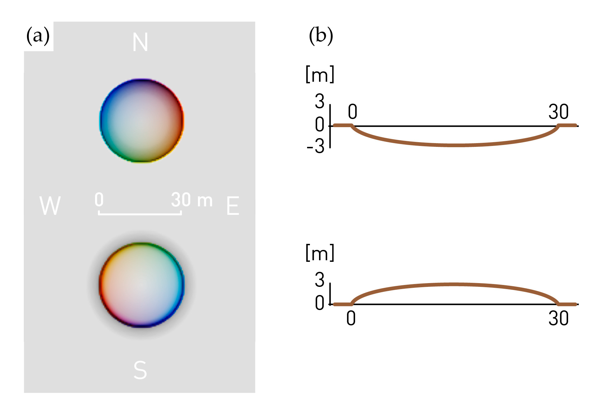
Table 1.
Display characteristics of grayscale visualizations.
| Visualization | Visible Microrelief [18] (p. 35) | Highlighted Topography (Appears Bright) | Shadowed Topography (Appears Dark) |
|---|---|---|---|
| hillshading | o | non-level terrain facing towards illumination | non-level terrain facing away from illumination |
| slope (inverted grayscale color bar) | + | level terrain | steep terrain |
| simple local relief model | ++ | local high elevation | local depressions |
| positive openness | ++ | convexities | concavities |
| negative openness (inverted grayscale color bar) | ++ | convexities | lowest parts of concavities |
| sky-view factor | ++ | planes, ridges, peaks | concavities |
| o indistinct; + suitable; ++ very suitable | |||
Table 2.
Visualization for archaeological topography computation speed.
| DEM Size [px] (0.5 m Resolution) | Size on Disk [MB] | Settings | Visualizations Time [min:s] | Blending Time [min:s] | Combined Time [min:s] |
|---|---|---|---|---|---|
| 1000 × 1000 | 4 | same as in Figure 1 | 0:02 | 0:01 | 0:03 |
| 2000 × 2000 | 16 | same as in Figure 1 | 0:09 | 0:03 | 0:12 |
| 10,000 × 10,000 | 390 | same as in Figure 1 | 3:37 | 1:07 | 4:44 |
© 2019 by the authors. Licensee MDPI, Basel, Switzerland. This article is an open access article distributed under the terms and conditions of the Creative Commons Attribution (CC BY) license (http://creativecommons.org/licenses/by/4.0/).
Share and Cite
MDPI and ACS Style
Kokalj, Ž.; Somrak, M. Why Not a Single Image? Combining Visualizations to Facilitate Fieldwork and On-Screen Mapping. Remote Sens. 2019, 11, 747. https://0-doi-org.brum.beds.ac.uk/10.3390/rs11070747
AMA Style
Kokalj Ž, Somrak M. Why Not a Single Image? Combining Visualizations to Facilitate Fieldwork and On-Screen Mapping. Remote Sensing. 2019; 11(7):747. https://0-doi-org.brum.beds.ac.uk/10.3390/rs11070747
Chicago/Turabian StyleKokalj, Žiga, and Maja Somrak. 2019. "Why Not a Single Image? Combining Visualizations to Facilitate Fieldwork and On-Screen Mapping" Remote Sensing 11, no. 7: 747. https://0-doi-org.brum.beds.ac.uk/10.3390/rs11070747
Note that from the first issue of 2016, this journal uses article numbers instead of page numbers. See further details here.