
Analysis of Ink/Toner Savings of English and Thai Ecofonts for Sustainable Printing


1
Center of Excellence in Sustainable Disaster Management, School of Engineering and Technology, Walailak University, Nakhonsithammarat 80161, Thailand
2
School of Engineering, The University of Warwick, Coventry CV4 7AL, UK
*
Authors to whom correspondence should be addressed.
Sustainability 2021, 13(7), 4070; https://0-doi-org.brum.beds.ac.uk/10.3390/su13074070
Submission received: 18 February 2021
/
Revised: 27 March 2021
/
Accepted: 31 March 2021
/
Published: 6 April 2021
(This article belongs to the Section Sustainable Engineering and Science)
Abstract
:The use of Ecofonts in printing can result in economic savings and lower environmental impact. However, most of the research on the use of Ecofonts focuses on Latin alphabets. Moreover, texts printed with Ecofonts can be perceived as being less legible than those printed with the original typefaces. This study (a) assesses toner use reductions in documents printed with English and Thai Ecofonts, and (b) studies the observers’ perception of texts printed either with Ecofonts or with original typefaces. To achieve this, black pixels were removed from 10 English and 13 Thai typefaces widely used in academia and other media. Visibility and legibility tests, as well as mass analyses tests, were then performed on texts printed with some such typefaces. Results from instrumental measurements and digital image analyses show that the use of Ecofonts reduces toner use of an inkjet printer by up to 28%. The study also proposes a new Ecofont typeface for the Thai language. Visual tests showed that the visual experience of text printed using this Thai Ecofont is satisfactory. Awareness of the benefits of using Ecofonts changes the users’ attitudes towards the printing quality of Ecofont. The removal of black pixels can lead to more sustainable printing, and this simple solution can be extended to other non-Latin languages as part of the global Green Information Technology efforts in South-East Asia.
1. Introduction
Sustainability can be defined as the balance between the use of natural resources, social engagement and economic capital for the existence of the present and future generations [1]. In the graphical communication industry, the Sustainable Green Printing (SGP) partnership promotes “sustainable printing” [2], whereas the American Institute of Graphic Arts (AIGA) recommends designing products that use less material and energy with recyclability and reusability for a longer life span [3]. Accordingly, many organisations are exploring alternatives to reduce their use of natural resources and operational costs, as well as methods/techniques that reduce the use of materials with considerable environmental impact [4,5,6,7]. This is fully aligned with the concept of “Green Information Technology” or GIT [8,9], which aims to reduce the use of environmentally harmful materials and to promote the use of recyclable products. The emission of greenhouse gas during printing pollutes our environment. Likewise, pulp and paper production is the 3rd largest industrial polluter [10,11,12]. For instance, the printing industry in China consumed 1.6 billion tons of paper in 2014, and it is growing at a rate of 4.68% per year [13]. The concept of GIT is increasingly influencing people’s behaviour and government’s policies. For example, the Chinese government has issued policies to reduce the energy consumption of the pulp and paper industries [14]. Further GIT efforts are also underway in other Asian regions, including Thailand.
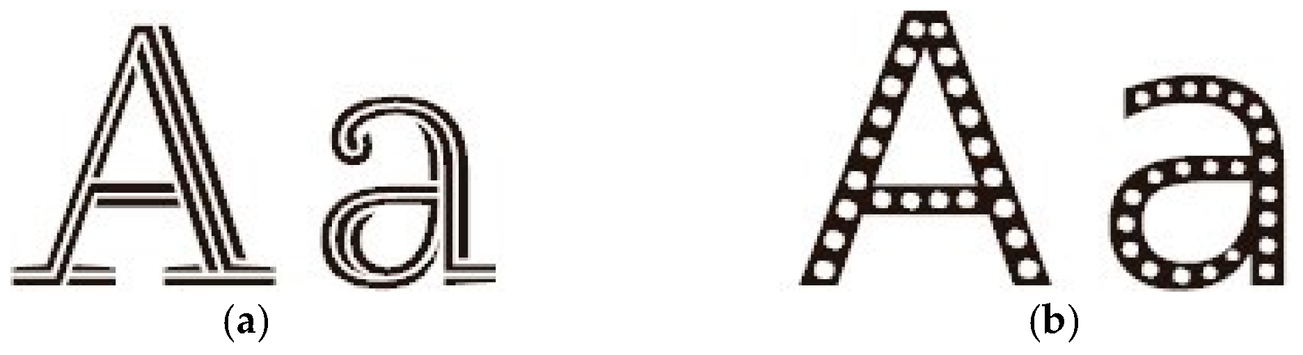
With the ongoing COVID-19 pandemic, offices in the private and government sectors are reducing office printing outputs, with great potential for further reductions as electronic devices become more readily available at accessible prices [15,16]. Also, the use of electronic email, projectors, e-books, scanners, and advanced printer settings (e.g., recycled paper, duplex printing, toner/ink saving modes) has a great potential to promote GIT [17,18,19,20,21]. However, as some of these options may require additional investments, many organisations seek other cost-effective alternatives such as pixel removals or Ecofont utilisation [22,23]. In particular, the use of Ecofonts as a GIT option has increasingly received attention. Among the numerous open-source options, the Ryman Ecofont (see Figure 1a) [24] is popular for Latin alphabets (like the English one). Research indicates [25] that the use of Ryman typeface instead of traditional solid-filled typeface (for the most used typeface sizes) reduces the consumption of inkjet toner by approximately 39%, although the visibility of the typeface becomes noticeable as the typeface size increases. Whilst reducing the use of toner is important, ease of reading is also critical in a document. Accordingly, the Handbook of Print Media [26] recommends that, for clear visibility and legible typography, there should be a maximum of around 60 characters per line and around 40 lines per page. It also recommends a font size no smaller than 9 pt, but no larger than 11 pt. The leading (line spacing minus size of type height) should be 2 pt.
Previous research has examined the modification of various typefaces to reduce the amount of ink and toner use [27]. The removal of black pixels from the typeface is an attractive option to font designers interested in GIT. One commercially-available example of such typeface is the Ryman (see Figure 1a [24]) and Eco Vera Sans [28], which fills in the original Vera Sans typeface with tiny holes (e.g., Figure 1b). Results from previous visual tests indicate that the observers of this typeface found it congenial and legible, i.e., pleasurable while reading texts [29]. Recently, a software called “Ecofont” (which embodies holes into the Vera Sans typeface) reported that it can reduce ink/toner consumption by up to 28% [28]. A commercial version of the Ecofont software includes other typefaces (like Sans, Garamond, and Arial), but only the Eco Vera Sans is freely available. Unfortunately, the software only supports Latin typefaces.
To date, existing research on the use of Ecofonts has focused on Latin typefaces, as most of the studies were carried out in countries where English is used. Therefore, the use of Ecofonts cannot be extended to other non-Latin alphabets [25], which in turn hinders opportunities for material and cost savings elsewhere. In this study, the commonly used Latin typefaces are first modified by placing holes within the typeface, and image analyses on pixel removal are subsequently performed. Comparisons are made between less ink intensive typefaces (Century Gothic and Times New Roman) and the Eco Vera Sans typeface. The removal of black pixels (leading to hollow-embodied typefaces) is also investigated using the Thai language as a case study of a non-Latin alphabet. Based on these results, the study proposes a new Ecofont typeface for the Thai language. The study also presents a mass analysis to examine ink/toner savings, as well as results from observers’ tests on visibility and legibility of texts printed with Ecofonts or solid (original) typefaces. The results of this study contribute towards promoting GIT printing, which is expected to bring benefits to the environment by reducing ink/toner consumption in South-East Asia.
2. Methodology
2.1. Selection of Latin Typeface for Analysis
The type of font can reduce ink/toner consumption by up to 31% [30]. In Table 1, all typefaces were printed on inkjet and laser printers with a 600 x 600 dpi resolution. The modern Sans Serif or Century Gothic typefaces use less ink/toner than other typefaces. Moreover, the Century Gothic typeface also shows higher efficiency (Rank #1) in terms of visibility, legibility and business costs [30]. Subsequent research also confirmed that a 30% ink reduction can be achieved by changing the default typeface from Arial to the less ink-demanding Century Gothic [31]. The Century Gothic typeface comes as a standard in general typing software.
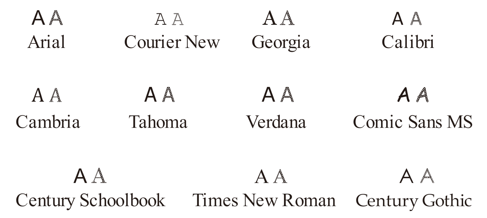
Figure 2 summarises other types of fonts commonly used in Latin alphabets. The Calibri font is particularly legible on computer screens. The Century Schoolbook font was designed to be legible in books, and it is widely used in textbooks [32,33]. The traditional-looking Times New Roman typeface was designed to be both legible and economic on printed newspapers, and it is extensively used in UK universities as it offers a right balance between traditional looks and ink/toner savings [34]. Other font types shown in Figure 2 are used in very few universities in both the UK and the USA [32,33,34]. Based on the above facts and on the results in Table 1, in this study, the Century Gothic (Rank #1) and Times New Roman (Rank #3) typefaces are selected for further investigation.
2.2. Development of Hollow-Embodied Ecofonts
In this step, black pixels were removed from the Century Gothic and Times New Roman typefaces for pixel image analyses. This was done by enclosing the open typeface anatomy so as to generate two hollow-embodied typeface counterparts. Figure 3 compares the existing Eco Vera Sans typeface (Rank #2 in Table 1) with the two modified typefaces. The implementation is performed using FontLab Studio software [35], which can easily produce hollow-embodied typeface from solid (original version) typefaces for any alphabet. The two modified typefaces (referred to as Eco-Century Gothic and Eco-Times New Roman) are examined later for pixel and structural visibility and then compared to the existing Eco Vera Sans typeface. The printing area use and toner consumption will be further analysed in Phases 1 and 2 of this study.
2.3. Development of Hollow-Embodied Ecofont: Thai Alphabet
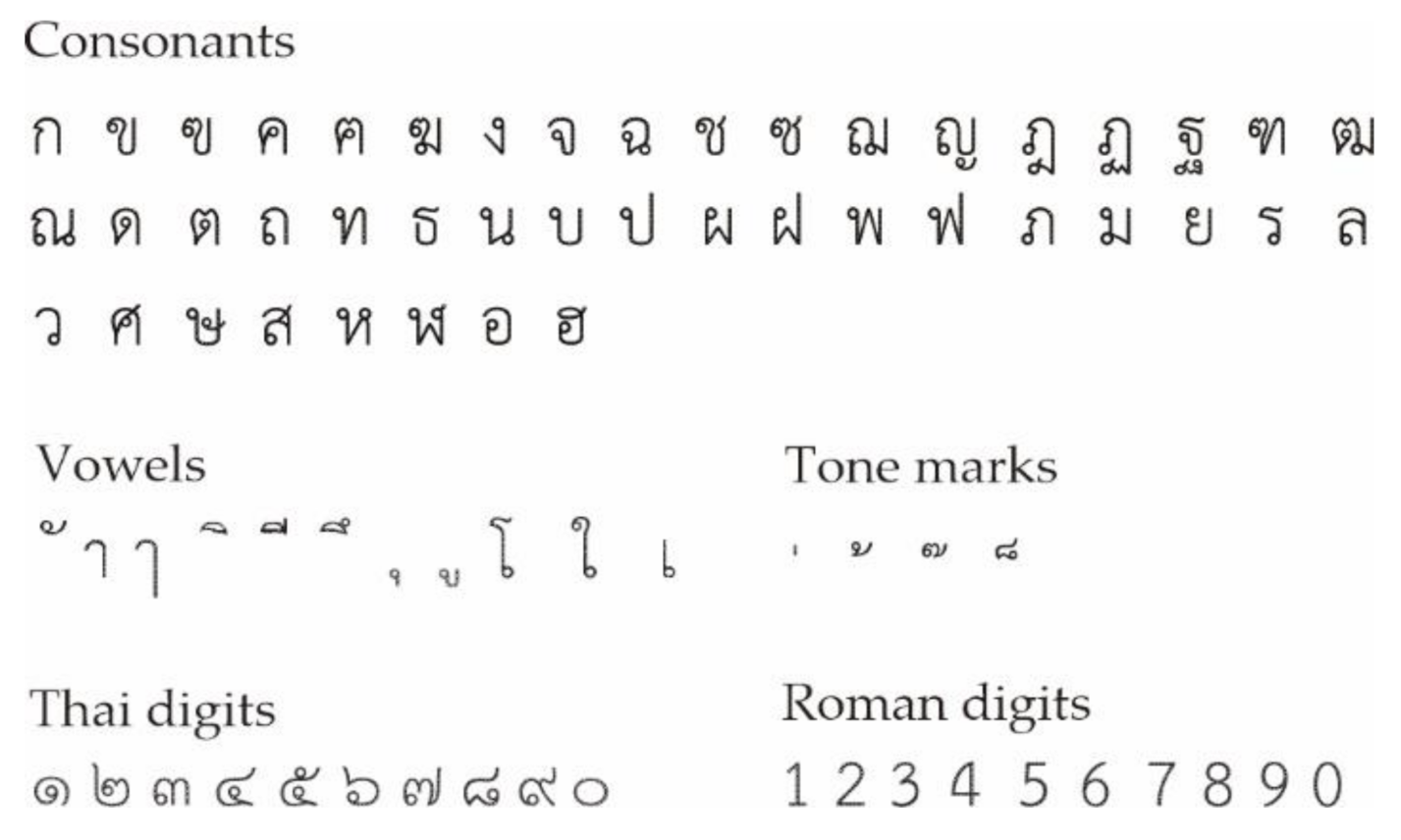
Various Thai typefaces have been developed to address the need for increased typographic legibility and visibility [36,37]. The Thai government has also set 13 typefaces to be used in official documents. The 13 typefaces lack the serif parts, which improves readability. More recently, the TH Sarabun PSK typeface was adopted as the official typeface for all Thai government documents [38], with a recommended font size of 16 pt. Further details regarding the Thai writing system can be found elsewhere [39,40].
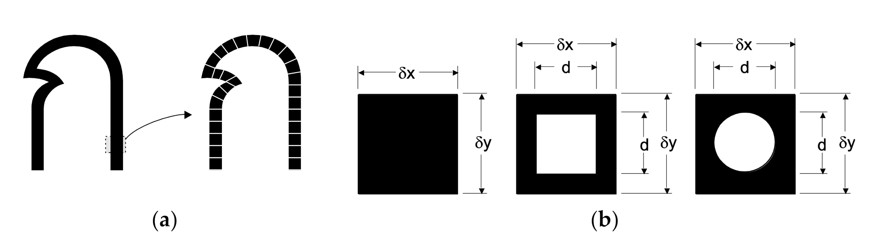
Structural modifications were performed on the above 13 Thai typefaces using FontLab Studio to create hollow-embodied Ecofont versions. In the case of Thai, an individual letter (see Figure 4a) is divided into segments, which are then converted into an image for pixel analysis (Figure 4b).
The image size of an individual segment consists of pixels, with pixels in the horizontal and pixels in vertical directions, respectively. The number of black and white pixels is calculated by counting (i.e., scanning) all pixels horizontally and vertically, and the sum of the two types of pixels gives the total number of pixels of a letter or character. The total number of black pixels in each letter () is the sum of the black pixels () of the individual segments, as expressed in Equation (1):
By replacing black pixels in the solid Thai typefaces with square or circular white pixels in individual segments, and by setting the width () of the font size to the most commonly used (16 pt) Thai font size, the optimum size of the total white pixels inserted in each letter () is defined as the sum of white pixels () in all individual segments, as shown in Equation (2):
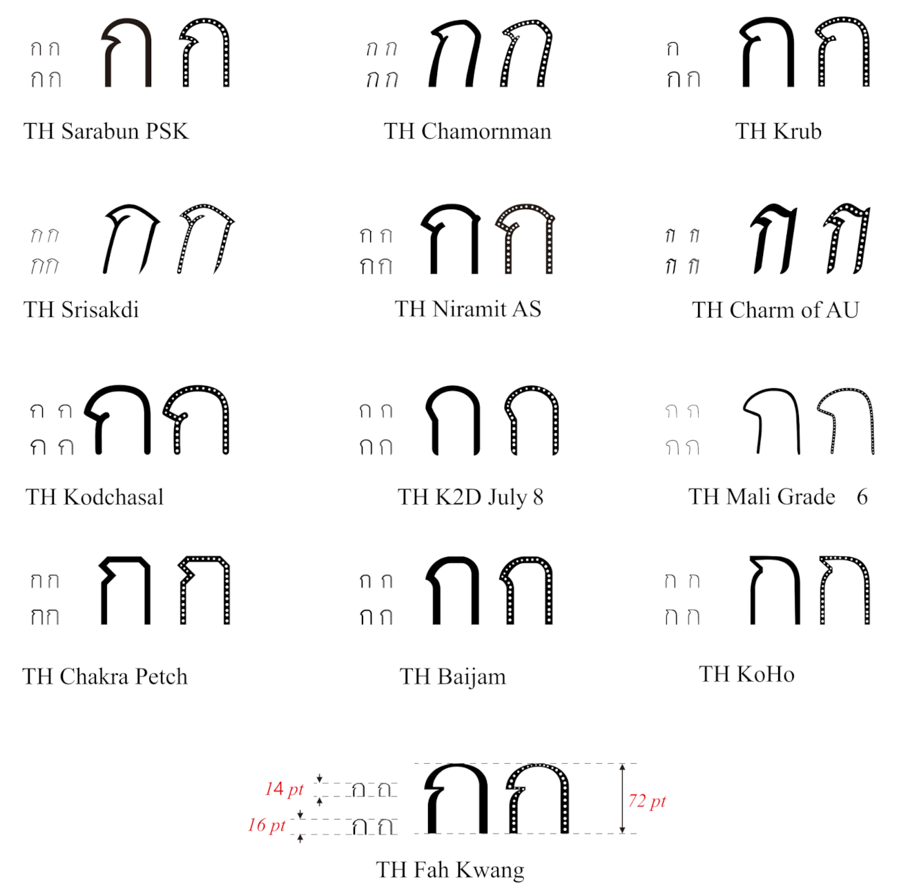
Figure 5 shows the 13 most used Thai typefaces (size 16 pt) and the modified Ecofonts generated using FontLab Studio. The removal of the black pixels was carried out using image analysis tools in Matlab. This new Thai Ecofont family is referred to as TH Imjai-Ecofont, which is licensed to Walailak University [41].
The above methodology was implemented for the whole Thai alphabet, which consists of 87 letters: 46 consonants, 18 vowels, 4 tone marks, 10 digits, 7 signs, 1 repetition mark, and 1 currency symbol for the Unicode Standard [42]. This exercise removed approximately 20% of black pixels from the Thai alphabet. The amount of black pixels removed from the 13 Thai fonts is less than in the Latin fonts as the former are thinner than the latter. For example, the typeface TH Mali Grade 6 is relatively thin, thus resulting in a small number of black pixels being removed. Indeed, only a small amount of white pixels could be filled in the solid face for the sake of good visibility and readability, as shown by the image analysis results presented later in Section 3.
Figure 6 shows the whole TH Imjai-Ecofont family after the black pixel removal. The TH Imjai-Ecofont family adopts the GIT concept. Subsequent sections of this study present psychological studies on legibility, visibility of typefaces, short-exposure and distance methods to measure the overall efficiency of this new Thai Ecofont. The analysis is divided into three Phases as explained in the following sections.
2.4. Phase 1: Analysis of Pixel Reduction
The 10 English fonts (Table 1) and 13 Thai fonts (Figure 5) were examined to assess their ink/toner consumption. First, a computer-based pixel (image) analysis was performed on sheets printed with solid and hollow-embodied typefaces. To achieve this, 11 pt commonly used Latin fonts with a total of 50 sets (one set includes capital letters, small letters and Arabic numbers) were written in MS Word 365 to fit in one A4 page (setting of four side margins = 25.4 mm). For the Thai alphabet, the 13 typefaces with a size of 16 pt were examined. 30 sets of each Thai typefaces (one set includes 44 Thai letters, Thai numbers and Arabic numbers) were printed on one A4 page with similar page settings as the Latin fonts. Each font type was designed with different weight, width, contrast, X-height and geometry. To perform the image analyses, the English and Thai letters (initially typed in one page of MS Word) were converted into a pdf format using Adobe Acrobat Pro DC version 20.006. This pdf document was then exported into a black and white image of size 2339 × 1654 pixels with .tiff extension. Each character had a black colour in this image. Therefore, the ratio between the black pixels and white pixels was used to analyse the necessary printed area of each font. A Matlab code was used to calculate the black and white pixels in RGB colour mode. Black and white pixels read red, green, blue values equal to 0, 0, 0 and 255, 255, 255, respectively.
A similar analysis was implemented for both Latin and Thai fonts, and the total pixel count () of the printed sheets was calculated as the sum of total black pixels () and total white pixels (), according to Equation (3):
The printing area utilisation ratio for the solid face () was then calculated using Equation (4):
The printing area utilisation ratio for the modified hollow-embodied typefaces is referred as and can be calculated by multiplying the reduction coefficient by the amount of black pixels, as shown in Equation (5):
2.5. Phase 2: Analysis of Toner Consumption
In this study, both samples of original solid and hollow-embodied fonts were printed on 500 papers using different 1200 × 1200 dpi printers: an HP Smart Tank 500 All-in-One inkjet printer, and a Ricoh SP C440DN laser office printer. In addition, a Multifunction Printer Ricoh MP 6055SP also used as a copier machine for the papers printed from the laser printer (Ricoh SP C440DN) to evaluate the toner used in a copier. The black cartridge ink toners used to print off the samples were supplied by the printer manufacturer. The technical specifications of the printers used in this study are shown in Table 2. Note that in this article, the term “toner” refers to powder used in laser (xerography) printers, whereas “ink” refers to liquid (apart from Xerox solid wax ink) used in inkjet printers [43].
Standard 80 g/m2 uncoated wood-free office paper was used in this study. The mechanical properties and physical characteristics of the paper are shown in Table 3. The paper weight was measured according to the ISO 536 standard using an ABJ-120 KERN analytical balance [44]. The paper thickness was measured according to the ISO 534 standard [45]. The paper surface roughness was measured with a Surface Roughness Tester TR 200 using a sample of five cut-off wavelengths of 0.8 mm (RC filter, range: ±40 µm). The mechanical properties of the paper (break force, break stress, stroke, and strain) were determined using a Shimadzu EZ-LX/SX series compact table-top universal tester. The test results show the mechanical properties of two strips cut off from the same sample of paper in different directions: machine direction (MD, i.e., the direction in which the paper moves during manufacturing) and cross-machine direction (CD, i.e., the direction at right angles to the machine direction). The optical characteristics were measured using a portable Techkon SpectroDens kit to detect whiteness and yellowness (measurement geometry 0/45°, illuminant D65, standard observer 2°), in accordance with ISO 13,655 standards [46].
Mass analysis was used to evaluate the ink/toner consumption of the Ecofont Vera Sans, Eco-Times New Roman, and TH Sarabun PSK fonts. To achieve this, the texts from Phase 1 were also used in Phase 2. The 500 paper sheets were used to find an average ink/toner consumption per page by measuring the weight of the ink used for inkjet and laser printers. First, the 500 sheets of blank paper were weighed using a Mettler Toledo Analytical Balance (AB204-Series) with a precision of 0.0001 g. The papers with the fonts were then printed off. The temperature and relative humidity (RH) in the laboratory were 27.5 °C and RH = 80% during the weight measurement. The average value of the paper weight was calculated from six measurements, which were generally found to have small differences at the fourth decimal place. At the end of Phase 2, all papers were reused as draft paper.
2.6. Phase 3: Visibility of Typefaces and Legibility Studies
Image quality in graphical reproductions can be evaluated by human observers through psychophysical assessment [36,37,47] using a visibility-controlled environment [48,49,50,51]. Human observers perceive relative changes in different viewing conditions equally, even though the viewing conditions may change [38,47,48,49]. Accordingly, Phase 3 sought to find more time-effective and cost-saving methods to subjectively determine the human’s capability to distinguish visible differences between texts printed with the original and Ecofont Latin and Thai typefaces. This project adopts the same psychometric test for a calibrated laboratory environment setting to visibility and legibility of web-based hollow-embodied typefaces (Ecofonts). The following sections describe the visibility of typefaces and legibility tests carried out as part of this study.
2.6.1. Paired Comparison Index
Thurstone’s model is widely used for reliability, scaling and comparative human judgment [52]. The model assumes that the human perception of quality is a Gaussian random variable that can be quantified using an arbitrary constant (see Equation (6)), also called Thurstone’s law for case V. Milosevic et al. [25] adopted the Thurnstone’s law for case V to determine the visibility of open-source Ecofonts and non-Eco typefaces using 40 observers. In their study, the approach was applied to the observers’ grading data on text paragraphs printed using the Ryman Ecofont and its original version. The results also reflect the observer’s reliability and congeniality [53].
In this equation, n is the number of observers, m is the number of samples and ri is the grade given by an observer (i.e., ri = 0 for visually less pleasant font, ri = 1 if the observer does not notice any visual difference between fonts, and ri = 2 for visually more pleasant font).
The visibility result is obtained by calculating a PC-index (Ipc) that multiplies by the interval quality scale (0 to 100), according to Equation (7). High values of Ipc indicate that the observers perceived a good text quality, whereas low values of Ipc indicate that the observers perceived an inferior text quality.
2.6.2. Test Procedure
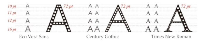
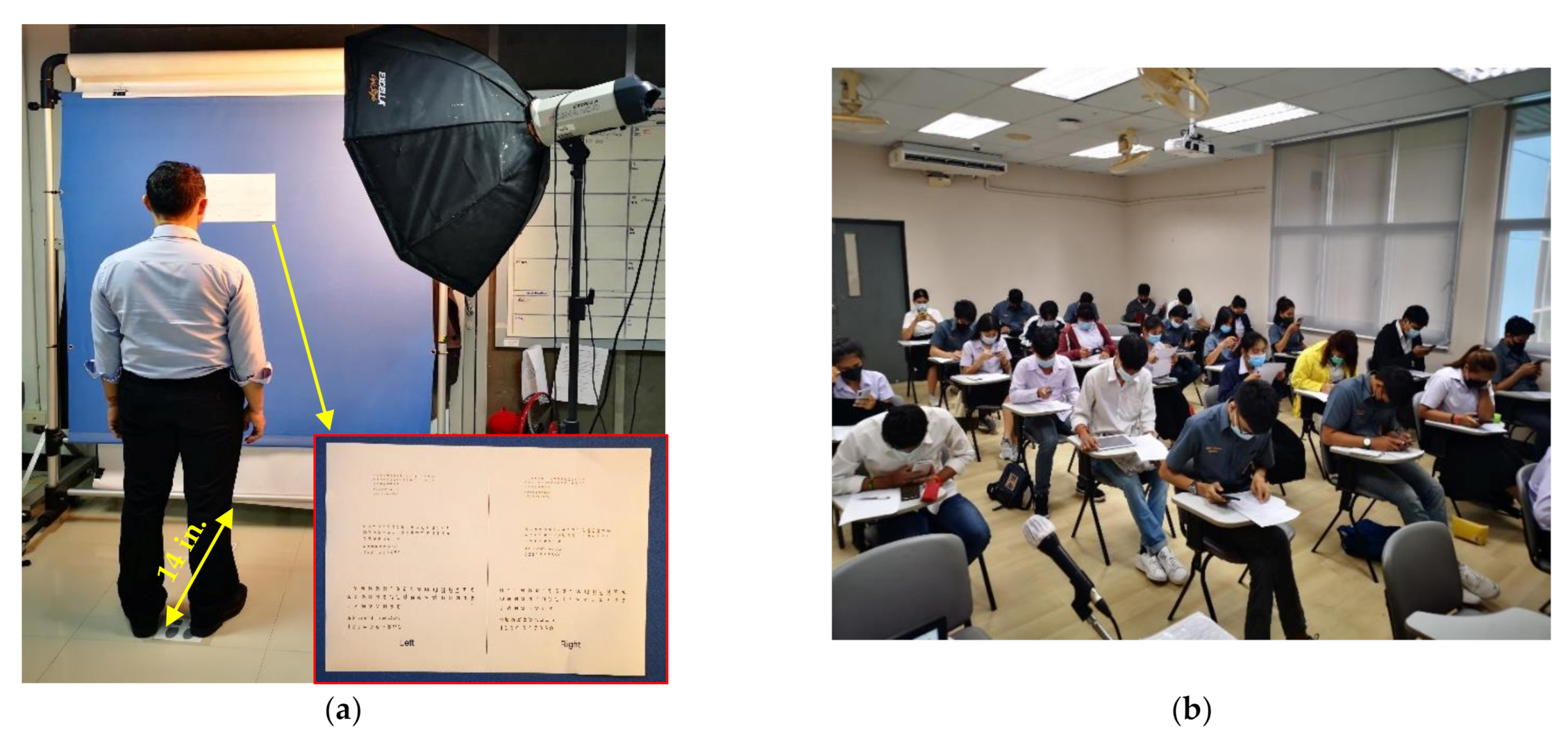
Single-person visibility tests (Figure 7a) were carried out using 10 A4 sheets written with the same typefaces but with different text sizes. A readability and performance group test was also performed (Figure 7b). In every test, two dummy text paragraphs were printed on a white A4 paper with different text sizes: a) 8, 9, 10, and 11 pt for the Vera Sans, Century Gothic and Times New Roman, and b) 11, 12, 14, 16, and 18 pt for the original TH Sarabun PSK typeface and the TH Imjai-Ecofont family.
The typography (such as line spacing, text-indent and page layout) was controlled on the sample cardboard. The temperature, humidity and light were also kept as in a normal lecture theatre (temperature = 26 °C, RH = 83%, illuminance = 500 lux). Thirty-two undergraduate university students from 3rd and 4th years (age range 19–20, with 17 males and 15 females) and 15 academic staff (age ranged 40–55, with 9 males and 6 females) from the Computer Engineering Software department at Walailak University acted as observers in this study (47 observers in total). All observers took a sight test before the single-person test, and glasses were provided if necessary. Every observer was then asked to detect each of the 10 cardboards individually and to mark if they detected any visual difference between the two cardboards.
For the readability and performance group test, the observers focused on the text paragraphs written from two dummy sample pages (solid and hollow-embodied typefaces), and they were asked to select which ones were more visually pleasant. At the end of the group test, all observers were informed about the Ecofonts used in this study, and they were asked whether they would choose Ecofonts to print off their documents after knowing the ink/toner consumption evidence (discussed later in Phases 1 and 2 of this study).
3. Results and Discussion
3.1. Phase 1: Printed Area Use and Ecofonts Performance
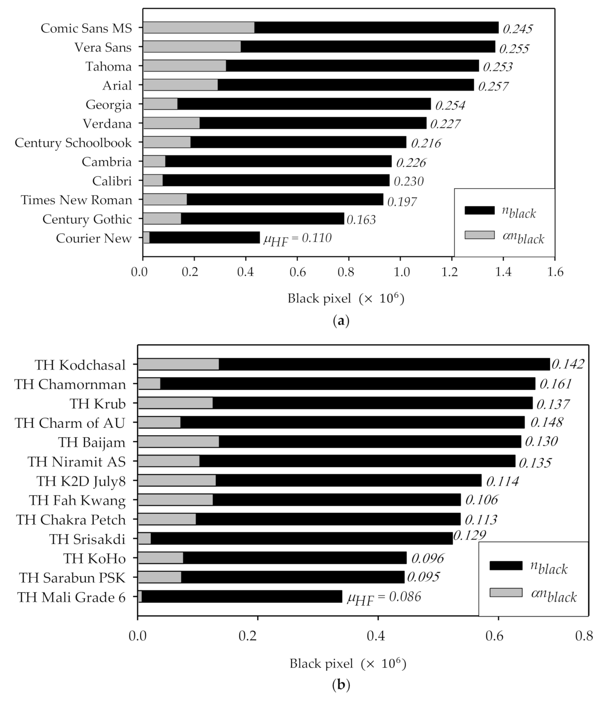
Table 4 and Table 5 summarise the main results for the investigated Latin and Thai typefaces. In these tables, the number of black pixels and white pixels was calculated with Equations (1) and (2). The typefaces are ranked in ascending order, based on the printing area utilisation ratio (). Given that all graduated Engineering theses at Walailak University adopt an 11 pt Times New Roman typeface, the main objective of this study was to assess whether spending of the ink coverage was reduced if Century Gothic and Verdana typefaces were used instead. As both Century Gothic and Verdana have a relatively wider typeface than the Times New Roman, a font size of 10 pt was chosen for both Century Gothic and Verdana for a fair comparison. The results in Table 4 show that the Courier New typeface ( = 0.110) uses the least black pixels (considering both and values) on a printed area. The Century Gothic typeface has also a low use of black pixels ( = 0.163), followed by Times New Roman ( = 0.197). The Comic Sans MS, Tahoma, Vera Sans, and Arial typefaces were found to have larger printing areas ( > 1,200,000). Moreover, these latter typefaces use approximately twice as much printing space as the Courier New typeface. The results from black pixel numbers shown in Table 4 confirm that there is very little difference in printing space between Times New Roman, Cambria and Calibri. However, this difference is very large for Times New Roman compared to Comic Sans MS, Tahoma, Vera Sans and Arial typefaces.
Table 4 also shows that the Courier New typeface has the lowest black pixel coverage (453,900 pixels), whereas the Comic Sans MS yields the maximum (1,380,582 pixels) due to relatively thicker characters. However, after removing the black pixels from the original version of the typeface, the value of the Courier New typeface reduces from 0.117 to 0.110, which is the smallest black pixel removal (27,143 only). In contrast, the Comic Sans MS has the maximum black pixel coverage and yields the maximum black pixel removal (434,054). For the extensively used Times New Roman, the black pixel removal is 172,192 with a = 0.197. The results in Table 4 also show that the Century Gothic ranks 2nd (only after Courier New) with a = 0.163. These results confirm previous research [30] where the Century Gothic typeface was found to reduce ink/toner consumption. Overall, the results show that the Courier New typeface is the least black pixel intensive. However, this type of font is not widely used in texts. Figure 8a compares the amount of black pixel removal and the printing area utilisation ratio for the original and modified typefaces investigated in this study. It is shown the Comic San MS, Vera Sans, Tahoma, and Arial typefaces have the largest printing areas and the same black pixel removal values. The results also indicate that by using the Century Gothic or Courier New the printing area (in terms of black pixel number) can be reduced by almost twice compared to the Comic Sans MS or Vera Sans typefaces.
In the case of Thai typefaces, Table 5 shows that the TH Mali Grade 6 has the lowest use of black pixels on a printed area ( = 0.086). Conversely, both the TH Baijam and TH Niramit AS typefaces have a larger printing area ( > 620,000). In fact, the latter typefaces use approximately twice as much printing space as the TH Mali Grade 6 typeface. There is only a 0.79% difference between the TH Sarabun PSK and TH KoHo typefaces. However, such a difference is very large if the TH Sarabun PSK is compared to other typefaces (e.g., TH Baijam, TH Niramit AS, TH Krub, and TH Kodchasal). In terms of , the TH Mali Grade 6 shows the lowest black pixel removal (approximately 2.3%) as this is a relatively thin typeface. As for the most commonly used TH Sarabun PSK typeface, the amount of black pixel removal is 73,210 (with = 0.095), thus leading to an 18.2% removal of black pixels. The maximum amount of black pixel removal was 23.4% for the TH Chakra Petch ( = 0.113). Figure 8b compares the printing area in terms of black pixel use and the printing area utilisation ratio for the TH Imjai-Ecofont family typefaces. The results in Figure 8b indicate that the TH Kodchasal typeface removes the largest amount of black pixels. It is also shown that the TH Mali Grade 6 shows the lowest black pixel removal with a utilisation ratio = 0.086, and this increases to 0.095 when the TH Sarabun PSK is used. The positive effect of using Ecofonts becomes more pronounced at smaller values of .
As part of Phase 1, an ink consumption analysis was also performed using the commercial software APFill Ink Coverage Meter v.6.1, as well as Adobe Photoshop Pro version 2020. The analysis examined the amount of ink used to print off on the A4 paper sheets during test Phase 2. The printed samples were sorted into three groups: (a) Type I: printed samples from an inkjet printer (scan), (b) Type II: printed samples from a laser printer (scan), and (c) Type III: built-in MS Word printer to pdf file. The results listed in Table 6 show that the Century Gothic leads to lower ink coverage (16.87%) when printed using the original typeface, and this coverage is further reduced to 13.75% when printed using Ecofont for samples Type I (paper printed using inkjet). For paper printed with laser (Type II), the ink coverage of the Century Gothic typeface is 16.01% and 11.02% for the original version and Ecofont, respectively. Surprisingly, the Century Gothic typeface performs even better than the Eco Vera Sans typeface. The results from paper Type II (digital original pdf file generated by MS Office) also show that both the original and Ecofont versions lead to lower ink coverage than Type I. In fact, the Type I samples have the highest ink coverage. This is attributed to the inkjet rheological characteristics, as the ink spreads on the paper surface and gets absorbed into the paper fibres. For the case of the TH Sarabun PSK typeface, the Type I samples printed using original typefaces show the higher toner coverage (13.70%) but this value reduces (to 11.16%) if an Ecofont is used.
3.2. Phase 2: Toner Saving Result
Table 7 shows the average and overall mass values of 500 papers before and after the printing process using three English typefaces and one TH Sarabun PSK typeface. The results indicate that, in all cases, the papers printed using Ecofont have lower mass than the original typefaces. The use of Eco Vera Sans typeface reduces ink consumption by up to 28% per page. Ink reductions are also observed for the Century Gothic, Times New Roman, and TH Sarabun PSK typefaces, with ink savings of 25%, 12%, and 18%, respectively. As reported previously [30], the original version of the Century Gothic consumes less ink than the Eco Vera Sans typeface, and this is also evident when comparing the mass of the ink used in the tested papers. For example, one page of inkjet-printed with Eco Vera Sans consumed about 0.0846 g of toner. Conversely, the original Century Gothic uses about 0.0758 g of ink, and this reduces to 0.0603 g when the Ecofont is used. For the widely used Times New Roman typeface, a larger ink reduction potential is evident if compared to its Ecofont (0.0765 g/page vs. 0.0691 g/page, respectively). A similar trend is observed for the papers printed using laser and copier machines. Therefore, both original and Ecofont versions of the Century Gothic and Times New Roman typefaces are a good solution to reduce ink/toner consumption without investing in extra printing devices or commercial software.
In the case of the TH Sarabun PSK Ecofont typeface, the average mass of toner used per pair is 0.0774 g if printed from an inkjet printer. However, if printed using the original typeface, the toner used was 1.8045 g. The ink use reduces to 0.0373 g and 0.0245 g when using laser and copier in the printing process, as seen in Table 7. Therefore, the removal of black pixels from this commonly used Thai typeface can lead to more sustainable printing, and this simple solution could be extended to other non-Latin languages as part of a global GIT campaign.
3.3. Phase 3: Visibility Analysis and Legibility Test
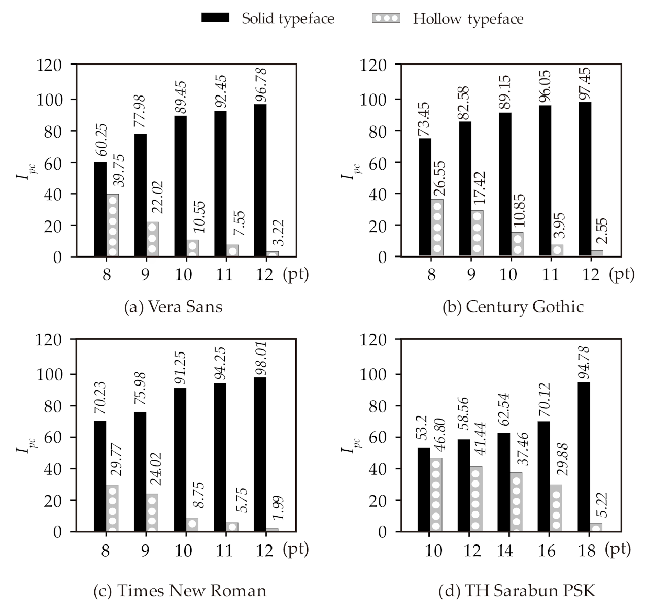
Figure 9a–c shows the PC-index scales () for the typeface s investigated in this study. The Eco Vera Sans typeface is also included for comparison. The scale varies from 0 to 100, where 100 refers to samples perceived with good visibility of the text quality. The results indicate that, as the text size increases, the PC-index value decreases as a result of a clearer contrast of the white pixels in the text structure. However, for the most common font sizes (i.e., 10–11 pt for Roman typeface, and 16 pt for TH Sarabun PSK typeface), the observers perceived good visibility of the texts. Indeed, the white pixels were not noticed, and the text quality was still maintained (i.e., < 10). Unsurprisingly, an increase in the font size leads to a greater perception of differences between the texts printed from original and Ecofont typefaces. Therefore, the perceived text quality and visibility of the Ecofont typefaces reduce as the physical structure of a character is more obvious.
In the readability and visibility group tests, 78% of the 47 observers noticed visual differences between the original and Ecofont typefaces for sizes of 12 pt and 18 pt for the Latin and TH Sarabun typefaces, respectively. In addition, about 90% (42 observers) detected the differences between the original and Ecofont printing. This is due to the observers being in general familiar with typographical aspects inherent to academic environments, and therefore they were able to spot the visual differences between these two typefaces. After the observers were made aware of GIT concepts and were told about the Ecofont alternatives to reduce ink/toner consumption by up to 28%, all of them showed a preference to use Ecofonts in their documents. Whilst the observers are aware of visual differences between the two typefaces as the size increases, all the observers indicated that the reliability and text quality was less important if the use of Ecofonts led to ink and cost savings, and clearly preferable to buying a new eco-printer.
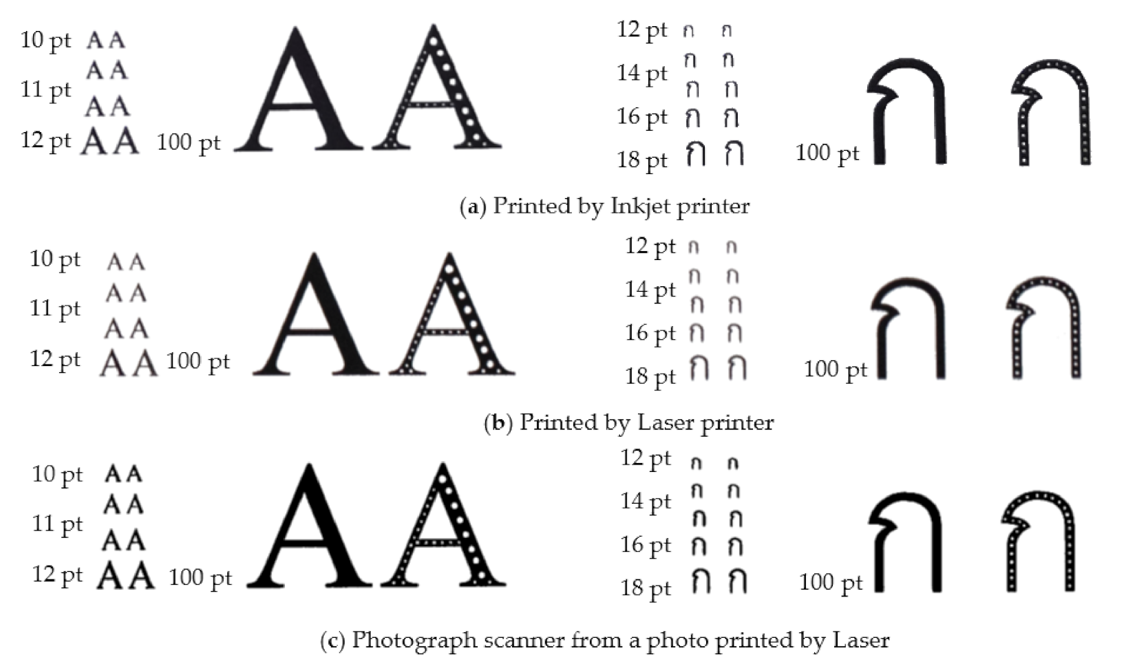
Figure 10 compares the quality of the original Times New Roman and TH Sarabun PSK typefaces, and the modified Ecofonts with the different text sizes printed from inkjet (Figure 10a), laser (Figure 10b), and copier machines (Figure 10c). It is evident that, as the text size increases, the text structures’ imperfections are more noticeable, which in turn explains the results in Figure 9. Interestingly, for the most common text sizes, the visibility and legibility of the Thais Ecofonts were found acceptable with a good text quality. Accordingly, the new TH Imjai-Ecofont family proposed in this study is deemed acceptable for use in Thai texts.
4. Concluding Remarks
This article (a) assessed the efficiency of Ecofont printing by determining toner use reduction in documents printed in English and Thai typefaces, and (b) studied the observers’ perception of texts printed either with Ecofonts or with original typefaces. This was done by removing black pixels from the original typefaces, and by performing the single-observer and group tests. A new Ecofont typeface for the Thai language was also proposed. Based on the results of this study, the following conclusions can be drawn:
- Analyses of pixel and printing covering area indicate that the Courier New typeface was the least ink-intensive of the most common Latin typefaces using in printing. In the case of the Thai typefaces, the TH Mali Grade 6 was the least ink-intensive of the common Thai typefaces.
- Image analyses results showed that the Comic Sans MS, Vera Sans, and Tahoma, typefaces have the highest black pixel coverage. Likewise, the TH Kodchasal, TH Chamornman, and TH Krub typefaces have the highest black pixel coverage in the case of Thai typefaces.
- The ink/toner consumption analyses results showed that the existing Eco Vera Sans typeface reduces ink/toner use by up to 28%, which confirms results from previous research. Moreover, Ecofont versions of the Century Gothic, Times New Roman, and TH Sarabun PSK typefaces reduced the ink/toner consumption by 25%, 12%, and 18%, respectively.
- Results from visibility and legibility tests revealed that, for the common sizes used to print off texts, the reading experience of 47 observers was very similar when reading texts printed on paper, regardless of whether original solid typefaces or Ecofont typefaces were used in printing.
- As the size of the typeface increased beyond the common ones used in texts, the observers were able to notice the physical differences between the original and Ecofont typefaces. Accordingly, the new TH Imjai-Ecofont family proposed in this study is deemed acceptable for use in Thai texts within the university environment.
- The removal of black pixels from typefaces can lead to more sustainable printing in Thailand. This simple solution can be extended to other non-Latin languages as part of the global Green Information Technology efforts in South-East Asia.
Author Contributions
Conceptualization, T.I. and U.M.; methodology, T.I. and U.M.; software, C.W.; formal analysis, T.I.; investigation, T.I, U.M., and C.W.; writing—original draft preparation, T.I. and C.W.; writing—review and editing, T.I. and R.G.; supervision, R.G. All authors have read and agreed to the published version of the manuscript.
Funding
This project is funded by National Research Council of Thailand (NRCT5-RSA63019-04).
Institutional Review Board Statement
Not applicable.
Informed Consent Statement
Not applicable.
Data Availability Statement
Not applicable.
Acknowledgments
This research was financially supported by the new strategic research project (P2P), Walailak University, Thailand. The authors are also thankful to Walailak University Science and Technology Park (WUSTP), for providing access to the licensed TH Imjai-Ecofont for this project. The authors would like to thank the staff and students of the Department of Engineering (Programme in Computer Engineering and Artificial Intelligent) at Walailak University for kindly participating in the tests of this study.
Conflicts of Interest
The authors declare no conflict of interest.
References
- Charter, M.; Tischner, U. Sustainable Solutions: Developing Products and Services for the Future; A Greenleaf Publishing, Routledge: London, UK, 2017. [Google Scholar]
- Wirtenberg, J.; Russell, W.G.; Lipsky, D. The Sustainable Enterprise Fieldbook; Greenleaf Publishing: Sheffield, UK, 2009. [Google Scholar]
- Cezzar, J. The AIGA Guide to Careers in Graphic and Communication Design; Bloomsbury Publishing: New York, NY, USA, 2017. [Google Scholar]
- Deng, X.Q.; Wu, G.Q.; Huang, H.R. Discuss on e-waste recycling system and management system. In Proceedings of the 38th International Conference on Computers and Industrial Engineering, Beijing, China, 31 October–2 November 2008; House of Electronics Industry: Beijing, China, 2008; pp. 3012–3016. [Google Scholar]
- Awasthi, A.K.; Zeng, X.; Li, J. Environmental pollution of electronic waste recycling in India: A critical review. Environ. Pollut. 2019, 211, 259–270. [Google Scholar] [CrossRef] [PubMed]
- Balde, C.P.; Wang, F.; Kuehr, R.; Huisman, J. The Global E-waste Monitor: 2014 Quantities Flows and Resources; United Nations University: Tokyo, Japan; Bonn, Germany, 2015; pp. 1–41. [Google Scholar]
- Dastbaz, M.; Pattinson, C.; Akhgar, B. Green Information Technology: A Sustainable Approach; Morgan Kaufmann: Burlington, MA, USA, 2015. [Google Scholar]
- Mishra, D.; Akman, I.; Mishra, A. Theory of Reasoned Action application for Green Information Technology acceptance. Comput. Human Behav. 2014, 36, 29–40. [Google Scholar] [CrossRef]
- Bai, C.; Sarkis, J. Green information technology strategic justification and evaluation. Inf. Syst. Front. 2013, 15, 831–847. [Google Scholar] [CrossRef]
- Kiurski, J.; Marić, B.; Djaković, V.; Adamović, S.; Oros, I.; Krstić, J. The impact factors of the environmental pollution and workers health in printing industry. In Proceedings of the World Academy of Science, Engineering and Technology; World Academy of Science, Engineering and Technology: France, Paris, 2012; pp. 755–758. [Google Scholar]
- Kiurski, J.S.; Marić, B.B. Occupational hazards in printing industry. Int. J. Environ. Sci. Technol. 2016, 13, 955–972. [Google Scholar] [CrossRef] [Green Version]
- Bajpai, P. Pulp and Paper Industry: Chemicals; Elsevier: Amsterdam, The Netherlands, 2015. [Google Scholar]
- Man, Y.; Han, Y.; Li, J.; Hong, M.; Zheng, W. Life cycle energy consumption analysis and green manufacture evolution for the paper making industry in China. Green Chem. 2019, 21, 1011–1020. [Google Scholar] [CrossRef]
- Chen, X.; Man, Y.; Zheng, Q.; Hu, Y.; Li, J.; Hong, M. Industrial verification of energy saving for the single-tier cylinder based paper drying process. Energy 2019, 170, 261–272. [Google Scholar] [CrossRef]
- Mingay, S. Green IT: The new Industry Shock Wave; Gart. RAS Res. Note G. 153703; Garnet, Inc: Dublin, Ireland, 2007. [Google Scholar]
- Jenkin, T.A.; McShane, L.; Webster, J. Green information technologies and systems: Employees’ perceptions of organizational practices. Bus. Soc. 2011, 50, 266–314. [Google Scholar] [CrossRef]
- Feng, H.; Tomonari, S. China’s sustainable strategy on waste paper as reusable resources. J. Environ. Sci. Eng. 2012, 1, 1142–1148. [Google Scholar]
- Counsell, T.A.M.; Allwood, J.M. Desktop paper recycling: A survey of novel technologies that might recycle office paper within the office. J. Mater. Process. Technol. 2006, 173, 111–123. [Google Scholar] [CrossRef]
- Rahman, M.O.; Hussain, A.; Basri, H. A critical review on waste paper sorting techniques. Int. J. Environ. Sci. Technol. 2014, 11, 551–564. [Google Scholar] [CrossRef] [Green Version]
- Rogers, J.G.; Cooper, S.J.; Norman, J.B. Uses of industrial energy benchmarking with reference to the pulp and paper industries. Renew. Sustain. Energy Rev. 2018, 95, 23–37. [Google Scholar] [CrossRef]
- Liang, S.; Zhang, T.; Xu, Y. Comparisons of four categories of waste recycling in China’s paper industry based on physical input–output life-cycle assessment model. Waste Manag. 2019, 32, 603–612. [Google Scholar]
- Miller, J.; Miller, M. Print Compound Conserving Font Production Method. U.S. Patent No. 8,467,082 B1, 18 June 2013. [Google Scholar]
- Montrucchio, B.; Ferrero, R. Toner savings based on quasi-random sequences and a perceptual study for green printing. IEEE Trans. Image Process. 2016, 25, 2635–2646. [Google Scholar] [CrossRef] [PubMed]
- UK Stationery Retailer Ryman and Grey London. Ryman Eco (Version 1), UK. Available online: https://rymaneco.co.uk/index.html (accessed on 10 November 2020).
- Milošević, R.; Nedeljković, U.; Banjanin, B.; Novaković, D.; Kašiković, N. The analysis of inkjet printed eco-font efficiency. J. Graph. Eng. Des. 2016, 7, 13–18. [Google Scholar] [CrossRef]
- Kipphan, H. Handbook of Print Media: Technologies and Production Methods; Springer: Berlin/Heidelberg, Germany, 2001. [Google Scholar]
- Aydemir, E. Comparison of the printing areas for commonly used font types: Example of green information. Eur. J. Tech. 2019, 9, 37–43. [Google Scholar] [CrossRef] [Green Version]
- SPRANQ. Ecofont, The Netherlands. Available online: https://www.ecofont.com/ (accessed on 12 November 2020).
- Možina, K.; Likar, K.; Muck, D. Legibility of eco fonts. In Proceedings of the 8th International Symposium on Graphic Engineering and Design—GRID16, Novi Sad, Serbia, 3–4 November 2016; Pavlović, Ž., Ed.; University of Novi Sad: Novi Sad, Serbia, 2016; pp. 387–393. [Google Scholar]
- Printer.com. Printing Costs: Does Font Choice Make a Difference? 2009. Available online: https://web.archive.org/web/20121022091251/http://blog.printer.com/2009/04/printing-costs-does-font-choice-make-a-difference (accessed on 12 March 2021).
- Murray, P. Changing Font To Save Ink, Wisconsin Public Radio, USA. 2010. Available online: https://www.npr.org/templates/story/story.php?storyId=125639616%3FstoryId%3D125639616&fbclid=IwAR3xnh_WWXN50KVqzrTzYl79X0K-ybed2tAnnL1pNyGJuhm7S10ljDRTYmg (accessed on 10 November 2020).
- Usability News, A Comparison of Popular Online Fonts: Which Size and Type Is Best? 2002. Available online: https://www.researchgate.net/publication/254696696_A_Comparison_of_Popular_Online_Fonts_Which_Size_and_Type_is_Best (accessed on 20 January 2021).
- Walker, S. Book Design for Children’s Reading: Typography, Pictures, Print; St Bride Foundation: London, UK, 2013. [Google Scholar]
- Hojjati, N.; Muniandy, B. The Effects of Font Type and Spacing of Text for Online Readability and Performance. Contemp. Educ. Technol. 2014, 5, 161–174. [Google Scholar] [CrossRef]
- FontLab 7, Studio FontLAB LTD., USA. Available online: https://www.fontlab.com/font-editor/fontlab/ (accessed on 10 March 2020).
- Punsongserm, R.; Sunaga, S.; Ihara, H. Thai Typefaces (Part 1): Assumption on Visibility and Legibility Problems. Arch. Des. Res. 2017, 30, 5–23. [Google Scholar]
- Punsongserm, R. Legibility and Readability of Roman-like Thai typeface. Fine Appl. Arts J. 2015, 10, 99–128. [Google Scholar]
- Punsongserm, R. Thai universal design font versus familiar Thai text fonts: The role of distinctive letterforms and suitable inter-letter space influence in blurred words. Proceeding of the Heritage & Vision, 2019 International Conference on Design for Experience and Wellbeing, Xi’an, China, 23–25 September 2019; Northwestern Polytechnical University: Xi’an, China, 2019. [Google Scholar]
- Haas, M.R. The Thai system of writing; American Council of Learned Societies: Washington, DC, USA, 1956. [Google Scholar]
- Diller, A. Thai and Lao Writing. In World’s Writing Systems; Bright, W., Daniels, P.T., Eds.; Oxford University Press: New York, NY, USA, 1996; pp. 457–466. [Google Scholar]
- Imjai, T. Saving Printer Ink by Using Eco-Friendly Fonts. Available online: https://engineer.wu.ac.th/?page_id=16578&lang=en (accessed on 5 January 2021).
- Thai Industrial Standard 620-2533. Thai Range: 0E00-0E7F. The Unicode Standard, Version 13. Available online: http://unicode.org/charts/PDF/U0E00.pdf (accessed on 10 November 2020).
- Chandler, N. What’s the Difference between Ink and Toner? Available online: https://computer.howstuffworks.com/difference-between-ink-and-toner.htm (accessed on 7 March 2021).
- ISO BSEN 536: Paper and Board. Determination of Grammage. Available online: https://www.iso.org/standard/60352.html (accessed on 10 February 2021).
- ISO PNEN 534: Paper and Paperboard-Determination of Thickness, Density and Bulk. Available online: https://www.iso.org/standard/53060.html (accessed on 10 February 2021).
- ISO 13655: Graphic Technology—Spectral Measurement and Colorimetric Computation for Graphic Arts Images. Available online: https://www.iso.org/standard/65430.html (accessed on 10 February 2021).
- Legge, G.E.; Pelli, D.G.; Rubin, G.S.; Schleske, M.M. Psychophysics of reading-I. Normal vision. Vision Res. 1985, 25, 239–252. [Google Scholar] [CrossRef] [Green Version]
- Phillips, J.R.; Johnson, K.O.; Browne, H.M. A comparison of visual and two modes of tactual letter resolution. Percept. Psychophys. 1983, 34, 243–249. [Google Scholar] [CrossRef] [PubMed]
- Nakano, Y.; Yamamoto, R.; Ari, T.; Inoue, S.; Hayashi, K.; Takata, Y.; Handa, A. Development of a “Universal Design” Font with Blur Tolerance (1): A Comparison of the Readability of Ming, Gothic, and “Universal Design” Typefaces. 2010. Available online: http://web.econ.keio.ac.jp/staff/nakanoy/research/largeprint/03_kaken/2012/fig/IAUD2010-1.pdf (accessed on 10 March 2021).
- Arai, T.; Nakano, Y.; Yamamoto, R.; Hayashi, K.; Takata, H.; Handa, A.; Inoue, S. Development of a “Universal Design” Font with Blur Tolerance (2): A Comparison of the Legibility of Ming, Gothic, and “Universal Design” Typefaces. 2010. Available online: http://web.econ.keio.ac.jp/staff/nakanoy/research/largeprint/03_kaken/2012/fig/IAUD2010-2.pdf (accessed on 10 March 2021).
- Kim, J.S.; Cho, M.S.; Choi, B.T. Study on the methods of digital image quality evaluation. In Proceedings of the IEEE Region 10 Conference TENCON 2004, Chiang Mai, Thailand, 24 November 2004; Volume 1, pp. 359–362. [Google Scholar] [CrossRef]
- Brown, T.C.; Peterson, G.L. An Enquiry into the Method of Paired Comparison: Reliability, Scaling, and Thurstone’s Law of Comparative Judgment; General Technical Report RMRS-GTR-216WWW; US Department of Agriculture, Forest Service, Rocky Mountain Research Station: Fort Collins, CO, USA, 2009. [Google Scholar]
- Engeldrum, P. Psychometric Scaling—A Toolkit for Imaging System Development; Imcotec Press: Winchester, UK, 2000. [Google Scholar]
Figure 1.
Freely available Ecofonts; (a) Ryman and (b) Ecofont Vera Sans (font size 11 pt, zoom 300%).
Figure 1.
Freely available Ecofonts; (a) Ryman and (b) Ecofont Vera Sans (font size 11 pt, zoom 300%).

Figure 2.
Original versions and hollow-embodied Latin typefaces.

Figure 3.
Hollow-embodied typeface visual comparison of Eco Vera Sans, Eco-Century Gothic, and Eco-Times New Roman Ecofonts.
Figure 3.
Hollow-embodied typeface visual comparison of Eco Vera Sans, Eco-Century Gothic, and Eco-Times New Roman Ecofonts.

Figure 4.
Concept design of hollow-embodied Thai typefaces generated by FontLab Studio; (a) font segmentation and (b) pixel analysis of individual segment.
Figure 4.
Concept design of hollow-embodied Thai typefaces generated by FontLab Studio; (a) font segmentation and (b) pixel analysis of individual segment.

Figure 5.
Original 13 most commonly used Thai fonts and the new TH Imjai-Ecofont family [41].
Figure 5.
Original 13 most commonly used Thai fonts and the new TH Imjai-Ecofont family [41].

Figure 6.
Hollow-embodied generated on TH Sarabun PSK typeface from TH Imjai-Ecofont family.

Figure 7.
Visual and legibility tests in Phase 3; (a) single-person visibility test, and (b) readability and visibility group test.
Figure 7.
Visual and legibility tests in Phase 3; (a) single-person visibility test, and (b) readability and visibility group test.

Figure 8.
Comparison of the amount of removal of black pixels using hollow-embodied typefaces; (a) commonly used Latin and (b) commonly used Thai typefaces.
Figure 8.
Comparison of the amount of removal of black pixels using hollow-embodied typefaces; (a) commonly used Latin and (b) commonly used Thai typefaces.

Figure 9.
values for (a) Vera Sants, (b) Century Gothic, (c) Times New Roman, and (d) TH Sarabun PSK according to the pair-comparison psychological tests.
Figure 9.
values for (a) Vera Sants, (b) Century Gothic, (c) Times New Roman, and (d) TH Sarabun PSK according to the pair-comparison psychological tests.

Figure 10.
Visual comparison of the original typefaces and Ecofonts printed using InkJet Laser and photograph scanner from a photo printed by Laser (100% original size and 30% white noise reduction).
Figure 10.
Visual comparison of the original typefaces and Ecofonts printed using InkJet Laser and photograph scanner from a photo printed by Laser (100% original size and 30% white noise reduction).


Table 1.
Analysis* of the 10 most commonly used Latin typefaces and Eco Vera Sans Ecofont [30].
Table 1.
Analysis* of the 10 most commonly used Latin typefaces and Eco Vera Sans Ecofont [30].
| #Rank | Typeface | Font Size | Coverage (%) | Private Cost ($) | Business Cost ($) |
|---|---|---|---|---|---|
| 1 | Century Gothic | 10 | 3.45 | 46.32 | 179.29 |
| 2 | Eco Vera Sans | 10 | 3.47 | 46.59 | 180.33 |
| 3 | Times New Roman | 11 | 3.54 | 47.53 | 183.97 |
| 4 | Calibri | 11 | 3.81 | 51.16 | 198.00 |
| 5 | Verdana | 10 | 4.55 | 61.09 | 236.45 |
| 6 | Arial | 11 | 4.97 | 66.73 | 258.28 |
| 7 | Sans Serif | 11 | 5.09 | 68.34 | 264.52 |
| 8 | Trebuchet | 11 | 5.12 | 68.74 | 266.08 |
| 9 | Tahoma | 11 | 5.21 | 69.95 | 270.75 |
| 10 | Franklin Gothic Medium | 11 | 5.51 | 73.98 | 286.34 |
Table 2.
Technical specification of the printers used in this study.
| General Printing Specification | HP Smart Tank 500 Inkjet Printer | Ricoh SP C440DN Laser Printer | Ricoh MP 6055SP Multifunction Printer |
|---|---|---|---|
| Printer Type | Inkjet/colour | Laser/colour | Laser/Black & White |
| Print Speed | Up to 34 ppm-B/W Up to 34 ppm-colour | Up to 42 ppm-B/W Up to 42 ppm-colour | Up to 42 ppm-B/W Up to 42 ppm-colour |
| Functions | Printer | Printer | Printer/Scanner/Copier |
| Max Resolution B/W | 1200 × 1200 dpi | 1200 × 1200 dpi | 1200 × 1200 dpi-printer 600 × 600 dpi-copier |
| Max Resolution Colour | 4800 × 1200 dpi | 1200 × 1200 dpi | n/a |
| Max Printing Speed B/W (ppm) | 11 ppm-black, ISO | 42 ppm-black, ISO | 60 ppm-black, ISO |
| Max Printing Speed Colour (ppm) | 5 ppm-colour, ISO | 42 ppm-colour, ISO | n/a |
| Media Weight | 60–90 g/m2 | 52–256 g/m2 | 52–300 g/m2 |
| Black Cartridges | 1VV22AA black ink | 821,094 Black Toner | 842,126 Black Toner |
Table 3.
Mechanical and physical properties of the paper used in this study.
| Properties | Average Value * |
|---|---|
| Nominal weight (g/m2) | 80 |
| Paper thickness (mm) | 0.1065 |
| Specific volume (cm3/g) | 1.329 |
| Surface roughness (μm) | 2.751 (MD), 2.928 (CD) |
| Breaking load (N) | 119.99 (MD), 60.38 (CD) |
| Breaking stress (N/mm) | 4.800 (MD), 2.410 (CD) |
| Stroke (mm) | 2.80 (MD), 6.67 (CD) |
| Strain (%) | 1.89 (MD), 4.42 (CD) |
| Yellowness (Y1925) | −18.60 |
| Whiteness (WCIE) | 124.00 |
* Average value obtained from six measurements.
Table 4.
Comparison of results between the original versions of Latin typeface and their Ecofont versions.
Table 4.
Comparison of results between the original versions of Latin typeface and their Ecofont versions.
| #Rank | English Typeface | # of Black Pixel Removed | |||||
| 1 | Courier New | 3,414,806 | 453,900 | 3,868,706 | 0.117 | 27,143 | 0.110 |
| 2 | Century Gothic | 3,087,206 | 781,500 | 3,868,706 | 0.202 | 149,346 | 0.163 |
| 3 | Times New Roman | 2,935,406 | 933,300 | 3,868,706 | 0.241 | 172,193 | 0.197 |
| 4 | Century Schoolbook | 2,846,306 | 1,022,400 | 3,868,706 | 0.264 | 186,179 | 0.216 |
| 5 | Cambria | 2,903,240 | 965,466 | 3,868,706 | 0.249 | 88,340 | 0.226 |
| 6 | Verdana | 2,767,856 | 1,100,850 | 3,868,706 | 0.284 | 221,821 | 0.227 |
| 7 | Calibri | 2,911,559 | 957,147 | 3,868,706 | 0.247 | 78,103 | 0.230 |
| 8 | Comic Sans MS | 2,488,124 | 1,380,582 | 3,868,706 | 0.356 | 434,054 | 0.245 |
| 9 | Tahoma | 2,564,165 | 1,304,541 | 3,868,706 | 0.337 | 324,178 | 0.253 |
| 10 | Georgia | 2,750,816 | 1,117,890 | 3,868,706 | 0.289 | 135,376 | 0.254 |
| 11 | Vera Sans | 2,501,156 | 1,367,550 | 3,868,706 | 0.353 | 381,546 | 0.255 |
| 12 | Arial | 2,583,956 | 1,284,750 | 3,868,706 | 0.332 | 292,152 | 0.257 |
Note: Typefaces ranked in ascending order according to the printing area utilisation ratio ().
Table 5.
Comparison of results between the original versions of Thai fonts and their modified versions.
Table 5.
Comparison of results between the original versions of Thai fonts and their modified versions.
| #Rank | Thai Typeface | # of Black Pixel Removed | |||||
| 1 | TH Mali Grade 6 | 3,529,226 | 339,480 | 3,868,706 | 0.087 | 7638 | 0.086 |
| 2 | TH Sarabun PSK | 3,425,546 | 443,160 | 3,868,706 | 0.114 | 73,210 | 0.095 |
| 3 | TH KoHo | 3,422,036 | 446,670 | 3,868,706 | 0.115 | 76,425 | 0.096 |
| 4 | TH Fah Kwang | 3,331,946 | 536,760 | 3,868,706 | 0.138 | 125,870 | 0.106 |
| 5 | TH Chakra Petch | 3,332,306 | 536,400 | 3,868,706 | 0.138 | 97,678 | 0.113 |
| 6 | TH K2D July 8 | 3,297,566 | 571,140 | 3,868,706 | 0.147 | 130,733 | 0.114 |
| 7 | TH Srisakdi | 3,345,266 | 523,440 | 3,868,706 | 0.135 | 22,769 | 0.129 |
| 8 | TH Baijam | 3,231,506 | 637,200 | 3,868,706 | 0.164 | 136,105 | 0.130 |
| 9 | TH Niramit AS | 3,241,316 | 627,390 | 3,868,706 | 0.162 | 103,644 | 0.135 |
| 10 | TH Krub | 3,212,516 | 656,190 | 3,868,706 | 0.169 | 125,660 | 0.137 |
| 11 | TH Kodchasal | 3,183,806 | 684,900 | 3,868,706 | 0.177 | 135,952 | 0.142 |
| 12 | TH Charm of AU | 3,225,836 | 642,870 | 3,868,706 | 0.166 | 72,194 | 0.148 |
| 13 | TH Chamornman | 3,208,196 | 660,510 | 3,868,706 | 0.170 | 38,639 | 0.161 |
Note: Typefaces ranked in ascending order according to the printing area utilisation ratio ().
Table 6.
Analysis results for an average ink/toner coverage per page.
| Type of Samples | Analysis Tools | Vera Sans (10 pt) | Century Gothic (10 pt) | Times New Roman (11 pt) | TH Sarabun PSK (16 pt) | ||||
|---|---|---|---|---|---|---|---|---|---|
| Original | Ecofont | Original | Ecofont | Original | Ecofont | Original | Ecofont | ||
| I | Apfill | 24.21% | 17.70% | 16.87% | 13.74% | 18.04% | 15.06% | 13.70% | 11.16% |
| Photoshop | 26.31% | 19.54% | 18.65% | 16.45% | 20.41% | 18.01% | 15.78% | 13.40% | |
| II | Apfill | 20.74% | 14.98% | 16.01% | 11.02% | 16.05% | 12.87% | 11.52% | 9.45% |
| Photoshop | 23.41% | 16.2% | 17.95% | 13.77% | 18.45% | 14.89% | 15.23% | 12.78% | |
| III | Apfill | 11.78% | 8.54% | 6.11% | 5.01% | 8.05% | 6.60% | 5.46% | 4.33% |
| Photoshop | 13.12% | 9.45% | 8.18% | 6.98% | 10.78% | 8.84% | 7.45% | 5.98% | |
Note: Type I is the printed samples from the inkjet printer (scan), Type II is the printed samples from the laser printer (scan), and Type III is the built-in MS Word printer to pdf file.
Table 7.
Mass analysis and toner saving results of printed paper.
| Vera Sans (10 pt) | Century Gothic (10 pt) | Times New Roman (11 pt) | TH Sarabun PSK (16 pt) | |||||
|---|---|---|---|---|---|---|---|---|
| Original | Ecofont | Original | Ecofont | Original | Ecofont | Original | Ecofont | |
| 500 blank papers (g) | 2506.1137 | 2504.1137 | 2507.4115 | 2502.7841 | 2505.8015 | 2505.8120 | 2501.0812 | 2501.0981 |
| Paper + Inkjet (g) | 3361.2415 | 2546.3951 | 2545.3124 | 2532.9738 | 2544.0312 | 2540.3443 | 3403.3522 | 2539.8151 |
| Paper + Laser (g) | 3374.2264 | 2537.0124 | 2536.1245 | 2518.0023 | 2543.4551 | 2520.6781 | 3376.4678 | 2519.7521 |
| Paper + Copier (g) | 3270.6465 | 2522.8050 | 2522.1184 | 2517.9578 | 2541.5515 | 2520.0548 | 3353.9125 | 2513.3496 |
| Toner use Inkjet (g) | 855.1278 (1.7103) | 42.2814 (0.0846) | 37.9009 (0.0758) | 30.1897 (0.0603) | 38.2297 (0.0765) | 34.5323 (0.0691) | 902.2710 (1.8045) | 38.7170 (0.0774) |
| Laser (g) | 868.1127 (1.7362) | 32.8987 (0.0658) | 28.7130 (0.0574) | 15.221 (0.0304) | 37.6536 (0.0753) | 14.8661 (0.0297) | 875.3866 (1.7508) | 18.6540 (0.0373) |
| Copier (g) | 764.5328 (1.5291) | 18.6913 (0.0374) | 14.7069 (0.0303) | 15.1737 (0.0294) | 35.7500 (0.0715) | 14.2428 (0.0285) | 852.8313 (1.7057) | 12.2515 (0.0245) |
Note: The values shown in the parentheses are the average mass of the ink toner usage for one sheet of paper.
Publisher’s Note: MDPI stays neutral with regard to jurisdictional claims in published maps and institutional affiliations. |
© 2021 by the authors. Licensee MDPI, Basel, Switzerland. This article is an open access article distributed under the terms and conditions of the Creative Commons Attribution (CC BY) license (https://creativecommons.org/licenses/by/4.0/).
Share and Cite
MDPI and ACS Style
Imjai, T.; Wattanapanich, C.; Madardam, U.; Garcia, R. Analysis of Ink/Toner Savings of English and Thai Ecofonts for Sustainable Printing. Sustainability 2021, 13, 4070. https://0-doi-org.brum.beds.ac.uk/10.3390/su13074070
AMA Style
Imjai T, Wattanapanich C, Madardam U, Garcia R. Analysis of Ink/Toner Savings of English and Thai Ecofonts for Sustainable Printing. Sustainability. 2021; 13(7):4070. https://0-doi-org.brum.beds.ac.uk/10.3390/su13074070
Chicago/Turabian StyleImjai, Thanongsak, Chirawat Wattanapanich, Uhamard Madardam, and Reyes Garcia. 2021. "Analysis of Ink/Toner Savings of English and Thai Ecofonts for Sustainable Printing" Sustainability 13, no. 7: 4070. https://0-doi-org.brum.beds.ac.uk/10.3390/su13074070
Note that from the first issue of 2016, this journal uses article numbers instead of page numbers. See further details here.