
Is Expansion or Regulation more Critical for Existing Protected Areas? A Case Study on China’s Eco-Redline Policy in Chongqing Capital


Graduate School of Agriculture and Life Sciences, The University of Tokyo, Tokyo 113-8654, Japan
*
Author to whom correspondence should be addressed.
Land 2021, 10(10), 1084; https://0-doi-org.brum.beds.ac.uk/10.3390/land10101084
Submission received: 21 September 2021
/
Revised: 6 October 2021
/
Accepted: 11 October 2021
/
Published: 14 October 2021
(This article belongs to the Section Land Planning and Landscape Architecture)
Abstract
:Protecting areas of important ecological value is one of the main approaches to safeguarding the Earth’s ecosystems. However, the long-term effectiveness of protected areas is often uncertain. Focusing on China’s ecological conservation redline policy (Eco-redline policy) introduced in recent years, this study attempted to examine the effectiveness of alternative policy interventions and their implications on future land-use and land-cover (LULC) patterns. A scenario analysis was employed to elucidate the implications of different policy interventions for Chongqing capital, one of the most representative cities in China. These interventions considered the spatial extent of Eco-redline areas (ERAs) and the management intensity within these areas. LULC data for two different periods from 2000 (first year) to 2010 (end year) were derived from satellite images and then used for future (2050) LULC projections, incorporating the various policy interventions. Furthermore, several landscape indices, including the shape complexity, contrast, and aggregation of forest patches were calculated for each scenario. After comparing the scenarios, our analysis suggests that the current extent of ERAs may not be sufficient, although their management intensity is. Therefore, we suggest that during the optimization of the Eco-redline policy, ERAs are gradually increased while maintaining their current management intensity.
1. Introduction
The establishment of protected areas is a means of maintaining biodiversity while assuring the sustainable provision of ecosystem services [1,2,3]. In the tenth meeting of the Conference of the Parties regarding the Convention on Biological Diversity, one of the most critical Aichi Targets was set: at least 17% of terrestrial land and 10% of waters should be effectively protected by 2020. In the fifth edition of the Global Biodiversity Outlook, it was concluded that this target had been partially achieved [4]. An updated target, increasing these protected areas to 30% by 2030, has been proposed in the first drafts of the fifteenth meeting of the Conference of the Parties [5] and could be recommended as a new deal for humans and nature. However, the debate over the necessary proportion of protected areas seems likely to persist because of the complexity of the recommendations provided by studies with different spatiotemporal patterns and selection methods and focus on different ecological processes. A recent review indicated that the protected area coverage called for by previous studies has a large range (30–70%) at a global level [6].
Management methods and the corresponding intensity of land-use regulation is another important point in setting up protected areas, in addition to their spatial extent. Although hierarchical and zoning-based protected area management has reached international consensus, owing to the complexity of social development and ecosystems, there are almost no universal solutions applicable to all countries or regions. In some developed countries, such as the United States and New Zealand, national parks have achieved remarkable results. However, this approach may not be appropriate in some developing countries, owing to their large rural populations which rely on natural resources and have a low tolerance for the large predators that play essential roles in many ecosystems [7]. Poor management has led to poaching and logging in some protected areas, turning them into “paper parks” e.g., [8,9], a severe issue that requires awareness and action [10].
Despite these difficulties, some countries and regions are still attempting to develop new methods of establishing and governing protected areas. In recent years, China has been implementing a national ecological conservation policy: the Ecological Conservation Redlines (Eco-redline) policy, which refers to the use of red lines to demarcate areas that have important ecological functions within the scope of ecological space and which must therefore be strictly protected [11]. By assessing the ecosystem services and ecological sensitivity of the target areas, areas with important ecological functions and ecological sensitivity are identified and then superimposed and calibrated with existing protected areas (e.g., nature reserves and national parks) to form Eco-redline areas (ERAs).
As one of the most important ecological policies in China, the Eco-redline policy will have a lasting influence on many aspects of social and economic development. Most government departments fall under the scope of the policy, whether they make development plans or environmental protection plans. Land use and land cover (LULC) result from human–nature interactions, and changes may be beneficial or detrimental to human beings, profoundly affecting human well-being and welfare [12]. Therefore, evaluating the impact of the Eco-redline policy on LULC is crucial to the future implementation and optimization of this policy.
In this regard, scenario analysis is considered an effective method of assessing the medium- and long-term impacts of a policy [13]. Scenario analyses in protected area studies often consider alternative policy interventions for protected areas and the drivers of change (e.g., climate change, economic development, and population growth) that influence the operation of the protected areas. For example, using data on the area and percentage of protected areas in countries worldwide from 1950–2005, McDonald and Boucher [14] modeled future projections of protected areas in 2030 to examine the effectiveness of two contrasting strategies: strict conservation and multiple-use (in which resource extraction is partly permitted). Based on LULC change between 1990 and 2001, Martinuzzi, et al. [15] quantified areas of urban landscapes, croplands, and natural vegetation around protected areas in the United States under business as usual, forest incentive, high crop demand, and urban containment scenarios. Velazco, et al. [16] modeled plant species losses resulting from the continuous emission of greenhouse gases in Bolivia, Brazil, and Paraguay in 2050 and 2080, and found that the current protected area network is not sufficient to safeguard the most valuable Corrado plant species, even in the most optimistic scenario.
There are also several studies on the demarcation and management of Eco-redlines, some of which used scenario analysis. For instance, taking Shanghai as an example, Bai, et al. [17] analyzed multiple land-use scenarios with different policy interventions to explore their impacts on LULC and ecosystem services and assess their implications for the effective implementation of the Eco-redline policy. Using the CLUE-S model, Jia, et al. [18] explored the impacts of the Eco-redline policy on spatiotemporal land-use changes in Beijing. They concluded that the Eco-redline policy could improve the spatial integrity and connectivity of ecological functions. Ju, et al. [19] projected the urban expansion of the Beijing–Tianjin–Hebei megaregion in China by 2030 with and without the Eco-redline policy to show the effects of the policy on runoff.
However, there is not much discussion on how to further optimize the Eco-redline policy. Many studies compared scenarios in which the Eco-redline policy either exists or not, to illustrate the positive effects or deficiencies of the policy but did not provide specific adjustment suggestions. In addition, restricted by practical conditions such as financial support especially in developing countries or regions, there are usually trade-offs between different approaches. Therefore, which approach should be prioritized needs to be considered in policymaking. About the study area, existing studies most often use the northern plains or the developed eastern regions of China as examples. These studies have paid little attention to China’s central and western regions, which are dominated by mountains and hills and remain relatively underdeveloped. Thus, we aimed to examine the effectiveness of alternative policy interventions and their implications on future LULC patterns, focusing on the capital of Chongqing, the only municipality under direct control of the central government in western China. We employed scenario analysis with different ERA spatial extents and management intensities, using LULC simulation and landscape indices to analyze how these interventions influence ERA effectiveness. According to the implementation outline of Eco-redline policy from the central government [11], each province or city in China needs to regularly (e.g., every 5 or 10 years) evaluate the effectiveness of its ERAs and make appropriate adjustments if necessary. By comparing the impact of different measures on the landscape, we try to evaluate which approach is more critical to promoting the Eco-redline policy; thus, our results will provide theoretical support in subsequent policymaking.
2. Materials and Methods
2.1. Study Area
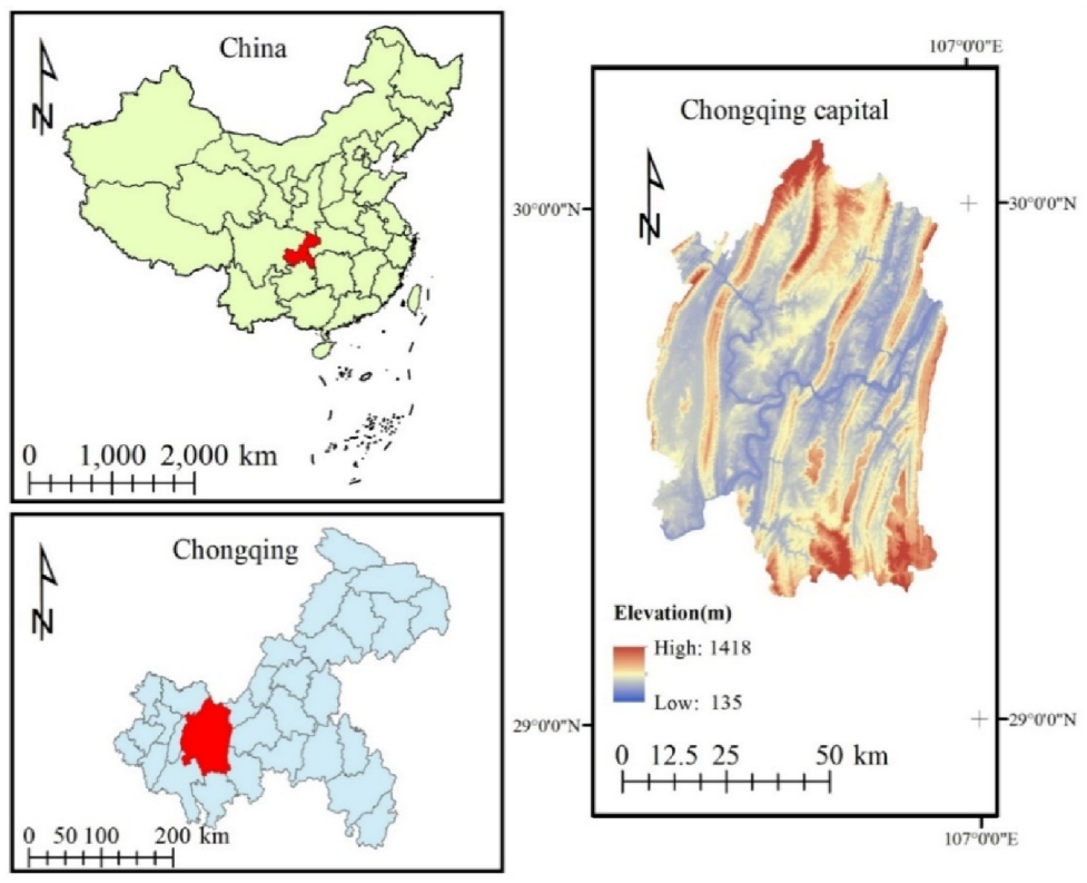
Chongqing is in southwest China, in the upper reaches of the Yangtze River (Figure 1). The capital of Chongqing is its administrative and economic center. It covers a total area of 5470 km2 and has nine districts under its jurisdiction, with a total population of nearly 8 million. The landforms of Chongqing are dominated by mountains and hills, of which mountains account for 76%, giving it the name “mountain city” [20]. Since the most influential development strategy in China, named Reform and Opening Up in 1978, Chongqing has undergone great changes in social and economic aspects over four decades. From 2000 to 2018, almost every year, the annual GDP growth rate of Chongqing exceeded 10%. In 2019, the GDP of Chongqing was USD 342 billion, with a medium to high growth rate (6.3%), and GDP per capita just exceeded USD 10,000 [21]. Economic development has brought rapid urbanization, with the urban population increasing from 35.6% in 2000 to 65.5% in 2018. According to the latest Eco-redline delimitation plan released by Chongqing Municipal People’s Government [22], the ERAs in Chongqing capital cover 912 km2, accounting for 17% of the total area. As there was no GIS data of the ERAs available, we produced vector data from a digital Eco-redlines map, showing the spatial distribution of the ERAs. The digitized ERAs covered a total area of 906 km2, which is very close to the official datum (912 km2).
2.2. Framework of Analysis
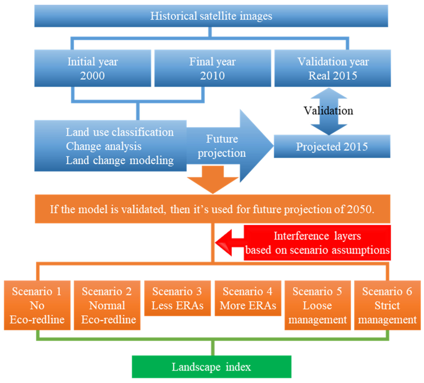
Scenario analysis is the combined application of models and scenarios [23]. With the development of GIS (geographic information system) technology, it becomes more and more convenient to obtain and analyze LULC data or use it for modeling. In the current study, we used the land change modeler (LCM) on TerrSet (version: 18.31) for land change simulation, which allows users to consider different policy interventions such as zoning regulations, land development plans, and road developments. We used 2050 as the time horizon for future projection and LULC maps from 2000 and 2010 for between different LULC classes, based on Chongqing’s socio-economic development. In addition, an LULC map from 2015 was used for the verification of the land change simulation.
Figure 2 demonstrates the framework of the analysis. Generally, it can be divided into the following steps: the construction of the land change model, the setting and conversions of the scenarios, the generation of future LULC images, and the calculation and statistical test of the landscape indices of the LULC images. First, cloud-free historical satellite images of 2000, 2010, and 2015 were acquired. The satellite images were then used to conduct LULC classification. The classified 2000 and 2010 LULC images were then used for land change modeling. A predicted 2015 LULC was created using the model and compared with the real 2015 LULC image. The model was then readjusted multiple times until satisfactory accuracy was obtained. Once the model was ready, the second step was the setting and converting of scenarios. Six scenarios based on different assumptions which incorporated the change of area and management intensity were proposed. The interference layers corresponding to different scenarios were generated and loaded into the model to simulate the future LULC images in 2050. Next, to compare the differences between these LULCs under different scenarios, several key forest patch landscape indices were calculated for each scenario. Finally, the landscape indices were used for statistical tests to find the effectiveness of the change of area and management intensity of ERAs. The following sections will provide more detailed explanations.
2.3. Data Acquisition of Historical Satellite Images
Landsat surface reflectance data images provided by the United States Geological Survey were sourced using the Google Earth Engine (GEE) platform. The Landsat surface reflectance data has a spatial resolution of 30 m, a temporal resolution of 16 days, and has been atmospherically corrected. GEE provides a function to filter for cloud-free pixels (https://developers.google.com/earth-engine/datasets/catalog/LANDSAT_LT05_C01_T1_SR accessed on 20 September 2021) by reading the description of the cloud cover in the metadata. In addition to this function, the IMAGE_QUALITY and CLOUD_COVER image properties were also used during pixel filtering.
To minimize phenological influences, the 2000, 2010, and 2015 images were preliminarily screened by month. After many attempts, we accepted that almost no image of a single month could cover the entire study area. In addition, cloudless images in summer and autumn generally covered no more than half the area. Therefore, we decided to use multiple images from adjacent periods for the subsequent land classification and then overlap them to obtain an LULC map of the whole study area. The following two criteria were applied in selecting images: first, the date range needed to be within three years of the target year; second, images from two months were used for each target year. Compared with the strategy of fusing images from different periods first and then classifying them, this strategy of first selecting images with higher homogeneity for separate classification and then overlapping (simply classify first then overlap) can effectively reduce the negative influences of phenology and sensor differences on later classification. The final images used for the target year 2000 were from July 2000 and July 2001; for 2010, they were from August 2010 and June 2008; and for 2015, they were from August 2015 and July 2016. A topographic illumination correction method proposed by Poortinga, et al. [24] was applied to all the images to reduce visual interpretation errors in the following LULC classification.
2.4. LULC Classification
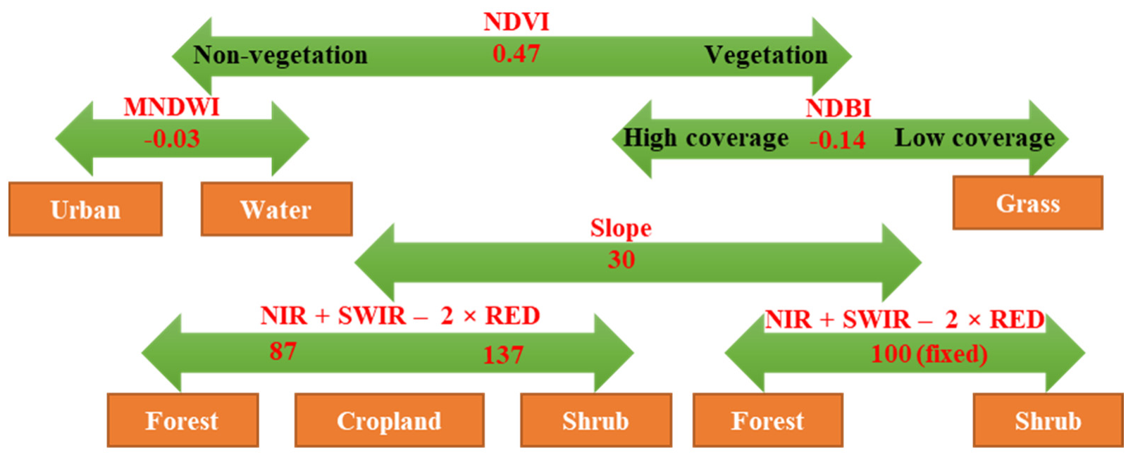
We encountered two challenges in the LULC classification of the study area. One was that the LULC was fragmented, and the other was the influence of cloud, fog, and haze. After many attempts to classify the satellite images using various common classification methods (e.g., supervised classification, unsupervised classification, and segmentation classification), decision tree classification was employed to minimize the errors and inconsistencies in images from different years and classify the images. The indices and calculation methods are shown in Table 1. Considering convenience during later modeling and the reality of LULC in Chongqing capital, the satellite images were classified into six LULC categories: urban, cropland, forest, shrubland, grass, and water, which refer to the categories defined by the Chinese Academy of Sciences and were slightly adjusted [25]. Figure 3 illustrates the classification process, taking August 2010 as an example. The digital numbers of each band were linearly stretched from 0–255 and then used to calculate the indices. The thresholds of the indices of all six images are presented in Table 2.
The normalized difference vegetation index (NDVI) was first used for the separation of vegetation and non-vegetation. The modified normalized difference water index (MNDWI) is very effective in extracting water bodies [26]. It was thus used to distinguish between urban landscapes and water bodies in the non-vegetation areas. Originally, the normalized difference building index (NDBI) was used to extract buildings e.g., [27,28], as it can also be used in conjunction with the NDVI to distinguish vegetation, built-up areas, and bare soil. Through visual interpretation of the satellite images and comparison with high-resolution historical images provided by Google Earth, we found that a small amount of grassland with low vegetation cover and soil as a background existed in the study area. The NDBI values of these grasslands were significantly different to those in areas with high vegetation cover, like forests. Urban areas were extracted using the NDVI in the previous step. Therefore, the NDBI was used to distinguish grasslands from areas with higher vegetation cover. The subdivision of the areas with high vegetation cover was challenging because their spectral characteristics are similar. As overly steep land is generally unsuitable for agricultural planting, slope degree was often used to distinguish woodland from cropland, e.g., [29,30]. As mountains and hills dominate Chongqing and several projects on the conversion and consolidation of sloping land have been underway for many years, e.g., the “Grain for Green” program [31], we were careful to use 30° as a threshold to initially extract some forest and shrubland areas. The relatively high threshold of 30° was used to minimize the risk of classifying cropland as woodland. After analyzing the band values, we found that the band values from infrared to red differed between forest, shrubland, and cropland. Therefore, the simple calculation of the band value “near infrared (NIR) + shortwave infrared (SWIR) − 2 × RED” was used to separate forest, shrubland, and cropland. Forests usually had the lowest “NIR + SWIR − 2 × RED” values, while shrublands had the highest, and the cropland values usually fell in between. Forests and shrublands with slopes less than 30° were distinguished using a fixed value (100), which was determined by trial and error. For areas with a slope greater than 30°, two thresholds were used to divide them into forests, croplands, and shrublands in turn (Figure 3, Table 2). In this study, the GREEN, RED, NIR, and SWIR bands correspond to b2, b3, b4, and b5 in Landsat 5 images, and b3, b4, b5, and b6 (SWIR 1) in Landsat 8 images, respectively.
The thresholds for the decision tree were based on the statistical analysis of the regions of interest (ROIs) in each category. ROIs were randomly selected from the segmented images by referring to high-resolution historical images on Google Earth. Six ROIs, corresponding to the six classification categories, were carefully selected to ensure balance in the quantity of each category and uniformity of distribution. The means and standard deviations (SD) of the indices used in the decision tree for each ROI were calculated. The distance between the threshold and the mean value of the target extraction category should preferably be at least twice the SD and should not be less than one SD in special cases, to ensure that the different categories can be easily distinguished. The meticulous extraction of the ROIs was used to determine the threshold values and for accuracy validation.
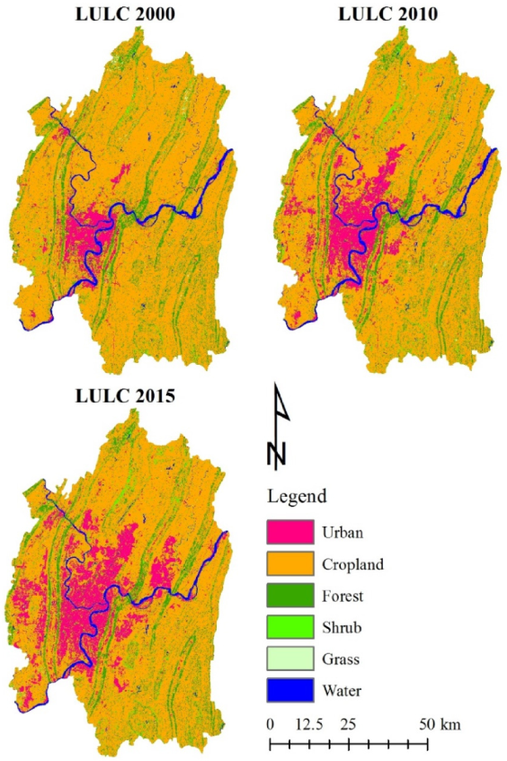
Finally, the classified image was generalized to remove isolated pixels using a 3 × 3 kernel-mode filter then validated using the ROIs as references. The overall accuracy for the 2000, 2010, and 2015 images was 80.2%, 86.3%, and 81.1%, respectively, while the corresponding kappa index of agreement was 0.74, 0.81, and 0.76, respectively. Figure 4 shows the classified LULC images for 2000, 2010, and 2015.
2.5. Land Change Modeling
The most important steps in land change modeling using LCM in TerrSet are the identification of major LULC transitions and the screening of corresponding explanatory variables. The rest settings such as new development plan by the government, infrastructure changes, road growth, and adjustment of change difficulty are selected depending on the actual needs. Our modeling process is comprised of the following major parts.
2.5.1. Identification of Major LULC Transitions
It is difficult and often unnecessary to analyze and simulate all LULC transitions. The LCM allows users to focus only on major transitions or those which may have a significant influence. Therefore, change analysis was first conducted to identify the major LULC transitions. We used land-use accounts and a change matrix to identify the main change trends and major transitions. Land-use accounts are an effective tool to explain the flow of each land category by explaining their gain, loss, persistence, net change, and turnover [32]. In the land-use accounts table, “gain” means a new formation from other categories, “loss” means consumption by other categories and persistence means no change, “net change” is the gain minus the loss, and “turnover” is the sum of gain and loss, reflecting all areas that underwent changes. Thus, a land-use accounts table was first used to show the general change trends of each LULC category (Table 3). The specific changes between LULC categories were displayed using a change matrix (Table 4).
The selection of transitions for modeling ultimately depends on the research purpose. Usually, a threshold transition area is set to distinguish major transitions. In our study, after careful analysis of the land-use accounts and change matrix, we decided to use 20 km2 as the threshold value, and transitions with an area less than this were ignored during change modeling. Seven major transitions were eventually included during change modeling (Table 5). A further advantage of the LCM is that it provides another tool, the multi-layer perceptron neural network tool, which can model several or even all changes at once that have similar driving forces (with the exception of logistic regression) [33]. Therefore, in this study, we divided the seven major transitions into three sub-models: urbanization, reclamation, and conservation, to represent three change trends. However, after many trials, the accuracy of the conservation model was always lower than 0.60. Thus, the transitions from cropland to forest and from cropland to shrubland were ultimately not merged into a sub-model but were calculated using separate models named “Conservation 1” and “Conservation 2,” respectively (Table 5).
2.5.2. Determination of Explanatory Variables
Transition potential modeling is used to find suitable explanatory variables and generate transition potential maps based on the calculation of these variables [34]. The preliminarily selected variables are shown in Table 6, including evidence likelihood–normalized past changes, topographic factors (elevation and slope degree), the distance to each category, the distance from roads, and the distribution density of each category. The elevation and slope degree were calculated using the NASA Shuttle Radar Topography Mission Digital Elevation (30 m) dataset [35], which was downloaded through the GEE. The road maps were from the National Earth System Science Data Center, the National Science & Technology Infrastructure of China (http://www.geodata.cn, accessed on 7 July 2021). There were five categories of roads included on the maps: railways, expressways, national roads, provincial roads, and county roads. For the LCM, the roads needed to be divided into three major levels; thus, railways and expressways were grouped into primary roads, national and provincial roads were grouped into secondary roads, and county roads were classified as tertiary roads. The distance parameters were Euclidean distance and the map density values were created using a 7 × 7 kernel on TerrSet.
Not all explanatory variables must be employed in the final modeling. The selection of suitable explanatory variables can be divided into two steps. First, LCM provides a quick tool, Cramer’s V, to measure the explanatory power of variables. Cramer’s V ranges from 0 to 1; the larger the value, the stronger the potential association. In our study, variables with a Cramer’s V less than 0.1 were eliminated (Table 6). Second, the multi-layer perceptron neural network analysis provides a more comprehensive report, including the detailed explanatory power of each variable. According to their influence order and a stepwise backward-elimination analysis, variables with less influence were dropped to achieve a more parsimonious model (Table 7). It should be noted here that “accuracy” refers to the model simulation accuracy when the corresponding variable is forced as a constant; thus, in general, the lower the accuracy, the higher the influence ranking of the variable. Once the accuracy of the selected explanatory variables was acceptable (larger than 70% in our study), the transition potential map could be created automatically by the modeler.
2.5.3. Incorporation of Government-Led Land Development
The Chongqing Municipal Government announced a land development plan for the capital urban area from 2007–2020 [36], which provided a map showing the planned construction zones in the Chongqing capital. Therefore, we digitized the construction zones and converted them into an incentive layer for urban expansion (Figure 5). Because the deadline for this development plan was 2020 and the target projection year was 2050, we added buffer zones of 2 km around the 2020 construction plans, indicating long-term development areas, and assigned them a value of 2 to indicate the higher urbanization probability within these areas. It should be noted that, before model accuracy assessment, the development plan layer was also imported into the model for land change simulation, but we did not incorporate the 2-km buffer zones around the construction areas because the planning period of the development plan, i.e., “2007–2020,” covered the later year “2010” and the verification year “2015”.
2.5.4. Validation of the Model
The projected 2015 LULC image was generated using the above settings. Meanwhile, a soft-prediction image was also created for validation. Soft prediction yielded a map indicating the change potential for LULC transitions. Thus, it can be used to quantify the predictive power of the model by comparing it to the image showing real change. The area under the curve (AUC, ranging from 0–1) was calculated by comparing the soft prediction image and the Boolean image showing the difference between the projected and real LULC images for 2015 [37]. Usually, transition potential modeling requires many attempts (selecting different explanatory variables, etc.). Considering the objective of our study, when the AUC exceeded 0.7, the model was used for future projection.
2.5.5. Road Growth Settings
Over relatively short periods, road growth simulation is optional, for example, in the 2015 validation projection. However, in this study, the target year 2050 is 40 years after the later year of the model, 2010. The proximity to roads may be a strong factor in LULC change, especially considering that China is still a developing country and has a considerable demand for roads. The LCM provides a tool for dynamic road development which can help determine how road networks may grow. The logic behind the road development tool is that primary roads can be extended and grow secondary roads, secondary roads can also be extended and grow tertiary roads, and tertiary roads can just be extended. The primary roads are generated automatically according to the internal calculations of the tool. Users need to decide the “road spacing” and “road length” of the secondary and tertiary roads, reflecting the frequency with which the lower-grade roads grow along the higher-grade roads and their degree of extension. In our study, the “road spacing” and “road length” values for secondary roads were 12 and 5 km, respectively, while those for tertiary roads were 12 and 3 km.
2.5.6. LULC Projection
The LCM produces an LULC change map through a multi-objective land allocation procedure which determines the change potential of the involved transitions by maximizing the suitability of the land for all the objectives [38]. The LULC transition quantities are calculated by an internal Markov model, then these transitions are allocated by a multi-objective land allocation algorithm. Each scenario is converted to a set of suitability maps for the decision process, and these can be loaded into the LCM to project the corresponding LULC map. The settings and conversions of the scenarios are described below in detail.
2.6. Scenario Settings and Conversions
The primary objective of this study was to explore the impact of the Eco-redline policy and assess various policy implications for the further improvement of policy implementation. In our analysis, two factors were integrated with the settings and analysis of future scenarios: 1) the spatial extent of the ERAs and 2) their management intensity. The “Normal Eco-redline” scenario was first set to represent a scenario in which the policy is implemented according to the current situation (Table 8). The “Normal Eco-redline” scenario served as a baseline scenario. The “No Eco-redline” scenario was set to explore land-use consequences in the absence of the Eco-redline policy. The “Less ERAs” and “More ERAs” scenarios were derived by adjusting the “Normal Eco-redline” scenario; “Less ERAs” incorporated smaller ERAs than those in the “Normal Eco-redline” scenario, while “More ERAs” incorporated larger ERAs. The “Loose management” and “Strict management” scenarios refer to the adjustment of management intensity, i.e., strengthening and loosening management, respectively.
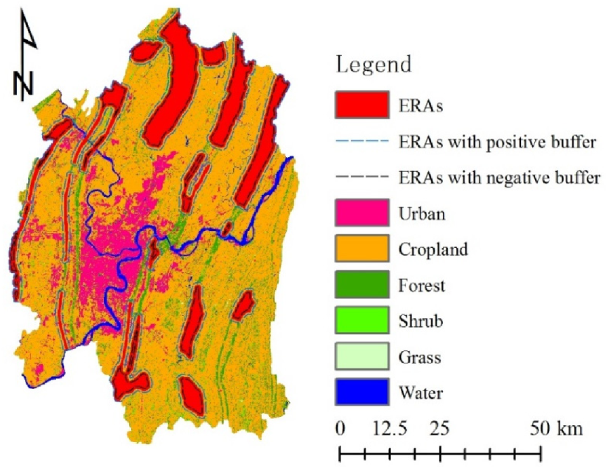
The above-mentioned assumptions for each scenario were translated into the model. We achieved the manipulation of the spatial extent of the ERAs by employing a 500-m buffer zone, based on the current ERAs (Figure 6). The “Less ERAs” scenario subtracted a negative buffer zone, while the “More ERAs” scenario added a positive buffer zone. The LCM can introduce constraints or incentive coefficients for each LULC transition to simulate the difficulty of change. A value of 1 represents no impact while a value of 0 represents an absolute constraint. Values between 0 to 1 were treated as constraints and values larger than 1 acted as incentives. Thus, with regard to management intensity, the major LULC transitions were assigned different constraint or incentive coefficients to represent corresponding management intensities (Table 9). For example, within the ERAs, cropland to urban transition is absolutely prohibited at normal management intensity, so it was assigned a 0 value, but it is slightly allowed under loose management, so it was assigned a value of 0.2. In the Strict management scenario, the transition of cropland to forest is highly encouraged in ERAs, so it was assigned a value of 2.
2.7. Future Projection for 2050
Before projection, recalculation stages must be specified. The period from 2010–2050 is 40 years, four times the length of the model period (2000–2010), so four recalculation stages were set in this study. The dynamic roads settings and recalculation stages were the same for all scenarios. The LULC images for all the scenarios were then generated, according to their different ERAs and management intensity coefficients.
2.8. Landscape Index
The landscape index is one of the most popular indicators to address the spatial and temporal characteristics, change trends, and driving factors of LULC. According to the explanation of the Eco-redline policy by the Chongqing Municipal People’s Government [22], the primary protection targets of Chongqing’s Eco-redlines are forests, wetlands, and grassland ecosystems. Our land change modeling indicated that the water and grass areas in Chongqing capital are relatively small and stable, and the changes related to them were not included in the major transitions (Table 5). Therefore, the forest (including both the forest and shrubland categories in this study) landscape indices are the best indicators to identify the effectiveness of the Eco-redline policy in Chongqing capital.
Many landscape indices have similar meanings and can be strongly correlated. To reduce this potential correlation, three aspects of forest patches representing distinctly different landscape features were considered in the current study. To be more precise, shape complexity, contrast with other patch categories, and aggregation of the same LULC class (i.e., forest) were calculated to compare the effectiveness of ERAs under the different scenarios. Shape complexity, which reflects the shape and size of a patch and their potential interaction, is highly related to ecological processes both within the patch and along its edges, e.g., [39]. The degree of contrast reflects the quality of the microhabitats and climates at the edge of the patch, which is critical for the survival and migration of some species [40]. In particular, an increase of urban patches around a forest, caused by urban expansion, may seriously affect the overall functioning of the forest. Therefore, it is often suggested that sufficient buffer space be left around protected areas to ensure their conservation value, e.g., [41]. As a comprehensive indicator of patch distribution, forest aggregation is highly correlated with connectivity; thus, it can be used as an indicator of the quality of ecological corridors [42]. Although there is still debate as to whether to maintain a few large forest patches (i.e., land sparing) or a large number of small forest patches (i.e., land sharing), the aggregation degree of an excessively fragmented landscape is generally smaller and is considered detrimental to ecological functions [43]. In practice, it is usually difficult to quantitatively determine the optimal values or intervals of landscape indices. Considering that the topography of Chongqing capital is fragmented, land-use change occurs frequently and human–land conflict is severe. For forest patches, which dominate most ecological processes, relatively low shape complexity, low contrast, and high aggregation are thought to be preferable, and these served as the criteria when comparing the effectiveness of the various ERA and management-intensity scenarios.
From FRAGSTATS version 4.2 [44], three class-level forest indices, the perimeter-area fractal dimension (PAFRAC), total edge contrast index (TECI), and aggregation index (AI), were selected to represent shape complexity, contrast, and aggregation, respectively (Table 10). As the proportion of shrubland to forest was small (see Table 3 and Table 4), the shrubland was integrated into the forest for the calculation of the landscape indices to simplify the calculations and comparisons. In addition, a table indicating the magnitude of the contrast is needed in the calculation of the contrast index, with values from 0–1 reflecting increasing contrast (Table 11). An exhaustive sampling strategy was selected, using 10 × 10-km squares to divide the whole area of Chongqing capital into 69 tiles. The landscape indices of the forest patches in these 69 tiles were calculated to represent the forest landscape characteristics of the whole of Chongqing capital.
2.9. Statistical Analysis
Owing to the large differences in LULC in the 69 tiles, a normality test was first conducted on the landscape indices. According to the results of the Shapiro–Wilk test, none of the indices were normally distributed (p < 0.05). The nonparametric Friedman rank-sum test was therefore used to examine the significance of the variance in all pairwise combinations of the six groups of landscapes indices. All analyses were carried out on SPSS v22.0 (IBM, USA). Box plots were used to display the median, first quartile, third quartile, minimum, and maximum values of the landscape indices for each scenario. The letters on the boxes indicate the significance of statistical analysis, while indices sharing the same letter indicate that the differences between them were not statistically significant (p < 0.05).
3. Results
3.1. Historical LULC Changes
Table 3 demonstrates the land-use account results from 2000–2010. In general, cropland dominated the study area, followed by urban landscape and forest, while the areas of shrubland, grass, and water were relatively small. The urban area changed drastically from 289 to 575 km2, a net increase of 99%, reflecting rapid urbanization. The area of cropland increased by 109 km2 while 373 km2 were converted to other land types, resulting in a net decrease of 264 km2. However, because the total amount of cropland was large, its total turnover rate was not high, only 11.7%. The total amount of forest decreased by 58 km2, owing to an increase of 72 km2 and a decrease of 130 km2. Overall, the net change in forest was not drastic, only a 7.2% decrease. Unlike the forest, the shrubland area increased from 73 to 110 km2. Although the net increase was only 37 km2, the total turnover rate of the shrubland was considerable, at 169.2%. This could be attributed to natural succession and/or ecological protection programs, e.g., the Grain for Green Project. Although the total turnover rate of grassland was extremely high (155.1%), the total amount was small (from 27 to 24 km2), and the net change rate was also low (−11.6%). The water bodies mainly comprised the two large rivers in the study area, the Jialing and Yangtze Rivers, and their areas remained relatively constant. Therefore, from the above analysis, LULC changes from 2000–2010 mainly occurred in the urban, cropland, forest, and shrubland areas. The change matrix shows the details of these transitions (Table 4). The main sources of urban expansion were cropland (264 km2) and forest (40 km2). Cropland was not only transformed into urban areas but also into forest (49 km2) and shrubland (43 km2). Forest areas mainly transitioned into cropland (50 km2) and shrubland (34 km2), as well as urban areas, while shrubland transitioned mainly into cropland (28 km2). These were the seven major transitions (Table 5).
From the perspective of the distribution of these LULC transitions (Figure 4), the formation of new urban areas mainly occurred in the center of the study area and showed a north–south expansion trend. The urban area in the southwest also increased to a certain extent. In the northern part of the study area, the conversion of forest and shrubland into cropland, i.e., land reclamation, was prevalent, while the trend of cropland becoming forest and shrubland, i.e., ecological protection, was more prominent in the southeast.
3.2. Land Change Modeling
In the preliminary screening of the explanatory variables, “distance to grass,” “distance to tertiary roads,” and “density” were eliminated because their Cramer’s Vs were less than 0.1 (Table 6). To ensure accuracy and keep the model concise, the explanatory variables ultimately used in the sub-models were somewhat different (Table 7). The “distance to primary roads” and “density of forest” variables showed the best explanatory power and were thus selected in all sub-models. The projection performances of “slope”, “distance to urban”, “density of cropland”, and “density of shrubland” were also good; thus, they were used in at least three sub-models. For the overall accuracy, the AUC was 0.781, indicating that the land change model was acceptable for future projection.
3.3. LULC in 2050 under Six Scenarios
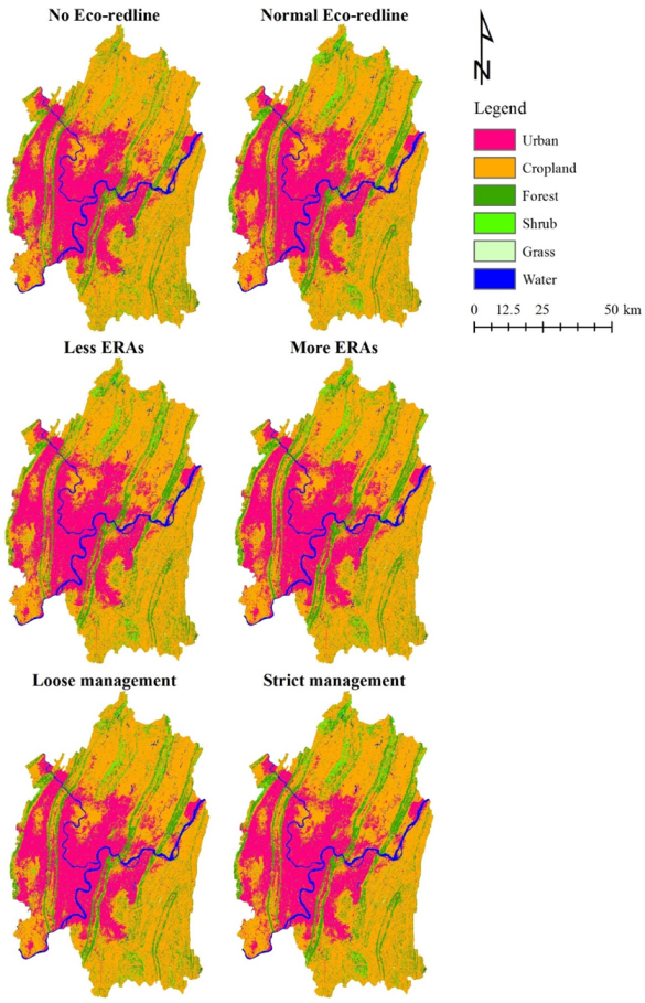
Figure 7 is the LULC of Chongqing capital under six scenarios in 2050. When comparing the 2050 scenario LULC images with that of 2010 (Figure 4), all scenarios showed that urbanization will cover most of the central and western parts of Chongqing capital, while the urban patches in the north and southeast will not change overly much. When comparing the No Eco-redline LULC images to all the other scenarios, the patches of forests and shrubland in the north-south mountain ranges (where the ERAs are mainly distributed) are clearly more extensive in all the Eco-redline scenarios than in the No Eco-redline scenario. Comparing the LULC images of the Less ERAs, Normal Eco-redline, and More ERAs scenarios indicated that the patches of forest and shrubland become more concentrated in the mountains as the ERAs increased. As for the management intensity, there are more patches of forests and shrubland in and near the mountains in the LULC images of the Loose management, Normal Eco-redline, and Strict management scenarios.
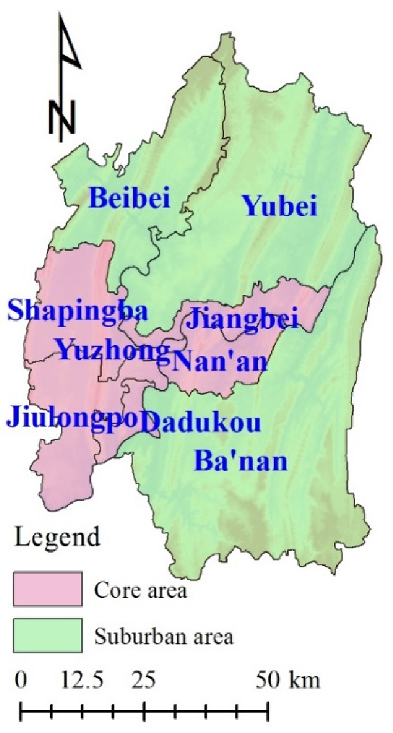
Combined with LULC between 2000 and 2010 (Figure 4), it is clear that urbanization remains the most prominent trend in every scenario. To further explore the impact of the Eco-redline policy on LULC, we divided the nine districts into two parts: the core area and the suburban area (Figure 8). The core area included six districts in the central and western regions (Yuzhong, Dadukou, Jiangbei, Shapingba, Jiulongpo, and Nan’an), while the other three districts on the periphery belonged to the suburban area (Beibei, Yubei, and Ba’nan). Table 12 lists the proportion of urban area and the sum of forest and shrubland in the core and suburban areas in two dimensions representing the area and management intensity. In the area dimension, the general trend is the more and larger the ERAs, the more urban patches will emerge in the core area, and the more forest and shrubland will emerge in the suburban area. In the management intensity dimension, increasing management intensity will result in increased urban patches and decreased forest and shrub patches in the core area, while in the suburban area, the urban patches will remain almost stable and forest and shrubland patches will increase.
3.4. Landscape Indices of 2050 LULC Images
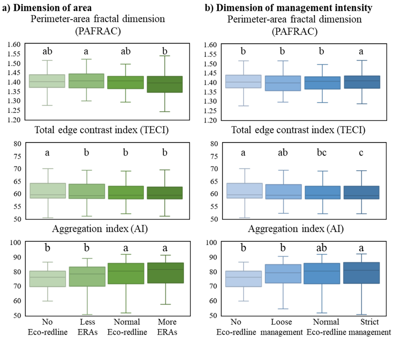
The landscape indices of the future projection images and the results of statistical analysis are shown in Figure 9. In the area dimension (Figure 9a), as the ERAs increased, the PAFRAC values gradually decreased, but the difference was only significant between the Less ERAs and More ERAs scenarios. The change trend of TECI was similar to that of PAFRAC; the differences between the Less ERAs, Normal Eco-redline, and More ERAs scenarios were not significant, but all of them had significantly smaller TECI values than the No Eco-redline scenario. For the AI, the values increased with increasing ERAs, and those of the No Eco-redline and Less ERAs scenarios were significantly lower than that of the Normal Eco-redline scenario, while the difference between the Normal Eco-redline and More ERAs scenarios was not significant.
In the management intensity dimension (Figure 9b), the PAFRAC did not show a monotonous change trend, and the value of the Normal Eco-redline scenario was significantly lower than that of the Strict management scenario but was not significantly different from the No Eco-redline and Loose management scenario values. With increasing management intensity, TECI decreased and the Normal Eco-redline value was only slightly, but significantly, lower than the No Eco-redline value, while it was not significantly different from the Loose management or Strict management scenario values. For the AI values, there were no significant differences between the Normal Eco-redline scenario and the other scenarios, but the AI of the Strict management scenario was significantly higher than those of the No Eco-redline and Loose management scenarios.
4. Discussion
4.1. The Eco-Redline Policy Helps to Promote Land-Use Compaction
Although China has made great strides in industrialization and urbanization, the country still faces many land-use problems, e.g., blind urban expansion, improper planning, and low use efficiency [45,46,47]. Therefore, it is proposed to improve the quality of land use and establish sustainable land-use patterns to ensure the long-term development of society and the economy, e.g., [48,49]. Various factors need to be comprehensively considered in land planning (including the establishment and management of protected areas) such as climate, geography, transportation, e.g., [50,51,52]. The complex and mountainous terrain makes the land planning of Chongqing more difficult than that of flat cities or coastal cities with regional advantages [53,54]. In 2002, Chongqing’s economic growth rate exceeded 10%, but after years of high growth, it slowed to around 6% in 2018 [55]. With the medium-high economic growth, urbanization is likely to remain the major trend in Chongqing capital in the next few decades [56,57], which means that more people will continue to move from rural or suburban areas to urban areas. Analysis in the area dimension indicated that the larger the ERAs become, the more significant the proportion of urban areas in the core area will become, while the urban areas in the suburbs will remain relatively stable (Table 12). This suggests that the Eco-redline policy has little effect on urban expansion in the suburbs, but will stimulate urbanization in the core area. Meanwhile, there will be fewer forest and shrubland areas in the core area and more in the suburbs, as the ERAs grow. This indicates that, overall, the larger the ERAs, the more urban areas in the core area, and the more forests in the suburbs. There was a similar trend for management intensity. There seems to be a division between the core area and the suburbs. While the core area undertakes the task of economic development, the suburbs are more responsible for ecological conservation.
4.2. Continue to Increase ERAs to Achieve Significant Effects
Although there is debate about how much of the areas should be protected, the current lack of protected areas is a consensus supported by most studies conducted from an ecological perspective. For example, McDonald and Boucher (2011) forecast the global land protection will be driven by economic development to increase by 15–29% by 2030. [58] identified the cost-effective zones (CEZs) for protected areas and proposed suggestions for different countries and targets according to the projection and comparison of protecting 19%, 26%, and 43% global terrestrial area. Arroyo-Rodríguez et al. (2020) suggested the forest cover should be larger than 40% when designing biodiversity-friendly landscapes, in which large forest patches account for 10% and dispersed smaller patches account for 30%. Most of these studies discussed the coverage of protected areas at global or national scales. Our research focuses on a city of thousands of square kilometers, filling the gap on the local scale.
To continue to increase the coverage of protected areas is not only the conclusion of many existing studies, but also one of the main measures that international environmental organizations have called on the government to implement [59,60]. The Aichi Target of protecting 17% of terrestrial areas and 10% of wetland areas is considered an interim goal, e.g., [61]. Although each country and region had different progress in completing the establishment of protected areas by 2020 (end year of Aichi Target), it is a general trend to pursue higher goals in the future. In 2000, China’s nature reserves accounted for only 9.85% of its territory [62]. Due to continuous efforts, China declared that by the end of 2017, nature reserves covered 14.86% of the country’s total land area in the sixth national report for the Convention on Biological Diversity [63]. In this study, the ratio of ERAs to the total area in the Less ERAs, Normal Eco-redline, and More ERAs scenarios were 10%, 17%, and 23%, respectively. This was also designed to get closer to the realistic trend. There are risks in comparing conclusions on different scales, but our results also supported increasing the extent of ERAs to achieve a significant effect. Although there are differences in the results of the statistical tests, the general trend was that an increase in ERAs would decrease PAFRAC and TECI, and increase AI (Figure 9a). This suggests that increasing the spatial extent of ERAs could reduce the complexity and contrast of forest patches and increase their aggregation. This may also apply to other cities that are dominated by mountains and hills and whose terrain is fragmented. According to the central government guidelines [11], local governments need to regularly assess the effects of their respective Eco-redlines and propose solutions. Thus, we suggest drawing more Eco-redlines to expand the ERAs, improving their conservation value.
4.3. Provide Sufficient Support to Ensure Current Management Intensity
Studies revealed that globally, less than 50% of protected areas are effectively managed, indicating that management intensity is critical to the effectiveness of protected areas [59,64]. Our results indicate that PAFRAC does not always decline as management intensity increases; that is, increasing management intensity may not effectively reduce forest patch complexity (Figure 9b). TECI changed very slightly with changes in management intensity, and there were almost no significant differences between the scenarios. This implies that increasing management intensity may not help to reduce the contrast between forests and their surroundings. With an increase in management intensity, AI showed an increasing trend, indicating that higher management intensity can help to improve aggregation. Therefore, we conclude that excessive management intensity may not positively impact landscape quality and that the current intensity of management is sufficient. What requires attention is preventing management downgrading or the formation of paper parks, which many studies have stressed e.g., [10,65].
The classification and zoning of protected areas is a common management method; for example, the International Union for Conservation of Nature (IUCN) divides the protected areas into six levels according to different management intensities and objectives [66]. According to the guidelines for the delineation of Eco-redlines, the scope of Eco-redlines includes existing protected areas, e.g., nature reserves and national parks, as well as some newly delineated areas [11]. This suggests that all the six types delineated by IUCN may exist within the ERAs. Although the management principle of the ERAs is generally to prohibit development, there is still a lack of detailed institutional arrangements. Developing countries are often faced with inadequate management resources, such as a lack of effective law enforcement and infrastructure [67,68]. Therefore, improving the existing legislation and providing subsidies to support sufficient management intensity would be another focus of future work.
4.4. Limitations and Perspectives
In this study, the existing ERAs were expanded and contracted for scenario analysis to examine how the spatial extent of the ERAs would affect LULC, which is a relatively simple approach. However, in the actual process of delineating ERAs, a range of different methods can be applied to identify areas of high conservation value, such as ecosystem services and ecological sensitivity assessments [11], ecological importance evaluations [69], the ecological footprint approach [70], multi-dimensional eco-land classifications [71], and ecological network constructions and assessments [72]. Combining these approaches with land change simulation would improve the accuracy and credibility of the scenario analysis to better inform policymakers. A similar limitation exists in our treatment of management intensity. This study used the method of assigning values to provide incentives and disincentives for the land-use transitions under investigation, which was somewhat subjective. More practice and experience is needed to make the constraint and incentive coefficients more closely match the actual situation, by investigating the effectiveness of existing ERAs across China. However, overall, this study illustrates that it is feasible to analyze the effectiveness of protected area policies using scenario analysis based on current data and models. Using more sophisticated methods, such as ecosystem services and ecological network assessments, to identify where new Eco-redlines should be added and how to enrich management methods is a vital task for the further optimization of Eco-redline policies. Moreover, as a new attempt to improve the system of protected areas in densely populated developing countries, our suggestions have reference value for other countries or regions that are trying to promote the development of protected areas.
5. Conclusions
This study employed scenario analysis to explore the impact of a protected area policy on LULC in an area with rapid economic development to assess policy implications for further improvement. We mainly analyzed the impact of two dimensions, area and management intensity, on LULC. In the projected 2050 LULC images, the more ERAs or the stricter the management intensity, the more urban pixels in the core area of Chongqing capital, which indicates that the existing Eco-redline policy contributes to the compaction of land use. Moreover, positive changes in landscape indices resulted from spatial expansion were more significant than that of increasing management intensity. This result suggests that the current ERAs may be insufficient to optimize the landscape of Chongqing capital and that changes in management intensity do not induce many significant effects. Therefore, we suggest that the local government gradually increases the area covered by Eco-redlines during a continuous optimization process, and provides sufficient institutional and financial support to maintain the current management intensity. We believe our analysis methods are helpful for the implementation of ecological conservation policies in areas with a complex topography and/or intense human–land conflicts.
Author Contributions
B.Z. conceived the original idea. S.H. encouraged B.Z. to perform the project and supervised the findings of the work. All authors have read and agreed to the published version of the manuscript.
Funding
This research was supported by the Research Institute for Humanity and Nature (RIHN: a constituent member of NIHU) [Project No. 14200103], the Strategic Research and Development Area (JPMEERF16S11510) project financed by the Environment Research and Technology Development Fund of the Environmental Restoration and Conservation Agency of Japan, CRRP2018-03MY-Hashimoto by the Asia Pacific Network for Global Change Research, and China Scholarship Council (CSC No. 202108050006).
Institutional Review Board Statement
Not applicable.
Informed Consent Statement
Not applicable.
Data Availability Statement
The data presented in this study are available on request from the corresponding author.
Conflicts of Interest
The authors declare no conflict of interest.
References
- Pimm, S.L.; Jenkins, C.N.; Li, B.V. How to protect half of Earth to ensure it protects sufficient biodiversity. Sci. Adv. 2018, 4, eaat2616. [Google Scholar] [CrossRef] [PubMed] [Green Version]
- Palomo, I.; Martín-López, B.; Potschin, M.; Haines-Young, R.; Montes, C. National Parks, buffer zones and surrounding lands: Mapping ecosystem service flows. Ecosyst. Serv. 2013, 4, 104–116. [Google Scholar] [CrossRef]
- Stolton, S.; Dudley, N.; Avcıoğlu Çokçalışkan, B.; Hunter, D.; Ivanić, K.; Kanga, E.; Senior, J. Values and Benefits of Protected Areas. In Protected Area Governance and Management; ANU Press: Canberra, Australia, 2015; pp. 145–168. [Google Scholar]
- Secretariat of the Convention on Biological Diversity. Global Biodiversity Outlook 5. Available online: https://www.cbd.int/gbo5 (accessed on 20 September 2021).
- Convention on Biological Diversity. Zero Draft of the Post-2020 Global Biodiversity Framework (CBD/WG2020/2/3, CBD, 2020). Available online: https://www.cbd.int/doc/c/9a1b/c778/8e3ea4d851b7770b59d5a524/wg2020-02-l-02-en.pdf (accessed on 20 September 2021).
- Woodley, S.; Locke, H.; Laffoley, D.; Mackinnon, K.; Sandwith, T.; Smart, J. A Review of Evidence for Area-Based Conservation Targets for the Post-2020 Global Biodiversity Framework. Parks 2019, 25, 31–46. [Google Scholar] [CrossRef]
- Heinen, J. International trends in protected areas policy and management. In Protected Area Management; Intech: Rijeka, Croatia, 2012; pp. 1–18. [Google Scholar]
- Pereira da Silva, A. Brazilian large-scale marine protected areas: Other “paper parks”? Ocean Coast. Manag. 2019, 169, 104–112. [Google Scholar] [CrossRef]
- Bonham, C.A.; Sacayon, E.; Tzi, E. Protecting imperiled “paper parks”: Potential lessons from the Sierra Chinajá, Guatemala. Biodivers. Conserv. 2008, 17, 1581–1593. [Google Scholar] [CrossRef]
- Di Minin, E.; Toivonen, T. Global Protected Area Expansion: Creating More than Paper Parks. Bioscience 2015, 65, 637–638. [Google Scholar] [CrossRef] [Green Version]
- Ministry of Ecological Environment. Guidelines for Delimitation of Ecological Conservation Redline (in Chinese); Ministry of Ecological Environment, National Development and Reform Commission: Beijing, China, 2017.
- Briassoulis, H. Analysis of Land Use Change: Theoretical and Modeling Approaches. 2019. Available online: https://researchrepository.wvu.edu/rri-web-book/3 (accessed on 12 May 2021).
- IPBES. Summary for Policymakers of the Global Assessment Report on Biodiversity and Ecosystem Services; Intergovernmental Science-Policy Platform on Biodiversity and Ecosystem Services: Bonn, Germany, 2019. [Google Scholar] [CrossRef]
- McDonald, R.I.; Boucher, T.M. Global development and the future of the protected area strategy. Biol. Conserv. 2011, 144, 383–392. [Google Scholar] [CrossRef]
- Martinuzzi, S.; Radeloff, V.C.; Joppa, L.N.; Hamilton, C.M.; Helmers, D.P.; Plantinga, A.J.; Lewis, D.J. Scenarios of future land use change around United States’ protected areas. Biol. Conserv. 2015, 184, 446–455. [Google Scholar] [CrossRef]
- Velazco, S.J.E.; Villalobos, F.; Galvão, F.; De Marco Júnior, P. A dark scenario for Cerrado plant species: Effects of future climate, land use and protected areas ineffectiveness. Divers. Distrib. 2019, 25, 660–673. [Google Scholar] [CrossRef]
- Bai, Y.; Wong, C.P.; Jiang, B.; Hughes, A.C.; Wang, M.; Wang, Q. Developing China’s Ecological Redline Policy using ecosystem services assessments for land use planning. Nat. Commun. 2018, 9, 1–13. [Google Scholar] [CrossRef] [Green Version]
- Jia, Z.; Ma, B.; Zhang, J.; Zeng, W. Simulating spatial-temporal changes of land-use based on ecological redline restrictions and landscape driving factors: A case study in Beijing. Sustainability 2018, 10, 1299. [Google Scholar] [CrossRef] [Green Version]
- Ju, X.; Li, W.; He, L.; Li, J.; Han, L.; Mao, J. Ecological redline policy may significantly alter urban expansion and affect surface runoff in the Beijing-Tianjin-Hebei megaregion of China. Environ. Res. Lett. 2020, 15, 1040b1041. [Google Scholar] [CrossRef]
- Chongqing Municipal People’s Government. Overview of Chongqing (in Chinese). 2020. Available online: http://www.cq.gov.cn/zjzq/ (accessed on 12 May 2021).
- National Bureau of Statistics of the People’s Republic of China. China Statistical Yearbook 2019; China Statistics Press: Beijing, China, 2019. [Google Scholar]
- Chongqing Municipal People’s Government. Notice of Chongqing Municipal People’s Government on Issuing Chongqing’s Ecological Conversation Redline; Chongqing Municipal People’s Government: Chongqing, China, 2018.
- IPBES. Summary for policymakers Chongqing Municipal People’s Government. Overview of Chongqing (in Chinese). 2016. Available online: http://www.cq.gov.cn/zqfz/zhsq/sqjj/201908/t20190825_690412.html (accessed on 12 May 2021).
- Poortinga, A.; Tenneson, K.; Shapiro, A.; Nquyen, Q.; San Aung, K.; Chishtie, F.; Saah, D. Mapping plantations in Myanmar by fusing landsat-8, sentinel-2 and sentinel-1 data along with systematic error quantification. Remote Sens. 2019, 11, 831. [Google Scholar] [CrossRef] [Green Version]
- Zhang, J.; Feng, Z.; Jiang, L. Progress on studies of land use/land cover classification systems (in Chinese). Resour. Sci. 2011, 33, 1195–1203. [Google Scholar]
- Han-qiu, X. A Study on Information Extraction of Water Body with the Modified Normalized Difference Water Index (MNDWI). J. Remote Sens. 2005, 5, 589–595. [Google Scholar]
- Zha, Y.; Ni, S.-X.; Yang, S. An effective approach to automatically extract urban land-use from TM imagery (in Chinese). J. Remote Sens. 2003, 7, 37–40. [Google Scholar]
- Xu, H. A new index for delineating built-up land features in satellite imagery. Int. J. Remote Sens. 2008, 29, 4269–4276. [Google Scholar] [CrossRef]
- Zhang, Z.; Sheng, L.; Yang, J.; Chen, X.-A.; Kong, L.; Wagan, B. Effects of land use and slope gradient on soil erosion in a red soil hilly watershed of southern China. Sustainability 2015, 7, 14309–14325. [Google Scholar] [CrossRef] [Green Version]
- Hua, L.; Zhang, X.; Chen, X.; Yin, K.; Tang, L. A feature-based approach of decision tree classification to map time series urban land use and land cover with Landsat 5 TM and Landsat 8 OLI in a Coastal City, China. ISPRS Int. J. Geo-Inf. 2017, 6, 331. [Google Scholar] [CrossRef] [Green Version]
- Delang, C.O.; Yuan, Z. China’s Grain for Green Program: A Review of the Largest Ecological Restoration and Rural Development Program in the World; Springer International Publishing: Berlin, Germany, 2014. [Google Scholar]
- Haines-Young, R.; Agency, E.E. Land Accounts for Europe 1990–2000: Towards Integrated Land and Ecosystem Accounting: European Environment Agency; 2006. Available online: https://www.eea.europa.eu/publications/eea_report_2006_11 (accessed on 6 October 2021).
- Eastman, J.R.; Toledano, J. A Short Presentation of the Land Change Modeler (LCM) Geomatic Approaches for Modeling Land Change Scenarios; Springer: Berlin/Heidelberg, Germany, 2018; pp. 499–505. [Google Scholar]
- Eastman, J.R.; Solorzano, L.; Fossen, M.V. Transition potential modeling for land cover change. In GIS, Spatial Analysis and Modeling; Maguire, D.J., Batty, M., Goodchild, M.F., Eds.; ESRI Press: Redlands, CA, USA, 2005; pp. 357–385. [Google Scholar]
- Farr, T.G.; Rosen, P.A.; Caro, E.; Crippen, R.; Duren, R.; Hensley, S.; Alsdorf, D. The Shuttle Radar Topography Mission. Rev. Geophys. 2007, 45. [Google Scholar] [CrossRef] [Green Version]
- Chongqing Municipal People’s Government. Urban and Rural General Planning of Chongqing Municipality (2007–2020); Planning and Natural Resources Burea: Chongqing, China, 2011. [Google Scholar]
- Pontius, R.G.; Schneider, L.C. Land-cover change model validation by an ROC method for the Ipswich watershed, Massachusetts, USA. Agric. Ecosyst. Environ. 2001, 85, 239–248. [Google Scholar] [CrossRef]
- Eastman, J.R.; Jiang, H.; Toledano, J. Multi-Criteria and Multi-Objective Decision Making for Land Allocation Using GIS Multicriteria Analysis for Land-Use Management; Springer: Berlin/Heidelberg, Germany, 1998; pp. 227–251. [Google Scholar]
- Shooshtari, S.J.; Gholamalifard, M. Scenario-based land cover change modeling and its implications for landscape pattern analysis in the Neka Watershed, Iran. Remote Sens. Appl. Soc. Environ. 2015, 1, 1–19. [Google Scholar] [CrossRef]
- Sharon, K.; Collinge, R.T.T.F.; Collinge, S.K.; Collinge, S.K.; Forman, R.T.T. Ecology of Fragmented Landscapes; Johns Hopkins University Press: Baltimore, Maryland, 2009. [Google Scholar]
- Borgström, S.; Cousins, S.A.O.; Lindborg, R. Outside the boundary—Land use changes in the surroundings of urban nature reserves. Appl. Geogr. 2012, 32, 350–359. [Google Scholar] [CrossRef]
- Huang, J.; He, J.; Liu, D.; Li, C.; Qian, J. An ex-post evaluation approach to assess the impacts of accomplished urban structure shift on landscape connectivity. Sci. Total Environ. 2018, 622–623, 1143–1152. [Google Scholar] [CrossRef]
- Arroyo-Rodríguez, V.; Fahrig, L.; Tabarelli, M.; Watling, J.I.; Tischendorf, L.; Benchimol, M.; Tscharntke, T. Designing optimal human-modified landscapes for forest biodiversity conservation. Ecol. Lett. 2020, 23, 1404–1420. [Google Scholar] [CrossRef]
- McGarigal, K.; Cushman, S.A.; Ene, E.; FRAGSTATS v4: Spatial pattern analysis program for categorical and continuous maps. Computer Software Program Produced by the Authors at the University of Massachusetts, Amherst. 2012. Available online: http://www.umass.edu/landeco/research/fragstats/fragstats.html (accessed on 12 May 2021).
- Wang, X.R.; Hui, E.C.M.; Choguill, C.; Jia, S.H. The new urbanization policy in China: Which way forward? Habitat Int. 2015, 47, 279–284. [Google Scholar] [CrossRef]
- Wei, X.; Wei, C.; Cao, X.; Li, B. The general land-use planning in China: An uncertainty perspective. Environ. Plan. B Plan. Des. 2016, 43, 361–380. [Google Scholar] [CrossRef]
- Guan, X.; Wei, H.; Lu, S.; Dai, Q.; Su, H. Assessment on the urbanization strategy in China: Achievements, challenges and reflections. Habitat Int. 2018, 71, 97–109. [Google Scholar] [CrossRef]
- Liu, Y.; Fang, F.; Li, Y. Key issues of land use in China and implications for policy making. Land Use Policy 2014, 40, 6–12. [Google Scholar] [CrossRef]
- Qu, Y.; Long, H. The economic and environmental effects of land use transitions under rapid urbanization and the implications for land use management. Habitat Int. 2018, 82, 113–121. [Google Scholar] [CrossRef]
- He, B.J.; Ding, L.; Prasad, D. Wind-sensitive urban planning and design: Precinct ventilation performance and its potential for local warming mitigation in an open midrise gridiron precinct. J. Build. Eng. 2020, 29, 101145. [Google Scholar] [CrossRef]
- Yang, J.; Ren, J.; Sun, D.; Xiao, X.; Xia, J.; Jin, C.; Li, X. Understanding land surface temperature impact factors based on local climate zones. Sustain. Cities Soc. 2021, 69, 102818. [Google Scholar] [CrossRef]
- Li, C.; Gao, X.; He, B.-J.; Wu, J.; Wu, K. Coupling Coordination Relationships between Urban-industrial Land Use Efficiency and Accessibility of Highway Networks: Evidence from Beijing-Tianjin-Hebei Urban Agglomeration, China. Sustainability 2019, 11, 1446. [Google Scholar] [CrossRef] [Green Version]
- Lu, L.; Zhang, Y.; Luo, T. Difficulties and strategies in the process of population urbanization: A case study in Chongqing of China. Open J. Soc. Sci. 2014, 2, 90. [Google Scholar] [CrossRef] [Green Version]
- Zhang, Y. Grabbing Land for Equitable Development? Reengineering Land Dispossession through Securitising Land Development Rights in Chongqing. Antipode 2018, 50, 1120–1140. [Google Scholar] [CrossRef]
- Lin, Y.; Li, Y.; Ma, Z. Exploring the Interactive Development between Population Urbanization and Land Urbanization: Evidence from Chongqing, China (1998–2016). Sustainability 2018, 10, 1741. [Google Scholar] [CrossRef] [Green Version]
- Du, W.; Ge, J.; Sun, S. Economic Forecast of the Southern China on BP Neural Network—Taking Chongqing as an Example. In Proceedings of the 6th International Conference on Financial Innovation and Economic Development (ICFIED 2021), Sanya, China, 29–31 January 2021. [Google Scholar]
- Li, L.; Yang, Q.; Xie, X. Coupling Coordinated Evolution and Forecast of Tourism-Urbanization-Ecological Environment: The Case Study of Chongqing, China. Math. Probl. Eng. 2021, 2021, 727163. [Google Scholar]
- Yang, R.; Cao, Y.; Hou, S.; Peng, Q.; Wang, X.; Wang, F.; Ma, K. Cost-effective priorities for the expansion of global terrestrial protected areas: Setting post-2020 global and national targets. Sci. Adv. 2020, 6, eabc3436. [Google Scholar] [CrossRef]
- Watson, J.E.M.; Dudley, N.; Segan, D.B.; Hockings, M. The performance and potential of protected areas. Nature 2014, 515, 67–73. [Google Scholar] [CrossRef]
- Noss, R.F.; Dobson, A.P.; Baldwin, R.; Beier, P.; Davis, C.R.; Dellasala, D.A.; Lopez, R. Bolder Thinking for Conservation; Wiley Online Library: New York, NY, USA, 2012. [Google Scholar]
- Gannon, P.; Dubois, G.; Dudley, N.; Ervin, J.; Ferrier, S.; Gidda, S.; Seyoum-Edjigu, E. Editorial Essay: An update on progress towards Aichi biodiversity target 11. Parks 2019, 25, 7–18. [Google Scholar] [CrossRef]
- Ministry of Environmental Protection. China’s First National Report on the Implementation of the Convention on Biological Diversity. 2001. Available online: https://www.cbd.int/kb/record/nr/4089?Country=cn&FreeText=national%20report (accessed on 12 May 2021).
- Ministry of Ecological Environment. China’s Sixth National Report on the Implementation of the Convention on Biological Diversity. 2018. Available online: https://chm.cbd.int/zh/database/record/C7B6BC32-C06D-B09C-BFF8-7D265F24DBE6 (accessed on 12 May 2021).
- Leverington, F.; Costa, K.L.; Pavese, H.; Lisle, A.; Hockings, M. A global analysis of protected area management effectiveness. Environ. Manag. 2010, 46, 685–698. [Google Scholar] [CrossRef]
- Barnes, M.D.; Glew, L.; Wyborn, C.; Craigie, I.D. Prevent perverse outcomes from global protected area policy. Nat. Ecol. Evol. 2018, 2, 759–762. [Google Scholar] [CrossRef]
- Deguignet, M.; Juffe-Bignoli, D.; Harrison, J.; MacSharry, B.; Burgess, N.; Kingston, N. 2014 United Nations List of Protected Areas; UNEP-WCMC: Cambridge, UK, 2014. [Google Scholar]
- Bruner, A.G.; Gullison, R.E.; Rice, R.E.; Da Fonseca, G. A Effectiveness of parks in protecting tropical biodiversity. Science 2001, 291, 125–128. [Google Scholar] [CrossRef] [Green Version]
- Buchanan, G.M.; Butchart, S.H.M.; Chandler, G.; Gregory, R.D. Assessment of national-level progress towards elements of the Aichi Biodiversity Targets. Ecol. Indic. 2020, 116, 106497. [Google Scholar] [CrossRef]
- Wang, C.; Sun, G.; Dang, L. Identifying ecological red lines: A case study of the coast in Liaoning province. Sustainability 2015, 7, 9461–9477. [Google Scholar] [CrossRef] [Green Version]
- Chu, X.; Deng, X.; Jin, G.; Wang, Z.; Li, Z. Ecological security assessment based on ecological footprint approach in Beijing-Tianjin-Hebei region, China. Phys. Chem. Earth Parts A/B/C 2017, 101, 43–51. [Google Scholar] [CrossRef]
- Guo, X.; Chang, Q.; Liu, X.; Bao, H.; Zhang, Y.; Tu, X.; Zhang, Y. Multi-dimensional eco-land classification and management for implementing the ecological redline policy in China. Land Use Policy 2018, 74, 15–31. [Google Scholar] [CrossRef]
- Dong, J.; Dai, W.; Shao, G.; Xu, J. Ecological Network Construction Based on Minimum Cumulative Resistance for the City of Nanjing, China. ISPRS Int. J. Geo-Inf. 2015, 4, 2045–2060. [Google Scholar] [CrossRef] [Green Version]
Figure 1.
Location of Chongqing capital, China.

Figure 2.
General methodology.

Figure 3.
Decision tree classification process (August 2010 as an example).

Figure 4.
LULC classification images of 2000, 2010, and 2015.

Figure 5.
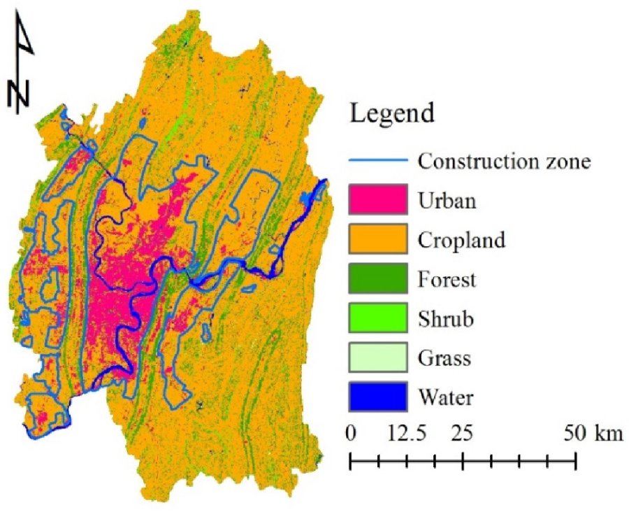
Digitized construction zone from the development plan designed for 2007 to 2020 (LULC 2010 as background).
Figure 5.
Digitized construction zone from the development plan designed for 2007 to 2020 (LULC 2010 as background).

Figure 6.
Eco-redline areas (ERAs) and the assumed expansion and shrinkage of them represented by using positive and negative buffers (LULC 2010 as background).
Figure 6.
Eco-redline areas (ERAs) and the assumed expansion and shrinkage of them represented by using positive and negative buffers (LULC 2010 as background).

Figure 7.
LULC images of six scenarios in 2050.

Figure 8.
Division of 9 districts in core area and suburban area (core area: Yuzhong, Dadukou, Jiangbei, Shapingba, Jiulongpo, and Nan’an; suburban area: Beibei, Yubei, and Ba’nan).
Figure 8.
Division of 9 districts in core area and suburban area (core area: Yuzhong, Dadukou, Jiangbei, Shapingba, Jiulongpo, and Nan’an; suburban area: Beibei, Yubei, and Ba’nan).

Figure 9.
The median, first quartile, third quartile, minimum, and maximum values of the Perimeter-Area fractal dimension (PAFRAC), Total edge contrast index (TECI) and Aggregation index (AI) and the statistical analysis results (p < 0.05), (a) demonstrates the change with the area dimension and (b) demonstrates the change with the management intensity dimension.


Table 1.
Indices for decision tree classification.
| Index | Full Name or Explanation | Calculation Method |
|---|---|---|
| NDVI | Normalized Difference Vegetation Index | (NIR − RED)/(NIR + RED) |
| MNDWI | Modified Normalized Difference Water Index | (GREEN − SWIR)/(GREEN − SWIR) |
| NDBI | Normalized Difference Building Index | (SWIR − NIR)/(SWIR + NIR) |
| Slope | Topographic slope | Calculated based on DEM. |
| NIR + SWIR − 2 × RED | Band calculation value | Calculated as its expression. |
Table 2.
Thresholds of indices for decision tree classification.
| Index | July 2000 | July 2001 | June 2008 | August 2010 | August 2015 | July 2016 |
|---|---|---|---|---|---|---|
| NDVI | 0.47 | 0.47 | 0.47 | 0.47 | 0.55 | 0.55 |
| MNDWI | 0 | −0.05 | −0.03 | −0.03 | 0 | −0.05 |
| NDBI | −0.12 | −0.12 | −0.14 | −0.14 | −0.12 | −0.18 |
| Slope | 30 | 30 | 30 | 30 | 30 | 30 |
| NIR + SWIR − 2 × RED | 85 and 130 | 72 and 113 | 73 and 113 | 87 and 137 | 97 and 128 | 85 and 128 |
Table 3.
Land accounts of Chongqing capital from 2000 to 2010 (unit: km2).
| Category | Urban | Cropland | Forest | Shrub | Grass | Water | Total |
|---|---|---|---|---|---|---|---|
| Land use in 2000 | 289 | 4133 | 814 | 73 | 27 | 139 | 5475 |
| Gain | 315 | 109 | 72 | 80 | 19 | 14 | 610 |
| Loss | 29 | 373 | 130 | 44 | 22 | 11 | 610 |
| Persistence | 260 | 3760 | 683 | 30 | 4 | 128 | 4865 |
| Net change (gain – loss) | 286 | –264 | –58 | 37 | –3 | 3 | 0 |
| Total turnover (gain + loss) | 344 | 482 | 202 | 124 | 41 | 25 | 1219 |
| Percentage of gain | 109.1 % | 2.6 % | 8.8 % | 109.7 % | 71.7 % | 9.9 % | 11.1 % |
| Percentage of loss | 10.1 % | 9 % | 16 % | 59.4 % | 83.3 % | 8.1 % | 11.1 % |
| Percentage of persistence | 89.9 % | 91 % | 84 % | 40.6 % | 16.7 % | 91.9 % | 88.9 % |
| Percentage of net change | 99 % | –6.4 % | –7.2 % | 50.3 % | –11.6 % | 1.9 % | 0 |
| Percentage of total turnover | 119.3 % | 11.7 % | 24.9 % | 169.2 % | 155.1 % | 18 % | 22.3 % |
| Land use in 2010 | 575 | 3869 | 755 | 110 | 24 | 142 | 5475 |
“Gain” means new formation from other categories, “loss” means consumption by other categories and persistence means no change, “net change” is gain minus loss and “turnover” is the sum of gain and loss which refers to all areas that had undergone changes.
Table 4.
LULC change matrix of Chongqing capital from 2000 to 2010 (unit: km2).
| Year | 2010 | |||||||
|---|---|---|---|---|---|---|---|---|
| Category | Urban | Cropland | Forest | Shrub | Grass | Water | ||
| Category | Total | 575 | 3869 | 755 | 110 | 24 | 142 | |
| 2000 | Urban | 289 | 260 | 15 | 8 | 1 | 1 | 4 |
| Cropland | 4133 | 264 | 3760 | 49 | 43 | 12 | 5 | |
| Forest | 814 | 40 | 50 | 683 | 34 | 4 | 2 | |
| Shrub | 73 | 5 | 28 | 8 | 30 | 1 | 1 | |
| Grass | 27 | 2 | 13 | 4 | 1 | 4 | 1 | |
| Water | 139 | 4 | 2 | 3 | 1 | 2 | 128 | |
Table 5.
Major transitions from 2000 to 2010 and sub-models.
| Before | After | Transition Area (km2) | Model Name |
|---|---|---|---|
| Cropland | Urban | 264 | Urbanization |
| Forest | Urban | 40 | Urbanization |
| Forest | Cropland | 50 | Reclamation |
| Shrub | Cropland | 28 | Reclamation |
| Forest | Shrub | 34 | Reclamation |
| Cropland | Forest | 49 | Conservation 1 |
| Cropland | Shrub | 43 | Conservation 2 |
Table 6.
Explanatory variables in land change modeling and their Cramer’s Vs.
| Variable | Type | Normalization | Cramer’s V | |
|---|---|---|---|---|
| 1 | Past changes | Qualitative | Evidence likelihood | 0.5225 |
| 2 | Density of Water | Qualitative | - | 0.4189 |
| 3 | Distance to Water | Quantitative | Natural log | 0.4065 |
| 4 | Distance to Forest | Quantitative | Natural log | 0.3845 |
| 5 | Elevation | Quantitative | - | 0.3776 |
| 6 | Density of Cropland | Qualitative | - | 0.3688 |
| 7 | Distance to Cropland | Quantitative | Natural log | 0.3669 |
| 8 | Density of Forest | Qualitative | - | 0.3307 |
| 9 | Density of Urban | Qualitative | - | 0.2879 |
| 10 | Distance to Urban | Quantitative | Natural log | 0.2734 |
| 11 | Slope | Quantitative | - | 0.2558 |
| 12 | Density of Shrub | Qualitative | - | 0.1624 |
| 13 | Distance to Shrub | Quantitative | Natural log | 0.1436 |
| 14 | Distance to secondary roads (national and provincial roads) | Quantitative | - | 0.1341 |
| 15 | Distance to primary roads (railway and expressway) | Quantitative | - | 0.1312 |
| 16 | Density of Grass | Qualitative | - | 0.0860 |
| 17 | Distance to Grass | Quantitative | Natural log | 0.0783 |
| 18 | Distance to tertiary roads (County roads) | Quantitative | - | 0.0580 |
Variables are listed in descending order with Cramer’s V, and only those with Cramer’s V greater than 0.1 are used for preliminary modeling.
Table 7.
Explanatory power of variables in sub-models and the ultimate selection for modeling.
| Variable | Urbanization | Reclamation | Conservation 1 | Conservation 2 | |||||||||
|---|---|---|---|---|---|---|---|---|---|---|---|---|---|
| Accuracy (%) | Influence Order | Selected | Accuracy (%) | Influence Order | Selected | Accuracy (%) | Influence Order | Selected | Accuracy (%) | Influence Order | Selected | ||
| With all variables | 81.56 | N/A | 73.27 | N/A | 77.7 | N/A | 72.95 | N/A | |||||
| 1 | Past changes | 55.65 | 2 | Yes | 51.68 | 1 | Yes | 77.7 | 12 | 72.95 | 13 | ||
| 2 | Density of Water | 81.13 | 10 | Yes | 73.05 | 10 | 77.67 | 10 | 72.88 | 8 | |||
| 3 | Distance to Water | 81.38 | 12 | 73.29 | 14 | 77.75 | 15 | 72.87 | 7 | ||||
| 4 | Distance to Forest | 81.57 | 15 | 73.27 | 13 | 77.69 | 11 | 72.94 | 12 | ||||
| 5 | Elevation | 80.36 | 8 | Yes | 72.98 | 9 | 77.6 | 6 | 71.86 | 3 | Yes | ||
| 6 | Density of Cropland | 78.76 | 4 | Yes | 70.48 | 5 | Yes | 77.29 | 3 | Yes | 73.02 | 15 | |
| 7 | Distance to Cropland | 81.56 | 14 | 73.26 | 12 | 77.7 | 13 | 72.95 | 14 | ||||
| 8 | Density of Forest | 49.16 | 1 | Yes | 52.92 | 2 | Yes | 46.5 | 1 | Yes | 60.95 | 1 | Yes |
| 9 | Density of Urban | 77.73 | 3 | Yes | 73.11 | 11 | 77.66 | 9 | 72.91 | 10 | |||
| 10 | Distance to Urban | 81.11 | 9 | Yes | 72.31 | 6 | Yes | 77.52 | 4 | 72.25 | 5 | Yes | |
| 11 | Slope | 80.02 | 6 | Yes | 59.41 | 3 | Yes | 77.54 | 5 | Yes | 72.21 | 4 | |
| 12 | Density of Shrub | 81.27 | 11 | 65.03 | 4 | Yes | 77.63 | 8 | Yes | 72.92 | 11 | Yes | |
| 13 | Distance to Shrub | 81.43 | 13 | 72.9 | 7 | Yes | 77.61 | 7 | 72.59 | 6 | |||
| 14 | Distance to secondary roads | 80.15 | 7 | Yes | 73.41 | 15 | 77.74 | 14 | 72.89 | 9 | |||
| 15 | Distance to primary roads | 79.43 | 5 | Yes | 72.9 | 8 | Yes | 77.13 | 2 | Yes | 71.39 | 2 | Yes |
The accuracy refers to the model simulation accuracy when the corresponding variable is forced as a constant; thus, in general, the smaller the accuracy, the higher the ranking of its influence order. To keep the model simple, only high-impact variables were selected for the final model.
Table 8.
Future scenarios for Eco-redline policy.
| Scenario | Assumption | Area Treatment | Management Intensity |
|---|---|---|---|
| No Eco-redline | Not implemented | / | / |
| Normal Eco-redline | Normal implementation | No | Normal |
| Less ERAs | Eco-redline areas expand | Expand outward 500 m | Normal |
| More ERAs | Eco-redline areas shrink | Shrink inward 500 m | Normal |
| Loose management | Management intensity is lower | No | Loose |
| Strict management | Management intensity is higher | No | Strict |
Table 9.
Constraint coefficients under different management intensities.
| Sub Model | Transition | Management Intensity | ||
|---|---|---|---|---|
| Normal | Loose | Strict | ||
| Urbanization | Crop to Urban | 0 | 0.2 | 0 |
| Forest to Urban | 0 | 0.2 | 0 | |
| Reclamation | Forest to Cropland | 0.5 | 0.8 | 0 |
| Shrub to Cropland | 0.5 | 0.8 | 0 | |
| Forest to Shrub | 0.5 | 0.8 | 0 | |
| Conservation 1 | Cropland to Forest | 1.5 | 1.2 | 2 |
| Conservation 2 | Cropland to Shrub | 1.5 | 1.2 | 2 |
0: absolute constraint; 1: no impact; 0 ~ 1: constraint, the smaller the stronger; > 1: incentive, the larger the stronger.
Table 10.
Landscape indices and the corresponding features to reflect.
| No. | Feature | Index | Description |
|---|---|---|---|
| 1 | Shape complexity | Perimeter-Area fractal dimension (PAFRAC) | Calculated by regressing the logarithm of patch area against the logarithm of patch perimeter. Ranging from 1 to 2. |
| 2 | Contrast | Total edge contrast index (TECI) | It equals the sum of lengths of edges multiplied by contrast weight then divided by the sum of lengths of edges. Ranging from 0 to 100. |
| 3 | Aggregation | Aggregation index (AI) | The number of like adjacencies divided by the maximum possible number of like adjacencies. Ranging from 0 to 100. |
Table 11.
Edge contrast values for LULC categories.
| Category | Urban | Cropland | Forest and Shrub | Grass | Water |
|---|---|---|---|---|---|
| Urban | 0 | ||||
| Cropland | 0.7 | 0 | |||
| Forest and Shrub | 0.9 | 0.6 | 0 | ||
| Grass | 0.9 | 0.5 | 0.3 | 0 | |
| Water | 0.9 | 0.7 | 0.7 | 0.7 | 0 |
Table 12.
The percentages of urban areas and sum of forest and shrub areas of different scenarios in 2050 from the dimension of area and management intensity.
Table 12.
The percentages of urban areas and sum of forest and shrub areas of different scenarios in 2050 from the dimension of area and management intensity.
| Scenario | Dimension of Area | Dimension of Management Intensity | ||||||
|---|---|---|---|---|---|---|---|---|
| No Eco-Redline | Less ERAs | Normal Eco-Redline | More ERAs | No Eco-Redline | Loose Management | Normal Eco-Redline | Strict Management | |
| Urban | Urban | |||||||
| Core area | 51.3% | 51.8% | 51.9% | 52.2% | 51.3% | 51.9% | 51.9% | 52.0% |
| Suburban area | 16.8% | 16.8% | 16.8% | 16.7% | 16.8% | 16.7% | 16.8% | 16.8% |
| Forest and Shrub | Forest and Shrub | |||||||
| Core area | 13.1% | 11.6% | 11.4% | 11.7% | 13.1% | 12.3% | 11.4% | 11.0% |
| Suburban area | 16.9% | 18.5% | 19.2% | 19.3% | 16.9% | 18.2% | 19.2% | 19.5% |
Publisher’s Note: MDPI stays neutral with regard to jurisdictional claims in published maps and institutional affiliations. |
© 2021 by the authors. Licensee MDPI, Basel, Switzerland. This article is an open access article distributed under the terms and conditions of the Creative Commons Attribution (CC BY) license (https://creativecommons.org/licenses/by/4.0/).
Share and Cite
MDPI and ACS Style
Zhu, B.; Hashimoto, S. Is Expansion or Regulation more Critical for Existing Protected Areas? A Case Study on China’s Eco-Redline Policy in Chongqing Capital. Land 2021, 10, 1084. https://0-doi-org.brum.beds.ac.uk/10.3390/land10101084
AMA Style
Zhu B, Hashimoto S. Is Expansion or Regulation more Critical for Existing Protected Areas? A Case Study on China’s Eco-Redline Policy in Chongqing Capital. Land. 2021; 10(10):1084. https://0-doi-org.brum.beds.ac.uk/10.3390/land10101084
Chicago/Turabian StyleZhu, Benhui, and Shizuka Hashimoto. 2021. "Is Expansion or Regulation more Critical for Existing Protected Areas? A Case Study on China’s Eco-Redline Policy in Chongqing Capital" Land 10, no. 10: 1084. https://0-doi-org.brum.beds.ac.uk/10.3390/land10101084
Note that from the first issue of 2016, this journal uses article numbers instead of page numbers. See further details here.