
The Use of Interactive Visualizations for Tracking Haplotypic Inheritance in Livestock

1
Department of Animal Nutrition and Production, School of Veterinary Medicine and Animal Science (FMVZ), University of Sao Paulo (USP), Pirassununga 13635-900, Brazil
2
Animal Genetics and Breeding Unit (AGBU), A Joint Venture of NSW Department of Primary Industries, University of New England, Armidale, NSW 2351, Australia
*
Authors to whom correspondence should be addressed.
Ruminants 2024, 4(1), 90-111; https://0-doi-org.brum.beds.ac.uk/10.3390/ruminants4010006
Submission received: 9 November 2023
/
Revised: 31 January 2024
/
Accepted: 16 February 2024
/
Published: 21 February 2024
(This article belongs to the Special Issue Beef Cattle Production and Management)
Abstract
:Our objective was to harness the power of interactive visualizations by utilizing open-source tools to develop an efficient strategy for visualizing Single Nucleotide Polymorphism data within a livestock population, focusing on tracking the transmission of haplotypes. To achieve this, we simulated a realistic beef cattle population in order to obtain phased haplotypes and generate the necessary inputs for creating our visualizations. The visualization tool was built using Python and the Plotly library, which enables interactivity. We set out to explore three scenarios: trio comparison, visualization of grandparents, and half-sibling evaluation. These scenarios enabled us to trace the inheritance of genetic segments, identify crossover events, and uncover common regions within related and unrelated animals. The potential applications of this approach are significant, particularly for improving genomic selection in smaller breeding programs and farms, and it provides valuable insights for guiding more in-depth genomic region analysis. Beyond its practical applications, we believe this strategy can be a valuable educational tool, helping educators clarify complex concepts like Mendelian sampling and haplotypic diversity. Furthermore, we hope it will encourage livestock producers to adopt advanced technologies like genotyping and genomic selection, thereby contributing to the advancement of livestock genetics.
1. Introduction
It is known that full siblings share approximately 50% of their genes with each other [1]. However, these genes are not randomly distributed across their genomes but rather grouped in segments or entire chromosomes that are inherited from each parent [2]. Additionally, this percentage may vary, making it possible that some siblings are more alike than others [1]. The fact that many genes do not express traits that can be easily noticed also contributes to how resemblance between relatives is perceived. In livestock production, producers may have certain expectations of the progeny obtained, especially when employing genomic selection. Nonetheless, the results sometimes differ from the predictions, due to Mendelian sampling and other factors [3]. Therefore, tracking genomic segments shared among individuals would be of interest to breeders and producers who wish to know which regions, or more generally chromosome segments, were passed from parent to offspring and even to assist in the selection of potential mates.
Visual representations are proven to be paramount in the process of learning and communicating science concepts since they make visible the concepts that are abstract and cannot be experienced directly [4,5], such as genetic inheritance and Mendelian sampling. The use of visualizations takes advantage of the human visual system, which evolved over millions of years and is now capable of capturing immense amounts of information about the world in a fast and efficient way [6]. Thus, visual representations have an important role in the comprehension of complex data, leveraging the human ability for the identification of patterns, relationships, and trends [7] that may not be easily discernible in tabular or textual formats.
Visual representation of a specific dataset offers multiple avenues for enhancement, where factors such as the target audience, the medium in use, and the intended message play a pivotal role in determining elements like color selection, plot type, level of detail, and more [8]. Conversely, the wrong use of such elements may be misleading or clutter the judgment of viewers [9,10]. Several authors have described how different aspects of visualization can be addressed with the means to create better figures: Zhou and Hansen [11] provide a comprehensive review of colormap generation techniques in order to help readers with color mapping decisions. Zacks and Tversky [12] reported that bar charts are usually associated with discrete comparisons, while line charts are more commonly associated with trends and temporal data, and that mixing these types of representation may cause confusion to the viewers. Hullman and Diakopoulos [10] suggested that the choice of which data is presented could be trusted to the user when interactivity is enabled, and the insertion of elements such as buttons and search bars is possible.
The interest in interactive visualization tools has been increasing across academia and industry since it facilitates communication between researchers, analysts, stakeholders, and the general public [5,13,14]. A critical decision is whether to utilize open-source or proprietary tools when developing visualization applications. Examples of open-source tools that can be used to create interactive visualizations are the Plotly and Dash libraries [15], which can be implemented in Python [16], R [17], or other programming languages. Some benefits of using open-source tools include cost-effectiveness, flexibility, and the possibility to contribute to and receive help from the community. On the other hand, there is the downside of having extensive customization options since this may lead to longer development times and increased complexity in creating and maintaining visualizations. Additionally, these tools usually present a steeper learning curve compared to user-friendly commercial solutions.
Examples of such commercial solutions are Tableau [18] and Power BI [19], which provide user-friendly interfaces and seamless data integration. However, these benefits come with trade-offs, such as licensing costs, restricted customization, and reliance on the vendor’s update schedule [13]. As discussed by Curti et al. [20], data integration is a crucial step for data analysis and visualization. The challenges posed in this step depend vastly on the structure of the data to be integrated, for instance, whether it is structured, semi- or non-structured data, and whether there is an immediate connection between the data sources. Depending on the data structure, there may be the need to build specific procedures to generate the input necessary to feed the visualizations.
Many tools were developed for visualizing genomic data, such as Jbrowse [21] and other web-based responsive visualization tools [22]. A recent presentation at PAG XXXI [23] presented an online tool named Chromosome Mating, which uses genomic information to optimize mating decisions, make accurate predictions, and restrict inbreeding, among other restrictions chosen by the users. This presentation evidenced how the industry can benefit by associating cutting edge technology with an interactive interface provided as an online tool, enabling farmers to make data-driven mating decisions. As a continuation of these studies, we aimed to apply the Business Intelligence concept via open-source tools to create an interactive and effective strategy to visualize Single Nucleotide Polymorphism (SNP) data shared among individuals and track the transmission of haplotypes in a livestock population. Larkin et al. [24] developed a strategy titled “haplotracking”, combining whole-genome resequencing of ancestors, haplotype reconstruction, and high-density genotyping of descendants in order to identify ancestor’s alleles that have been subjected to artificial selection, in addition to detecting potential causative mutations that underlie Quantitative Trait Loci (QTL) regions.
Our proposal in this study is also to “track haplotypes”, however, with different approaches and goals. We simulated a realistic beef cattle population and obtained phased haplotypes with the purpose of testing a novel visualization approach to observe the similarities between individuals in a population and conveying the advantages of employing interactive visualizations. Data simulation was crucial in order to obtain genotyped families with the same marker density, besides validating the results obtained in a population in which the structure is known. Furthermore, we also aimed to generate specific inputs from phased genomic data in order to provide the means to create such visualizations, building a pipeline from scratch to generate the haplotype windows. The use of open-source tools, as opposed to earlier studies developed by the authors [5], provided the flexibility necessary for developing customizable graphics designed for specific means. With this strategy, we expect to encourage the adoption of technologies such as genotyping and genomic selection by producers, making it easier to explain frequently asked questions such as why sometimes full siblings are so different from one another and illustrate the differences between populations and selection lines. Additionally, this approach could assist educators in explaining complex concepts such as Mendelian sampling and haplotypic diversity.
2. Materials and Methods
2.1. Data Simulation and Validation
A beef cattle population was simulated using the R [17] package AlphaSimR [25]. The function runMacs2 was used to create 2000 founder genomes with 5 chromosomes of length 100 Mb each, simulating a population of effective size of 200. To simulate the historical evolution of this population, the parameters histNe and histGen were set to the respective arrays: (1000, 2000, 4000, 7500, and 10,000) and (50, 100, 500, 1000, and 1500). A trait of heritability 0.5, mean 0, and variability 1 was simulated, with 29, 15, 5, 1, and 0 QTLs distributed over the 5 chromosomes, respectively. An SNP map with 2000 markers in each chromosome was simulated, with a total of 10,000 markers in the genome. Both the QTL and SNP maps were exported for later use.
The simulation was carried out as illustrated in Figure 1 and served for additional studies besides the present one. Thus, not all populations described herein were included in the scenarios presented below, but form an important part of the complete simulation. The initial population (A) with 2000 individuals was created and randomly mated to form the expanded population (B). B was randomly mated for 11 generations, with the number of crosses increasing by 50% in each generation. Populations C and D1 were derived from the last generation of B by randomly selecting 10 thousand males and 10 thousand females (non-overlapping) for each. Population C was selected by phenotype for 19 generations, while population D1 was selected for 29 generations. D1 was split into D2 and D3, each being selected for 5 generations. Population E was a result of crossing C and D2, and F was created by crossing E and D3. From the last generation of each population, phased genotypes, phenotypes, and pedigree information were obtained. Further details on the functions used and the parameters specified can be found in Figure 1 and in the simulation code, available as Supplementary Scripts S1 and S2.
The validation of the simulation was carried out by analyzing the linkage disequilibrium (LD) in samples of 100 individuals at the last generation of each population. The r2 between all marker pairs in each chromosome was calculated via Plink v1.9 [26], whereas statistics and LD decay plots were generated in R. A Principal Components Analysis (PCA) was also performed on the same populations in a combination of the samples (N = 700), using the R package flashpcaR v2.1 [27].
2.2. Single SNP Regression and Preparation of Data
In order to obtain the marker effects, a Single SNP Regression (SSR) was performed in R by adapting the code provided by Gondro [28] (pp. 111–124). The genotypes used were obtained from the entire last generation of the population D2 (N = 5000), and fixed alleles were removed, leaving a total of 9628 SNPs (from 10,000) for the SSR. Moreover, the SNP map, calculated SNP effects, pedigree, and phased haplotypes were further processed in Python to create 5 files, which are the input of the visualization tool (Figure 2).
“QTL_info.txt” contains the QTL IDs and their respective type (the affected trait), chromosome, start and end positions. “window_pos.txt” aggregates N markers from the SNP map according to the number of SNPs specified for the window size. For this study, we adopted window sizes of 25 SNPs (2000 SNPs per chromosome/25 = 80 windows in each chromosome). Each window has an ID, and information on their chromosome, start and end positions. “haplotypes.txt” contains all combinations of alleles found in each window of the phased haplotypes. Each haplotype has an ID, content (the allele combinations), and effect (calculated as the sum of the marker effects based on whether or not the allele with the calculated effect is present). “ani_hap.txt” is a matrix of size A×2 x W, where A is the number of animals (times 2 chromosome strands), and W is the number of windows across the genome. The content of the matrix is the haplotype ID for each respective animal strand and window. “animals.txt” contains animal IDs and their respective sire, dam, sex, phenotype, and genetic value.
2.3. Visualization Tool
The visualization tool presented herein was built in Python. All the visual and interactive components were added with the Plotly and Dash libraries, and data manipulation was performed using the Pandas library [29]. As illustrated in Figure 3, after loading each of the 5 data sets described in the previous section, one animal is chosen as the “reference individual”, that is, the reference animal to be compared with all other animals. By default, the first animal in the data set is selected, as well as the first strand. Next, for each one of the windows (haplotypes), the similarity between the reference animal and strand is compared against the corresponding window from each individual and strand in the population. The similarity is calculated by dividing the number of alleles that are identical by the total number of alleles in the haplotype.
Figure 4 shows the interface of the visualization tool. The reference individual’s haplotypes are plotted on the top of the page (Figure 4, Section A), colored by their effects—ranging from dark red (negative values) to white (no effect) and dark blue (positive values). By hovering the mouse over the reference individual’s haplotypes, it is possible to visualize the ID of the reference individual and the start, end, and effect of each haplotype. In the second section of the screen (Figure 4, Section B), all other animals’ haplotypes are plotted. They are colored according to the similarity with the respective haplotype from the reference individual. Light green is less similar, and dark green is more similar. When another reference individual is selected, the color of the haplotypes of the other animals is updated to show the similarity with the newly selected reference individual, and the previous reference individual is now present in the section with the other individuals. Each row of haplotypes shown in the visualization (either in Section A or B) presents the number 1 or 2 following the individual’s ID, representing the strand (1 for paternal and 2 for maternal).
Furthermore, some filters can be applied. In the upper left-hand side of the screen (Figure 4, Section A), it is possible to select the strand from the reference individual (1 for paternal and 2 for maternal) to be used as a reference. On the right-hand side (Figure 4, Section C), it is possible to select the reference animal, the chromosome (only one chromosome can be visualized at a time), a range of haplotype effects, a range of similarity effects, the QTLs seen (by affected trait), and whether identical haplotypes should be highlighted or not. When the haplotype effect filter is applied, the reference individual’s haplotypes that do not pass the criteria are left out of the visualization, leaving a blank space where they should be. This, in turn, causes the haplotypes in the second section to be filtered out as well, reflecting the reference individual’s haplotypes. Conversely, the similarity filter is applied directly to the haplotypes in the second section without affecting the reference individual’s haplotypes. The selected QTLs are seen as vertical lines on the position where the QTLs were reported. When the “Identical Haplotypes” filter is enabled, it transforms the color scale of the haplotypes in the second section to a binary system. In this system, a blue haplotype signifies a perfect match with the reference individual’s paternal haplotype, while a gray haplotype indicates the presence of at least one differing allele. If the second strand of the reference individual is selected, the other animal’s haplotypes are compared to the maternal strand from the reference individual, and the identical haplotypes are colored red.
2.4. Scenarios to Illustrate the Visualization Tool
With the purpose of demonstrating how the tool can be applied as well as the functionality, three scenarios were designed.
2.4.1. Trio Comparison
The first scenario is the Trio comparison, where a male and a female were randomly sampled from the D2 population (Figure 1) and mated to produce one progeny. This is a simple scenario aimed at showcasing the basic features of the tool, such as observing which haplotypes were inherited from each parent and which haplotypes are similar across unrelated individuals. Furthermore, the effect and similarity filters will be applied in order to distinguish the haplotypes of the highest effect (derived from the sum of marker effects in the haplotype) in the second strand of the second chromosome of the sire and determine how similar they are to the respective haplotypes from the other individuals.
2.4.2. Visualization of Grandparents
The second scenario consisted of the visualization of grandparents, in which two males and two females were randomly selected from the D2 population and mated to produce a couple of unrelated offspring. This couple was mated to produce 10 progeny (full sibs). In this scenario, the objective is to investigate ancestral genomic regions transmitted via older generations, pinpoint the ancestors responsible for passing on these regions, and assess the impact of these genetic segments on the observed trait. Additionally, we will also compare shared haplotypes across the three generations and among unrelated individuals (grandparents).
2.4.3. Half-Siblings Evaluation
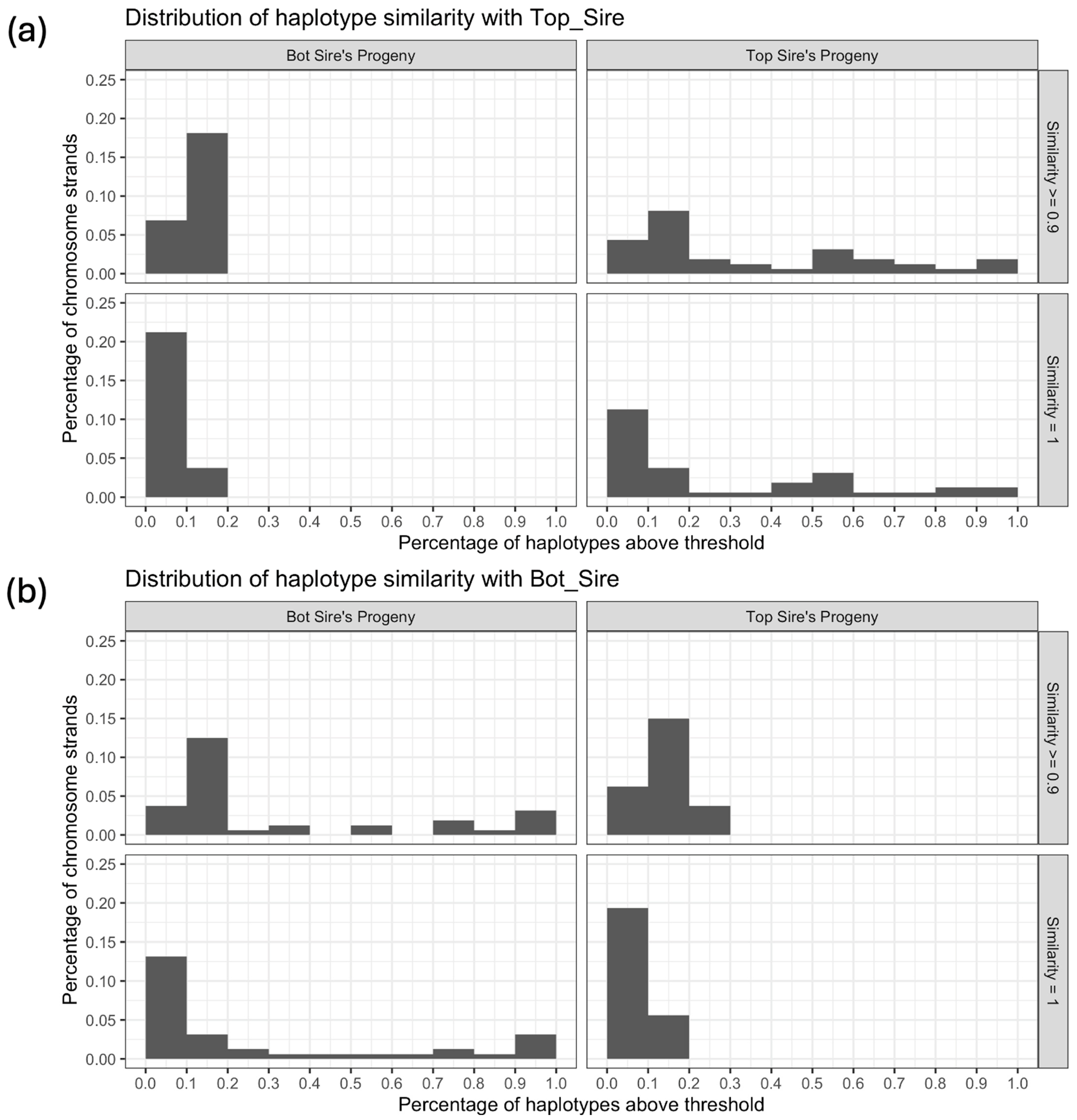
The third scenario shows the visualization of half-siblings. For this scenario, the males with the highest and lowest genetic values from the D2 population were selected, and 10 females from population C were selected at random. Each one of the females was mated with the two males, producing 20 progeny in total (2 sets of half-sibs). We compared the groups of progeny from each sire, the dams, and each of the two sires with the other Top or Bot sires, observing the mean, standard deviation, and median of haplotypes in chromosome 1 with similarity above the thresholds of 90% and 100%. We also plotted histograms to observe the percentage of haplotypes in chromosome 1 with similarity above these thresholds and the percentage of strands in the groups that fall inside each of these bins.
3. Results
3.1. Data Simulation and Validation
Table 1 shows statistics of the r2 between marker pairs separated by different distances, calculated from the sample (N = 100) of population D2, the same population from which the marker effects were obtained. For all other populations, see the Supplementary Tables S1–S6. The number of marker pairs analyzed varied according to the distance between them. The number of SNP pairs ranged from 5786 to 55,122 for shorter distances (from 0 to 50 kb) and longer distances (from 500 to 1000 kb), respectively. On average, for distances between 100 and 500 kb, 11,083 SNP pairs were observed. The mean r2 ranged from 0.26 to 0.08 and the median r2 from 0.09 to 0.03, considering the shortest (0–50 kb) and longest (500–1000 kb) distances, respectively. The mean, standard deviation across all distances was 0.21. The percentage of marker pairs with r2 ≥ 0.3 decreased as the distance between the pairs increased, ranging from 0.3 to 0.06, with an average of 0.15 across all distances.
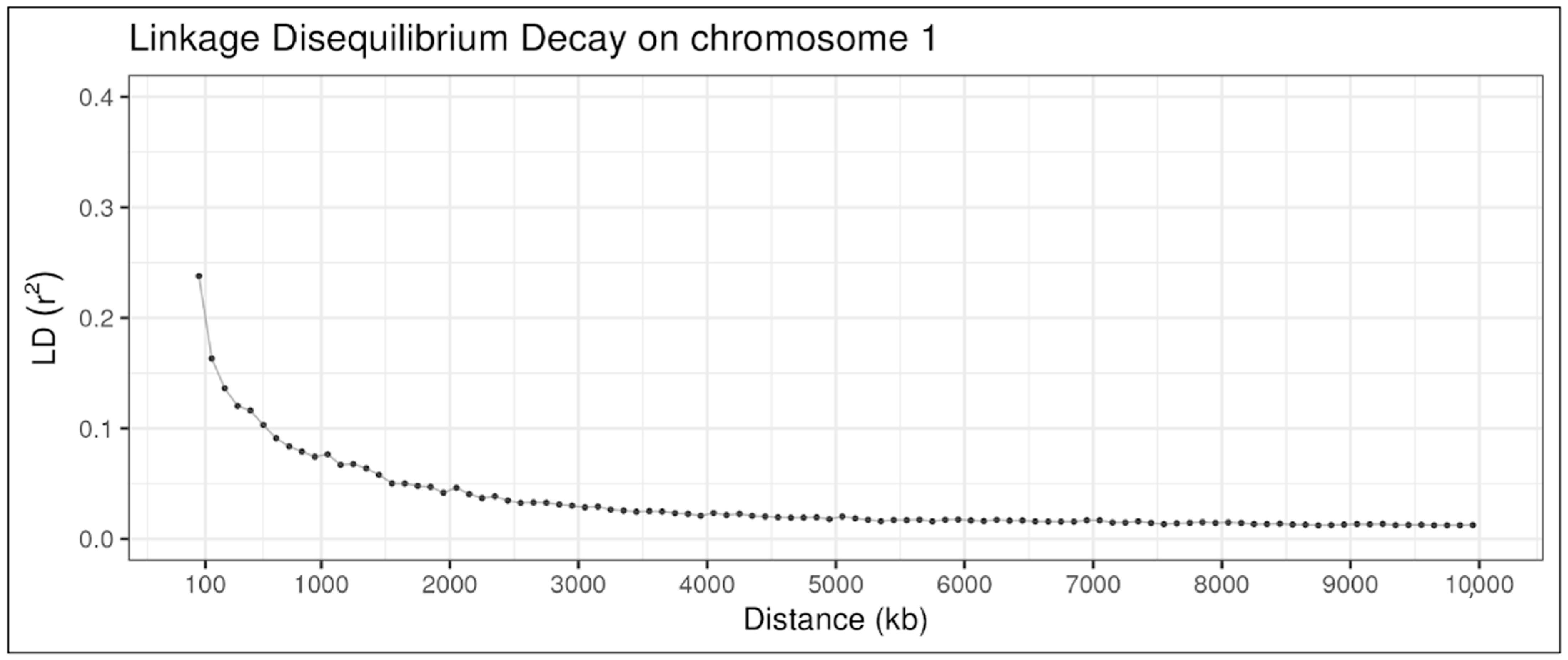
Figure 5 illustrates the LD decay in chromosome 1 of the same population, D2. The r2 begins around 0.24 between marker pairs with distances up to 100 kb, dropping sharply below 0.2 and reaching close to 0.075 for distances of 1000 kb, and finally arriving at nearly 0.01 at distances of 10 Mb.
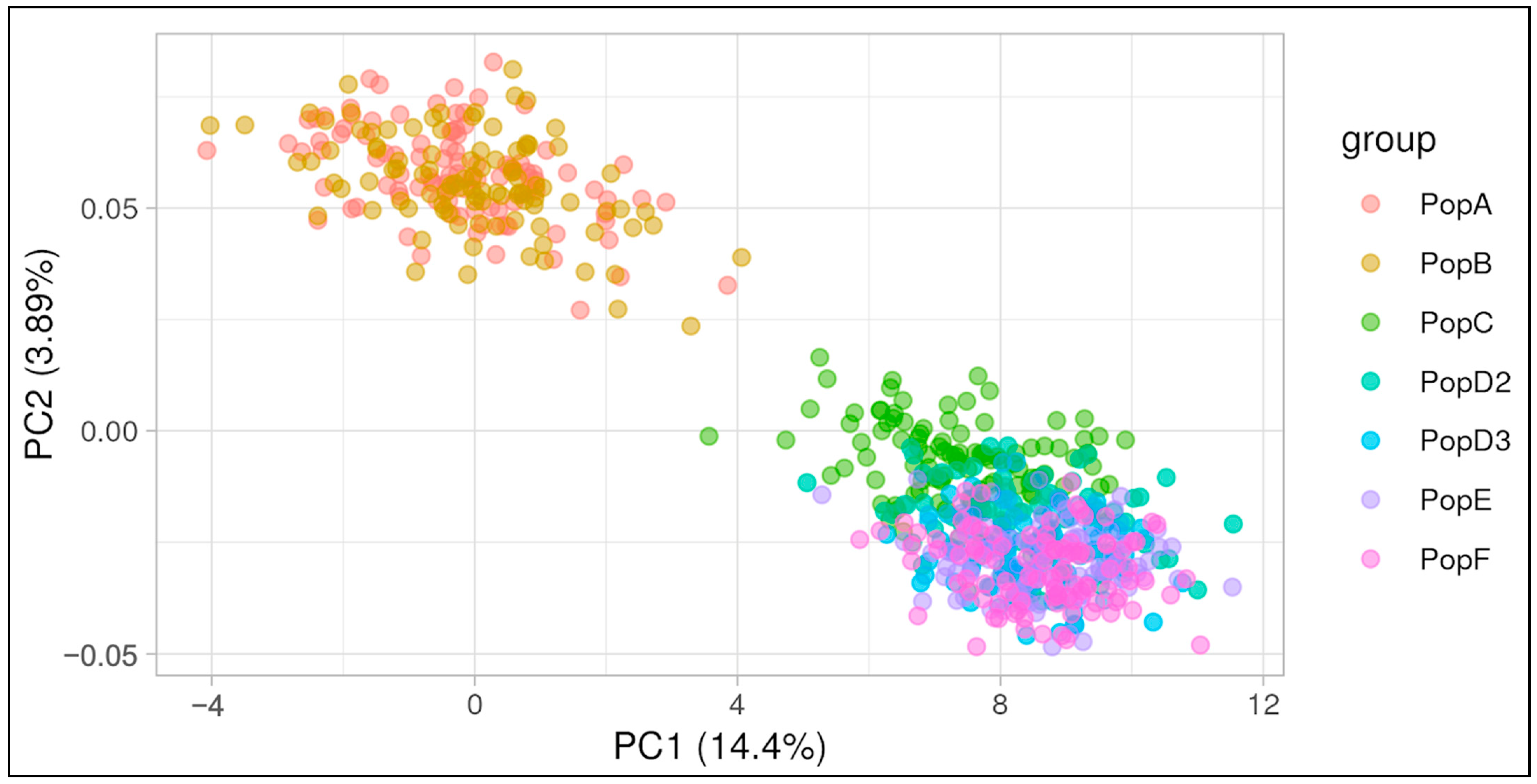
In order to assess the level of genetic differentiation across the simulated populations, a PCA was performed, and the first two principal components were plotted (Figure 6). The percentage of variance explained by each component was 14.4% and 3.89%, respectively. In Figure 6, we observe that populations A and B exhibit overlapping patterns in the upper left-hand quadrant, whereas the remaining populations are clustered in the lower right-hand quadrant. Population A is the founding population, while Population B was expanded via random mating without specific directional selection. Populations C, D2, and D3 underwent artificial selection, with Population C having a shorter selection history and being more closely related to the preceding populations. Populations E and F are descendants of the selected populations and exhibit overlap with them.
3.2. Visualization of Trios
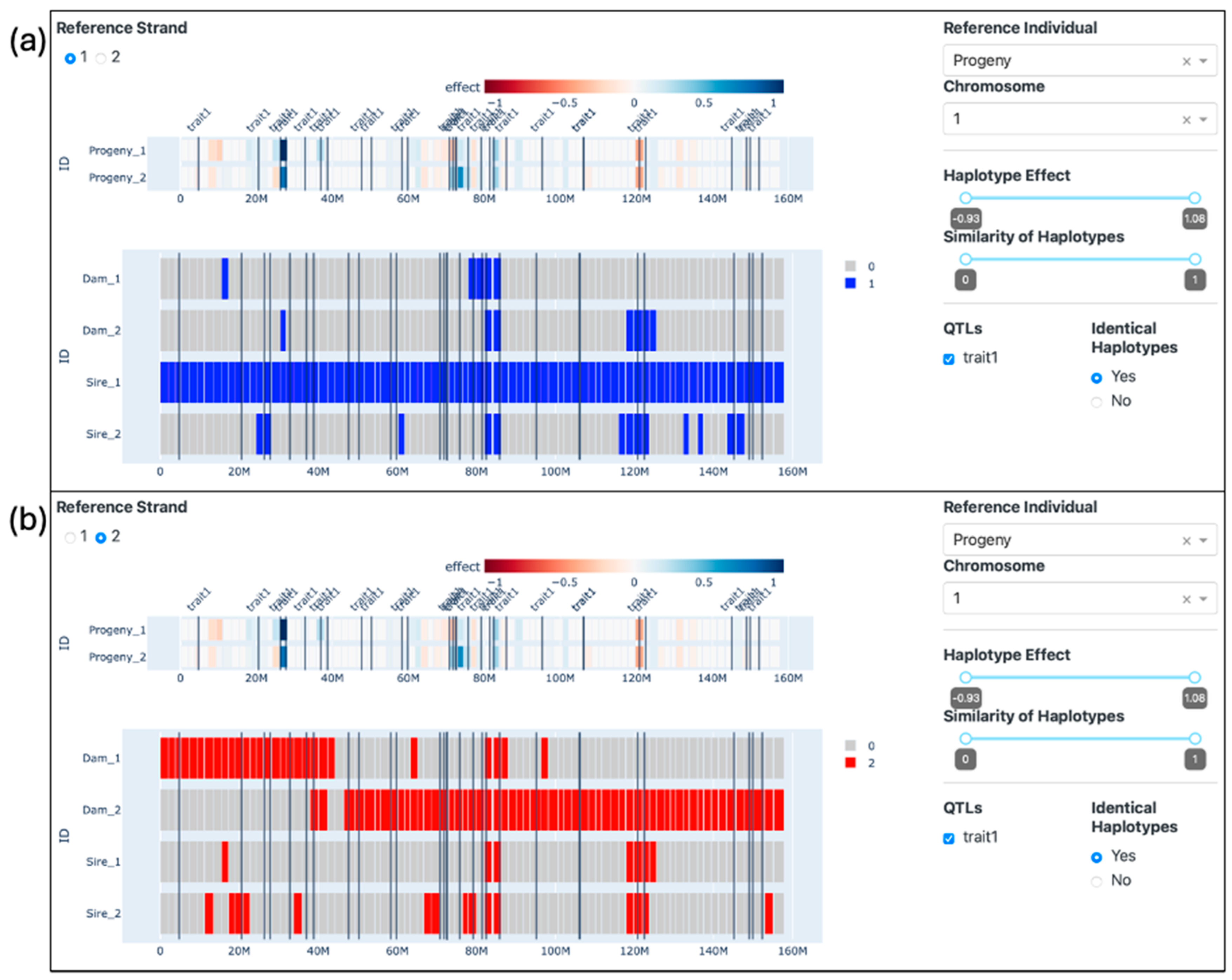
Figure 7 illustrates the interface, where the progeny is chosen as the reference individual, and the option “Identical Haplotypes” is set to “Yes”. We can also visualize the location of the traits (represented as vertical black lines) provided by the simulation software, which can be contrasted with the haplotype effects, represented by the color palette from red to blue on the reference animal’s visualization. The parents’ haplotypes are colored according to whether they are identical or not to the respective haplotypes from the progeny. All the results presented here can also be visualized in the Supplementary Video S1.
In Figure 7a, the haplotypes of the Dam and the Sire are compared to the first strand of the progeny. While the first strand from the progeny shared 100% of its haplotypes with the first strand from the Sire, it shared only 16.25% (13 haplotypes) with the second strand from the sire. When compared to the dam, the first strand of the progeny shared only 6.25% (5 haplotypes) and 8.75% (7 haplotypes) of the haplotypes with the first and second strands of the dam, respectively.
In Figure 7b, the second strand of the progeny is used as a reference. The percentage of haplotypes shared with the first and second strands of the sire were 8.75% (7 haplotypes) and 18.75% (15 haplotypes), respectively. In contrast, the percentage of haplotypes identical to the first and second strands of the dam was 35% (28 haplotypes) and 72.5% (58 haplotypes). Some of these haplotypes are composed of small genomic segments, with a range of 1 to 4 haplotypes and varying in size from approximately 1.5 Mb to 8.5 Mb.
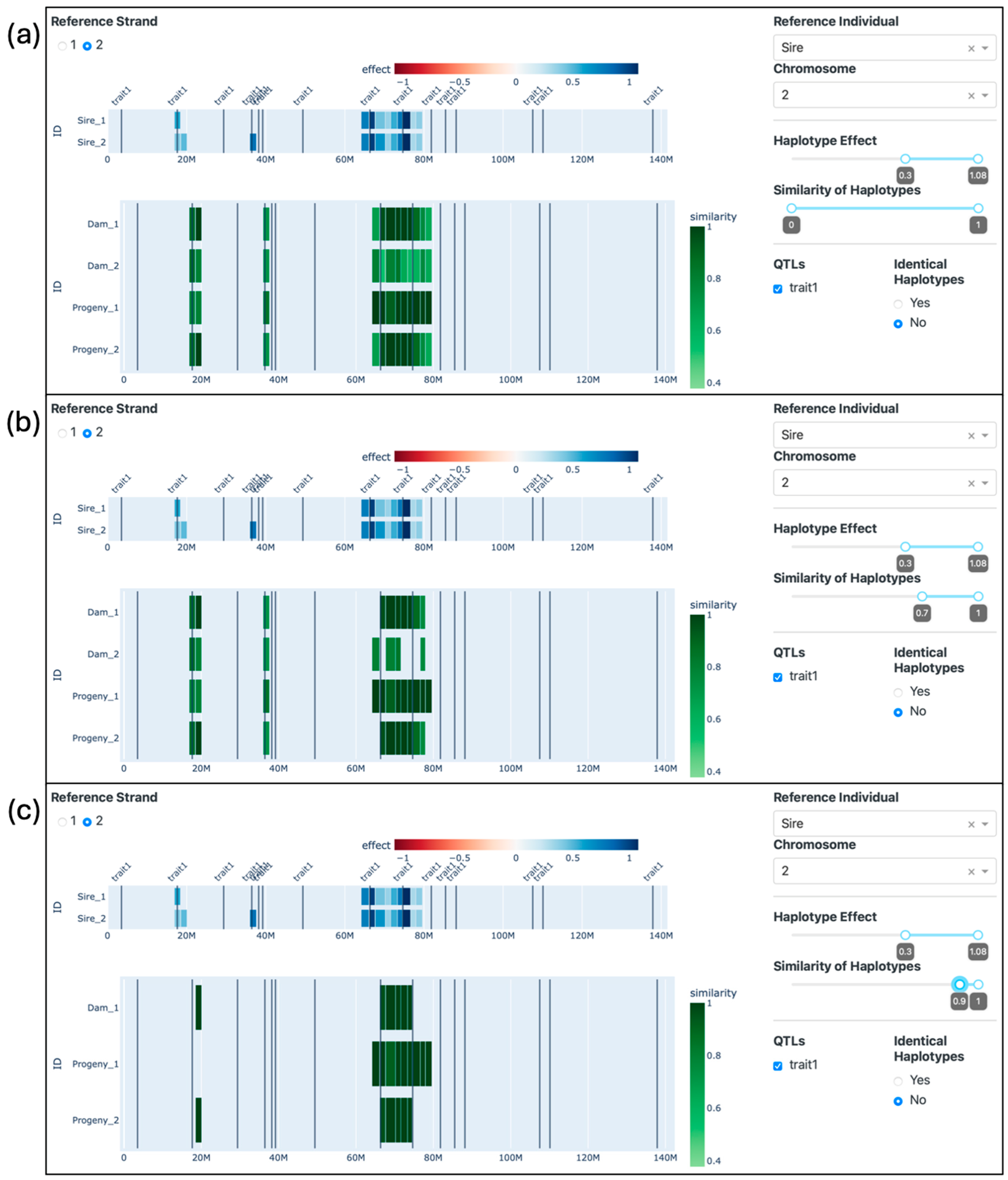
Figure 8 illustrates the comparison of the Sire with the Dam and the Progeny, where the second strand of the second chromosome of the Sire is compared with both strands from the second chromosome of the other individuals. The effect filter was set to 0.3 in order to select only the haplotypes from the Sire with an effect for the simulated trait equal to or greater than 0.3 and the corresponding haplotypes from the other individuals. Such haplotypes from the Sire were located around the marks of 20 Mb (mean effect of 0.46) and 40 Mb (effect of 0.81) and between 60 and 80 Mb (mean effect of 0.65), even though the QTLs are distributed along the chromosome. Notably, the most pronounced effects were observed between 60 and 80 Mb, ranging from 0.3 to 1.08. In Figure 8a, the similarity of the haplotypes of the dam and the progeny compared to the second strand of the sire ranged from 52% to 100%.
Subsequently, in Figure 8b, the similarity filter was adjusted to 0.7, which led to the exclusion of 2, 5, and 2 haplotypes from Dam_1, Dam_2, and Progeny_2, respectively. In Figure 8c, the similarity filter was set to 0.9, leading to the exclusion of 6, 3, and 6 haplotypes from Dam_1, Progeny_1, and Progeny_2, respectively. Remarkably, the second strand of the Dam does not exhibit any haplotypes with a similarity score equal to or greater than 0.9 with the selected haplotypes from the Sire and thus was entirely removed from the visualization.
3.3. Visualization of Grandparents
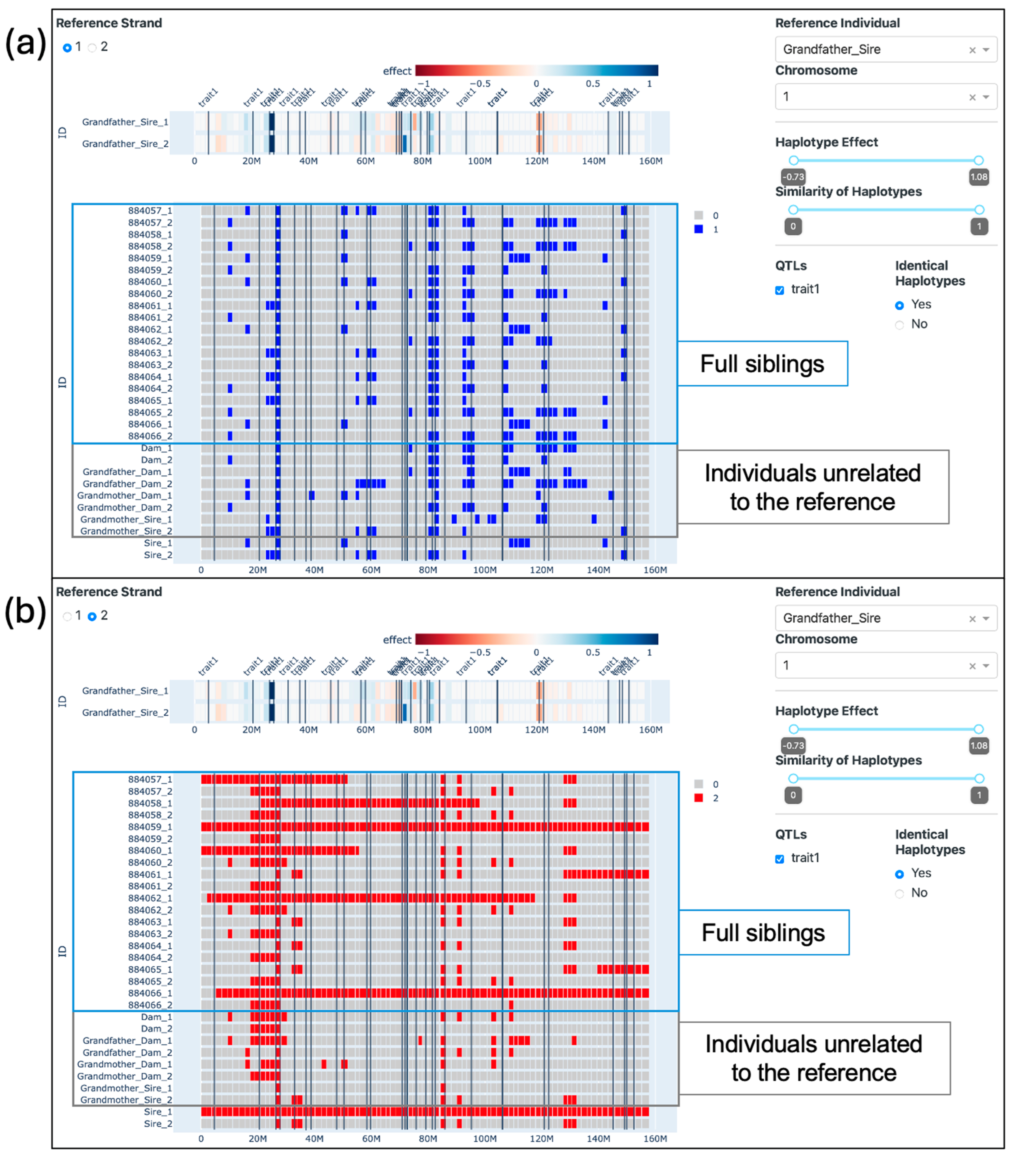
Figure 9 presents our tool with the grandfather from the sire’s side (ID: Grandfather_Sire) as the reference individual and the identical haplotypes option set to “yes”. In Figure 9a, we observe numerous genomic fragments identical to the first strand of the reference individual. However, in Figure 9b, a more intriguing pattern emerges: it becomes clear that the Sire has inherited the entire second strand (which we use as the reference) from his father. This full strand is then passed down to only one of his progeny (ID: 884059), while the other offspring inherit only segments of it. Of particular interest is a single haplotype found between the positions of 20 and 30 Mb, nestled between two QTLs, where all observed animals share precisely the same alleles in both strands. The Supplementary Video S2 also illustrates the visualizations presented in this topic.
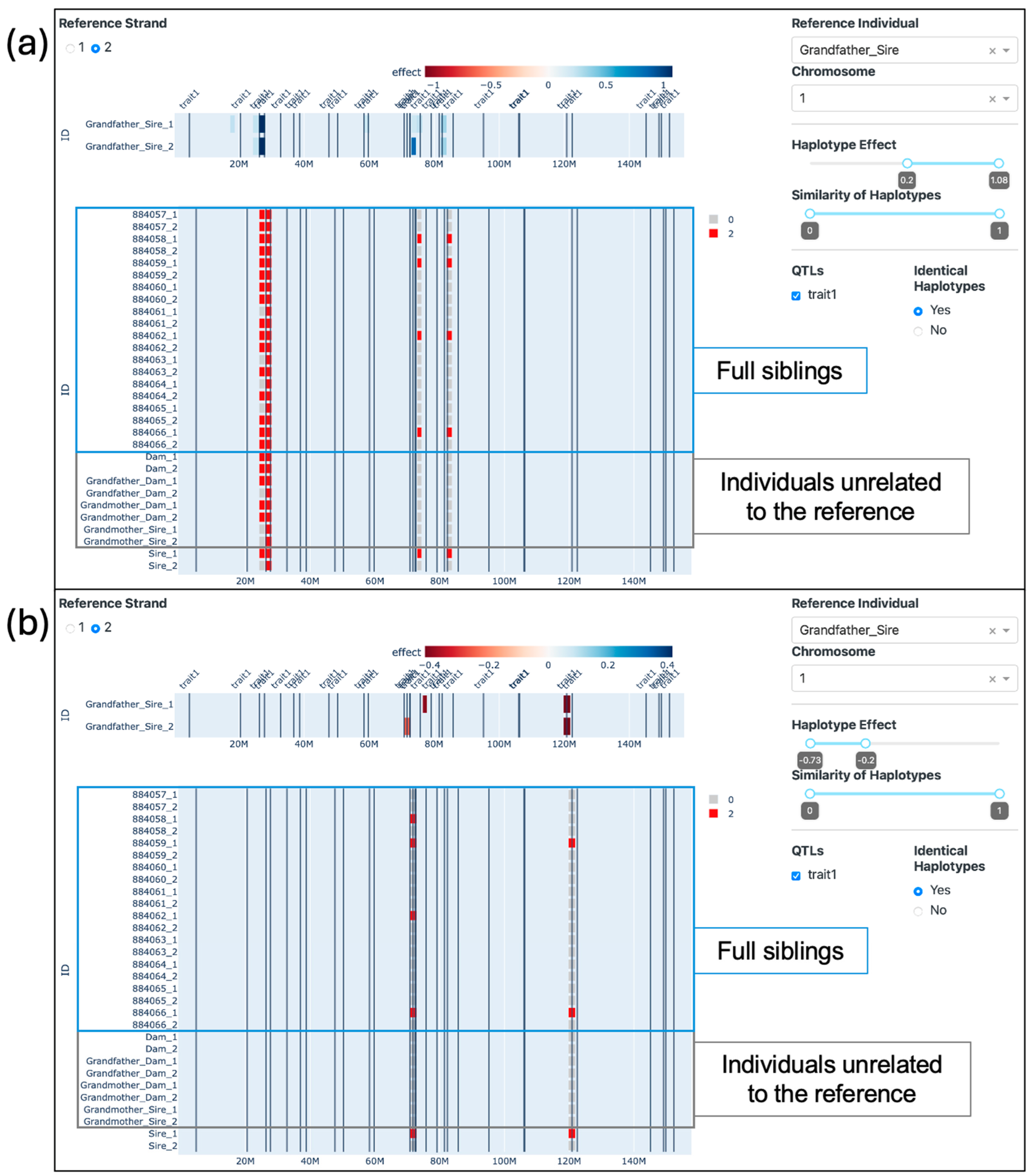
When applying the effects filter, it is possible to visualize the haplotypes from the Grandfather_Sire with the greatest (Figure 10a) and lowest (Figure 10b) effects. When comparing such haplotypes from the second strand of the reference individual with the rest of the populations, it is possible to observe that some individuals carry the exact same haplotypes. Apart from the one haplotype that is identical for all individuals analyzed, only one other haplotype (located in the previous window) is identical in individuals other than the descendants of the Grandfather_Sire (Figure 10a). We can also observe which progeny inherited the best and the worst haplotypes from the Grandfather_Sire. Four progeny inherited haplotypes with positive effects located around 80 Mb, while four and two progeny inherited haplotypes with negative effects located around 70 and 120 Mb, respectively. The progeny with IDs 884058 and 884062 inherited segments of the chromosome that did not include the negative haplotype located around 120 Mb.
3.4. Visualization of Half-Siblings
Table 2 presents the mean, standard deviation, and median of haplotypes with similarity equal to 100% and equal to or greater than 90% for each of the groups—Bot Progeny, Top Progeny, and Dams—and the Bot Sire compared to the Top Sire. Table 3 presents the same statistics for comparisons of the groups and the Top Sire with the Bot Sire as a reference. This scenario is presented in the Supplementary Video S3.
The number of haplotypes that passed each threshold of similarity varied between the groups. When the Top Sire was used as a reference (Table 2), the mean number of haplotypes to pass the threshold of 1 ranged from 4.5 to 28.25, and for the threshold of 0.9, from 9.55 to 32.9. The median varied from 4.5 to 17.5 and from 9.5 to 23 for the thresholds of 1 and 0.9, respectively. The Top Progeny group was evidently more similar to the Top Sire, especially when considering the first strand of the sire as a reference. There was a 55% increase in the mean of haplotypes passing the threshold of 1 when using the first strand as a reference instead of the second. This difference was slightly smaller for the threshold 0.9, where the mean was 35% higher when using the first strand as a reference. Additionally, the standard deviation was particularly high in this group, with averages of 23.49 and 22.56 for the thresholds of 1 and 0.9, respectively. The groups that were not directly related to the Top Sire presented similar metrics among themselves, with means ranging from 4.5 to 6.55 and from 9.55 to 11.05 haplotypes passing the thresholds of 1 and 0.9, respectively. In these groups, the standard deviation presented means of 2.97 and 3.94 for the thresholds of 1 and 0.9, respectively. However, the Bot Sire stood out with an standard deviation (SD) of 7.07 when compared to the second strand of the Top Sire when considering the threshold of 0.9.
Table 3 summarizes the mean, SD, and median number of haplotypes that pass both thresholds of similarity (1 and 0.9) with the Bot Sire. Similarly, the group of progeny from the reference individual (in this case, the Bot Progeny) presented higher numbers of haplotypes with elevated similarity. The means were 18.3 and 30.6 for the first and second strands with similarity equal to 1 and 21.09 and 29.28 for the first and second strands with similarity equal to or greater than 0.9. Conversely, the means from the other groups ranged from 3 to 7.5 and from 7.5 to 13.15 for the thresholds of 1 and 0.9, respectively. These numbers are similar to the results obtained in Table 2, however with a slightly higher range. The group of dams presented a modest increase in similarity with the Bot Sire as opposed to with the Top Sire: the mean number of haplotypes (among both strands) to pass the threshold of 1 was 29% higher, and to pass the threshold of 0.9 was 15% higher.
Figure 11 displays histograms representing the proportion of haplotypes within the first chromosome that exhibit similarity with the reference individual above a specific threshold (x-axis). The y-axis depicts the percentage of strands within particular groups of individuals falling within each corresponding bin. Figure 11a employs the Top Sire as the reference individual, whereas Figure 11b uses the Bot Sire as the reference. All of the quadrants presented strands in the first bin, corresponding to a proportion from 0 (included) to 10% (not included) of the haplotypes above the thresholds. The highest percentage was identified when comparing the Bot Sire’s progeny with the Top Sire, showing 0 to 10% of strands with similarity = 1. When comparing the progeny groups with the unrelated sire, all chromosome strands fell in bins under 20%, except for Top Sire’s progeny compared to the Bot Sire with similarity ≤ 90%, which had approximately 3% of strands in the bin of 20% to 30%. When comparing the progeny with their respective sires, the percentages were more distributed, ranging from approximately 0 to 12% of strands in each bin.
4. Discussion
4.1. Data Simulation and Validation
We simulated a beef cattle population with the purpose of showcasing the advantages of employing interactive visualizations to track shared genomic regions among individuals. Thus, the aim of the simulation was not to mimic one specific breed but to generate blocks of haplotypes similar to those found in a generic beef cattle population. Sargolzaei and Schenkel [30] described the advantages of employing data simulation, which included the low costs associated, the possibility of observing—and obtaining data from—several generations of the same population, and being able to better evaluate the results obtained since the researcher knows the underlying structure of the simulation. To validate the simulation, we calculated the LD (r2) between adjacent markers for samples of 100 individuals for each population simulated and performed a PCA analysis on all population samples combined.
The LD metrics obtained for population D2 (Table 1) are consistent with Lu et al. [31], even though the authors used different distance measures. The authors reported mean r2 values for three cattle breeds: Angus, Charolais, and Crossed. For distances between 0 and 30 kb, the mean r2 was 0.29, 0.22, and 0.21, respectively. For distances between 30 and 70 kb, mean r2 was 0.23, 0.16, and 0.15, and for distances between 70 and 100 kb, mean r2 was 0.19, 0.12, and 0.11. Brito et al. [3] also reported the means, standard deviations and frequency of r2 greater than 0.3 for two simulated populations. At distances from 0 to 100 kb, the r2 obtained in a population of Ne = 272 was 0.22, and the standard deviation was 0.24. The percentage of r2 > 0.3 was 27.89%. For distances of 100 to 200 kb, the average r2 and standard deviation were 0.17 and 0.19, with a percentage of r2 > 0.3 equal to 19.57%. These values, as well as those reported for longer distances, are also in line with the results obtained herein. The LD decay in chromosome 1, illustrated in Figure 4, is comparable with the LD decay reported by Pérez O’Brien et al. [32], who reported r2 under 0.1 for distances of 1000 kb while using windows of 10 kb and r2 between 0.1 and 0.03 in distances from 1 to 10 Mb while using windows of 100 kb.
The PCA of the seven simulated populations (Figure 6) exhibited low percentages of variance explained by the first two components, which is not unusual in genomic analyses [33]. Nevertheless, it presented a clear separation between the two initial populations, which were bred at random, and the selected populations, with more distinction between the populations selected for a longer period of time (D2 and D3) and their descendants (E and F) from population C.
4.2. Visualization of Trios
In this initial scenario, we introduce the fundamental functionalities of the visualization tool. In this context, we compared a male and a female from population D2, along with their offspring. Setting the progeny as the reference individual allowed us to visualize that the first strand of the progeny was inherited directly from the first strand of the sire, while the second strand of the progeny was the result of a crossover event between the two strands of the dam. Additionally, some haplotypes presented the maximum level of similarity with more than one strand, revealing regions that are identical across individuals that are not immediately related. These identical haplotypes represent potential regions of lower genetic diversity in this population. This low diversity could be attributed to a myriad of factors, namely linkage disequilibrium, artificial selection, family structure, and inbreeding.
The entire first strand of the progeny mirrors that of the Sire, indicating an absence of crossing over on this paternal chromosome. Additionally, some haplotypes align with the second strand of the sire, suggesting homozygosity in those regions of the sire’s genome. Notably, certain haplotypes are also identical to those of the dam despite the reference strand not originating from the dam. These likely represent prevalent haplotypes within the population. In Figure 7b, the second strand of the progeny is used as a reference. In contrast to the paternal chromosome, the maternal chromosome underwent a crossover event, resulting in the first segment of the progeny’s strand being identical to the corresponding portion of the dam’s first strand, while the second segment mirrors the second strand of the dam.
Similarly, we can observe identical haplotypes between the sire and the dam and between the progeny and the sire, even though the second strand of the progeny was inherited from the dam. These common regions are likely to be the result of lower rates of recombination and higher rates of inbreeding due to common ancestors and demographic events such as bottlenecks, admixture, or selection. The small size of such regions may reflect the fact that long regions of LD or homozygosity are usually broken over the generations.
Moreover, we applied filters of haplotype effect and similarity in order to observe the similarity of the haplotypes of greatest effect in the second strand of the second chromosome of the sire with the corresponding haplotypes from the other individuals. The haplotypes of greater effect from the sire are located on specific regions spanning no longer than 20 Mb each, even though the QTLs extracted from the simulation were distributed throughout the chromosome. This observation may stem from the limitation of single SNP regression analysis, which may not fully capture all relevant regions, or it could suggest that the sire does not harbor haplotypes of substantial effects on those specific regions.
4.3. Visualization of Grandparents
In the context of examining generational genomic inheritance, we delve into a three-generation scenario using our visualization tool. Our aim is to trace the transmission of genomic segments across these generations. To illustrate this process, four individuals were randomly chosen from the D2 population to represent the grandparents—comprising both grandfathers and grandmothers from both the sire and dam lineages—as well as their offspring (the sire and dam themselves) and their grandchildren (comprising 10 full siblings, each identified by a numeric ID).
In this scenario, we can visualize how a segment or entire chromosome strand is passed down from one generation to another and how two full siblings may present very different percentages of the genetic load from their grandparents, which in turn may affect relevant economic or health traits. Roach et al. [34] analyzed the whole-genome sequences (WGS) of four family members (two siblings and their parents) and were able to pinpoint recombination sites with great precision, identify sequencing errors, detect very rare SNPs, and significantly reduce the number of candidate genes associated with two genetic disorders to only four. The authors emphasize the efficacy of employing WGS on a dataset encompassing four family members. However, they caution that the effectiveness of such analyses would diminish substantially in studies with fewer markers or involving a smaller number of family members. In the present study, we simulated a medium-density SNP array of ~50,000 markers (nearly 2000 markers per chromosome in bovine). This likely would not serve the purpose of identifying rare SNPs, such as performed in Roach et al. [34]; however, it could still be informative about wider regions of the genome where an important mutation could be harbored.
As presented in Figure 9, our analysis allowed us to trace both long and short genome segments that exhibited either Identical By Descent (IBD) in the sire and the full siblings or Identical By State (IBS) in individuals unrelated to the reference. The IBD segments offer clear insights into which descendants inherited specific genetic segments from the grandsire, facilitating the narrowing down of common genomic regions among descendants exhibiting a particular trait or disease. This capability may provide great value for genomic selection in smaller programs or farms. Evidently, the effectiveness of this strategy is contingent on the nature of inheritance and the number of loci controlling the trait.
On the other hand, our analysis revealed several regions displaying IBS across unrelated individuals. In a specific case, a small region spanning from 26.01 Mb to 28.11 Mb was identified where all haplotypes among the analyzed individuals were identical, indicating the possibility of the existence of a common ancestor many generations ago, whose haplotype was passed down to many individuals and likely broken down over the generations [35]. Such a discovery may provide a basis for inter-population comparisons and the removal of uninformative SNPs in future population-based analyses. Moreover, common regions in the genome within populations have been shown to indicate putative signatures of selection [36,37] and reveal composite breeds’ history [38,39], where visualization is key to communicating such findings [5].
When selecting only regions of very high or very low effect (Figure 10), we gain the ability to trace which individuals have inherited these specific haplotypes. This enables us to selectively choose descendants who have inherited the desired genetic segments while excluding individuals with undesirable or potentially harmful genetic content, as previously identified. It is worth noting that in this simulation, varying numbers of QTLs were simulated on each chromosome. The single SNP regression method failed to capture all QTL effects and erroneously attributed some effects to regions lacking actual QTLs, introducing certain limitations to the effectiveness of the effects filter. Nevertheless, we were able to draw visual comparisons between the number of effects and the presence of QTLs on each chromosome (as illustrated in Supplementary Video S1). The effects observed in the tool were both more abundant and exhibited greater magnitude in the chromosomes containing a higher number of QTLs, specifically chromosomes 1, 2, and 3. Conversely, in chromosomes with fewer or no QTLs (chromosomes 4 and 5), the effects were comparatively smaller in magnitude and less numerous.
It is important to emphasize that the primary focus of this study was not on the estimation of marker effects, with the GWAS serving as a supplementary analysis for the tool. Instead, our investigation centered on the identification of specific genetic segments and their inheritance patterns within the simulated population. This allowed us to explore the potential for targeted selection and filtering based on the presence of desired or undesirable haplotypes in the context of complex trait analysis.
4.4. Visualization of Half-Siblings
In this scenario, we selected the sires with the highest (Top Sire) and lowest (Bot Sire) genetic values from the D2 population and mated each with ten females from population C, generating a total of 20 crossed half-siblings (sharing either the same father or the same mother). We compared each individual in the data set with the Top and the Bot Sire and calculated the number of haplotypes equal to or greater than a certain threshold of similarity (90% or 100%) in chromosome 1. Next, we generated statistics for each group (progeny of the Bot Sire, progeny of the Top Sire, and Dams) and for the Sire being compared, where the number of strands being compared was equal to the number of individuals in the group times 2.
Table 2 exhibits higher mean and median values for the Top Progeny group, which is genetically related to the Top Sire. The SD can be attributed to the fact that only the first strand of the progeny is inherited from the sire, while both strands are being compared at the same time. It is evident that the progeny shares more haplotypes with the first strand of the sire. In contrast, the Bot Progeny and the Bot Sire show a smaller resemblance to the Top Sire. While the Bot Progeny demonstrates a similar degree of similarity to each strand of the Top Sire, the Bot Sire exhibits a stronger likeness to the second strand of the Top Sire. The higher SD observed in the Bot Sire suggests that one of its strands bears a closer genetic relationship to the second strand of the Top Sire. Interestingly, the group of dams does not display a particular distinctive pattern from that of the Bot Sire and Bot Progeny despite originating from a different population. Moreover, by allowing only a 10% divergence in alleles, the number of haplotypes passing the filter increases by approximately 100% in groups unrelated to the reference individual. Within the Top Progeny group, this increase occurs at a more modest rate, with only around four additional haplotypes compared to the first strand and approximately six additional haplotypes compared to the second strand.
In Table 3, a parallel comparison was conducted with the Bot Sire. Consistent with the observations in Table 2, the offspring of the reference sire, represented here as the Bot Sire, exhibited a higher degree of haplotype sharing with this specific individual compared to other groups. This discrepancy in haplotype sharing was accentuated by a higher standard deviation, as it entails a comparison of both strands from the progeny, while only one strand originates from the Bot Sire. Both the Top Sire and the Top Progeny displayed a greater degree of similarity with the second strand of the Bot Sire, although the difference averaged a mere two haplotypes. Conversely, the dams displayed no discernible disparity between the two strands of the Bot Sire and exhibited a similar level of similarity with other unrelated groups, with an average of seven haplotypes. When considering a 10% allowance for allele differences, a similar pattern emerged, with the mean number of haplotypes exceeding this threshold approximately doubling across the board, except for the Bot Progeny group, which displayed a more modest increase.
In the comparison of progeny with their respective unrelated sires (Figure 11), the Bot progeny group exhibited a greater degree of similarity with the Top Sire than the reverse scenario. Notably, some individuals within this group fell within the bin spanning 20% to 30% of haplotypes exceeding the 90% similarity threshold. When assessing the progeny in relation to their respective sires, the Bot progeny group displayed higher density at the extremes (0% to 10% and 90% to 100%) when contrasted with the Top progeny group. It is worth noting that these metrics are influenced to some extent by the level of similarity between the dams and sires, as well as the sires’ degree of homozygosity.
This article aimed at showcasing the potential uses of interactive visualizations, specifically focusing on the question, “Why are some full siblings so different?”. Instead of providing a tool for all purposes, we encourage academics, breeders, and teachers to embrace this visualization concept (whether using open-source or proprietary tools) to develop their own pipelines and dashboards in order to answer their specific questions. In dairy cattle breeding schemes, for instance, there is concern about major genes, such as beta-casein A1/A2 [40], recessive diseases, namely Complex Vertebral Malformation [41] and Brachyspina [42], and decreased fertility caused by particular haplotypes [43]. Since the genes underlying these conditions have been identified and can be mapped by markers, this information could be easily included in the dashboard and thus provide a better understanding of the inheritance process of such genes and how they relate with regions of interest for producers. Visual representations offer an intuitive way of observing results obtained by statistical and genomic analyses, facilitating communication between researchers, educators, breeders, and farmers, as illustrated by Deeb et al. [23].
Furthermore, we emphasize the advantages of employing open-source tools in the development of specific types of graphics. In another study by Selli et al. [5], the use of a proprietary tool allowed for the quick and efficient visualization of genomic analyses; however, the difficulty of replicating the graphics in new sets of data was one of the obstacles that led to the adoption of more flexible tools in the current study. The smoothness of incorporating complex back-end computations in order to prepare the data was also a great advantage observed when using open-source software, besides the flexibility to create tailored visualizations to answer specific questions posed by the researchers.
5. Conclusions
In our study, we utilized open-source tools to create an interactive and effective strategy for visualizing SNP data shared among individuals and tracking the transmission of haplotypes in a livestock population. Our objectives were to showcase the advantages of interactive visualizations and to provide insights into genetic inheritance in livestock populations. We used a visualization tool to explore three key scenarios. In the first scenario, we visualized genetic inheritance patterns within trios, highlighting the transmission of genomic segments between parents and offspring. This allowed us to identify regions of identical haplotypes, shedding light on factors such as inbreeding and artificial selection. In the second scenario, we traced the transmission of genomic segments across three generations. This provided valuable insights into which descendants inherited specific genetic segments from their grandparents, offering potential applications for genomic selection and breeding programs. In the third scenario, we compared half-siblings from different sires to understand genetic inheritance patterns. Our findings revealed differences in genetic similarity between half-siblings and their respective sires, providing valuable information for breeding strategies and selection. Overall, our study underscores the power of employing open-source tools, as opposed to proprietary software, in order to shed light on specific questions, showing applications for the livestock genetics and breeding community, as well as educators and researchers seeking to communicate complex genetic concepts and explore selection strategies.
Supplementary Materials
The following supporting information can be downloaded at https://drive.usercontent.google.com/download?id=1FPGkKxKmcacvHMGNh-_sYmx1gOBmaFzL&export=download, 9 November 2023. Table S1: Linkage disequilibrium (r2) between marker pairs separated by different distances in a simulated beef cattle population (A); Table S2: Linkage disequilibrium (r2) between marker pairs separated by different distances in a simulated beef cattle population (B); Table S3: Linkage disequilibrium (r2) between marker pairs separated by different distances in a simulated beef cattle population (C); Table S4: Linkage disequilibrium (r2) between marker pairs separated by different distances in a simulated beef cattle population (D2); Table S5: Linkage disequilibrium (r2) between marker pairs separated by different distances in a simulated beef cattle population (E); Table S6: Linkage disequilibrium (r2) between marker pairs separated by different distances in a simulated beef cattle population (F); Script S1: Simulation code for generic beef cattle populations (purebred and crossed); Script S2: Additional functions for AlphaSimR; Video S1: The transmission of haplotypes in a trio (mp4 format without audio); Video S2: The transmission of haplotypes over three generations (mp4 format without audio); Video S3: The transmission of haplotypes in half-siblings (mp4 format without audio).
Author Contributions
Conceptualization, S.P.M. and R.V.V.; methodology, A.S., S.P.M. and R.V.V.; software, A.S.; validation, A.S.; formal analysis, A.S.; investigation, A.S.; resources, R.V.V.; data curation, A.S.; writing—original draft preparation, A.S., S.P.M. and R.V.V.; writing—review and editing, A.S., S.P.M. and R.V.V.; visualization, A.S.; supervision, S.P.M. and R.V.V.; project administration, R.V.V.; funding acquisition, R.V.V. All authors have read and agreed to the published version of the manuscript.
Funding
This research was funded by Fundação de Amparo à Pesquisa do Estado de São Paulo (FAPESP), grant numbers 2016/19514-2, 2021/03101-9 and 2021/11156-8.
Institutional Review Board Statement
Not applicable.
Informed Consent Statement
Not applicable.
Data Availability Statement
The data presented in this study are available in Supplementary Materials Script S1 and Script S2.
Conflicts of Interest
The authors declare no conflicts of interest.
References
- Oldenbroek, K.; van der Waaij, L. Textbook Animal Breeding: Animal Breeding and Genetics for BSc Students; Centre for Genetic Resources and Animal Breeding and Genomics Group, Wageningen University and Research Centre: Wageningen, The Netherlands, 2014. [Google Scholar]
- Bohmanova, J.; Sargolzaei, M.; Schenkel, F.S. Characteristics of Linkage Disequilibrium in North American Holsteins. BMC Genom. 2010, 11, 421. [Google Scholar] [CrossRef]
- Brito, F.V.; Neto, J.B.; Sargolzaei, M.; Cobuci, J.A.; Schenkel, F.S. Accuracy of Genomic Selection in Simulated Populations Mimicking the Extent of Linkage Disequilibrium in Beef Cattle. BMC Genet. 2011, 12, 80. [Google Scholar] [CrossRef]
- Cook, M.P. Visual Representations in Science Education: The Influence of Prior Knowledge and Cognitive Load Theory on Instructional Design Principles. Sci. Educ. 2006, 90, 1073–1091. [Google Scholar] [CrossRef]
- Selli, A.; Ventura, R.V.; Fonseca, P.A.S.; Buzanskas, M.E.; Andrietta, L.T.; Balieiro, J.C.C.; Brito, L.F. Detection and Visualization of Heterozygosity-Rich Regions and Runs of Homozygosity in Worldwide Sheep Populations. Animals 2021, 11, 2696. [Google Scholar] [CrossRef] [PubMed]
- Van Essen, D.C.; Anderson, C.H.; Felleman, D.J. Information Processing in the Primate Visual System: An Integrated Systems Perspective. Science 1992, 255, 419–423. [Google Scholar] [CrossRef] [PubMed]
- Dosher, B.; Lu, Z.-L. Visual Perceptual Learning and Models. Annu. Rev. Vis. Sci. 2017, 3, 343–363. [Google Scholar] [CrossRef]
- Rougier, N.P.; Droettboom, M.; Bourne, P.E. Ten Simple Rules for Better Figures. PLoS Comput. Biol. 2014, 10, e1003833. [Google Scholar] [CrossRef]
- Bateman, S.; Mandryk, R.L.; Gutwin, C.; Genest, A.; McDine, D.; Brooks, C. Useful Junk? The Effects of Visual Embellishment on Comprehension and Memorability of Charts. In Proceedings of the SIGCHI Conference on Human Factors in Computing Systems, Atlanta, GA, USA, 10 April 2010; pp. 2573–2582. [Google Scholar]
- Hullman, J.; Diakopoulos, N. Visualization Rhetoric: Framing Effects in Narrative Visualization. IEEE Trans. Vis. Comput. Graph. 2011, 17, 2231–2240. [Google Scholar] [CrossRef]
- Zhou, L.; Hansen, C.D. A Survey of Colormaps in Visualization. IEEE Trans. Vis. Comput. Graph. 2016, 22, 2051–2069. [Google Scholar] [CrossRef] [PubMed]
- Zacks, J.; Tversky, B. Bars and Lines: A Study of Graphic Communication. Mem. Cognit. 1999, 27, 1073–1079. [Google Scholar] [CrossRef]
- Ali, S.M.; Gupta, N.; Nayak, G.K.; Lenka, R.K. Big Data Visualization: Tools and Challenges. In Proceedings of the 2016 2nd International Conference on Contemporary Computing and Informatics, Greater Noida, India, 14–17 December 2016; pp. 656–660. [Google Scholar]
- Morota, G.; Cheng, H.; Cook, D.; Tanaka, E. ASAS-NANP Symposium: Prospects for Interactive and Dynamic Graphics in the Era of Data-Rich Animal Science1. J. Anim. Sci. 2021, 99, skaa402. [Google Scholar] [CrossRef]
- Plotly. Dash Documentation & User Guide. Available online: https://dash.plotly.com/ (accessed on 10 March 2022).
- Van Rossum, G.; Drake, F.L., Jr. Python Reference Manual; Centrum voor Wiskunde en Informatica: Amsterdam, The Netherlands, 1995. [Google Scholar]
- R Core Team. R: A Language and Environment for Statistical Computing; R Foundation for Statistical Computing: Vienna, Austria, 2021. [Google Scholar]
- Tableau. Business Intelligence and Analytics Software. Available online: https://www.tableau.com/ (accessed on 26 October 2023).
- Microsoft Power BI. Data Visualisation. Available online: https://powerbi.microsoft.com/en-gb/ (accessed on 26 October 2023).
- Curti, P.D.F.; Selli, A.; Pinto, D.L.; Merlos-Ruiz, A.; Balieiro, J.C.D.C.; Ventura, R.V. Applications of Livestock Monitoring Devices and Machine Learning Algorithms in Animal Production and Reproduction: An Overview. Anim. Reprod. 2023, 20, e20230077. [Google Scholar] [CrossRef]
- Buels, R.; Yao, E.; Diesh, C.M.; Hayes, R.D.; Munoz-Torres, M.; Helt, G.; Goodstein, D.M.; Elsik, C.G.; Lewis, S.E.; Stein, L.; et al. JBrowse: A Dynamic Web Platform for Genome Visualization and Analysis. Genome Biol. 2016, 17, 1–12. [Google Scholar] [CrossRef]
- L’Yi, S.; Gehlenborg, N. Multi-View Design Patterns and Responsive Visualization for Genomics Data. IEEE Trans. Vis. Comput. Graph. 2023, 29, 559–569. [Google Scholar] [CrossRef]
- Deeb, J.; Juan, R.P.; Kendall, D.; Castellani, D.; Heuer, C.; Utsunomiya, Y.T.; Su, H.; Westberry, S.; Utsunomiya, A. Chromosomal Mating: A Data-Driven Approach to Improving Dairy Cattle Breeding Decisions. In Proceedings of the Plant and Animal Genome XXXI, San Diego, CA, USA, 12–17 January 2024. [Google Scholar]
- Larkin, D.M.; Daetwyler, H.D.; Hernandez, A.G.; Wright, C.L.; Hetrick, L.A.; Boucek, L.; Bachman, S.L.; Band, M.R.; Akraiko, T.V.; Cohen-Zinder, M.; et al. Whole-Genome Resequencing of Two Elite Sires for the Detection of Haplotypes under Selection in Dairy Cattle. Proc. Natl. Acad. Sci. USA 2012, 109, 7693–7698. [Google Scholar] [CrossRef] [PubMed]
- Gaynor, R.C.; Gorjanc, G.; Hickey, J.M. AlphaSimR: An R Package for Breeding Program Simulations. G3 GenesGenomesGenetics 2021, 11, jkaa017. [Google Scholar] [CrossRef] [PubMed]
- Purcell, S.; Neale, B.; Todd-Brown, K.; Thomas, L.; Ferreira, M.A.R.; Bender, D.; Maller, J.; Sklar, P.; de Bakker, P.I.W.; Daly, M.J.; et al. PLINK: A Tool Set for Whole-Genome Association and Population-Based Linkage Analyses. Am. J. Hum. Genet. 2007, 81, 559–575. [Google Scholar] [CrossRef] [PubMed]
- Abraham, G.; Qiu, Y.; Inouye, M. FlashPCA2: Principal Component Analysis of Biobank-Scale Genotype Datasets. Bioinformatics 2017, 33, 2776–2778. [Google Scholar] [CrossRef] [PubMed]
- Gondro, C. Primer to Analysis of Genomic Data Using R.—Use R! Springer International Publishing: Cham, Switzerland, 2015; ISBN 978-3-319-14474-0. [Google Scholar]
- McKinney, W. Data Structures for Statistical Computing in Python. In Proceedings of the 9th Python in Science Conference, Austin, TX, USA, 28 June–3 July 2010; pp. 56–61. [Google Scholar]
- Sargolzaei, M.; Schenkel, F.S. QMSim: A Large-Scale Genome Simulator for Livestock. Bioinformatics 2009, 25, 680–681. [Google Scholar] [CrossRef] [PubMed]
- Lu, D.; Sargolzaei, M.; Kelly, M.; Li, C.; Voort, G.V.; Wang, Z.; Plastow, G.; Moore, S.; Miller, S.P. Linkage Disequilibrium in Angus, Charolais, and Crossbred Beef Cattle. Front. Genet. 2012, 3, 1–10. [Google Scholar] [CrossRef] [PubMed]
- Pérez O’Brien, A.M.; Mészáros, G.; Utsunomiya, Y.T.; Sonstegard, T.S.; Garcia, J.F.; Van Tassell, C.P.; Carvalheiro, R.; da Silva, M.V.B.; Sölkner, J. Linkage Disequilibrium Levels in Bos Indicus and Bos Taurus Cattle Using Medium and High Density SNP Chip Data and Different Minor Allele Frequency Distributions. Livest. Sci. 2014, 166, 121–132. [Google Scholar] [CrossRef]
- Buzanskas, M.E.; Ventura, R.V.; Chud, T.C.S.; Bernardes, P.A.; De Abreu Santos, D.J.; De Almeida Regitano, L.C.; De Alencar, M.M.; De Alvarenga Mudadu, M.; Zanella, R.; Da Silva, M.V.G.B.; et al. Study on the Introgression of Beef Breeds in Canchim Cattle Using Single Nucleotide Polymorphism Markers. PLoS ONE 2017, 12, 1–16. [Google Scholar] [CrossRef]
- Roach, J.C.; Glusman, G.; Smit, A.F.A.; Huff, C.D.; Hubley, R.; Shannon, P.T.; Rowen, L.; Pant, K.P.; Goodman, N.; Bamshad, M.; et al. Analysis of Genetic Inheritance in a Family Quartet by Whole-Genome Sequencing. Science 2010, 328, 636–639. [Google Scholar] [CrossRef]
- Gibson, J.; Morton, N.E.; Collins, A. Extended Tracts of Homozygosity in Outbred Human Populations. Hum. Mol. Genet. 2006, 15, 789–795. [Google Scholar] [CrossRef]
- Fariello, M.I.; Boitard, S.; Naya, H.; SanCristobal, M.; Servin, B. Detecting Signatures of Selection Through Haplotype Differentiation Among Hierarchically Structured Populations. Genetics 2013, 193, 929–941. [Google Scholar] [CrossRef] [PubMed]
- Brito, L.F.; Kijas, J.W.; Ventura, R.V.; Sargolzaei, M.; Porto-Neto, L.R.; Cánovas, A.; Feng, Z.; Jafarikia, M.; Schenkel, F.S. Genetic Diversity and Signatures of Selection in Various Goat Breeds Revealed by Genome-Wide SNP Markers. BMC Genomics 2017, 18, 229. [Google Scholar] [CrossRef] [PubMed]
- Kijas, J.W.; Lenstra, J.A.; Hayes, B.; Boitard, S.; Porto Neto, L.R.; San Cristobal, M.; Servin, B.; McCulloch, R.; Whan, V.; Gietzen, K.; et al. Genome-Wide Analysis of the World’s Sheep Breeds Reveals High Levels of Historic Mixture and Strong Recent Selection. PLoS Biol. 2012, 10, e1001258. [Google Scholar] [CrossRef] [PubMed]
- Brito, L.F.; McEwan, J.C.; Miller, S.P.; Pickering, N.K.; Bain, W.E.; Dodds, K.G.; Schenkel, F.S.; Clarke, S.M. Genetic Diversity of a New Zealand Multi-Breed Sheep Population and Composite Breeds’ History Revealed by a High-Density SNP Chip. BMC Genet. 2017, 18, 25. [Google Scholar] [CrossRef] [PubMed]
- Olenski, K.; Kamiński, S.; Szyda, J.; Cieslinska, A. Polymorphism of the Beta-Casein Gene and Its Associations with Breeding Value for Production Traits of Holstein–Friesian Bulls. Livest. Sci. 2010, 131, 137–140. [Google Scholar] [CrossRef]
- Malher, X.; Beaudeau, F.; Philipot, J.M. Effects of Sire and Dam Genotype for Complex Vertebral Malformation (CVM) on Risk of Return-to-Service in Holstein Dairy Cows and Heifers. Theriogenology 2006, 65, 1215–1225. [Google Scholar] [CrossRef] [PubMed]
- Charlier, C.; Agerholm, J.S.; Coppieters, W.; Karlskov-Mortensen, P.; Li, W.; De Jong, G.; Fasquelle, C.; Karim, L.; Cirera, S.; Cambisano, N.; et al. A Deletion in the Bovine FANCI Gene Compromises Fertility by Causing Fetal Death and Brachyspina. PLoS ONE 2012, 7, e43085. [Google Scholar] [CrossRef] [PubMed]
- VanRaden, P.M.; Null, D.J.; Olson, K.M.; Hutchison, J.L. Reporting of Haplotypes with Recessive Effects on Fertility. Interbull Bull. 2011, 44, 117–121. [Google Scholar]
Figure 1.
The structure of the simulation of beef cattle populations.

Figure 2.
The relation of files required to implement the visualization tool.

Figure 3.
How the similarity between haplotypes of the reference individual and of the other individuals is calculated.
Figure 3.
How the similarity between haplotypes of the reference individual and of the other individuals is calculated.

Figure 4.
The initial screen of the visualization tool. Section (A) displays the haplotypes of the reference animal (the Sire). Section (B) shows all other individuals in the data set (the Dam and the Progeny). Section (C) allows for the application of filters. Letters in brackets exhibit which section the filters are applied to.

Figure 5.
Linkage disequilibrium decay on chromosome 1 in a simulated beef cattle population.

Figure 6.
Principal components analysis of seven simulated beef cattle populations. Numbers in parentheses correspond to the percentage of variance explained by the first two principal components, PC1 and PC2.
Figure 6.
Principal components analysis of seven simulated beef cattle populations. Numbers in parentheses correspond to the percentage of variance explained by the first two principal components, PC1 and PC2.

Figure 7.
Visualization of trios—progeny as the reference individual with either the paternal (a) or maternal (b) strand as reference. Only identical haplotypes are highlighted.
Figure 7.
Visualization of trios—progeny as the reference individual with either the paternal (a) or maternal (b) strand as reference. Only identical haplotypes are highlighted.

Figure 8.
The visualization of haplotypes with great positive effects, where the second strand of the second chromosome of the Sire was selected as a reference. Images show (a) the application of the effect filter > 0.3; (b) the application of the effect filter > 0.3 and the similarity filter > 0.7; and (c) the application of the effect filter > 0.3 and the similarity filter > 0.9.

Figure 9.
The visualization of three generations. The grandfather (sire side) with either (a) the first strand or (b) the second strand selected as a reference. Only Identical Haplotypes are highlighted.
Figure 9.
The visualization of three generations. The grandfather (sire side) with either (a) the first strand or (b) the second strand selected as a reference. Only Identical Haplotypes are highlighted.

Figure 10.
The visualization of haplotypes from the second strand of the grandfather (Sire side) with effects (a) equal to or greater than 0.2 and (b) equal to or smaller than −0.2. Identical Haplotypes are set to yes.
Figure 10.
The visualization of haplotypes from the second strand of the grandfather (Sire side) with effects (a) equal to or greater than 0.2 and (b) equal to or smaller than −0.2. Identical Haplotypes are set to yes.

Figure 11.
Histograms of the distribution of the haplotype similarity within groups of progeny with the (a) Top and (b) Bot Sires, considering both strands from the progeny and both strands from the Sire, in chromosome 1. The x-axis represents bins (including the lowest value) of the percentage of haplotypes in chromosome 1 that present a similarity equal to or greater than 90% or 100%. The y-axis represents the percentage of strands in the group that fall within each bin. The total number of strands evaluated was equal to 40 (10 progeny in each group ×2 strands from the progeny ×2 strands from the Sire).


Table 1.
Linkage disequilibrium (r2) between marker pairs separated by different distances in a simulated beef cattle population.
Table 1.
Linkage disequilibrium (r2) between marker pairs separated by different distances in a simulated beef cattle population.
| Distance (kb) | Number of SNP Pairs | Mean r2 | Standard Deviation r2 | Median r2 | Percentage of r2 ≥ 0.3 |
|---|---|---|---|---|---|
| 0–50 | 5786 | 0.26 | 0.34 | 0.09 | 0.3 |
| 50–100 | 5557 | 0.19 | 0.26 | 0.07 | 0.21 |
| 100–200 | 10,943 | 0.15 | 0.22 | 0.05 | 0.17 |
| 200–300 | 11,191 | 0.12 | 0.18 | 0.04 | 0.12 |
| 300–400 | 11,127 | 0.11 | 0.17 | 0.04 | 0.11 |
| 400–500 | 11,070 | 0.1 | 0.15 | 0.04 | 0.09 |
| 500–1000 | 55,122 | 0.08 | 0.12 | 0.03 | 0.06 |
Table 2.
Mean, standard deviation (SD), and median of haplotypes in chromosome 1 with similarity 1 or equal to or greater than 0.9 between different groups of animals and the “Top Sire” of the population. N is the number of strands (number of animals × 2) in each group.
Table 2.
Mean, standard deviation (SD), and median of haplotypes in chromosome 1 with similarity 1 or equal to or greater than 0.9 between different groups of animals and the “Top Sire” of the population. N is the number of strands (number of animals × 2) in each group.
| Group | Reference Strand | N | Similarity = 1 | Similarity ≥ 0.9 | ||||
|---|---|---|---|---|---|---|---|---|
| Mean | SD | Median | Mean | SD | Median | |||
| Bot Progeny | 1 | 20 | 5.3 | 2.27 | 5.5 | 10.7 | 2.41 | 11.5 |
| 2 | 20 | 5.55 | 2.86 | 5 | 10.55 | 3.90 | 9.5 | |
| Bot Sire | 1 | 2 | 4.5 | 2.12 | 4.5 | 10.5 | 2.12 | 10.5 |
| 2 | 2 | 6 | 4.24 | 6 | 11 | 7.07 | 11 | |
| Dams | 1 | 20 | 6.55 | 3.69 | 6 | 11.05 | 4.21 | 11 |
| 2 | 20 | 4.6 | 2.68 | 4.5 | 9.55 | 3.98 | 10 | |
| Top Progeny | 1 | 20 | 28.25 | 27.37 | 17.5 | 32.9 | 26.11 | 23 |
| 2 | 20 | 18.2 | 19.60 | 7.5 | 24.25 | 19.01 | 16.5 | |
Bot Progeny: the group of progeny of the Bottom Sire; Bot Sire: the Bottom Sire; Dams: the group of dams that were mated to each one of the sires; Top Progeny: the group of progeny of the Top Sire.
Table 3.
Mean, standard deviation (SD), and median of haplotypes in chromosome 1 with similarity 1 or equal to or greater than 0.9 between different groups of animals and the “Bottom Sire” of the population. N is the number of strands (number of animals × 2) in each group.
Table 3.
Mean, standard deviation (SD), and median of haplotypes in chromosome 1 with similarity 1 or equal to or greater than 0.9 between different groups of animals and the “Bottom Sire” of the population. N is the number of strands (number of animals × 2) in each group.
| Group | Reference Strand | N | Similarity = 1 | Similarity ≥ 0.9 | ||||
|---|---|---|---|---|---|---|---|---|
| Mean | SD | Median | Mean | SD | Median | |||
| Bot Progeny | 1 | 20 | 18.3 | 22.09 | 8 | 21.55 | 21.09 | 13 |
| 2 | 20 | 30.6 | 30.88 | 9 | 33.4 | 29.28 | 15 | |
| Dams | 1 | 20 | 7.3 | 3.06 | 6.5 | 11.55 | 3.38 | 10.5 |
| 2 | 20 | 7.1 | 2.86 | 6.5 | 12.1 | 4.44 | 12 | |
| Top Progeny | 1 | 20 | 5.35 | 3.51 | 4 | 9.65 | 3.47 | 9 |
| 2 | 20 | 7 | 3.26 | 6.5 | 13.15 | 4.36 | 13 | |
| Top Sire | 1 | 2 | 3 | 0.00 | 3 | 7.5 | 2.12 | 7.5 |
| 2 | 2 | 7.5 | 2.12 | 7.5 | 14 | 2.83 | 14 | |
Bot Progeny: the group of progeny of the Bottom Sire; Dams: the group of dams that were mated to each one of the sires; Top Progeny: the group of progeny of the Top Sire; Top Sire: the Top Sire.
Disclaimer/Publisher’s Note: The statements, opinions and data contained in all publications are solely those of the individual author(s) and contributor(s) and not of MDPI and/or the editor(s). MDPI and/or the editor(s) disclaim responsibility for any injury to people or property resulting from any ideas, methods, instructions or products referred to in the content. |
© 2024 by the authors. Licensee MDPI, Basel, Switzerland. This article is an open access article distributed under the terms and conditions of the Creative Commons Attribution (CC BY) license (https://creativecommons.org/licenses/by/4.0/).
Share and Cite
MDPI and ACS Style
Selli, A.; Miller, S.P.; Ventura, R.V. The Use of Interactive Visualizations for Tracking Haplotypic Inheritance in Livestock. Ruminants 2024, 4, 90-111. https://0-doi-org.brum.beds.ac.uk/10.3390/ruminants4010006
AMA Style
Selli A, Miller SP, Ventura RV. The Use of Interactive Visualizations for Tracking Haplotypic Inheritance in Livestock. Ruminants. 2024; 4(1):90-111. https://0-doi-org.brum.beds.ac.uk/10.3390/ruminants4010006
Chicago/Turabian StyleSelli, Alana, Stephen P. Miller, and Ricardo V. Ventura. 2024. "The Use of Interactive Visualizations for Tracking Haplotypic Inheritance in Livestock" Ruminants 4, no. 1: 90-111. https://0-doi-org.brum.beds.ac.uk/10.3390/ruminants4010006