The Effects of Ambient Illumination, Color Combination, Sign Height, and Observation Angle on the Legibility of Wayfinding Signs in Metro Stations


Abstract
:1. Introduction
2. Methodology
2.1. Participants
2.2. Experiment Time and Design
2.3. Apparatus
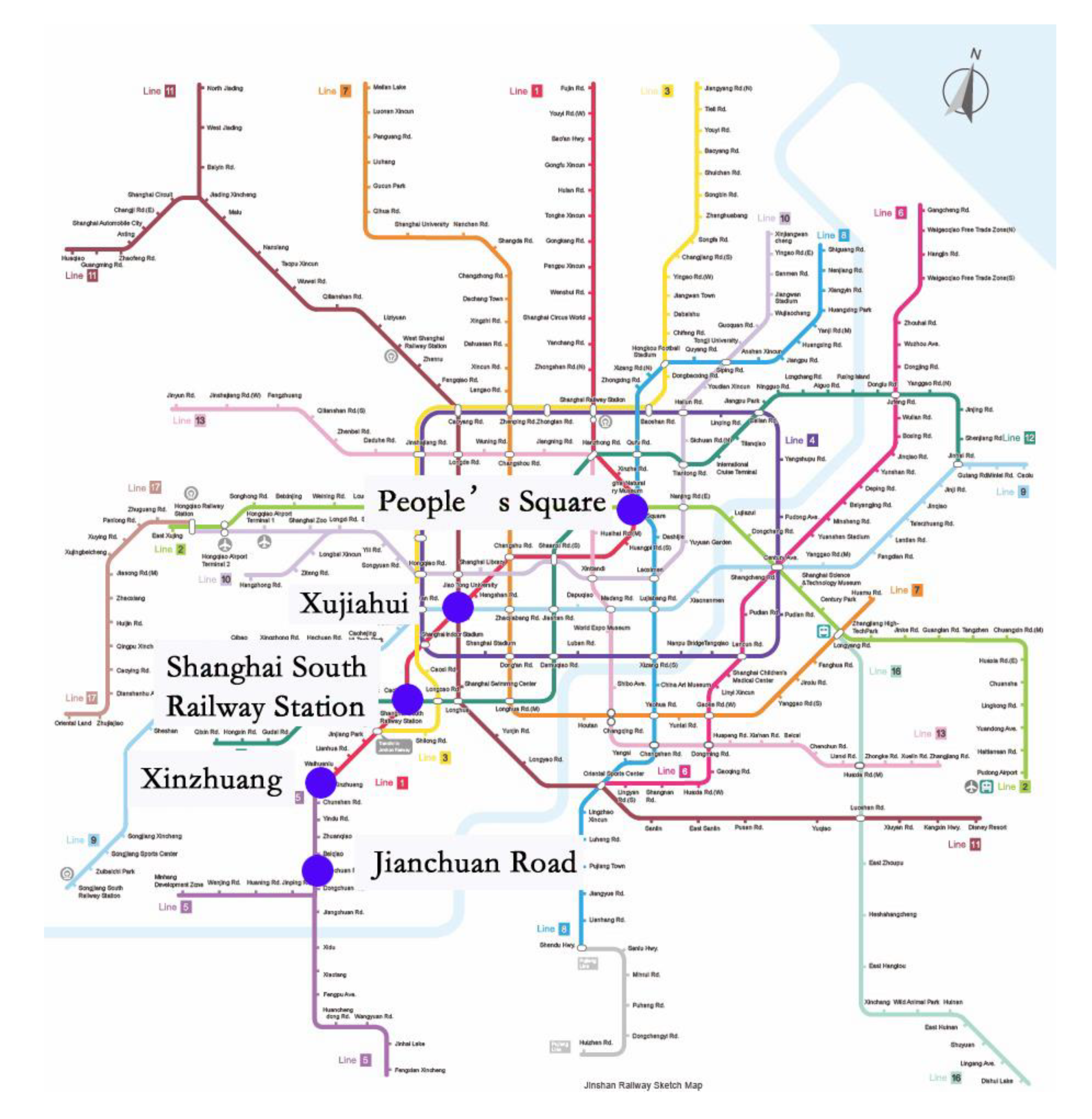
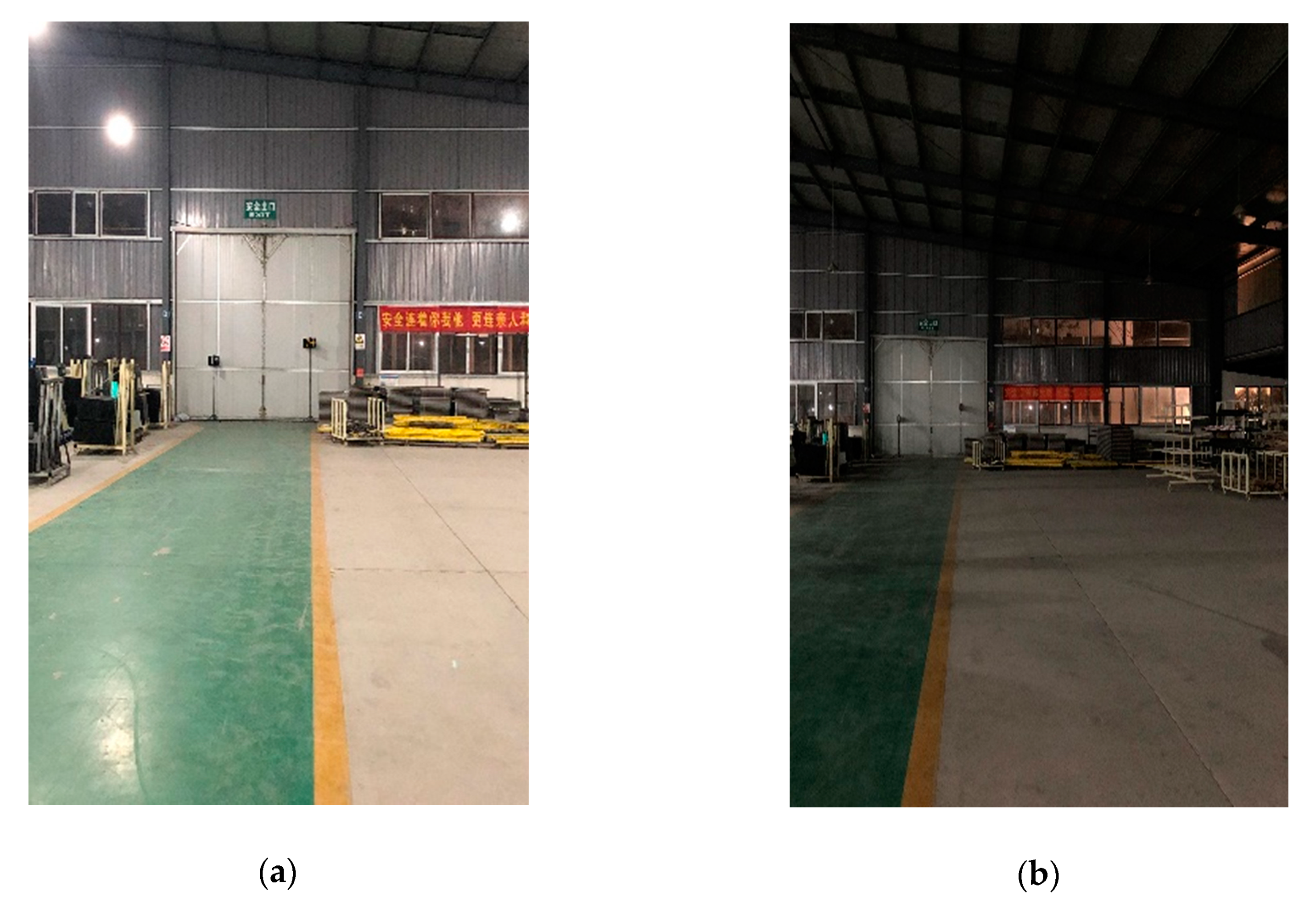
2.4. Workplace Conditions
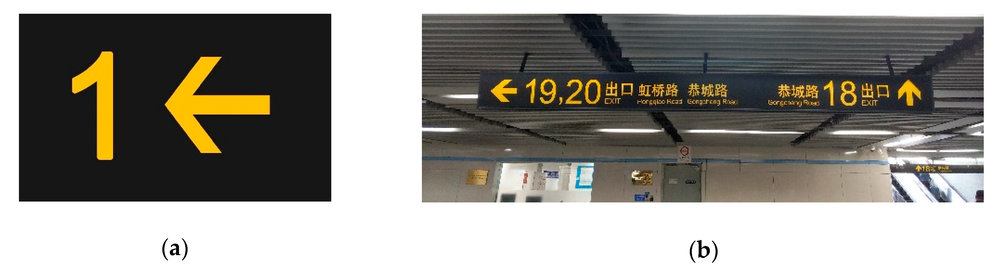
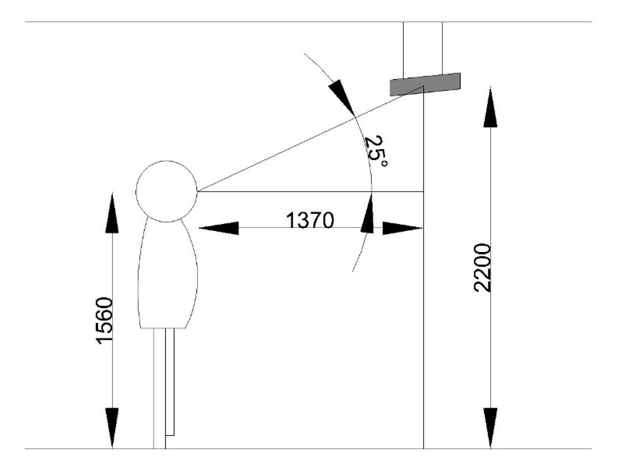
2.5. Stimuli
2.6. Procedure
2.7. Data Analysis
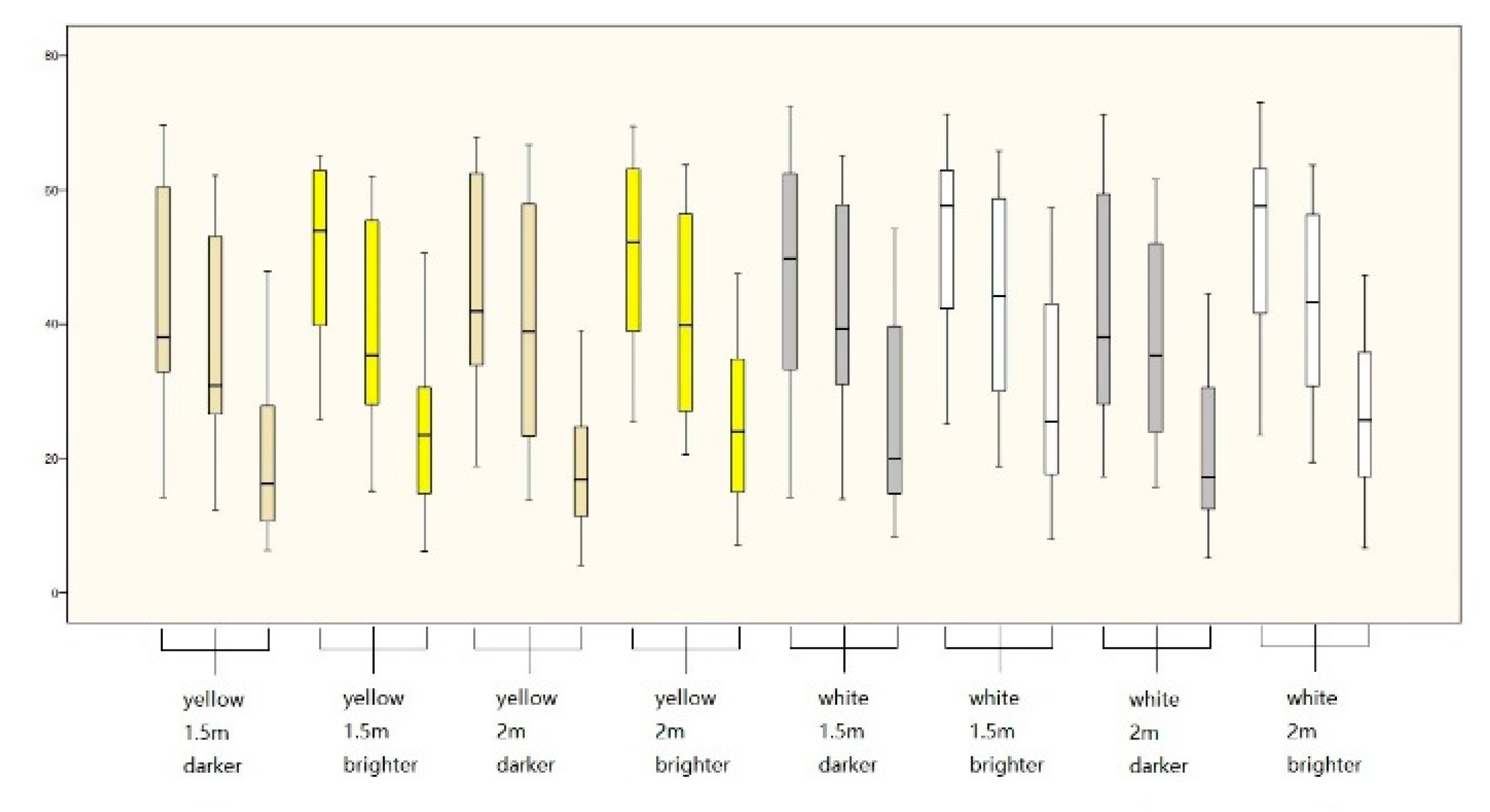
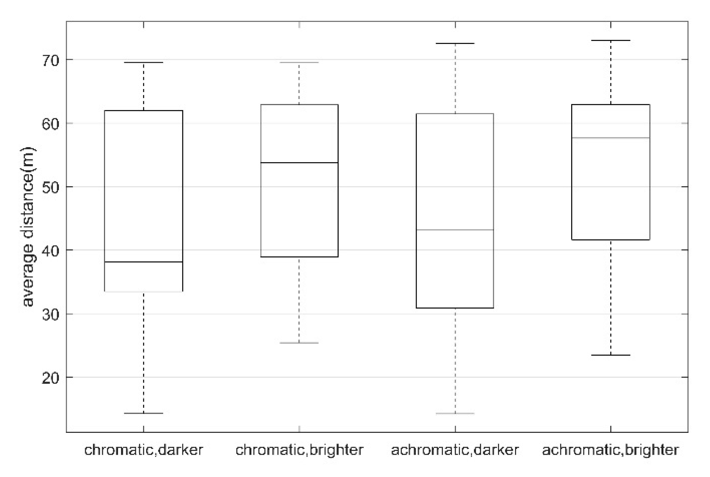
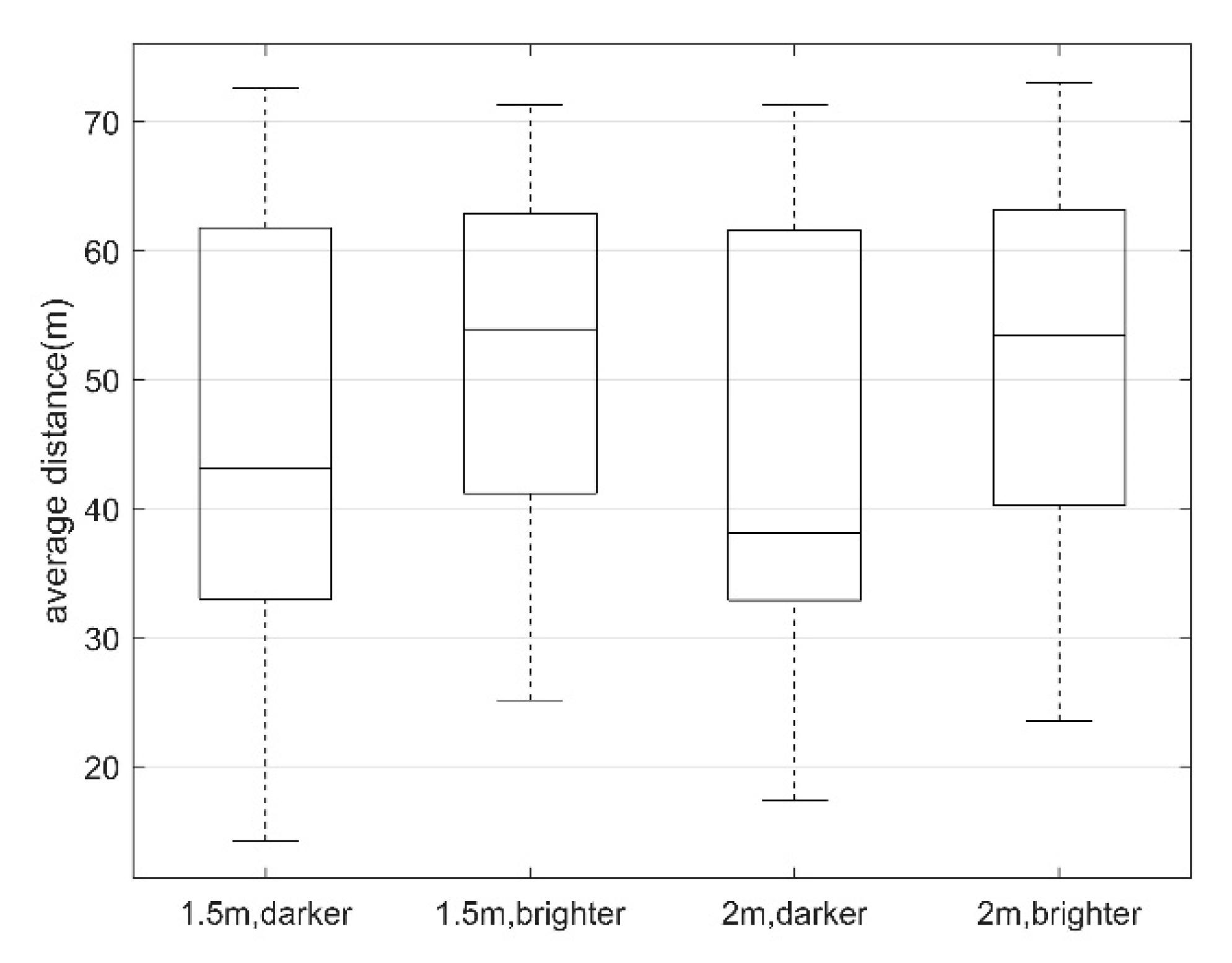
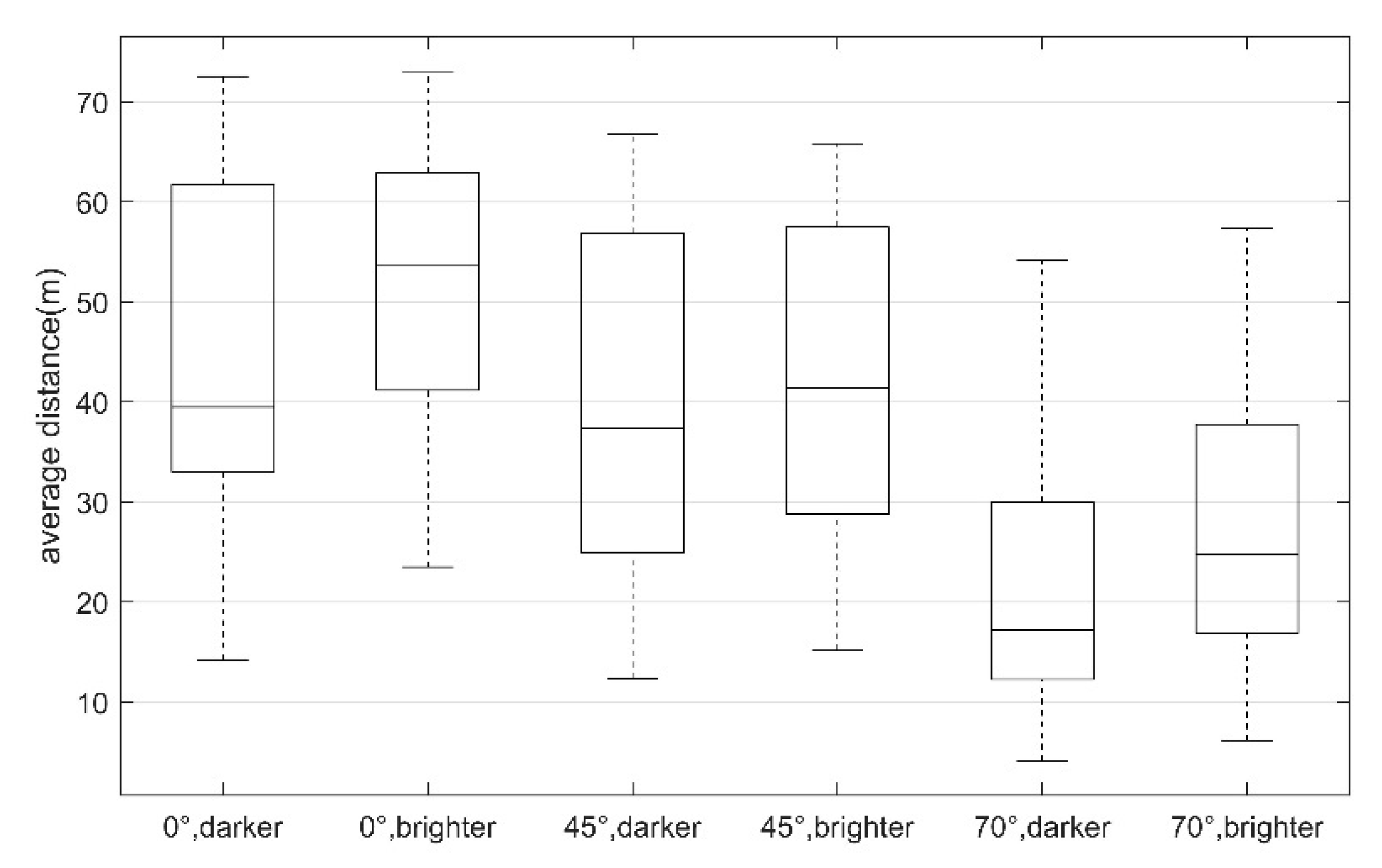
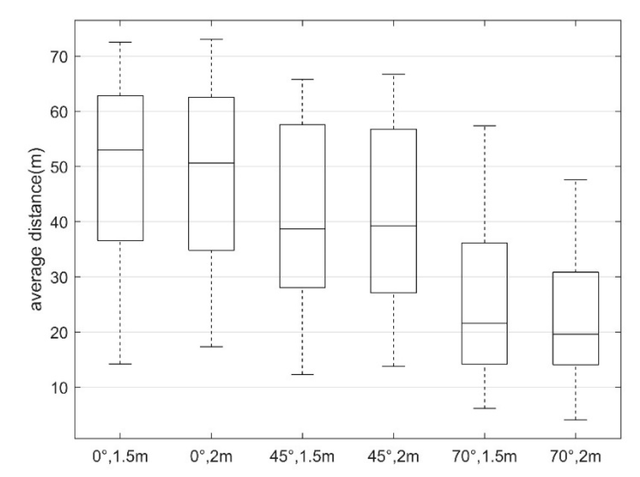
3. Results
3.1. ANOVA Analysis
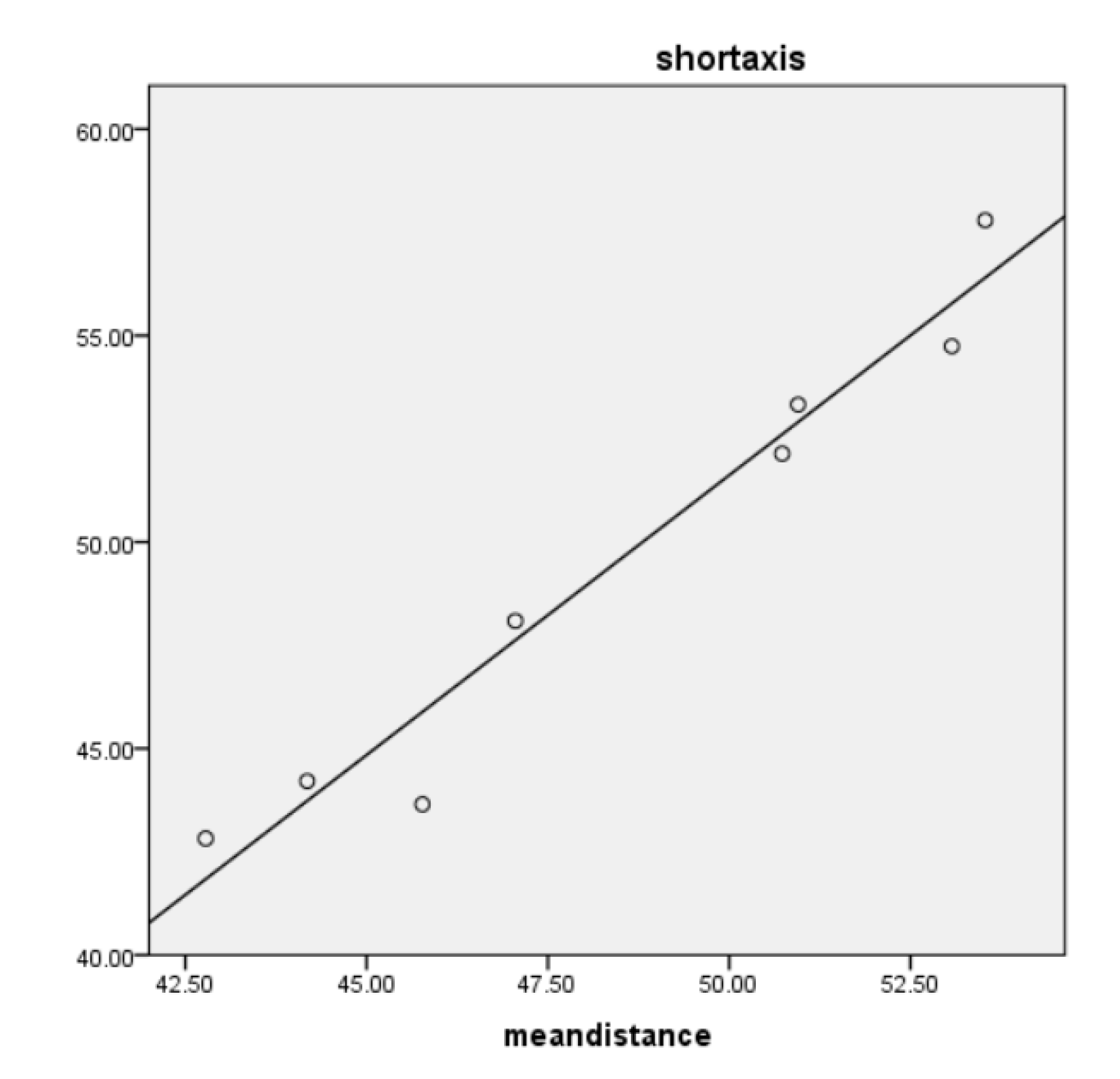
3.2. The Fitting Results
4. Discussion
4.1. Ambient Illumination
4.2. Color Combination
If GsRGB <= 0.03928, then G = GsRGB/12.92; else G = ((GsRGB+0.055)/1.055)^2.4
If BsRGB <= 0.03928, then B = BsRGB/12.92; else B = ((BsRGB+0.055)/1.055)^2.4
4.3. Sign Height
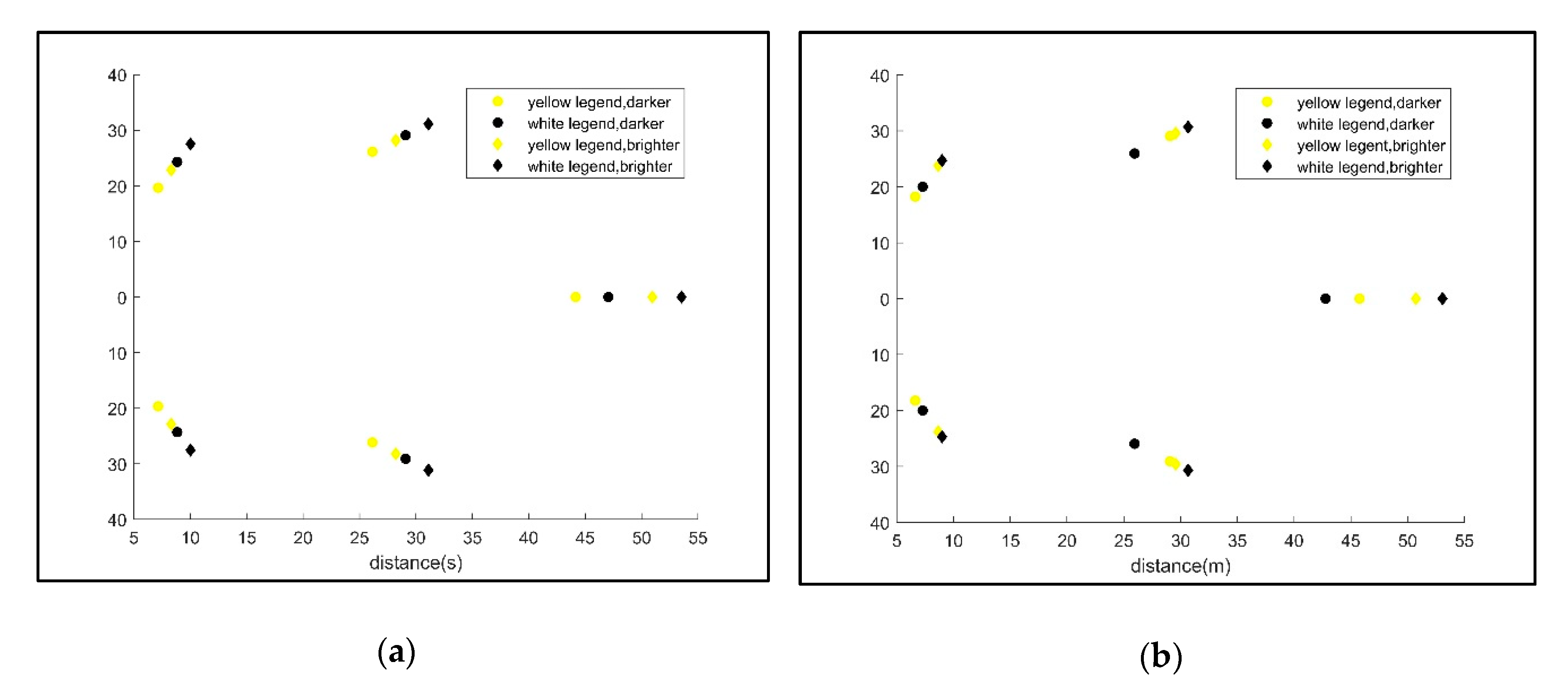
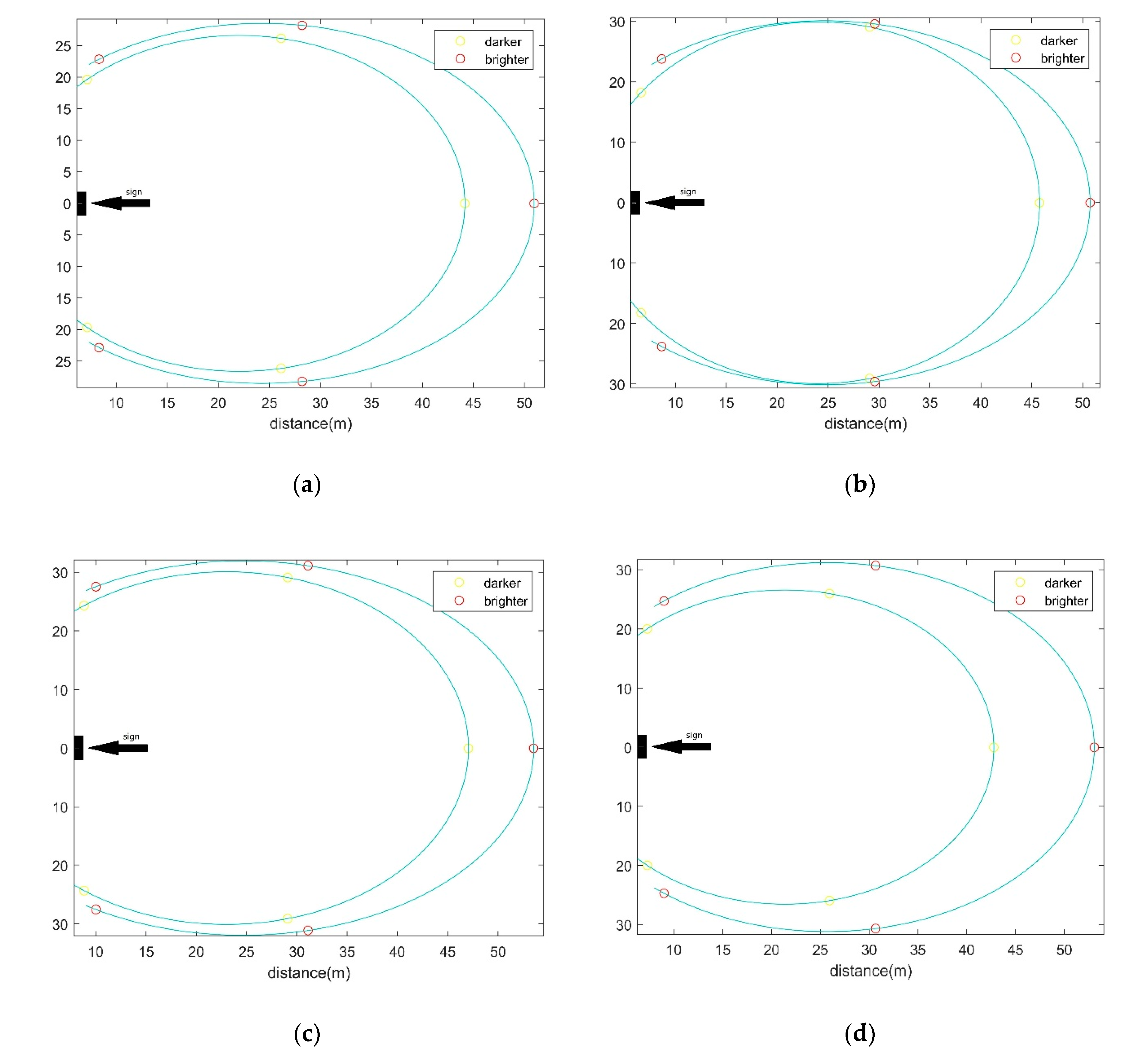
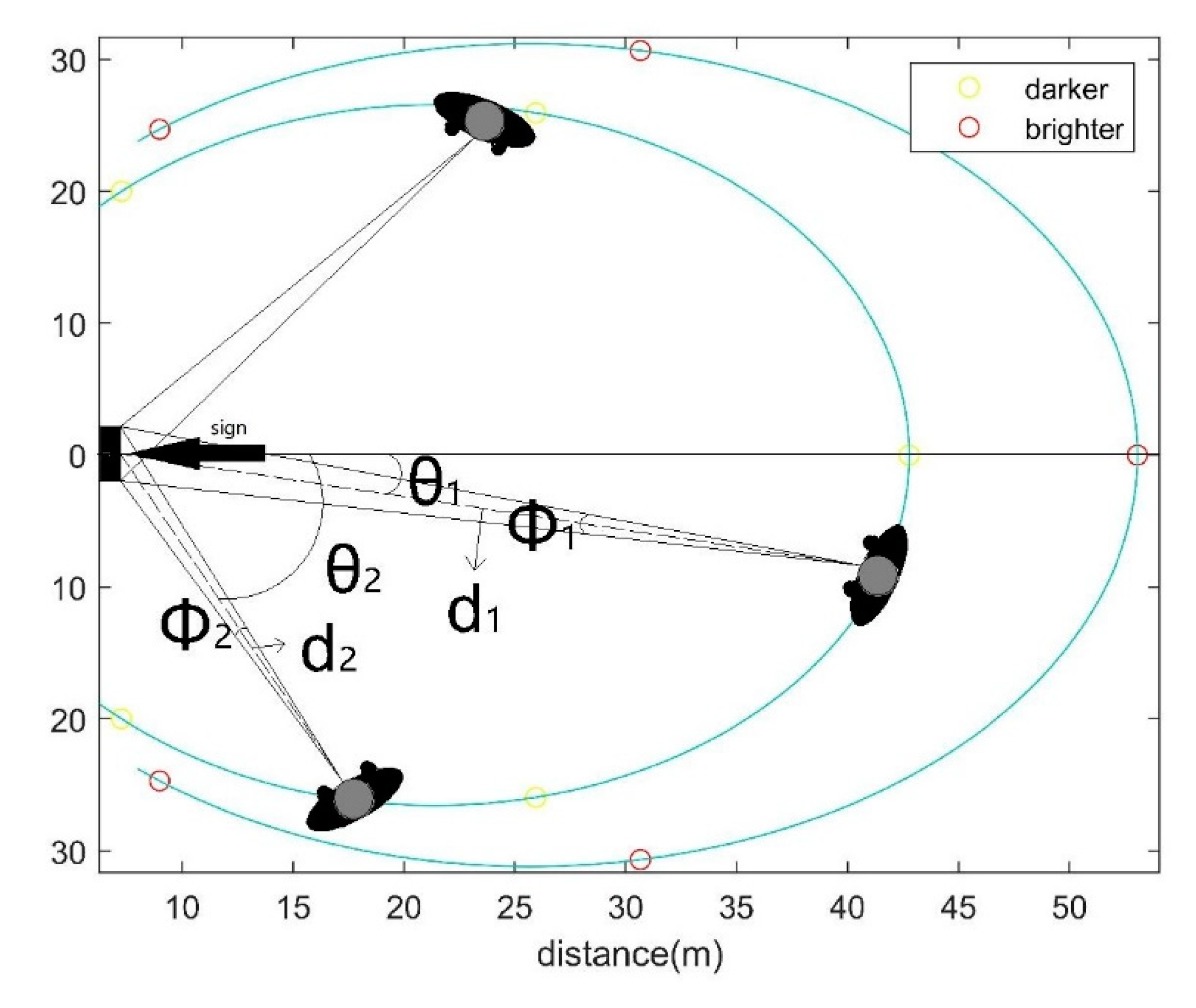
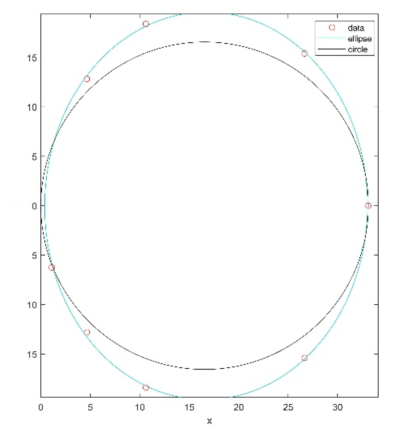
4.4. Observation Angle and Visibility Catchment Area (VCA)
5. Conclusions
Author Contributions
Funding
Acknowledgments
Conflicts of Interest
References
- Sterling, R.; Admiraal, H.; Bobylev, N.; Parker, H.; Godard, J.P.; Vähäaho, I.; Rogers, C.D.F.; Shi, X.D.; Hanamura, T. Sustainability Issues for Underground Space in Urban Areas. Urban Des. Plan. 2012, 165, 241–254. [Google Scholar]
- China’s Railway, High-Speed Rail and Urban Rail Transit Operating Mileage, Operating Lines and Operating Mileage Ranking in 2019. Available online: http://www.chyxx.com/industry/202003/839726.html (accessed on 3 April 2020).
- Yu, D.D. Evaluation of Guidance Sign Set Project Based on Passenger Wayfinding Behavior in Rail Transit Hubs Using Simulation Method. Master’s Thesis, Beijing Jiaotong University, Beijing, China, 2012. [Google Scholar]
- Yoo, S. Architectural Legibility of Shopping Centers: Simulation and Evaluation of Floor Plan Configurations. Ph.D. Thesis, University of Wisconsin, Madison, WI, USA, 1993. [Google Scholar]
- Bennett, D. METRO; Octopus Publishing Group Ltd.: London, UK, 2004. [Google Scholar]
- Li, D.W. Modeling and Simulation of Microscopic Pedestrian Flow in MTR Hubs. Ph.D. Thesis, Beijing Jiaotong University, Beijing, China, 2007. [Google Scholar]
- Su, Y. Study on Guidance Efficiency of Pedestrian Sign System in Comprehensive Rail Transit Hub. Master’s Thesis, Beijing University of Architecture, Beijing, China, 2014. [Google Scholar]
- Lei, B.; Xu, J.; Li, M.; Li, H.; Li, J.; Cao, Z.; Hao, Y.; Zhang, Y. Enhancing Role of Guiding Signs Setting in Metro Stations with Incorporation of Microscopic Behavior of Pedestrians. Sustainability 2019, 11, 6109. [Google Scholar] [CrossRef] [Green Version]
- Peponis, J.; Zimring, C.; Cho, Y.K. Finding the Building in Wayfinding. Environ. Behav. 1990, 22, 555–590. [Google Scholar] [CrossRef]
- Bae, Y.H.; Kim, Y.C.; Oh, R.S.; Son, J.Y.; Hong, W.H.; Choi, J.-H. Gaze Point in the Evacuation Drills: Analysis of Eye Movement at the Indoor Wayfinding. Sustainability 2020, 12, 2902. [Google Scholar] [CrossRef] [Green Version]
- Jeon, G.Y.; Hong, W.H. An Experimental Study on How Phosphorescent Guidance Equipment Influences on Evacuation in Impaired Visibility. J. Loss Prev. Process Ind. 2009, 22, 934–942. [Google Scholar] [CrossRef]
- Frank, V.D.H.; van Nes, A. Improving the Design of Urban Underground Space in Metro Stations Using the Space Syntax Methodology. Tunn. Undergr. Space Technol. 2014, 40, 64–74. [Google Scholar]
- Kong, Y.; Lee, I.; Jung, M.; Song, Y. The Effects of Age, Viewing Distance, Display Type, Font Type, Colour Contrast and Number of Syllables on the Legibility of Korean Characters. Ergonomics 2011, 54, 453–465. [Google Scholar] [CrossRef]
- Lin, C.; Huang, K. Effects of Ambient Illumination Conditions and Background Color on Visual Performance with TFT-LCD Screens. Displays 2013, 34, 276–282. [Google Scholar] [CrossRef]
- Lin, P.; Lin, Y.; Hwang, S.; Jeng, S.; Liao, C. Effects of Anti-Glare Surface Treatment, Ambient Illumination and Bending Curvature on Legibility and Visual Fatigue of Electronic Papers. Displays 2008, 29, 25–32. [Google Scholar] [CrossRef]
- Lin, Y.; Lin, P.; Hwang, S.; Jeng, S.; Liao, C. Investigation of Legibility and Visual Fatigue for Simulated Flexible Electronic Paper under Various Surface Treatments and Ambient Illumination Conditions. Appl. Ergon. 2009, 40, 922–928. [Google Scholar] [CrossRef]
- Oetjen, S.; Ziefle, M. A Visual Ergonomic Evaluation of Different Screen Types and Screen Technologies with Respect to Discrimination Performance. Appl. Ergon. 2009, 40, 69–81. [Google Scholar] [CrossRef]
- Piepenbrock, C.; Mayr, S.; Mund, I.; Buchner, A. Positive Display Polarity is Advantageous for Both Younger and Older Adults. Ergonomics 2013, 56, 1116–1124. [Google Scholar] [CrossRef]
- Guidelines for Nighttime Visibility of Overhead Signs. In National Academies of Sciences, Engineering, and Medicine 2016; The National Academies Press: Washington, DC, USA, 2016.
- Garvey, P.M.; Pietrucha, M.T.; Meeker, D.T. Effects of Font and Capitalization on Legibility of Guide Signs. Transp. Res. Record. 1997, 1605, 73–79. [Google Scholar] [CrossRef]
- Hawkins, H.G.; Wooldridge, M.D.; Kelly, A.B.; Picha, D.L.; Greene, F.K. Legibility Comparison of Three Freeway Guide Sign Alphabets. Transp. Res. Record. 1999, 1692. [Google Scholar] [CrossRef]
- Knez, I.; Kers, C. Effects of Indoor Lighting, Gender, and Age on Mood and Cognitive Performance. Environ. Behav. 2000, 32, 817–831. [Google Scholar] [CrossRef]
- Dobres, J.; Chahine, N.; Reimer, B. Effects of Ambient Illumination, Contrast Polarity, and Letter Size on Text Legibility under Glance-Like Reading. Appl. Ergon. 2017, 60, 68–73. [Google Scholar] [CrossRef] [PubMed]
- Hidayetoglu, M.L.; Yildirim, K.; Akalin, A. The Effects of Color and Light on Indoor Wayfinding and the Evaluation of the Perceived Environment. J. Environ. Psychol. 2012, 32, 50–58. [Google Scholar] [CrossRef]
- Liu, C. Experimental and Simulation Research on the Visibility Area of High Evacuation Sign in Large Supermarkets. Master’s Thesis, Capital University of Economics and Business, Beijing, China, 2013. [Google Scholar]
- McLean, M.V. Brightness Contrast, Color Contrast, and Legibility. Hum. Factors 1965, 7, 521–527. [Google Scholar] [CrossRef]
- Yeh, Y.Y.; Lee, D.S.; Ko, Y.H. Color Combination and Exposure Time on Legibility and Eeg Response of Icon Presented on Visual Display Terminal. Displays 2013, 34, 33–38. [Google Scholar] [CrossRef]
- Huang, K.C. Effects of Computer Icons and Figure/Background Area Ratios and Color Combinations on Visual Search Performance on An LCD Monitor. Displays 2008, 29, 237–242. [Google Scholar] [CrossRef]
- Huang, S.M. A Study of Reading Time and Viewers’ Preferences for A Variety of Combinations of Character-Background Chromaticity for Small Traditional Chinese Characters. Percept. Mot. Skills 2006, 103, 887–895. [Google Scholar] [CrossRef]
- Lin, C.C. Effects of Screen Luminance Combination and Text Color on Visual Performance with TFT-LCD. Int. J. Ind. Ergon. 2005, 35, 229–235. [Google Scholar] [CrossRef]
- Xie, H.; Filippidis, L.; Galea, E.R.; Gwynne, S.; BlackShields, D.; Lawrence, P.J. Experimental Study and Theoretical Analysis of Signage Legibility Distances as a Function of Observation Angle. In Pedestrian and Evacuation Dynamics 2005; Springer: Berlin/Heidelberg, Germany, 2007. [Google Scholar]
- Analysis on the Change of Gender and Age Structure of Permanent Resident Population in Shanghai. Available online: https://wenku.baidu.com/view/fcf7c083bb0d4a7302768e9951e79b89680268dd.html (accessed on 27 October 2018).
- Peng, J.J. The Study of Beijing Subway Signage System. Master’s Thesis, Tongji University, Shanghai, China, 2007. [Google Scholar]
- Lasauskaite, R.; Reisinger, M. Optimal luminance of internally illuminated wayfinding signs. Lighting Res. Technol. 2017, 49, 521–533. [Google Scholar] [CrossRef]
- Buchner, A.; Baumgartner, N. Text–Background Polarity Affects Performance Irrespective of Ambient Illumination and Colour Contrast. Ergonomics 2007, 50, 1036–1063. [Google Scholar] [CrossRef] [PubMed]
- Ko, Y.H. The Effects of Luminance Contrast, Colour Combinations, Font, and Search Time on Brand Icon Legibility. Appl. Ergon. 2017, 65, 33–40. [Google Scholar] [CrossRef]
- Luria, S.M.; Neri, D.F.; Schlichting, C. Performance and Preference with Various VDT Phosphors. Appl. Ergon. 1989, 20, 33–38. [Google Scholar] [CrossRef]
- Lin, C.C. Effects of Contrast Ratio and Text Color on Visual Performance with TFT-LCD. Int. J. Ind. Ergon. 2003, 31, 65–72. [Google Scholar] [CrossRef]
- Penkelink, G.P.J.; Besuijen, J. Chromaticity Contrast, Luminance Contrast, and Legibility of Text. J. Soc. Inf. Display 1996, 4, 135–144. [Google Scholar] [CrossRef]
- Cai, H.; Green, P.A.; Kim, J.J. Estimating the Legibility of A Single Letter E Viewed at Different Display Angles. Appl. Ergon. 2013, 44, 575–587. [Google Scholar] [CrossRef]
- Zhao, J.; Kunzli, O. An Introduction to Connectivity Concept and An Example of Physical Connectivity Evaluation for Underground Space. Tunn. Undergr. Space Technol. 2016, 55, 205–213. [Google Scholar] [CrossRef]


| Station | Site | Max | Min | AVERAGE |
|---|---|---|---|---|
| Jianchuan Road | 1 | 220.3 | 173.5 | 192 |
| 2 | 1791 | 1767 | 1778 | |
| Xinzhuang | 1 | 236.6 | 64.4 | 138.8 |
| 2 | 46.3 | 43 | 44.7 | |
| Shanghai South Railway Station | 1 | 236.8 | 205.6 | 213.4 |
| 2 | 295.5 | 265.6 | 282.8 | |
| Xujiahui | 1 | 172.2 | 116.4 | 132 |
| 2 | 116.2 | 103.5 | 109.9 | |
| 3 | 194.2 | 13 | 77 | |
| 3 | 107.7 | 60.8 | 88.9 | |
| 3 | 8.5 | 6.4 | 7.5 | |
| People’s Square | 1 | 103.8 | 91.8 | 99.4 |
| 2 | 340.2 | 231.8 | 278.4 |
| The Serial Number | Ambient Illumination | Color Combination | Sign Height | Observation Angle | Number of Participants Assigned |
|---|---|---|---|---|---|
| 1 | 273 lux | Chromatic | 1.5 m | 0° | 20 |
| 2 | 45° | 20 | |||
| 3 | 70° | 20 | |||
| 4 | 2 m | 0° | 20 | ||
| 5 | 45° | 20 | |||
| 6 | 70° | 20 | |||
| 7 | Achromatic | 1.5 m | 0° | 20 | |
| 8 | 45° | 20 | |||
| 9 | 70° | 20 | |||
| 10 | 2 m | 0° | 20 | ||
| 11 | 45° | 20 | |||
| 12 | 70° | 20 | |||
| 13 | 70 lux | Chromatic | 1.5 m | 0° | 20 |
| 14 | 45° | 20 | |||
| 15 | 70° | 20 | |||
| 16 | 2 m | 0° | 20 | ||
| 17 | 45° | 20 | |||
| 18 | 70° | 20 | |||
| 19 | Achromatic | 1.5 m | 0° | 20 | |
| 20 | 45° | 20 | |||
| 21 | 70° | 20 | |||
| 22 | 2 m | 0° | 20 | ||
| 23 | 45° | 20 | |||
| 24 | 70° | 20 |
| Independent Variables | Number of Trials | Mean (m) | SD |
|---|---|---|---|
| Ambient contrast: | 480 | 37.74 | 17.76 |
| 70 lux | 240 | 35.26 | 17.85 |
| 273 lux | 240 | 40.21 | 17.37 |
| Color combination: | 480 | 37.74 | 17.76 |
| Chromatic | 240 | 36.78 | 17.71 |
| Achromatic | 240 | 38.70 | 17.80 |
| Sign height: | 480 | 37.74 | 17.76 |
| 1.5 m | 240 | 38.17 | 17.81 |
| 2 m | 240 | 37.30 | 17.75 |
| Observation angle: | 480 | 37.74 | 17.76 |
| 0° | 160 | 48.51 | 15.18 |
| 45° | 160 | 40.63 | 15.46 |
| 70° | 160 | 24.08 | 12.98 |
| Sources | Df | Mean Square | F | Partial Eta Squared |
|---|---|---|---|---|
| Ambient illumination (I) | 1 | 2943.761 | 13.910 | 0.000 |
| Color combination (C) | 1 | 441.345 | 2.085 | 0.149 |
| Sign height (H) | 1 | 90.443 | 0.427 | 0.514 |
| Sigh angle (A) | 2 | 24870.400 | 117.515 | 0.000 |
| C*H | 1 | 493.504 | 2.332 | 0.127 |
| C*I | 1 | 84.024 | 0.397 | 0.529 |
| C*A | 2 | 49.543 | 0.234 | 0.791 |
| H*I | 1 | 49.249 | 0.233 | 0.630 |
| H*A | 2 | 52.210 | 0.247 | 0.781 |
| I*A | 2 | 155.470 | 0.735 | 0.480 |
| Error | 456 | 211.637 |
| Observation Angle Legibility | 0° 48.51 | 45° 40.63 | 70° 24.08 |
|---|---|---|---|
| Tukey grouping (α = 0.05) | A | ||
| B | |||
| C |
| Scenario | Center Point (x) | Center Point (y) | Long Axis | Short Axis | Mean Distance | ||
|---|---|---|---|---|---|---|---|
| Chromatic | 1.5 m | dark | 22.05 | 0 | 53.21 | 44.21 | 44.18 |
| bright | 24.29 | 0 | 57.04 | 53.33 | 50.95 | ||
| 2 m | dark | 23.94 | 0 | 59.83 | 43.65 | 45.77 | |
| bright | 24.66 | 0 | 60.24 | 52.14 | 50.73 | ||
| Achromatic | 1.5 m | dark | 23.01 | 0 | 60.13 | 48.09 | 47.05 |
| bright | 24.64 | 0 | 63.82 | 57.79 | 53.53 | ||
| 2 m | dark | 21.37 | 0 | 53.12 | 42.82 | 42.78 | |
| bright | 25.7033 | 0 | 62.38 | 54.74 | 53.07 | ||
| Background Color | Text Color | Contrast Ratio |
|---|---|---|
| Black | White | 21.00 |
| Black | Yellow | 14.97 |
© 2020 by the authors. Licensee MDPI, Basel, Switzerland. This article is an open access article distributed under the terms and conditions of the Creative Commons Attribution (CC BY) license (http://creativecommons.org/licenses/by/4.0/).
Share and Cite
Shi, Y.; Zhang, Y.; Wang, T.; Li, C.; Yuan, S. The Effects of Ambient Illumination, Color Combination, Sign Height, and Observation Angle on the Legibility of Wayfinding Signs in Metro Stations. Sustainability 2020, 12, 4133. https://0-doi-org.brum.beds.ac.uk/10.3390/su12104133
Shi Y, Zhang Y, Wang T, Li C, Yuan S. The Effects of Ambient Illumination, Color Combination, Sign Height, and Observation Angle on the Legibility of Wayfinding Signs in Metro Stations. Sustainability. 2020; 12(10):4133. https://0-doi-org.brum.beds.ac.uk/10.3390/su12104133
Chicago/Turabian StyleShi, Yuqi, Yi Zhang, Tao Wang, Chaoyang Li, and Shengqiang Yuan. 2020. "The Effects of Ambient Illumination, Color Combination, Sign Height, and Observation Angle on the Legibility of Wayfinding Signs in Metro Stations" Sustainability 12, no. 10: 4133. https://0-doi-org.brum.beds.ac.uk/10.3390/su12104133