
Visualizing Spatial Economic Supply Chains to Enhance Sustainability and Resilience

1
Department of Agricultural and Rural Policy Research, Korea Rural Economic Institute, Naju-si, Jeollanam-do 58217, Korea
2
Northeast Regional Center for Rural Development and Department of Agricultural Economics, Sociology, and Education, Pennsylvania State University, University Park, PA 16802-5602, USA
3
Department of Agricultural Economics, Sociology, and Education, Pennsylvania State University, University Park, PA 16802-5602, USA
*
Author to whom correspondence should be addressed.
Sustainability 2021, 13(3), 1512; https://0-doi-org.brum.beds.ac.uk/10.3390/su13031512
Submission received: 2 December 2020
/
Revised: 23 January 2021
/
Accepted: 26 January 2021
/
Published: 1 February 2021
(This article belongs to the Special Issue Rural and Urban Management: Innovative Strategies to Enhance Resilience)
Abstract
:This article presents a spatial supply network model for estimating and visualizing spatial commodity flows that used data on firm location and employment, an input–output table of inter-industry transactions, and material balance-type equations. Building on earlier work, we proposed a general method for visualizing detailed supply chains across geographic space, applying the preferential attachment rule to gravity equations in the network context; we then provided illustrations for U.S. extractive, manufacturing, and service industries, also highlighting differences in rural–urban interdependencies across these sectors. The resulting visualizations may be helpful for better understanding supply chain geographies, as well as business interconnections and interdependencies, and to anticipate and potentially address vulnerabilities to different types of shocks.
1. Introduction
Like no other recent crisis, the coronavirus disease 2019 (COVID-19) pandemic has raised public awareness of both the importance and vulnerability of national and global supply chains, including those for food supplies, e.g., [1,2]. Beginning with the disruptions in Wuhan, China, affecting Apple Inc., among other technology companies (e.g., [3,4,5]), concern among policymakers, business owners, and researchers in the United States, Germany, and elsewhere then shifted to the food processing sector, specifically beef and pork slaughtering facilities (e.g., [6,7,8,9,10]). Subsequent studies focused on diverse sectors, such as general food and beverage manufacturing [11], the fisheries sector [12], and ready-made garment manufacturing [13].
While rudimentary spatial supply chains could be visualized by mapping where different establishments are located using public information, such industry location maps would not reveal flows of inputs and outputs between firms. Yet, in order to identify and anticipate bottlenecks and disruptions, it would benefit public agencies and emergency responders to know where and how these flows crisscross the economy in space, especially when a highly contagious virus creates local infection hotspots and threatens workers. We used a systems approach in this study to demonstrate how secondary public data can be used under a limited set of assumptions to construct, model, and visualize spatial supply chains for all businesses engaged in an industrial sector. For illustrative purposes, we present these for primary, secondary, and tertiary sectors. Because of the importance of agriculture and food, we provide additional discussion and illustrations from this sector. For example, knowing where different food processors are located relative to COVID-19 hotspots, an earthquake zone, or a tornado belt could be helpful for targeting prevention resources, medical personnel, or even considering lockdowns and similar mitigation strategies. Moreover, knowing where different food processors within hotspots sell their output to and from where they source their inputs in space could help to further anticipate upstream and downstream impacts of the pandemic in geographic space.
Interest in supply chains research has expanded in recent years, as is evident from a burgeoning academic literature, including one that draws on input–output tables. For example, recent pre-COVID-19 articles have studied shocks to specific manufacturing sectors resulting from natural disasters (e.g., [14,15]), how a product’s carbon footprint is affected by expanding its lifetime [16,17], how to identify manufacturing supply chain bottlenecks [18], how to mitigate the impact of road delays when shipping perishable products [19], and they have examined hubs and spokes in international value-added trade systems [20] and critical pathways and sectors for reducing pollution in Asia [21]. Supply chains also are of interest to planners, economic development practitioners, and policymakers for their potential to stimulate and disperse economic development to lagging regions. Alternatively, some regions may suffer greater exposure to natural shocks or economic events, such as “Brexit” (e.g., [22]), due to their reliance on particular supply chains. In the case of the food system, supply chains are also of interest for issues such as social equity [23], waste and spoilage [24], the spread of disease [25], vulnerability to disruptions [14,26], and the potential to enhance access to local or regionally sourced food [27]. The most sophisticated studies available [28,29,30,31] examine food flows across space but exclude the detailed and disaggregated intermediate processes and establishments involved in transforming a product; in contrast, we do consider all of these intermediate features in this study. For example, while Lin et al. [29] use the Oak Ridge National Laboratory’s Freight Analysis Framework to approximate product flows, we used explicit county locations of individual establishments to estimate product supply, demand, and trade for each industry to estimate county-to-county trade flows for the products of all industries. We also use the more detailed (albeit more dated) U.S. national input–output table from 2012. Thus, our approaches were fundamentally different. Other studies use approaches more similar to ours but examine only individual sectors, such as dairy [32] or broiler meat [33]; our work can thus be considered a generalization and extension of earlier studies to the entire economy. Finally, we also examined trade flows between rural and urban areas to shed light on their economic interdependence.
In this study, we thus proposed a straightforward method for modeling and visualizing supply chains over geographic space. While the approach is based on strong assumptions, using the case of the United States we illustrate how it can be applied at relatively low cost to all industries (we use the terms industry and sector interchangeably) at the level of 409, 3-digit North American Industry Classification System (NAICS) intermediate industries, thereby providing a comprehensive view of all supply chains operating in the nation. The purpose of this study was to illustrate the basic approach; given the complexity and richness of networks, many further extensions are possible for applications that are close to real-world situations, as we discuss below.
For illustrative purposes, we mainly show the high-level aggregations of flows, but these can be disaggregated using multi-dimensional scaling (akin to zooming in on a national map to states, cities, and then neighborhoods; we illustrate this in the Supplementary Materials for meat-packing plants, given the great interest in the vulnerability of that sector at this time). Our results can be seen as complementing existing, more detailed but very specific supply chain studies in the literature. Among other benefits, the maps generated here (and in future, more detailed maps) would allow local decision-makers, as well as business owners, to better understand how their economies and firms are linked to surrounding regions, as well as to the nation, and how they depend on buyers and sellers located elsewhere. The results are also useful for understanding complex rural–urban interdependencies of different products and industries. Our visualization approach combines information on the geographic locations of all U.S. firms and their employment with the economic transactions (or matrix of supply chains) that are reflected in the national input–output (IO) table compiled by the Bureau of Economic Analysis.
IO tables are inherently aspatial, and while they have been used to model regional flow relationships within and across countries, they have to date not been commonly used to explicitly identify and visualize spatial supply chains of particular industries at the subnational level. Here we illustrate how such chains can be modeled using the information on local employment in different sectors, as well as the U.S. national IO table. Our approach is conceptually similar to that of a materials balance equation (for a recent example, [34]). We do not consider international trade flows because our primary interest is in the geography of domestic supply chains, but export and import flows could readily be introduced into the analysis.
The primary aim of our study was thus to generate and visualize monetary flows of goods and services among industries and to locate these geographically by combining the aspatial input–output table with detailed spatial data on where specific firms making up the industries in the input–output table are located. Our work was located at the intersection of the supply chain management and network visualization literatures. For example, a growing literature uses visual analytics to model and understand [35] or design, manage, and evaluate (e.g., [36]) supply networks, but these studies do not explicitly consider the location of supply chains in space. Other studies seek to visualize innovation processes in global supply chain networks but do not consider space explicitly (e.g., [37]), or they consider latent innovation in specific locations but without visualizing the underlying interactions that contribute to innovation (e.g., [38]).
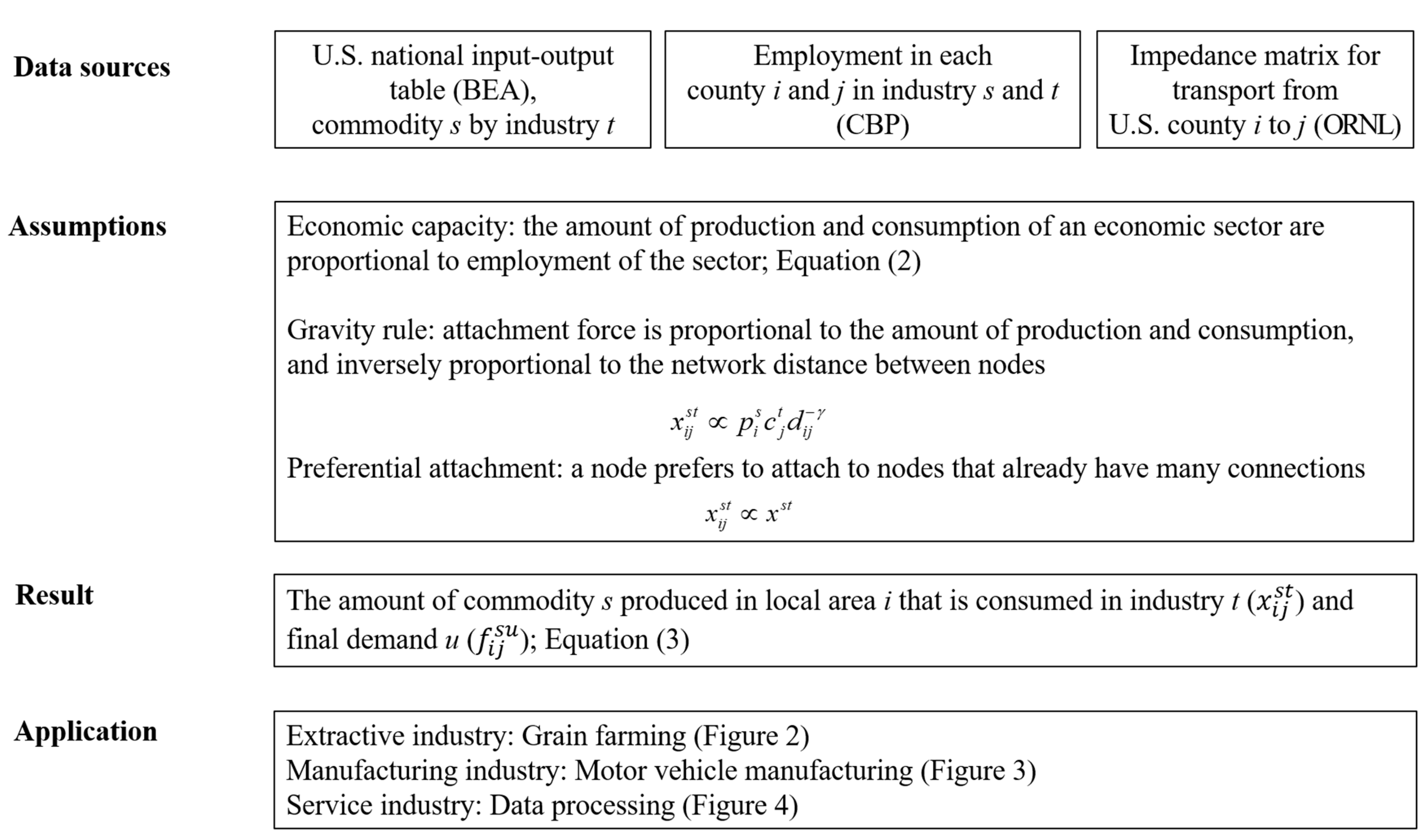
2. Materials and Methods
Previous studies have used multi-regional IO models to model and identify inter-regional and inter-industry economic flows at the state level (e.g., [39]), country level (e.g., [29,40]), or internationally (e.g., [41]). Most of these regional IO studies share common features: (1) they step down the national-level IO table to the region using regional-level labor market data and (2) they assume identical technologies and tastes in each region such that the quality of products is similar and consumers have the same preferences across regions. Using these assumptions, regional IO tables can be estimated by linking industries across regions. Recently, Boero et al. [42] proposed a non-survey method to identify local IO tables and calculated trade flows using a gravity model and a transportation cost minimization model; however, they did not consider inter-industry trade flows across regions.
Each local economy consists of a network of firms within their respective industries, forming a local IO network in which local industries represent nodes and transactions among the industries measured in dollars represent edges. Using the idea that nodes in a network connect to each other in a predictable manner, and based on the above assumptions, we can estimate the inter-industry linkages or flows across local areas. To model and subsequently visualize the underlying supply chains, we make two key assumptions: (1) transactions between local industries follow the gravity rule, which we extended to the case of complex networks [43,44,45,46,47], and (2) the amount of production (supply) and consumption (demand) of an economic sector are proportional to the employment of the sector, or population in the case of final demand, including personal consumption expenditure and residential private fixed investment. We discuss ideas for relaxing these assumptions below.
The following variables and parameters were defined:
- —Total output of commodity s
- —Total intermediate input of industry t
- —Transactions (in $) from commodity s to industry t
- —Transactions (in $) from commodity s produced in local area i to industry t in local area j
- —Transactions (in $) of commodity s to the final demand of sector u
- —Transactions (in $) of commodity s produced in local area i to the final demand of sector u in local area j
- —Production (in $) of commodity s in local area i
- —Consumption (in $) of industry t in local area j
- —Final demand (in $) of sector u in local area j
- —Network impedance (unit free) between local area i and j
- —Exponential coefficient of the impact of network impedance
- —Employment in local area i in industry s.
In the national IO table, the simplest balance equation of a commodity s is . Considering the geographic distribution of products and the consumption of the commodities or industries, we extend the material balance equation to that given as Equation (1):
Here, and indicate transactions between industries across local areas, i.e., the local IO table for each county i (or j).
Assuming that the local production and consumption of a sector are proportional to employment in the sector, or population in the case of final demand, we calculated the total production of commodity s in local area i (), total consumption of industry t in local area j (), and total final demand of sector t in local area j () using Equation (2):
According to the gravity model, interactions between two masses depend on their relative sizes and the distance between them. Leontief and Strout [48] introduced the gravity model to estimate transactions in an IO table, Riddington et al. [49] and Fournier Gabela [50] used the model to generate local IO tables, and Duarte et al. [41] used the model to embody carbon in international trade. We extended the gravity rule here by applying it in the context of the preferential attachment rule in complex networks.
According to the preferential attachment rule, a node prefers to attach to nodes that already have many connections [51] such that the transaction from commodity s produced in local area i to industry t in local area j, , is estimated with the following equation: . The gravity rule suggests that the attachment force is proportional to the amount of production and consumption, and inversely proportional to the network distance between nodes [52]: , where is the exponential distance coefficient. Each industry may have its own unique distance coefficient; for example, agriculture may have a large gamma value and a web portal has a small value. Because we do not know the specific coefficient of every industry, we used 2 as a representative value. In future simulations, different values could be explored in sensitivity analyses.
Applying the equations above in a spatial network context, trade flows between industries in local areas are proportional to the amount of local production and consumption of the industries, and inversely proportional to the distance between the two local areas. The amount of commodity s produced in local area i that is consumed in industry t () and final demand sector u () in local area j was calculated using Equation (3):
Here, is the potential flow of a unit commodity s produced in local area i to industry (or sector) t in local area j. The proportionality factors and were determined using the following five conditional equations: total production of commodity s in place i (), total consumption of industry t in place j ( total final demand of sector u in place j (, total transaction from commodity s to industry t (), and the final demand u () was fixed, as in Equation (4):
Next, we discuss the data and their sources. We used the 2012 Benchmark Input–Output use table from the Bureau of Economic Analysis (BEA) to measure the transactions between economic sectors; this is presently the most recent version available. The IO table identifies 409 intermediate sectors and 20 final demand sectors. We then used county-level employment data from the Commerce Department’s County Business Patterns (CBP) to estimate the amount of local production and consumption of each sector identified in the IO table. Employment according to the NAICS was converted to employment using the IO sector. The CBP do not provide farm-related (NAICS 111–112) or government employment data; therefore, we used county-level farm sales measured in dollars from the National Agricultural Statistics Service (NASS) based on the 2012 Census of Agriculture and total government-related employment from the BEA. County-level populations were used to measure the personal consumption expenditures and residential or non-residential investment of counties.
Network impedances from Oak Ridge National Laboratory were used to measure the county-to-county transportation costs or distances (Oak Ridge National Laboratory 2011 County-to-county distance matrix (cited 15 July 2018), available from: http://cta.ornl.gov/transnet/SkimTree.htm). Transportation costs depend on the geographical environment (mountains, river, etc.) and shipment mode (highway, railroad, ship, etc.). We used network impedance to reflect these various logistics costs. Impedance reflects the distance between each pair of county centroids via highway, railroad, water, and combined highway–rail paths. A unit impedance indicates a 1 mile distance via highway, and different modes have specific adjustment factors to convert the cost into a common unit: 1/3.3 for rail, 1/5.0 for an inland barge, 1/5.8 for the Great Lakes, and 1/6.5 for marine shipping. The lowest impedance path was selected regardless of the transport mode used between counties; this is a strong assumption, which could be relaxed in future extensions that consider specific products and their forms, including perishability (e.g., canned vs. frozen or fresh). By way of summary, Figure 1 shows how we conceptually derived the spatial supply chains.
3. Results
For illustrative purposes, we generated simulated supply chain or network maps for three representative industries that included the extractive sector (primary), manufacturing (secondary), and services (tertiary sector): these were grain farming; motor vehicle gasoline engine, and engine parts manufacturing; data processing, hosting, and related services. We discuss grain farming first.
3.1. Grain Farming
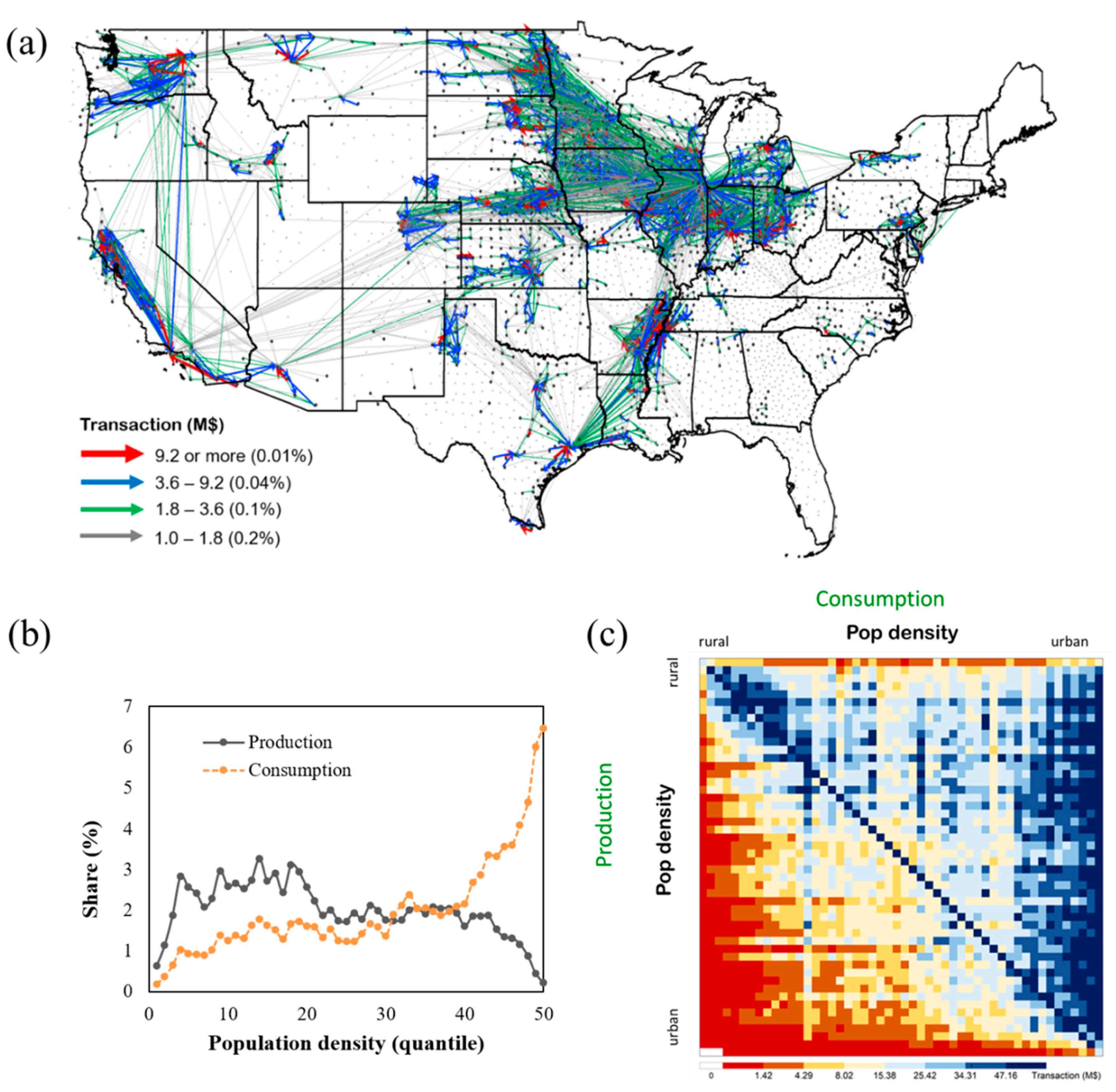
Figure 2a shows the simulated flows of commodities over space using the above assumptions and calculations for grain farming. The colored arrows or directed graphs reflect the relative sizes of the simulated spatial transactions or supply chains. The clustering of activities in grain farming and the supply chain for subsequent processing is evident around the Great Lakes, the Midwest, and along the West Coast. Illinois is the largest producer of soybeans and ranks second in corn production. Iowa is the largest producer of corn and the second-largest producer of soybeans, while Kansas is the largest wheat-producing state, followed by North Dakota and Washington (United States Department of Agriculture, National Agricultural Statistical Service, 2017 (cited 15 December 2019), available from https://quickstats.nass.usda.gov).
We show only the largest (in this case >$1 million) transactions for grain flows nationally to avoid cluttering the graphs. This threshold varies by sector, as shown in the legends of subsequent graphs. To demonstrate the enormous size and number of total transactions involved, consider that the flows of $1.0 to 1.8 million make up only 0.2 to 0.1% of the total value of transactions in the grains sector; flows making up at least $9.2 million comprise a mere 0.01% of the total value. This also underscores the tremendous complexity and magnitude of the networks involved, as well as the calculations underlying these simulations. Alternatively, consider that we are showing less than 1% of all transactions in this sector (only the top 0.85%), and the resulting graph is already relatively dense. In future work, we plan to introduce a multidimensional scaling feature into related mapping software that allows decision-makers to study specific communities with much more detail.
Consequently, our maps show only the largest (most important) flows and transactions for grains and other commodities (below), and as such, the primary locations of the most important components of the supply chains. However, as we have already computed all of the other remaining 99.8% of transaction flows, they could be graphed for subregions of the country, or individual states and contiguous counties, if that were of interest to a policymaker or planner-practitioner. To illustrate how more local detail can be provided in terms of transactions, we show the zoomed-in flows of grain farming in Iowa and the two largest sets of transactions—these are other basic organic chemical manufacturing and flour milling and malt manufacturing (Figure S1). In the legend to the map showing grain farming flows to other basic organic chemical manufacturing, for example, the percentages show the share of these particular links (n = 77) out of the 776,085 total links for which the transactions were 4.4 M$ or more; these are only 0.01% of all national grain → other basic organic chemical manufacturing transactions or flows. Obviously, if we were interested only in Iowa or the breadbasket region of the United States, we could calculate these percentages with respect to the state’s or region’s total flows, which would yield higher percentages.
For the sake of visual clarity, we limited the flows to those starting and ending within the state of Iowa; it is also possible to add flows across state borders. In future work, we will develop a platform that allows users to zoom in on particular commodities to trace out these flows. We are also limited in the sector-level detail available from public data: for example, we are unable to distinguish corn from wheat and soybeans using these data. However, the flows for these different products could be developed using knowledge of what is grown where, and how it is used: corn tends to be used as a feed and to produce high fructose corn syrup, whereas soybeans are used primarily as livestock feed or are exported. Wheat is used primarily for bread-making.
In Figure 2b, we show the relative production and consumption shares of grain farming across the population density spectrum, ranked from lowest (most rural) to highest (most urban) along the x-axis. By showing where grains are produced vs. consumed, one can develop an idea of how much of the product has to flow over space. This also shows the degree of interdependence between rural and urban areas and how that varies for different commodities.
It is important to stress that this consumption is not just the end users of grain products, such as consumers eating bread and pastries but also all value-added processing higher up the supply chain. These activities include transportation, milling, refining, storing, baking, etc. The latter explains why a relatively high share of consumption also occurs in more rural areas: this is where grain millers and other processors are located. The fact that some grain production occurs in more population-dense areas is also noteworthy. This likely represents urban farming, as well as the growing of grains in fields located in urban fringe and core areas. Figure 2b makes it clear that most grain production and subsequent processing takes place in lower-density places, while consumption (for example, in the form of bread or baked products but also as raw grain product prior to milling) occurs in more densely settled urban areas, where consumers live and processors including bakeries are based. The gap between where production and consumption occur gives rise to the need for transportation between places and shows the interdependence between rural and urban areas. This interdependence varies depending on the industry (or commodity) and is of growing interest, especially to rural policymakers, as well as economic development practitioners.
To further demonstrate the richness and utility of our approach, Figure 2c shows where the production (vertical axis) and consumption (horizontal axis) of grains occur in two-dimensional space and using a heat map, again ranked by population density from rural to urban. Clearly, most grains were produced in rural areas, clustered as the blue shading in the upper-left-hand corner of the graph, while the consumption of these products was fairly evenly distributed across urban areas, shown as dark blue in the right-most columns.
As an alternative to this heat map, we also tabulated the production and consumption shares according to the rural–urban continuum. Here, we used the USDA Economic Research Service rural–urban county classification scheme (USDA Economic Research Service, Rural–Urban Continuum Codes, 2013 (cited 15 December 2019), available from https://www.ers.usda.gov/data-products/rural-urban-continuum-codes). Table 1 shows that most consumption (56.2%) occurred in urban areas, where they received 15.8%, 20.3%, and 20.2% of their products from rural, suburban, and urban areas, respectively. Note again that in this case, the urban areas were also producing forms of grain products that were higher up the supply chain (i.e., processed or producing other forms of added value). As such, urban areas still produced 29.6% of all grain-farming-related products by value.
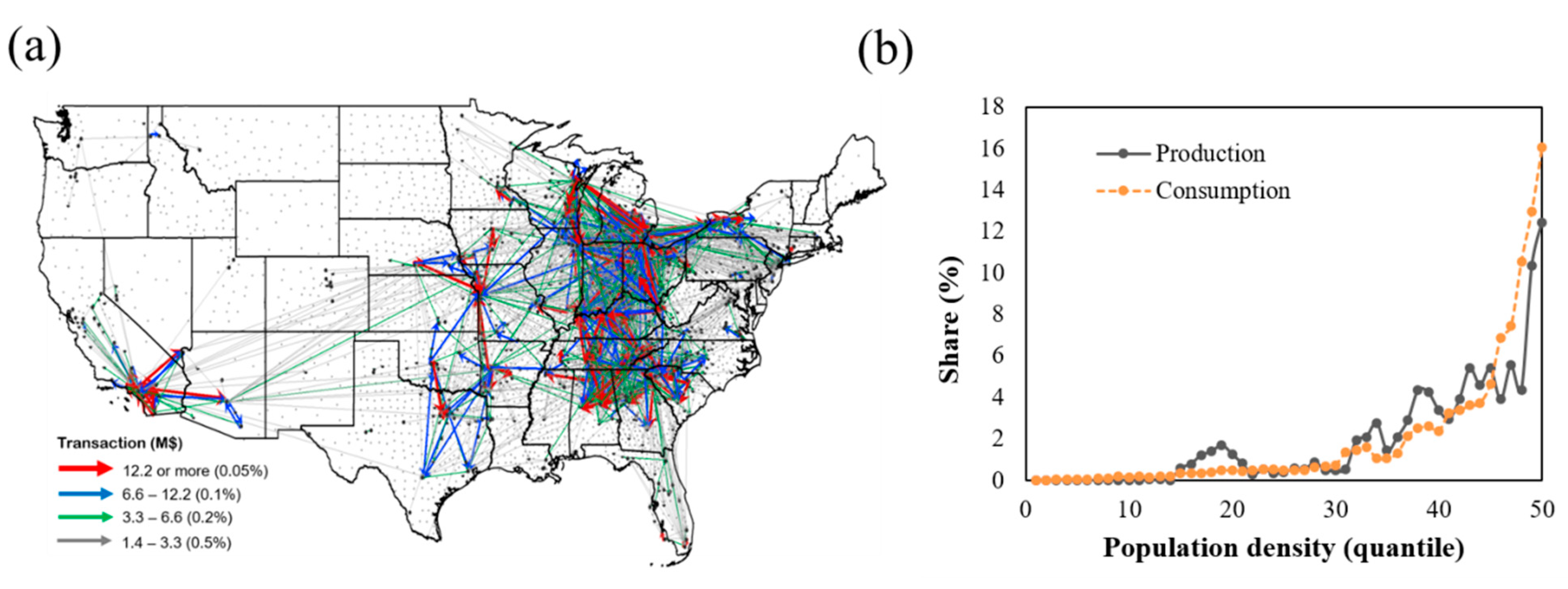
3.2. Motor Vehicle Manufacturing
Turning next to the manufacturing sector example, Figure 3a clearly highlights the well-known U.S. auto alley stretching from Michigan into Alabama, Georgia, and South Carolina, with linkages to the former New United Motor Manufacturing, Inc. plant in Fremont, California. Although the plant no longer exists (having been purchased by Tesla Motors in 2010), gasoline engine and engine parts manufacturers and suppliers are evidently still located there and continue to supply major manufacturers in the auto alley. The smallest size category of transactions ranged from $1.4–3.3 million in this case, and they made up 0.2–0.5% of the flows. Again, as noted already, it would be possible also to map smaller, disaggregated flows within specific states and counties. Using knowledge of where the major automobile plants are located, one could begin to approximate the supply chains of individual manufacturers (e.g., Chrysler vs. BMW vs. Mercedes).
Figure 3b likewise shows the relative production and consumption shares for this sector, again including all subsequent value-added activities (such as attaching fuel pumps to engines during final assembly), that were distributed across U.S. counties ranked from lowest to highest population density. While consumption and production did occur in rural areas, as well as urban, clearly much less activity was found in rural areas for this sector compared to grains. Furthermore, in this case, there was more of an overlap of the production and consumption lines than was the case for the grain sector; this, in turn, suggests that, on average, the consumption (using) and production (making) of parts were more closely co-located in space for this sector, presumably to economize on shipping costs. Although we do not provide them here, it is of course possible to generate figures and tables for this sector that correspond to Figure 2c and Table 1 above.
3.3. Data Processing
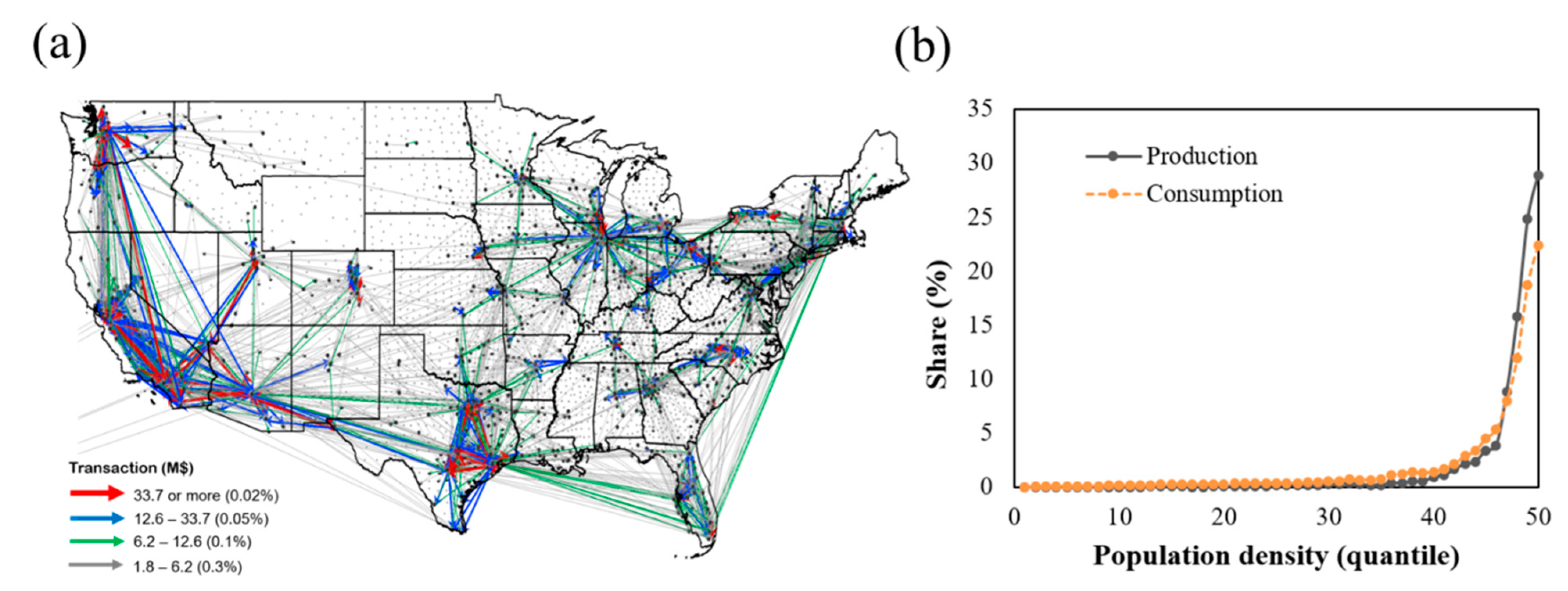
Our third example is from the services sector. Figure 4a indicates that most data processing, hosting, and related services were based in major metropolitan areas, including New York City, Chicago, and Dallas-Fort Worth, as well as places that were home to well-known high-tech companies along the West Coast, including Seattle, San Francisco, and Los Angeles, and that most transactions occurred between these areas. Here, we map only transactions of at least $1.8 million to avoid clutter; the largest flows were valued at $33 million and higher (the largest 0.02% transactions). Altogether, we are showing only the top 0.3% of all transactions in the data processing, hosting, and related services supply chain.
Figure 4b clearly shows that most of these data services were also consumed where they were produced (as evident from the tight overlap between the grey and orange production and consumption lines). Most notably, virtually no activity was observed in this sector in low population density, highly rural areas. However, the high degree of overlap between the lines in Figure 4b is also misleading in that Figure 4a reveals major trade links for these services up and down the supply chain across the nation, with major flows of services occurring across the East Coast, Chicago, Florida, Texas, and West Coast.
So far, the above figures show the largest transactions within the primary designated supply chain. Because we are dealing with networks, a next step could be to examine the subsequent supply chains of the top recipients of transactions from each of these initial suppliers. In this manner, we can simulate the cascading supply chains that emanate from these initial sectors, starting with the top two sectors. This is shown in Figure S1; in principle, these maps can be generated for each of the other sectors that are relevant to the one showcased.
3.4. Additional Illustrations from the Food System
Figure S2 shows other basic organic chemical manufacturing, along with flour milling and malt manufacturing, as the top two recipients of the transactions from grains. The first of these sectors includes synthetic sweetener (i.e., sweetening agents) manufacturing, or high fructose corn syrup, which is one of the major uses of corn, other than animal feed. Soybeans, another major grain, are largely exported and as such do not show up in our domestic transactions analysis. Again, however, this could easily be incorporated if one were interested in international trade flows as well. It is also noteworthy that animal feed does not appear as a major flow in the figure. This is due to the fact that many livestock farmers grow their own feedstock and, as such, these flows would not appear in the transactions table as inter-industry (or inter-firm) commodity flows, as ownership is never transferred. Furthermore, Figure S2 shows the shares of production and consumption across the population density spectrum. Clearly, different patterns again emerge for the two sectors shown, and the same is true of the patterns across the rural, suburban, and urban spectrum.
In Figures S3 and S5, respectively, we show the top two recipients of transactions from our illustrative examples in the manufacturing and services sectors. While the light truck and utility vehicle manufacturing activity map looks similar to a lighter version of the motor vehicle gasoline engine and engine parts manufacturing sector in Figure S3, it completely lacks the West Coast (California, in particular) component. On the other hand, the map for automotive repair and maintenance had a relatively strong presence in western New York state and a heavy presence in California. In Figure S4, personal consumption expenditures (i.e., consumers) and non-depository credit intermediation activities are seen to be the two users of data services. Perhaps not surprisingly, the former map looks very similar to that of data services (with the services essentially being produced where they are consumed, even though transaction flows did occur across county lines), while the non-depository services appeared as a much lighter version. It is noteworthy that the latter already included 4.7% of all transaction flows in this particular sector. The tables underneath the maps and line graphs confirmed that most (97.1%) of these types of services were produced in urban areas.
In Figures S5 and S6, we show two additional important agricultural sectors with production and primary supply chains, as well as the respective top two recipients of transactions. For vegetables (Figure S5), California was the leading state in terms of area harvested and the value of production with 39.1 and 56.7%, respectively. Florida contributed 6.6% of area harvested and 7.6% of the total value of production (USDA. Vegetables 2017 Summary, 2018 (cited 15 December 2019), available from https://downloads.usda.library.cornell.edu/usda-esmis/files/02870v86p/5425kd81z/9019s517t/VegeSumm-02-13-2018.pdf). In Figure S6, the map for cattle highlights that Texas was a major cattle-producing and -processing state. It contributed 14.5% of cattle to the national inventory, followed by Kansas and Nebraska, with 7% each. The major processing states for cattle were Nebraska, Kansas, and Texas (North American Meat Institute, The United States Meat Industry at a Glance, 2018 (cited 15 December 2019), available from https://www.meatinstitute.org/index.php?ht=d/sp/i/47465/pid/47465). To provide detail, given the concern about meat-packing industry employees contracting COVID-19, we again “zoomed in” on the state of Iowa to illustrate the within-state flows.
In Figure S7, the first two maps show the flows of beef cattle to packing houses, again with estimated volumes of flows between each county, and flows of cattle between farms (mostly breeding-related or for fattening). The third map shows the flows of processed meat from the packing houses to retail consumers (in the form of personal consumption expenditures, which is how this was tracked within the input–output table). The two maps in Figure S8 show the flows between packing facilities, usually for more refined cuts of meat or to deal with product volumes that exceeded the capacity of any one house, as well as direct flows from packing houses to limited-service restaurants, which were essential fast-food places that were sourcing from local packers. In this manner, great sector-level spatial detail can be provided for the different industries.
4. Discussion
By extending and generalizing earlier studies, this article presents a spatial supply network model that can be used to estimate and visualize spatial flows of any commodity within a country. The resulting maps can be matched with data on natural disasters and pandemics, as well as city- or county-level infection hotspots, to anticipate where the mitigation and protection of workers may be critically needed. Extensions of this work would include multidimensional scaling that allows decision-makers to zoom into particular communities for greater detail, or to trace the simulated flow of a particular product through local counties.
We suggest that these visualizations with more detail can be helpful for addressing supply chain problems now but also in the event of future pandemics, diseases, or food-safety-related issues. In the future, it is also likely that the identified supply chain connections and geography will change as weather fluctuations become more pronounced. The corn belt is expected to shift northward [53] and California, the current leading state in vegetable production, is likely to continue to experience either drought or heavy rains, leading to significant crop losses. Mapping and comparing these shifts over time will allow users to forecast spatial changes in supply chains. Changes in one local economy would ripple through the entire economy and force a restructuring of other local economies, where these changes can be modeled using the framework provided in this article.
Our method is based on strong assumptions, such as constant technology and preferences over space. Productivity is higher in more densely settled places, but this could be introduced in further refinements of the method (for example, a productivity premium or discount associated with density). In addition, we do not incorporate international trade linkages, although this could easily be done in the future using the IO table, as well as import/export data associated with ports located in different counties. Our approach also suffers from typical problems in regional economic studies, such as cross-hauling. Yet we submit that the visualization proposed here offers more potential place-specific insights than the next alternative, which would be the Commerce Department’s Commodity Flow Survey, which is available only every 5 years and provides only state-level rather than county-level data. As such, our work also complements and further refines that of Boero et al. [41].
For the specific research questions discussed in this study, and especially in the context of an evolving pandemic, clear opportunities exist to extend the proposed approach. First, it can be used to identify future potential business opportunities that are related, for example, to import substitution. The fact that producers in any one county incur longer transport distances for a given commodity than other counties means that residents (firms) of the county consume relatively more expensive products. Next, the resilience (or vulnerability) of the local economy can be measured over space. A county with more complex transactions is more resilient [54,55]. Here, it is possible to explore network-based concepts, such as local cascading failures and structural holes, in addition to the key inter-county linkages. This would help local decision-makers to better understand the independencies to which their respective county economies may be exposed. This, in turn, could be used to identify vulnerabilities within counties to natural (or human) shocks that may wipe out key suppliers, as well as critical rail and road infrastructures. More strategic planning could be devoted by county emergency response management to such disruptions. Furthermore, economic clusters of counties that share similar transactions and vulnerabilities can be identified and categorized. Finally, changes in the local economies that may result from environmental changes can be forecast, including climate change, improvements in technology and population growth, and natural shocks and disasters [56].
Supplementary Materials
The following are available online at https://0-www-mdpi-com.brum.beds.ac.uk/2071-1050/13/3/1512/s1, Figure S1: Zoomed-in spatial supply chain for grain farming in Iowa, Figure S2: Spatial supply chain for grain farming to the top two recipients of the transaction, Figure S3: Spatial supply chain for motor vehicle manufacturing to the top two recipients of the transaction, Figure S4: Spatial supply chain for data processing to the top two recipients of the transaction, Figure S5: Production and supply chain for vegetable and melon farming, Figure S6: Production and supply chain for beef cattle ranching and farming, Figure S7: Zoomed-in spatial supply chain for beef cattle in Iowa, Figure S8: Zoomed-in spatial supply chain for beef cattle in Iowa.
Author Contributions
Conceptualization, Y.H., S.J.G., and C.S.; methodology, Y.H. and S.J.G.; software, Y.H.; validation, Y.H., S.J.G., and C.S.; formal analysis, Y.H.; investigation, Y.H., S.J.G., and C.S.; resources, Y.H.; data curation, Y.H.; writing—original draft preparation, Y.H. and S.J.G.; writing—review and editing, Y.H., S.J.G., and C.S.; visualization, Y.H.; supervision, S.J.G.; project administration, S.J.G.; funding acquisition, S.J.G. All authors have read and agreed to the published version of the manuscript.
Funding
This research was funded in part by the United States Department of Agriculture, National Institute of Food and Agriculture, under grant no. 2017-51150-27125, and the Pennsylvania State University, Agricultural Experiment Station.
Institutional Review Board Statement
Not applicable.
Informed Consent Statement
Not applicable.
Data Availability Statement
Publicly available datasets were analyzed in this study. This data can be found at the respective weblinks provided above.
Acknowledgments
Earlier versions of this article were presented at the Western Region Science Association annual conference, Napa Valley, CA, USA, 11 February 2019; the 59th Congress of the European Regional Science Association, Lyon, France, 28 August 2019; the U.S. Economic Development Administration–Indiana University Project Meeting, Bloomington, IN, USA, 26 April 2018; the International Geography Union Mini-Conference on Rural–Urban Linkages for Sustainable Development, Innsbruck, Austria, 19 July 2018; the Agricultural and Applied Economics Association Meeting, Washington, D.C., USA, 7 August 2018. We thank our discussants and attendees at these various workshops for their valuable comments and suggestions, in addition to three anonymous journal reviewers.
Conflicts of Interest
The authors declare no conflict of interest.
References
- Laborde, D.; Martin, W.; Swinnen, J.; Vos, R. COVID-19 risks to global food security. Science 2020, 369, 500–502. [Google Scholar] [CrossRef] [PubMed]
- Pu, M.; Zhong, Y. Rising concerns over agricultural production as COVID-19 spreads: Lessons from China. Glob. Food Secur. 2020, 26, 100409. [Google Scholar] [CrossRef] [PubMed]
- Eadicicco, L. Apple’s Supply Chain Still Struggling to Return to Normal Even as China Recovers from the Pandemic, Report Says. Business Insider. Available online: https://www.businessinsider.com/coronavirus-apple-supply-chain-iphone-12-production-2020-3 (accessed on 20 March 2020).
- Ivanov, D. Predicting the impacts of epidemic outbreaks on global supply chains: A simulation-based analysis on the coronavirus outbreak (COVID-19/SARS-CoV-2) case. Transp. Res. Part E Logist. Transp. Rev. 2020, 136, 101922. [Google Scholar] [CrossRef] [PubMed]
- Ivanov, D.; Dolgui, A. Viability of intertwined supply networks: Extending the supply chain resilience angles towards survivability. A position paper motivated by COVID-19 outbreak. Int. J. Prod. Res. 2020, 58, 2904–2915. [Google Scholar] [CrossRef] [Green Version]
- Ker, A.P.; Cardwell, R. Introduction to the special issue on COVID-19 and the Canadian agriculture and food sectors: Thoughts from the pandemic onset. Can. J. Agric. Econ. 2020. [Google Scholar] [CrossRef]
- Luckstead, J.; Nayga, R.M., Jr.; Snell, H.A. Labor Issues in the Food Supply Chain amid the COVID-19 Pandemic. Appl. Econ. Perspect. Policy 2020. [Google Scholar] [CrossRef]
- Nikolopoulos, K.; Punia, S.; Schäfers, A.; Tsinopoulos, C.; Vasilakis, C. Forecasting and planning during a pandemic: COVID-19 growth rates, supply chain disruptions, and governmental decisions. Eur. J. Oper. Res. 2020. [Google Scholar] [CrossRef]
- Singh, S.; Kumar, R.; Panchal, R.; Tiwari, M.K. Impact of COVID-19 on logistics systems and disruptions in food supply chain. Int. J. Prod. Res. 2020, 1–16. [Google Scholar] [CrossRef]
- Wang, Y.; Wang, J.; Wang, X. COVID-19, supply chain disruption and China’s hog market: A dynamic analysis. China Agric. Econ. Rev. 2020, 12, 427–443. [Google Scholar] [CrossRef]
- Telukdarie, A.; Munsamy, M.; Mohlala, P. Analysis of the Impact of COVID-19 on the Food and Beverages Manufacturing Sector. Sustainability 2020, 12, 9331. [Google Scholar] [CrossRef]
- Giannakis, E.; Hadjioannou, L.; Jimenez, C.; Papageorgiou, M.; Karonias, A.; Petrou, A. Economic Consequences of Coronavirus Disease (COVID-19) on Fisheries in the Eastern Mediterranean (Cyprus). Sustainability 2020, 12, 9406. [Google Scholar] [CrossRef]
- Taqi, H.; Ahmed, H.; Paul, S.; Garshasbi, M.; Ali, S.; Kabir, G.; Paul, S. Strategies to Manage the Impacts of the COVID-19 Pandemic in the Supply Chain: Implications for Improving Economic and Social Sustainability. Sustainability 2020, 12, 9483. [Google Scholar] [CrossRef]
- Arto, I.; Andreoni, V.; Rueda Cantuche, J.M. Global impacts of the automotive supply chain disruption following the Japanese earthquake of 2011. Econ. Syst. Res. 2015, 27, 306–323. [Google Scholar] [CrossRef]
- Okuyama, Y.; Santos, J.R. Disaster impact and input–output analysis. Econ. Syst. Res. 2014, 26, 1–12. [Google Scholar] [CrossRef]
- Nakamoto, Y. Spatial structural decomposition analysis with a focus on product lifetime. Econ. Syst. Res. 2020, 32, 239–261. [Google Scholar] [CrossRef]
- Kagawa, S.; Suh, S.; Kondo, Y.; Nansai, K. Identifying environmentally important supply chain clusters in the automobile industry. Econ. Syst. Res. 2013, 25, 265–286. [Google Scholar] [CrossRef]
- Thomas, D.S.; Kandaswamy, A.M. An examination of national supply-chain flow time. Econ. Syst. Res. 2018, 30, 359–379. [Google Scholar] [CrossRef]
- Bogataj, D.; Hudoklin, D.; Bogataj, M.; Dimovski, V.; Colnar, S. Risk Mitigation in a Meat Supply Chain with Options of Redirection. Sustainability 2020, 12, 8690. [Google Scholar] [CrossRef]
- Lejour, A.; Rojas-Romagosa, H.; Veenendaal, P. Identifying hubs and spokes in global supply chains using redirected trade in value added. Econ. Syst. Res. 2017, 29, 66–81. [Google Scholar] [CrossRef] [Green Version]
- Nagashima, F.; Kagawa, S.; Suh, S.; Nansai, K.; Moran, D. Identifying critical supply chain paths and key sectors for mitigating primary carbonaceous PM 2.5 mortality in Asia. Econ. Syst. Res. 2017, 29, 105–123. [Google Scholar] [CrossRef]
- Brown, R.; Liñares-Zegarra, J.; Wilson, J.O. The (potential) impact of Brexit on UK SMEs: Regional evidence and public policy implications. Reg. Stud. 2019, 53, 761–770. [Google Scholar] [CrossRef]
- Borgatti, S.P.; Li, X. On social network analysis in a supply chain context. J. Supply Chain Manag. 2009, 45, 5–22. [Google Scholar] [CrossRef]
- Bellemare, M.F.; Çakir, M.; Peterson, H.H.; Novak, L.; Rudi, J. On the measurement of food waste. Am. J. Agric. Econ. 2017, 99, 1148–1158. [Google Scholar] [CrossRef]
- Havelaar, A.H.; Mangen, M.J.J.; De Koeijer, A.A.; Bogaardt, M.J.; Evers, E.G.; Jacobs-Reitsma, W.F.; Van Pelt, W.; Wagenaar, J.A.; De Wit, G.A.; Van Der Zee, H.; et al. Effectiveness and efficiency of controlling Campylobacter on broiler chicken meat. Risk Anal. Int. J. 2007, 27, 831–844. [Google Scholar] [CrossRef]
- Beske, P.; Land, A.; Seuring, S. Sustainable supply chain management practices and dynamic capabilities in the food industry: A critical analysis of the literature. Int. J. Prod. Econ. 2014, 152, 131–143. [Google Scholar] [CrossRef]
- Vachon, S.; Mao, Z. Linking supply chain strength to sustainable development: A country-level analysis. J. Clean. Prod. 2008, 16, 1552–1560. [Google Scholar] [CrossRef]
- Lin, X.; Dang, Q.; Konar, M. A network analysis of food flows within the United States of America. Environ. Sci. Technol. 2014, 48, 5439–5447. [Google Scholar] [CrossRef]
- Lin, X.; Ruess, P.J.; Marston, L.; Konar, M. Food flows between counties in the United States. Environ. Res. Lett. 2019, 14, 084011. [Google Scholar] [CrossRef]
- Smith, T.M.; Goodkind, A.L.; Kim, T.; Pelton, R.E.; Suh, K.; Schmitt, J. Subnational mobility and consumption-based environmental accounting of US corn in animal protein and ethanol supply chains. Proc. Natl. Acad. Sci. USA 2017, 114, E7891–E7899. [Google Scholar] [CrossRef] [Green Version]
- Konar, M.; Lin, X.; Ruddell, B.; Sivapalan, M. Scaling properties of food flow networks. PLoS ONE 2018, 13, e0199498. [Google Scholar] [CrossRef]
- Pinior, B.; Konschake, M.; Platz, U.; Thiele, H.D.; Petersen, B.; Conraths, F.J.; Selhorst, T. The trade network in the dairy industry and its implication for the spread of contamination. J. Dairy Sci. 2012, 95, 6351–6361. [Google Scholar] [CrossRef] [PubMed] [Green Version]
- Hao, S.; Kassahun, A.; Bouzembrak, Y.; Marvin, H. Identification of potential vulnerable points and paths of contamination in the Dutch broiler meat trade network. PLoS ONE 2020, 15, e0233376. [Google Scholar] [CrossRef] [PubMed]
- Førsund, F.R. Multi-equation modelling of desirable and undesirable outputs satisfying the materials balance. Empir. Econ. 2018, 54, 67–99. [Google Scholar] [CrossRef]
- Xiao, H.; Meng, B.; Ye, J.; Li, S. Are global value chains truly global? Econ. Syst. Res. 2020, 32, 540–564. [Google Scholar] [CrossRef]
- Park, H.; Bellamy, M.A.; Basole, R.C. Visual analytics for supply network management: System design and evaluation. Decis. Support Syst. 2016, 91, 89–102. [Google Scholar] [CrossRef]
- Basole, R.C.; Bellamy, M.A.; Park, H. Visualization of innovation in global supply chain networks. Decis. Sci. 2017, 48, 288–306. [Google Scholar] [CrossRef]
- Goetz, S.J.; Han, Y. Latent innovation in local economies. Res. Policy 2020, 49, 103909. [Google Scholar] [CrossRef]
- Park, J.; Gordon, P.; Moore, J.E.; Richardson, H.W. A two-step approach to estimating state-to-state commodity trade flows. Ann. Reg. Sci. 2009, 43, 1033. [Google Scholar] [CrossRef]
- Canning, P.; Wang, Z. A flexible mathematical programming model to estimate interregional input–output accounts. J. Reg. Sci. 2005, 45, 539–563. [Google Scholar] [CrossRef]
- Duarte, R.; Pinilla, V.; Serrano, A. Factors driving embodied carbon in international trade: A multiregional input–output gravity model. Econ. Syst. Res. 2018, 30, 545–566. [Google Scholar] [CrossRef]
- Boero, R.; Edwards, B.K.; Rivera, M.K. Regional input–output tables and trade flows: An integrated and interregional non-survey approach. Reg. Stud. 2018, 52, 225–238. [Google Scholar] [CrossRef]
- Barabási, A.L.; Albert, R. Emergence of scaling in random networks. Science 1999, 286, 509–512. [Google Scholar] [CrossRef] [PubMed] [Green Version]
- Yook, S.H.; Jeong, H.; Barabási, A.L.; Tu, Y. Weighted evolving networks. Phys. Rev. Lett. 2001, 86, 5835. [Google Scholar] [CrossRef] [PubMed] [Green Version]
- Barrat, A.; Barthélemy, M.; Vespignani, A. Weighted evolving networks: Coupling topology and weight dynamics. Phys. Rev. Lett. 2004, 92, 228701. [Google Scholar] [CrossRef] [PubMed] [Green Version]
- Li, C.; Chen, G. A comprehensive weighted evolving network model. Phys. A Stat. Mech. Appl. 2004, 343, 288–294. [Google Scholar] [CrossRef] [Green Version]
- Balcan, D.; Colizza, V.; Gonçalves, B.; Hu, H.; Ramasco, J.J.; Vespignani, A. Multiscale mobility networks and the spatial spreading of infectious diseases. Proc. Natl. Acad. Sci. USA 2009, 106, 21484–21489. [Google Scholar] [CrossRef] [PubMed] [Green Version]
- Leontief, W.; Strout, A. Multiregional input-output analysis. In Structural Interdependence and Economic Development; Palgrave Macmillan: London, UK, 1963; pp. 119–150. [Google Scholar]
- Riddington, G.; Gibson, H.; Anderson, J. Comparison of gravity model, survey and location quotient-based local area tables and multipliers. Reg. Stud. 2006, 40, 1069–1081. [Google Scholar] [CrossRef]
- Fournier Gabela, J.G. On the accuracy of gravity-RAS approaches used for inter-regional trade estimation: Evidence using the 2005 inter-regional input–output table of Japan. Econ. Syst. Res. 2020, 32, 521–539. [Google Scholar] [CrossRef]
- Andersson, C.; Hellervik, A.; Lindgren, K. A spatial network explanation for a hierarchy of urban power laws. Phys. A Stat. Mech. Appl. 2005, 345, 227–244. [Google Scholar] [CrossRef]
- Daraganova, G.; Pattison, P.; Koskinen, J.; Mitchell, B.; Bill, A.; Watts, M.; Baum, S. Networks and geography: Modelling community network structures as the outcome of both spatial and network processes. Soc. Netw. 2012, 34, 6–17. [Google Scholar] [CrossRef]
- Beddow, J.M.; Pardey, P.G. Moving matters: The effect of location on crop production. J. Econ. Hist. 2015, 75, 219–249. [Google Scholar] [CrossRef]
- Janssen, M.A.; Bodin, Ö.; Anderies, J.M.; Elmqvist, T.; Ernstson, H.; McAllister, R.R.J.; Olsson, P.; Ryan, P. Toward a network perspective of the study of resilience in social-ecological systems. Ecol. Soc. 2006, 11, 15. [Google Scholar] [CrossRef] [Green Version]
- Han, Y.; Goetz, S.J. Predicting US county economic resilience from industry input-output accounts. Appl. Econ. 2019, 51, 2019–2028. [Google Scholar] [CrossRef]
- Flores, H.; Villalobos, J.R. A modeling framework for the strategic design of local fresh-food systems. Agric. Syst. 2018, 161, 1–15. [Google Scholar] [CrossRef]
Figure 1.
A conceptual model of spatial supply chain derivations. Here, is the production (in $) of commodity s in local area i, is the consumption (in $) of industry t in local area j, and is the network impedance (unit free) between local area i and j. are the transactions (in $) from commodity s to industry t. BEA: Bureau of Economic Analysis, CBP: Commerce Department’s County Business Patterns, ORNL: Oak Ridge National Laboratory.

Figure 2.
Spatial supply chain of grain farming: (a) the simulated spatial transactions, (b) grain farming’s relative production and consumption shares, and (c) the heat map.
Figure 2.
Spatial supply chain of grain farming: (a) the simulated spatial transactions, (b) grain farming’s relative production and consumption shares, and (c) the heat map.

Figure 3.
Spatial supply chain of motor vehicle manufacturing: (a) simulated spatial transactions and (b) motor vehicle manufacturing relative production and consumption shares.
Figure 3.
Spatial supply chain of motor vehicle manufacturing: (a) simulated spatial transactions and (b) motor vehicle manufacturing relative production and consumption shares.

Figure 4.
Spatial supply chain of data processing: (a) simulated spatial transactions and (b) data processing relative production and consumption shares.
Figure 4.
Spatial supply chain of data processing: (a) simulated spatial transactions and (b) data processing relative production and consumption shares.


Table 1.
Production and consumption shares (%) for grain farming.
| Production → Consumption ↓ | Rural | Suburban | Urban | Total |
|---|---|---|---|---|
| Rural | 11.6 | 7.4 | 15.8 | 34.8 |
| Suburban | 5.8 | 9.6 | 20.3 | 35.6 |
| Urban | 3.5 | 6.0 | 20.2 | 29.6 |
| Total | 20.8 | 23.0 | 56.2 | 100 |
Publisher’s Note: MDPI stays neutral with regard to jurisdictional claims in published maps and institutional affiliations. |
© 2021 by the authors. Licensee MDPI, Basel, Switzerland. This article is an open access article distributed under the terms and conditions of the Creative Commons Attribution (CC BY) license (http://creativecommons.org/licenses/by/4.0/).
Share and Cite
MDPI and ACS Style
Han, Y.; Goetz, S.J.; Schmidt, C. Visualizing Spatial Economic Supply Chains to Enhance Sustainability and Resilience. Sustainability 2021, 13, 1512. https://0-doi-org.brum.beds.ac.uk/10.3390/su13031512
AMA Style
Han Y, Goetz SJ, Schmidt C. Visualizing Spatial Economic Supply Chains to Enhance Sustainability and Resilience. Sustainability. 2021; 13(3):1512. https://0-doi-org.brum.beds.ac.uk/10.3390/su13031512
Chicago/Turabian StyleHan, Yicheol, Stephan J. Goetz, and Claudia Schmidt. 2021. "Visualizing Spatial Economic Supply Chains to Enhance Sustainability and Resilience" Sustainability 13, no. 3: 1512. https://0-doi-org.brum.beds.ac.uk/10.3390/su13031512
Note that from the first issue of 2016, this journal uses article numbers instead of page numbers. See further details here.