
Prediction of Spread Trend of Epidemic Based on Spatial-Temporal Sequence

Computer Science and Technology College, Donghua University, Shanghai 201620, China
*
Author to whom correspondence should be addressed.
Symmetry 2022, 14(5), 1064; https://0-doi-org.brum.beds.ac.uk/10.3390/sym14051064
Submission received: 13 March 2022
/
Revised: 24 April 2022
/
Accepted: 11 May 2022
/
Published: 23 May 2022
(This article belongs to the Special Issue Recent Advances in Social Data and Artificial Intelligence II)
Abstract
:Coronavirus Disease 2019 (COVID-19) continues to spread throughout the world, and it is necessary for us to implement effective methods to prevent and control the spread of the epidemic. In this paper, we propose a new model called Spatial–Temporal Attention Graph Convolutional Networks (STAGCN) that can analyze the long-term trend of the COVID-19 epidemic with high accuracy. The STAGCN employs a spatial graph attention network layer and a temporal gated attention convolutional network layer to capture the spatial and temporal features of infectious disease data, respectively. While the new model inherits the symmetric “space-time space” structure of Spatial–Temporal Graph Convolutional Networks (STGCN), it enhances its ability to identify infectious diseases using spatial–temporal correlation features by replacing the graph convolutional network layer with a graph attention network layer that can pay more attention to important features based on adaptively adjusted feature weights at different time points. The experimental results show that our model has the lowest error rate compared to other models. The paper also analyzes the prediction results of the model using interpretable analysis methods to provide a more reliable guide for the decision-making process during epidemic prevention and control.
1. Introduction
Novel coronavirus pneumonia was first discovered in China in December 2019, and until now the number of confirmed cases has reached hundreds of millions worldwide. COVID-19 is highly life threatening to living organisms, and severe disease can present with dyspnea, shock and even multiple organ failure. Since 2021, there have been many cases of local infection in small areas in China. Unlike the initial period of the sudden outbreak of the epidemic in Wuhan, China now has adequate and complete prevention and control measures. First, cases are quarantined and treated immediately, then all possible dense contacts are traced back to the source, isolated and nucleic acid tested. Finally, the risk level of cases and areas where dense contacts have occurred is raised and local areas are blocked. Aggregation is strictly prohibited and nucleic acid tests are conducted on all personnel in the region. Minimize the spread of the epidemic as quickly as possible. The results of prevention and control are impressive. Cases in cities can be quickly cleared and kept under control without affecting the normal life of the people as much as possible.
It can be seen that case activity tracking is similar to building a graph, where each case’s activity route and regions are related to each other, forming a graph network, and regions are nodes. This spatial association has a significant role in predicting the spread trend of infectious diseases. Therefore, for predicting the epidemic transmission trend in the future, scientific prevention and control of the epidemic, and precise implementation of policies, monitoring the spatial and temporal data characteristics of infectious cases is very important and effective.
Currently, there are two data-driven methods to predict the spread trend of epidemic: methods based on time series and methods based on spatial–temporal sequence.
As predicting the infectiousness of COVID-19 is relevant to time series, methods based on time series have mostly been applied. In terms of time series data, the commonly used method is autoregressive integrated moving average (ARIMA). For example, Pan et al. [1] proposed an ARIMA-based infectious disease prediction model, Mekparyup et al. [2] established an unconstrained seasonal ARIMA infectious disease prediction model, Anwar et al. [3] introduced environmental and climate data into ARIMA-built prediction models, and Roy et al. predicted the trend of epidemic in India based on ARIMA [4]. However, these models require stable time series data and cannot predict the spread trend with nonlinearity.
In response to this, machine learning methods such as Support Vector Regression (SVR) method [5,6,7] and Extreme Gradient Boosting (XGBoost) method [8,9] can effectively process non-linear data and obtain higher prediction accuracy. Using general prediction methods based on deep learning, such as Gate recurrent unit (GRU) [10], Multi-channel LSTM [11,12], and LSTM-RNN [13], which are based on attention mechanisms, can extract more complex and high-dimensional data to predict trends.
Theoretically, measuring the spread trend of epidemics should take into account not only the time dimension (i.e., the number of new infections per day), but also the spatial dimension (i.e., the number of new infections in different cities or regions). Models based on time series data do not take into account the spatial dimension between different nodes, so it is difficult to capture spatial correlation [14]. Therefore, a spatial–temporal series data-driven approach is proposed. Graph Convolutional Network (GCN) can efficient capture location information and process high-dimensional data, which makes it useful for capturing spatially related features, such as intelligent transportation [15,16], behavior recognition [17,18], and epidemic trend prediction [19,20]. In predicting epidemic trend of infectious diseases, Derr et al. [19] proposed Epidemic Graph Convolutional Network (EGCN) to capture the spatial characteristics of disease transmission by analyzing the characteristics of an infectious disease transmission network. Heo et al. [20] used GCN models in the analysis of epidemic space–time data. Graphic convolution networks capture geospatial characteristics, and gated loop units capture temporal dynamics.
However, these methods also have two shortcomings:
- The distribution of weights is inaccurate due to the lack of consideration for the importance ranking of features and the lack of attention to important features. For example, a period of time with a larger migration index should have a greater impact on outcomes, and the epidemic transmission of infectious diseases in a region is more affected by its neighboring regions, which cannot be generalized.
- Lack of explanation for the results. End-to-end model processing and output results belong to black-box processing, which cannot be traced back to the source and lacks some confidence.
In view of the above problems, this paper mainly makes the following work:
- The spatial map information is innovatively introduced into the data, that is, the intensity of association adjacency matrix between risk areas is constructed to represent the relationship between regions and neighborhood characteristics, and to improve the sensitivity of the model to the spatial information of the data.
- A prediction model STAGCN based on a space–time series is proposed. The model introduces the attention mechanism to adaptively assign the feature weights of epidemic data in different time periods, and adaptively extracts the spatial information of epidemic data using the attention network. We use the time series model LSTM to compare the effect with the model, and take STACN as the benchmark model to evaluate the generalization ability of the time series and time series models.
- The migration index in explainable data is analyzed and interpreted using explanatory methods, taking cities as units.
The structure of this paper is arranged as follows: First, we introduce the data source and composition, then we explain the structure of the benchmark model STGCN and how we can improve on the basis of STGCN to get our proposed model STAGCN, and then introduce the structure of STAGCN in detail. In the next step, we introduce the experiment and result analysis, and finally analyze the interpretability of migration index.
2. Materials and Methods
2.1. Data Description
The experimental data used in this paper are from a desensitized infectious disease dataset provided by a platform from Xi’an, Shaanxi province [21]. There are 5 cities and 392 regions in the infectious disease data set, with a total of 2,154,184 data records. This data set describes the specific information of infectious diseases in all cities and regions in detail, and provides enough data support for the following model experiments. The goal of our experiment is to predict the number of new infections in the next few days. The data set counts the daily number of new infections of infectious diseases for 60 days from 1 May 2020 to 29 June 2020. The original data set mainly includes the following files:
Migration Data: Indicates the migration of people between different cities. The geographic units are cities.
Grid Density Data: Indicates the current population density of a grid. The geographic units are grids.
Transfer Data: Indicates the intensity of population migration between different grids in a city. The intensity of migration of human traffic is used to indicate the degree of association. The geographic unit is the grid, and the time unit is the hour.
Grid Attribution Area Data: Indicates that a grid belongs to an area. Indicates ownership: The grid belongs to an area.
Infection Data: Indicates the number of new infections per day added to each region of a city, and also indicates the attribution: the area belongs to the city.
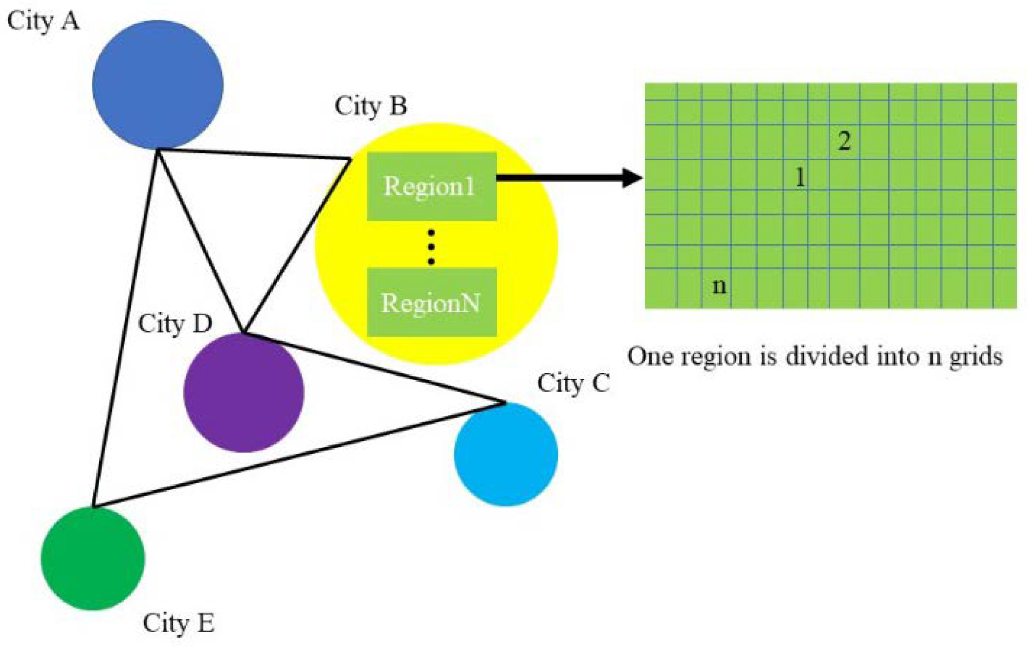
The original data divides a city into areas with their own ID, each of which is densely divided into rectangular grids (in grids), each of which uses four latitude and longitude coordinate points to determine the extent of the area and the grid’s center coordinate to uniquely identify the grid (Figure 1).
The daily characteristics of each area in each city are shown in the following table (Table 1). Among them, cities are named with “capital letters”, such as city “A”, and regions are named with “capital letters Arabic numerals”, which is the administrative region of the city, such as region “A_0”. According to the statistics of the distribution of the data set, city C has the largest number of regions, totaling 135, and city B has the smallest number of regions, totaling 30.
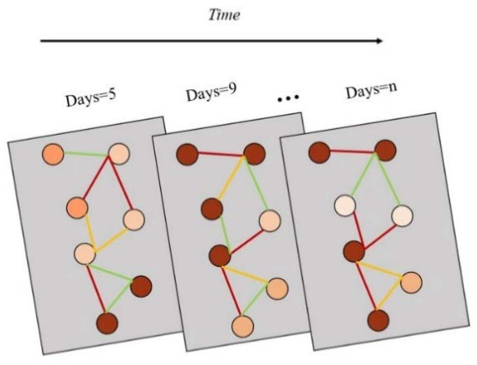
Each region contains a period of time series features, so it is necessary to aggregate different features of infectious disease data into one feature, and use this feature to represent the attributes of a regional node, so as to ensure that the time information and spatial information of infectious disease data can be simultaneously input into the model for training and learning (Figure 2). For all the existing features, the corresponding feature aggregation is required, and the calculation process is shown in Formula (1). represents the characteristic value of infectious diseases, represents the corresponding weight of features, represents the number of features, and represents the new feature vector set generated by aggregation.
After unifying the time and geographical units, the data features are aggregated to get a region feature file (Region Features), using represents all the regional features of the days, represents the features of the day.
In the process of epidemic prevention and control, each person’s range of activities will associate regions, and each area will become nodes. The degree of association between different regions is the aggregation of people’s activities. Thus, an appropriate graph network can be constructed to represent the spatial characteristics of data. The adjacency matrix is a good data structure to store the network information of a graph. Therefore, we aggregate the region-based intensity data based on the grid’s intensity data, and construct an adjacency matrix from it.
2.2. Construction of Adjacency Matrix
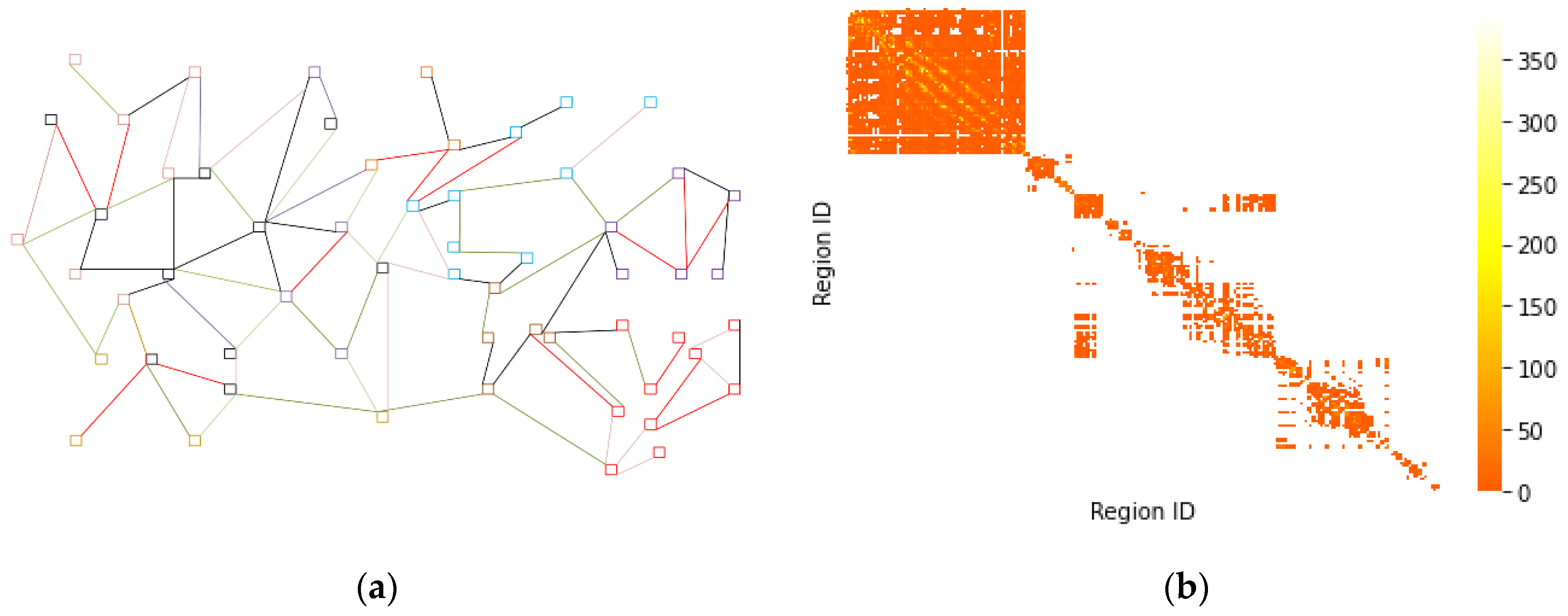
The correlation degree of regions can better reflect the connectivity between different regions. For example, there are different degrees of correlation between the 10 regions of city a and the 8, 9, 11 and 12 regions of city A, which means that they are connected with each other, but the strength of connection is different. The correlation strength between the 10 regions of city a and the regions of other cities such as city B and C is zero, that is, there is no connectivity. The association strength of the region is constructed as an adjacency matrix, which is used as the information supplement when the graph attention network is used to adaptively aggregate the characteristics of the nodes in the neighborhood region, which is helpful to improve the prediction accuracy of the model.
The corresponding adjacency matrix is constructed based on the data of regional correlation degree, and each element in the adjacency matrix is calculated as shown in the Equation (2).
The in equation (2) represents the degree of correlation between region and region . and is the threshold that controls the distribution and sparsity of the adjacency matrix. Depending on the actual situation, the and are specified as 10 and 0.5, respectively.
Connectivity between 392 regions in 5 cities in infectious disease data was calculated and an adjacency matrix e was obtained. To visualize the input and output forms of the data during the construction process, the results are shown in Figure 3.
The data format of the correlation matrix e is shown in Table 2.
Finally, we use the and adjacency matrix as the input data.
2.3. STAGCN
2.3.1. STGCN
Traditional convolution neural networks have limited ability to process graph data, because the local structure of each node in the graph data is different, which results in the loss of translation invariance. Due to the ubiquitous existence of graph data, the deep learning model constructed on the graph is gradually active, and the Graph Convolutional Network (GCN) has become an extremely important one [22]. There are two main methods to build graph convolution neural networks: spectral method and spatial method. The spectral method is mainly based on the convolution operator in the frequency or spectral domain of the Fourier transform. The spatial method is based on the spectral method to parameterize the convolution kernel and use the attention mechanism, serialization model and other means to model the weights between nodes [18]. The process of defining the graph convolution operator is shown in the Equation (3).
represents the feature information of node on layer , represents the normalization factor, represents the weight matrix of the nodes, represents the feature information of target node on layer . The convolution process can be summarized as transferring the feature information of a node to a neighborhood node, which aggregates its own feature information with the feature information transmitted from the neighborhood. At the same time, an activation function is introduced to transform the nodes to enhance the expressive ability of the model.
The STGCN network reconstructs the predicted space-time convolution modules, each consisting of two time-gated convolutions, one space map convolution, and one time-gated convolution consisting of a 1D convolution and a GLU unit, where the kernel width of the 1D convolution is , the spatial map convolution is the Graph Convolution Neural Network Layer (GCN). This configuration not only greatly reduces the consumption of time-dependent feature capture, but also captures global information through convolution layer.
However, it still has the problem of inaccurate weight distribution. Graphic convolution network (GCN) aggregates neighborhood node information to extract spatial information of data. It is only a simple standardization for the aggregation and calculation of neighborhood node characteristics, and the weights of different neighborhood nodes are the same. Therefore, based on this improvement, we propose our own network framework STAGCN.
2.3.2. STAGCN
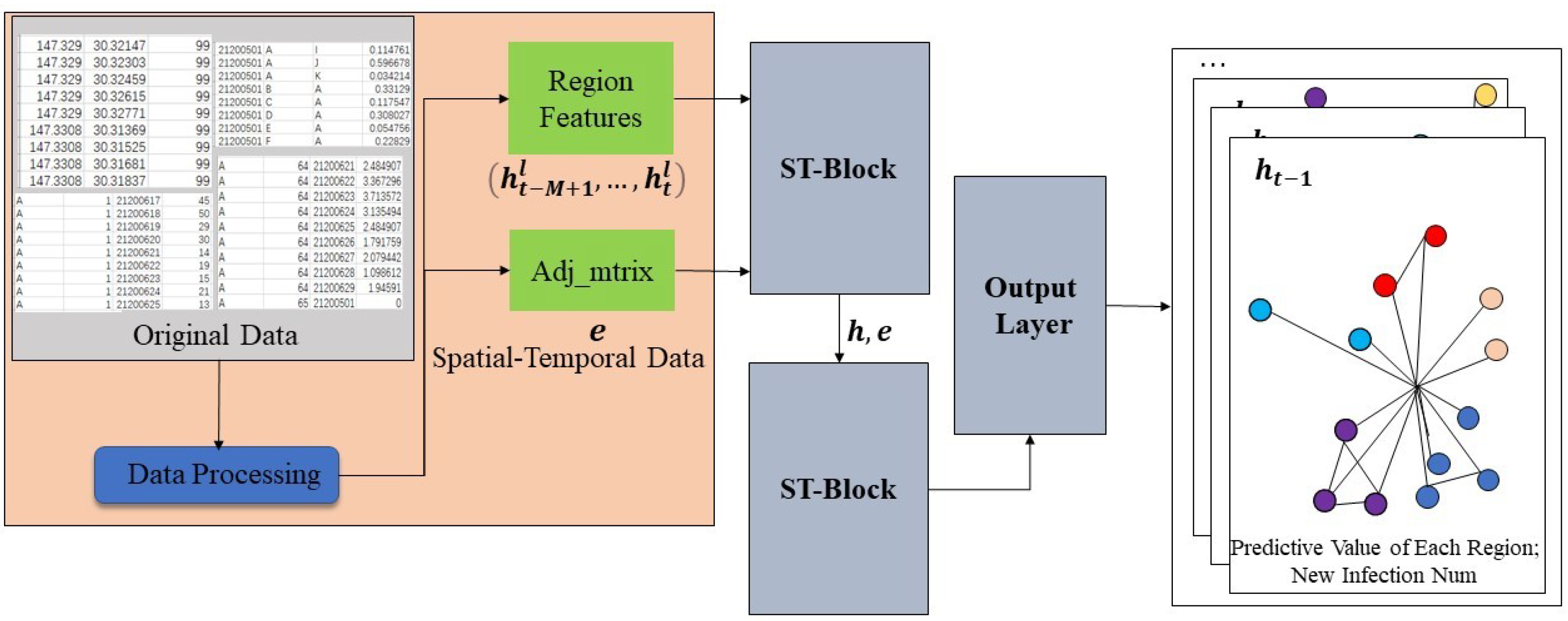
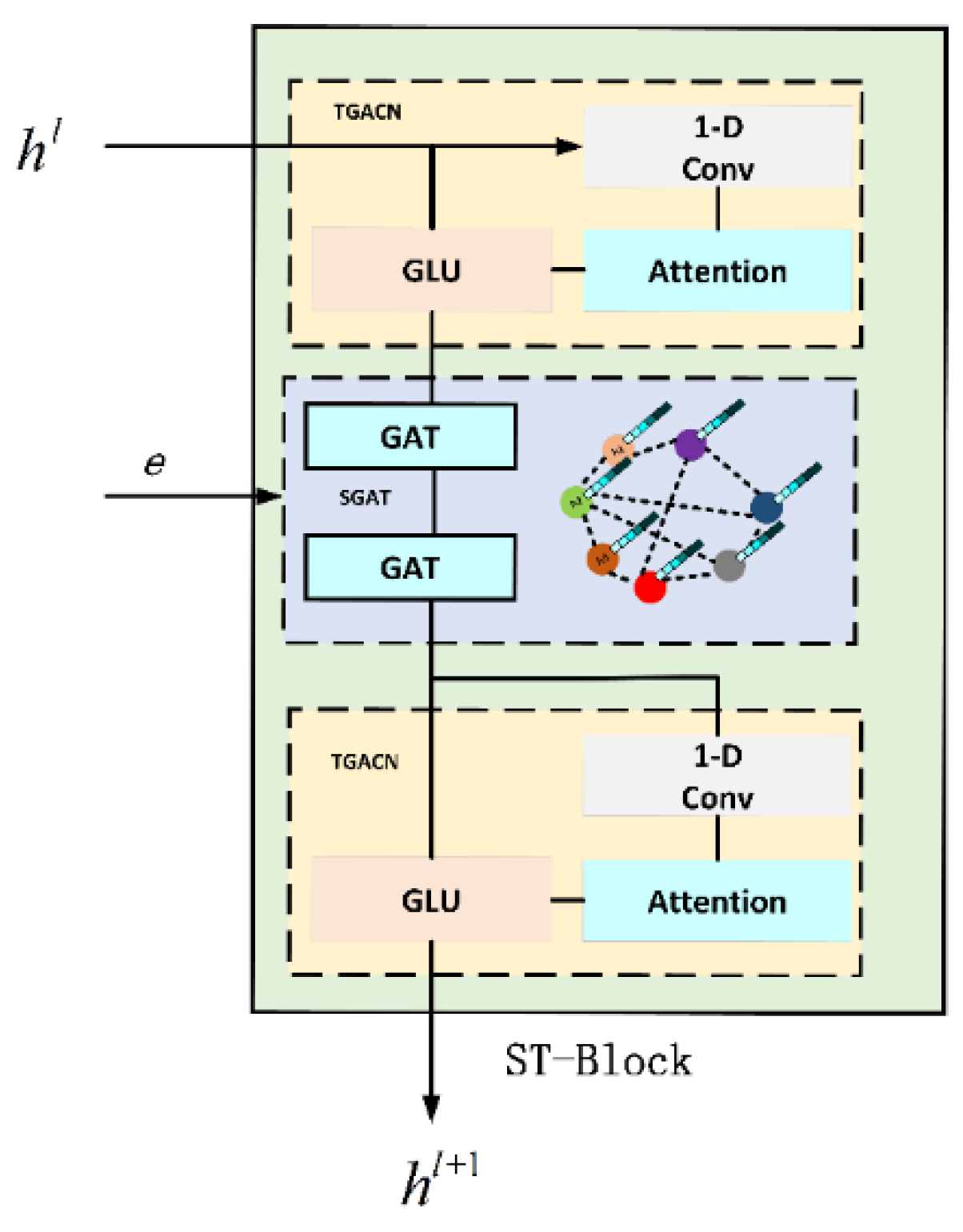
The model mainly includes two ST-Blocks and one Output layer. ST-Block inherits the sandwich structure of STGCN network and makes its own improvements. The model first receives the pre-processed data and the adjacency matrix . After ST-Block processing, the model outputs the daily number of new infections in all areas of the city from the Output layer, which is shown in Figure 4.
The ST-Block network structure is shown in Figure 5. The upper and lower layers are time-gated attention convolution network layers (TGACN), and the middle layer is a spatial graphical attention network layer (SGAT). In order to effectively solve the problem of model prediction weight misalignment, we introduced the Attention mechanism into time-gated convolution (TGCN) to become a new time-gated attention convolution (TAGCN), which adaptively assigns weights to infectious disease data at different time steps, thus improving the model’s ability to focus on time information of infectious disease data. The spatial map convolution (GCN) is improved. Graphic Attention Network (GAT) is used to extract the spatial features of infectious disease data, improve the representation of node features, and introduce adjacency matrix to supplement the spatial information of infectious disease data.
Enter in module. After learning from the multilayer network in the module, the final output is , as shown in Equation (4).
is the spectral core of the convolution. represents a graph convolution operator used to extract the spatial characteristics of infectious diseases. Define the Fourier transform on the graph, convolute the spatial structure information of the nodes in the GCN, and then use the convolution operator find the basis vectors of the Fourier transform to describe the local structure of the region nodes. and is the time kernel of time-gated attention convolution network layers in the space–time map convolution module to extract the time characteristics of infectious diseases. is an activation function and refers to the graph information.
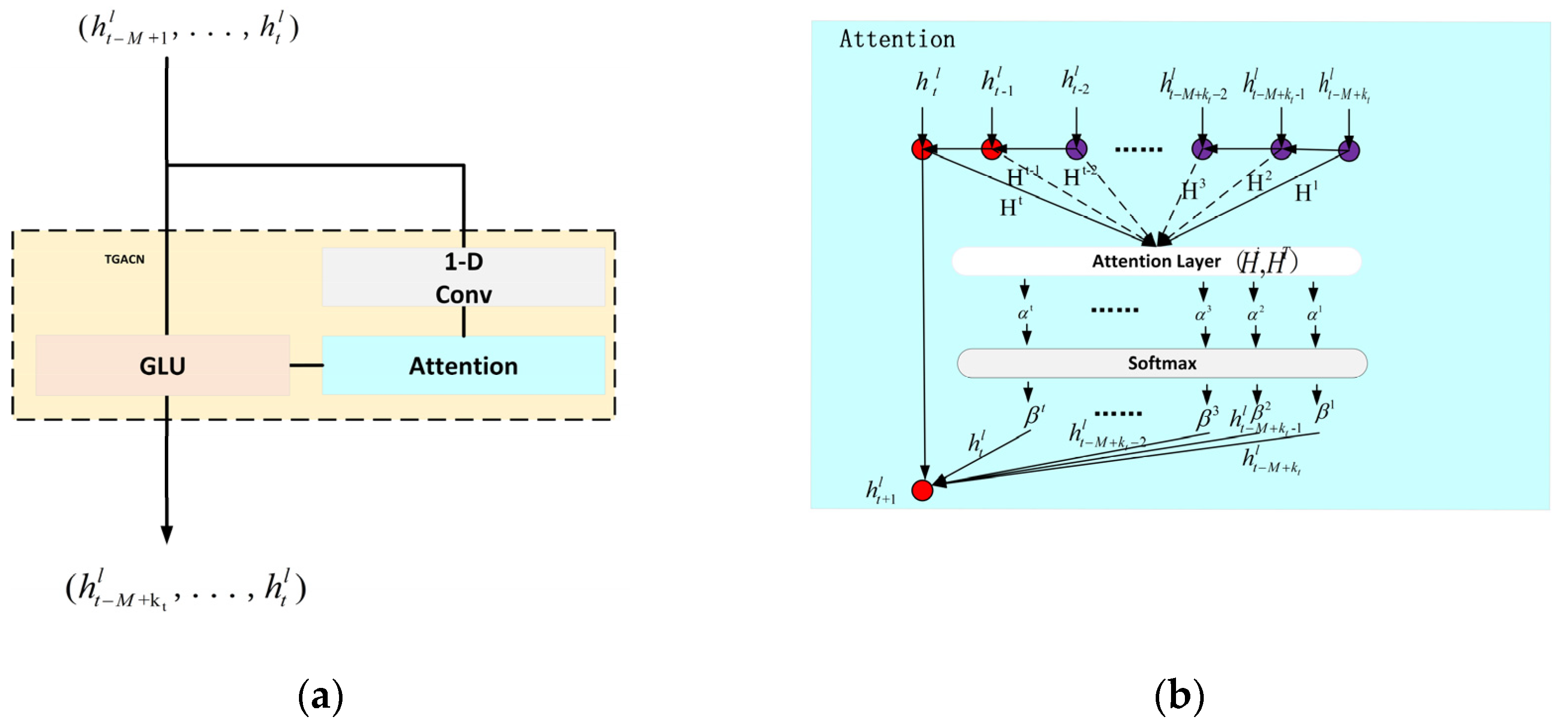
2.3.3. The TAGCN Layer of ST-Block
The STGCN model [22] mainly captures the temporal characteristics of infectious diseases in the time dimension through the time-gated convolution network. The time gated convolution layer is composed of one-dimensional convolution and nonlinear gated linear units, in which the kernel width of one-dimensional convolution is . For each regional node of infectious disease epidemic network, make the channel , where represents the number of channels, the input is an infectious disease sequence with length . Convolution kernel is used to map the input infectious disease sequence to a single output element [P, Q] (P and Q are divided by the same channel size). Therefore, the time-gated convolution network is defined as Equation (5).
P and Q in Equation (5) are the inputs of gated linear unit, represents Hadamard product, and is the set of real number, is used to control the correlation between the current state P and the composition structure and dynamic change of time series. Based on the network layer, we introduce the attention mechanism so as to improve the attention ability of the model to the time information of infectious disease data.
As shown in Figure 6, in the attention layer, the network layer inputs the infectious disease data of steps, there is a dependency between the infectious disease data of each time step and the data of the next time step, and each time step will generate an implicit state value . The attention layer obtains the correlation coefficient by calculating the implicit value of each time step and the implicit value generated in the t time step. Finally, the attention coefficient conforming to the probability is obtained by normalizing the softmax layer. Multiply the infectious disease data of each time step to obtain the infectious disease data of time steps (i.e., the next day).
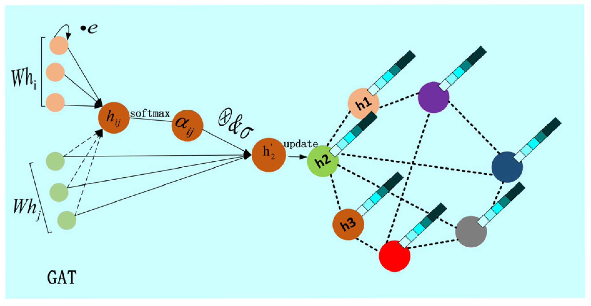
2.3.4. The SGAT Layer of ST-Block
The Graphic Attention Network Layer is composed of two Graphic Attention Network (GAT) [20] overlays, as shown in Figure 7.
The input is the region information of a set of epidemic epidemic networks processed by the time-gated attention convolution network, where is the historical number of days of infectious disease, is the kernel width of one-dimensional convolution, and is the characteristic dimension of the area nodes, that is, each input is the infectious disease area node, and each area node has feature information. Producing predicted regional node feature information from the attention layer, which represents the regional node characteristics of the output prediction, with feature information for each regional node. For better expressive ability, the layer of attention needs several linear transformations based on the input infectious disease characteristics to obtain higher-level features. First, we consider the influence of edge weights between neighbor nodes on the relationship between two nodes. We introduce the adjacency matrix of epidemic disease network as information complement between nodes, and transformation for node . Then, a weight matrix is trained for all the region nodes, and a shared attention mechanism, self-attention, is applied to each region node of the epidemic network to calculate the attention factor . The formulas for calculating them are as follows (6).
where is a function of calculating the correlation degree of two regional nodes (eigenvectors), it is implemented by a single-layer feed-forward neural network parameterized by the weight vector . The masked attention is also introduced into the epidemic network structure. The function of masked attention is to compute only the first-order neighbor region node , the region node , and the interval area node is not obscured as a neighbor area node of area node . Considering the convenience and comparability of correlation coefficient calculation, the first-order neighbor region node regularization of all region nodes is performed using the softmax function, for example, Equation (7).
After adding leaky relu nonlinear activation function, the attention coefficient is calculated as Equation (8).
The attention coefficient calculated by Equation (5) is used to calculate the linear combination of corresponding features. After aggregating the features of all neighbor regional nodes, the output feature of each regional node is predicted, calculated as Equation (9).
Compared with graph convolution neural network (GCN), the node characteristics of neighbor regions are standardized and summed in a graph convolution operation, as shown in Equation (10).
Graph attention network (GAT) replaces the standardized operation in graph convolution neural network with attention mechanism, adapts and learns the weight coefficient, and finally aggregates the node characteristics of neighbor regions. Through the superposition of the attention layer of the graph, the structure of the epidemic network of infectious diseases is gradually topological, and the migration index of infectious disease data is introduced as the adjacency matrix to supplement the importance between neighborhood nodes, which improves the ability to capture the spatial characteristics of the epidemic network of infectious diseases.
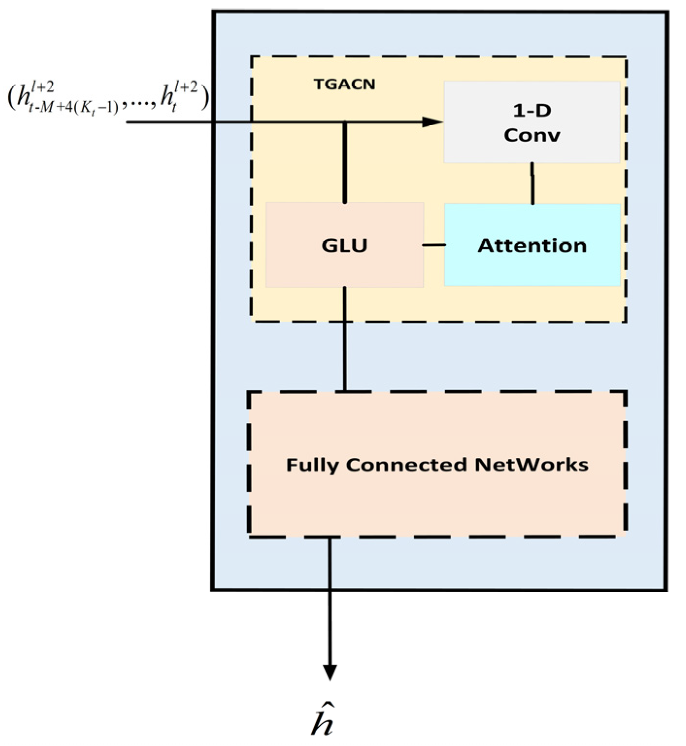
2.3.5. The Output Layer of STAGCN
After two ST-Block processing, the output layer of the model is composed of time gated attention convolution network layer (TGACN) and fully connected networks layer (FCN), as shown in Figure 8.
After the second ST-Block, the output is , after gating, pay attention to convolution network layer output to obtain , and then the one-step prediction value is obtained by linear change mapping on channel by the fully connected network layer. The loss function predicted by the infectious disease model uses L2, so its calculation formula is shown in Equation (11).
where is the prediction result of infectious disease model, is the true value, is the relevant training parameter.
3. Experiments and Results
The experimental data comes from the data set of the transmission trend prediction competition of highly pathogenic infectious diseases [23]. The data of the first 45 days are divided into model training set and verification set, and the remaining 15 days are used as the test set of the model.
The model is run on a Linux server (CPU: 4 cores, GPU: Tesla V100, video memory: 16GB, RAM: 32GB). We will train 60 epochs for the model, set the learning rate to 0.005, and the optimizer defaults to Adam to predict the number of new infections in each region in the next 15 days. In order to test and evaluate the performance of the model, we will use RMSE and RMSLE as error evaluation indexes. The benchmark model selects the common prediction model of infectious disease transmission trend: (1) ARIMA [24]; (2) LSTM [25]; and (3) STGCN [26].
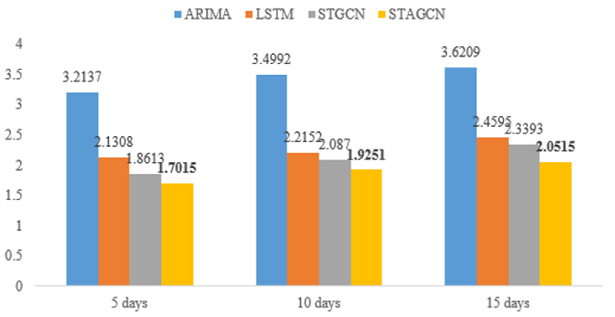
Calculate the error evaluation indexes RMSE and RMSLE of different prediction models under 5 days, 10 days and 15 days. The results are shown in Table 3.
The error evaluation indexes of STAGCN model based on spatial–temporal sequence data are basically smaller than other benchmark models, which shows that the improved STAGCN model can effectively capture the spatial–temporal characteristics of infectious disease data, and the prediction error results are better than other methods. As can be seen from Figure 9, the RMSLE value of STAGCN model is 8.59%, 7.76% and 12.30% lower than that of STAGCN model, respectively.
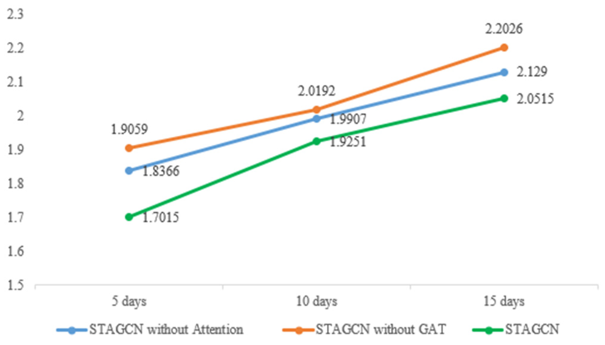
In order to verify the improvement effect of our model, we conducted model ablation experiment, controlled other network layers to remain unchanged, and deleted a specific network layer to observe the prediction accuracy of the model. The results are shown in Table 4 and Figure 10.
It is obvious from the chart that the prediction effect will decline in varying degrees after removing the Attention layer or GAT layer in the model. The model error of STAGCN proposed by us is the smallest. Therefore, the attention mechanism and GAT introduced can better improve the prediction accuracy of the model.
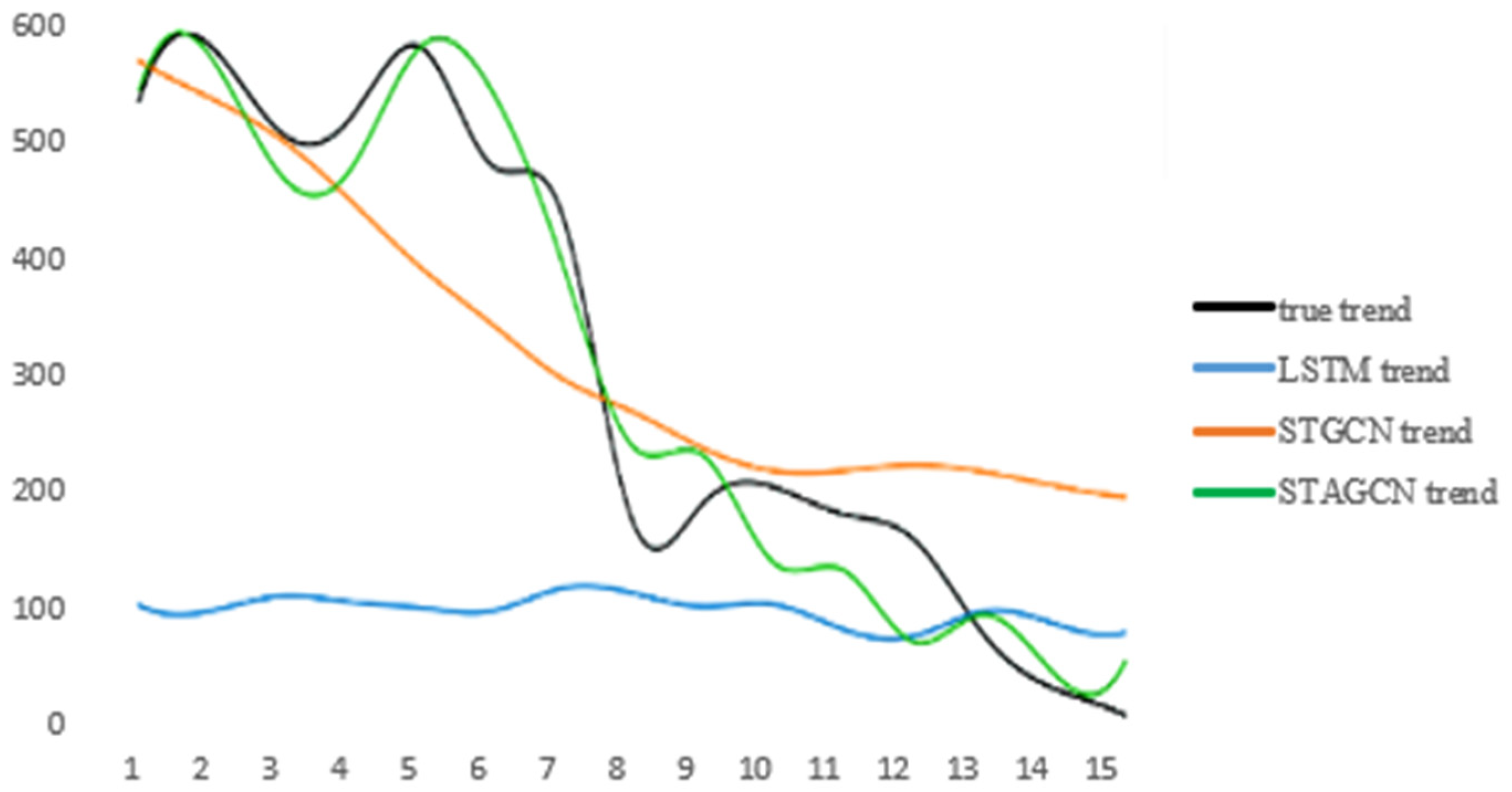
Finally, our STAGCN model is used to fit the infectious disease data set. From Figure 11, it can be seen that the fitting effect of the model is obviously better than that of other models.
In addition to the above analysis of the experimental results, this paper starts with several problems that can best reflect the scenario of infectious disease prediction task, and gets the benchmark list for analysis and display.
The points listed in the table are the most relevant to the method of this paper, and they are the key points that need to be faced and dealt with in the task of infectious disease prediction. The first is the time evolution characteristics. In recent years, most of the research on the prediction of infectious diseases has focused on this point. ARIMA and LSTM have better time series performance. Papers [24,25,27,28] all use time series data to improve or compare ARIMA and LSTM to predict the growth trend and mortality of infectious diseases in the future, without paying attention to the spatial factors of infectious disease transmission. The second is the spatial characteristics. The spatial transmission characteristics of infectious diseases have great research value and practical significance. Therefore, as shown in article [29], the author improved the spatial generalized linear mixed model, and got the spatial-temporal prediction model, simulating the predicted quantity, and getting the influence of spatial diffusion. In article [30], the author constructed the model according to the spatial-temporal characteristics of the number of infected people, which was used to predict and allocate emergency medical resources. On the basis of temporal and spatial characteristics, we should further consider the importance and influence of different spatial characteristics. For example, in the paper [31], the author constructed and trained the spatial-temporal model based on Bayesian hierarchical spatial-temporal SEIR model, which predicted the spread of illness and death and the spatial-temporal variability in small areas of Britain, pointed out the key factors, and put forward valuable suggestions for regional prevention and control.
As shown in Table 5, the content of comparison is based on whether the compared works cover the questions raised, with 25 score for each point, totaling four points. Compared with ours, Benchmark#1 [27] only covers one point, and Benchmark#2 [28] and Benchmark#3 [30] cover only two points, while our work covers all.
4. Interpretability Analysis
It can be seen from that the experimental results show the good performance of the model, but due to the black box nature of the deep learning model, we have no way to know what role the data features play in the prediction process and how much contribution they make. Theoretically, the adjacency matrix of correlation strength between regions can well reflect the spatial characteristics, and it should make a great contribution to the prediction results. However, we cannot try to analyze its interpretability. The reason is that the data characteristics of the matrix are obtained through the transformation of the original data, which cannot represent the real meaning of the original data characteristics, and the object of interpretability analysis needs to have real physical meaning. Luckily, the characteristics of migration index in the original data—the indicators of daily migration from other cities to or from other cities to other cities have the same spatial relevance. Therefore, our interpretable analysis of different migration indexes can provide some reference for relevant departments and contribute to the prevention and control of the epidemic.
4.1. Influence Weight of Each Migration Index of the Sample
By calculating the influence weight of each migration index on the prediction results of the model, the contribution degree and importance ranking of the index are obtained, so as to analyze how it affects the final results. We first calculate the contribution weight of each migration index of a single sample by using Shapley additive explanations (SHAP) method [32], and then observe the influence of migration index on the overall sample.
Taking A as an example, the meaning of each migration index is given, as shown in Table 6.
4.1.1. Impact Analysis of Each Migration Index of a Single Sample
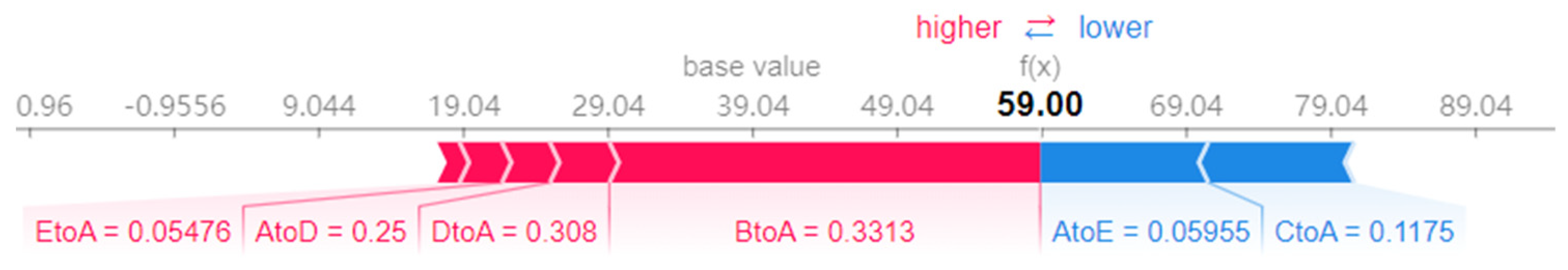
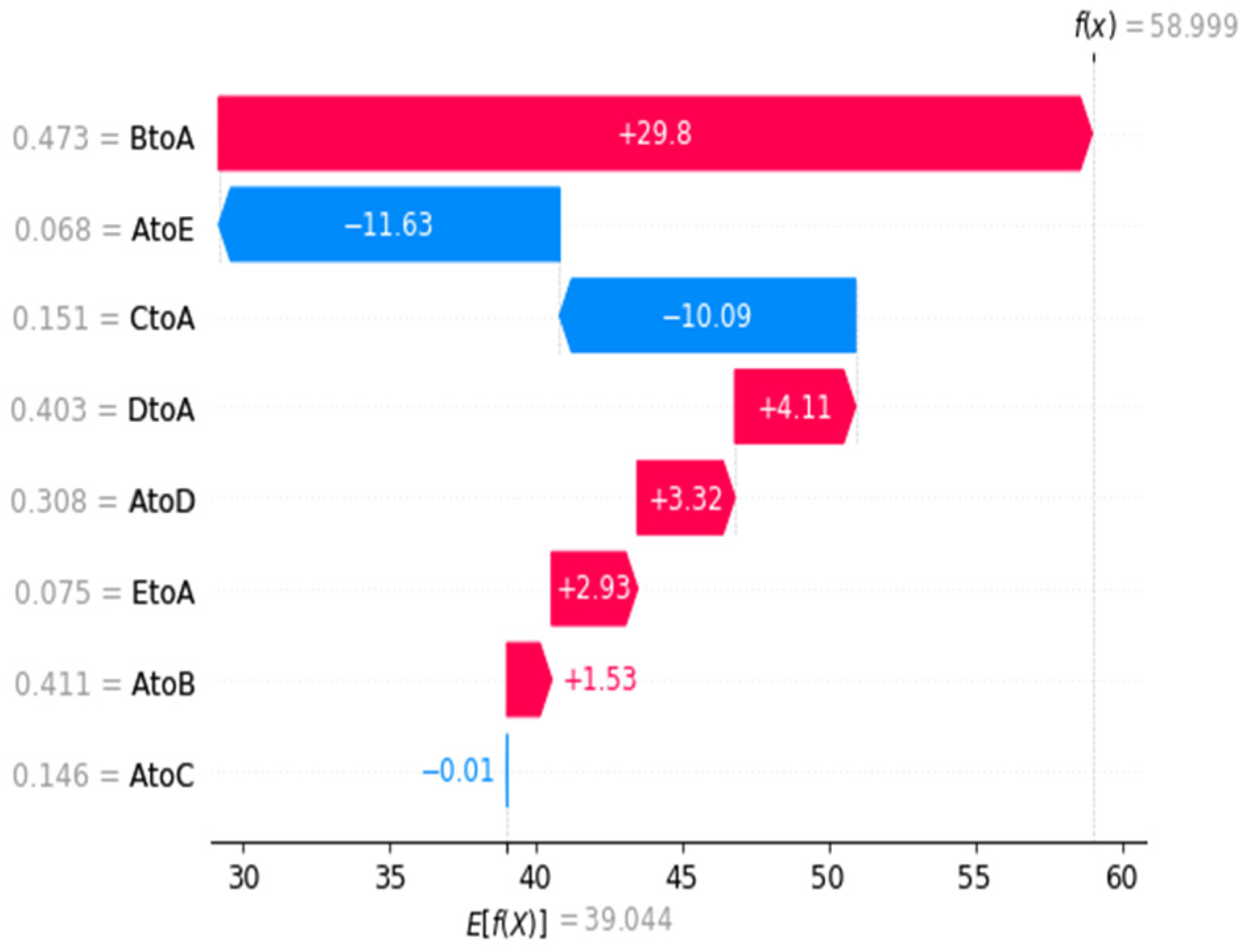
The impact of each migration index of city a on the prediction results of the model on the 15th day is shown in Figure 12. The average value of 39.04 output from the model is positively pushed up by BtoA, DtoA and other migration indexes, and inversely pulled down by AtoE and CtoA migration indexes. After a series of positive and negative promotion of migration index, the predicted value 59 of the sample is finally output, that is, the number of new infections on that day. The results show that each migration index has different contribution to the prediction results of the model, and promotes the prediction results of the model from the forward and reverse.
We calculate the specific SHAP value of each migration index for this sample, and more clearly observe the process of each migration index driving the prediction results of the model forward and backward, as well as the contribution ranking of each migration index, as shown in Figure 13. It can be seen intuitively that the migration index BtoA has pushed up the predicted value by 29.8, indicating that the number of newly infected people in City A on the same day is greatly affected by the migration of population in City B. We can appropriately increase the detection intensity of personnel input in City B, control the gate of City B, limit the outflow of people, reduce unnecessary personnel flow and reduce the risk of infectious disease infection. Therefore, the monitoring intensity and personnel arrangement can be adjusted appropriately, and resources can be allocated reasonably to improve the ability of controlling infectious diseases.
4.1.2. Impact Analysis of Each Migration Index of a Single Sample
As shown in Figure 14. Taking AtoE as an example, the SHAP value corresponding to its smaller value is in the positive range, that is, the prediction result of the model is pushed forward. The larger value will make the corresponding SHAP value in the negative range, which will reverse the prediction result of the model. This analysis result is in line with practical significance. When the number of people moving out of City A to City E is large, the number of people in City A will be reduced, so the incidence of infectious diseases in City A will be reduced. Similarly, the CtoA is analyzed and explained.
The CtoA distribution in Figure 14 shows that the value corresponding to the small distribution mainly focuses on the interval of negative numbers, that is, the small value of CtoA will reverse the prediction results of the model. It is also in line with the actual situation, that is, when the number of people moving from City C to City A is small, the number of infected people in city a will be reduced accordingly. According to the above analysis, it is concluded that reducing the flow of people from City C to City A can reduce the incidence of infectious diseases in City A.
4.2. Analysis on the Dependence and Interaction of Migration Index
The dependence analysis of migration index can analyze the linear or nonlinear correlation between them to some extent through the calculation of the dependence between the model prediction results and characteristics. The interaction analysis of infectious diseases can analyze the relationship between different migration index combinations from the perspective of variables and understand the interaction between them. These methods provide a new analysis scheme for the prediction of infectious diseases, and provide the basis and explanation for the prediction of the development trend of infectious diseases in a more comprehensive way.
4.2.1. The Dependence Analysis of Migration Index
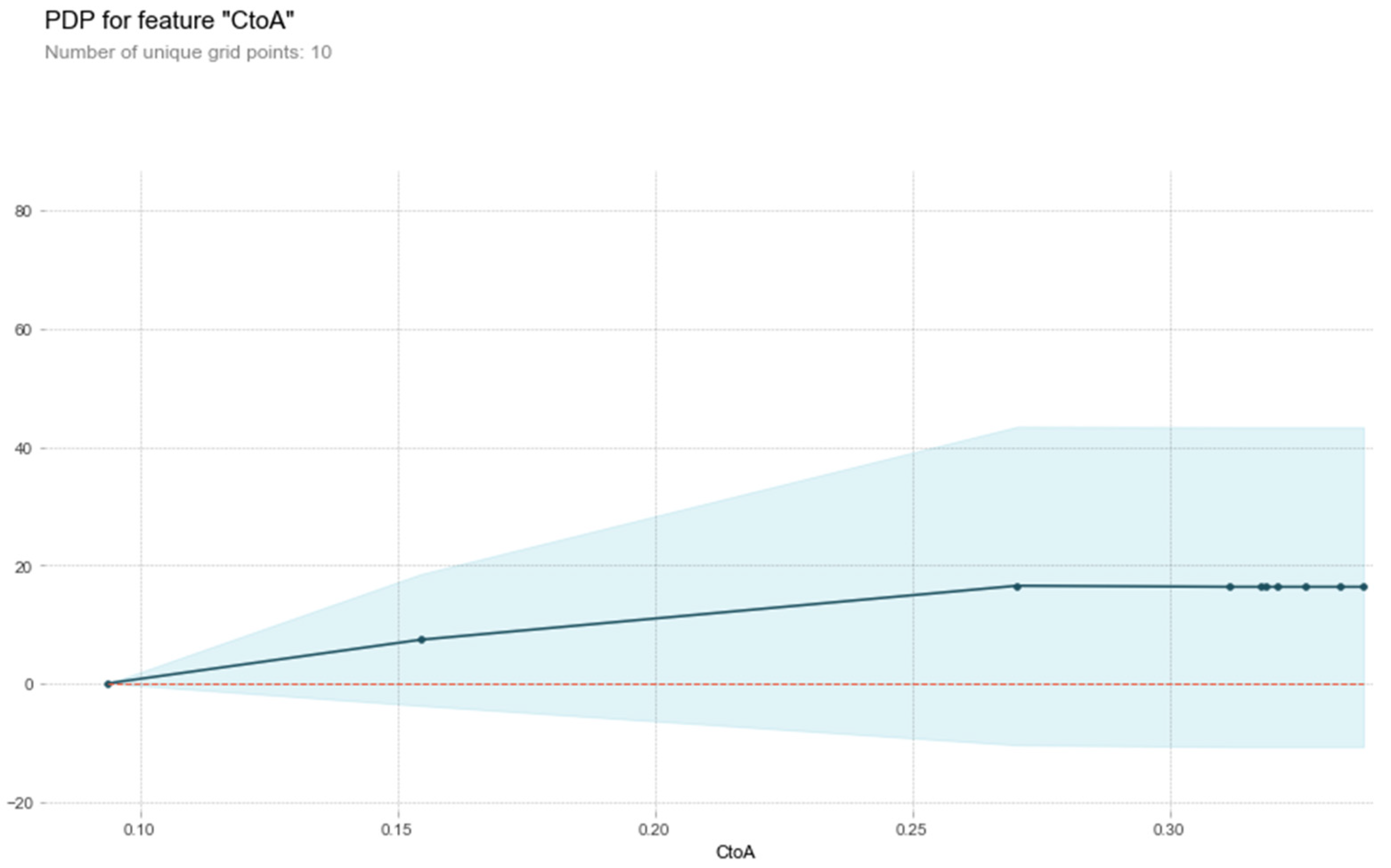
The dependence of migration index is analyzed by using partial dependence graph method and individual period conditional expectation. Partial dependency graph mainly analyzes how the input features affect the model prediction, and can show the different relationships between the model prediction results and features, including linear, nonlinear or more complex mapping. The principle of individual conditional expectation is mainly to calculate the dependence between the prediction result of the model and a characteristic variable in each sample. It is a global method. It draws the dependence between the prediction results of the model and a certain feature in the sample in a visual way. Different from the average value of the partial dependence diagram, each sample is a row, which can more intuitively see the dependence between the prediction results and the characteristic variables of different samples. Taking the migration indexes CtoA as examples, the dependence between the model prediction results and CtoA is analyzed by using the partial dependence diagram method, as shown in Figure 15. It can be seen that when CtoA is in the range of [0.10, 0.25], it will slowly promote the increase of the number of infected people, and then it will not have a significant impact on the increase of the number of infected people. The above dependency analysis is helpful to set the threshold of population migration index between different cities and reduce the risk of sustained epidemic of infectious diseases.
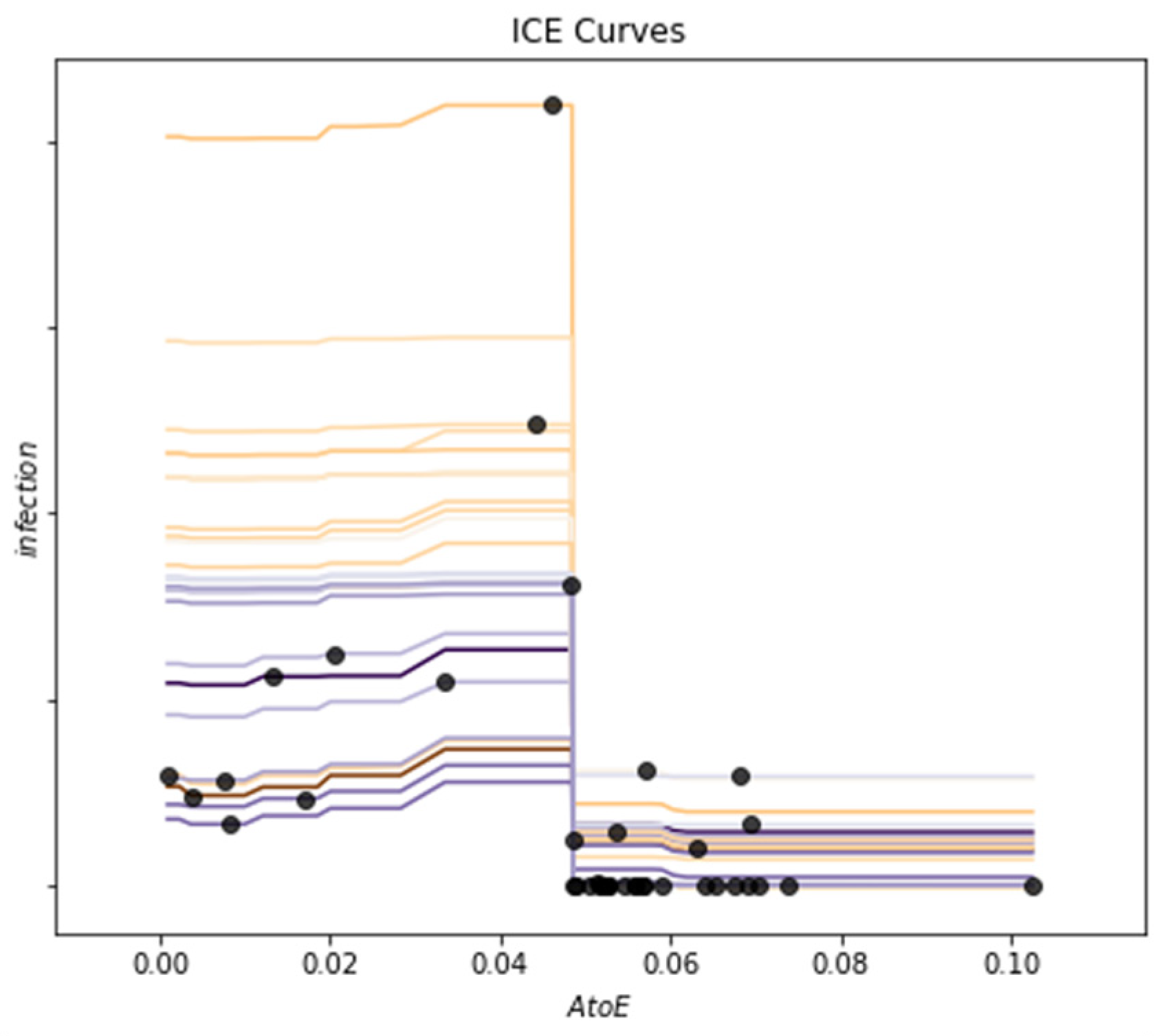
The individual conditional expectation method is used to analyze the dependence between the model prediction results and AtoE. The results are shown in Figure 16. It can be seen that when AtoE falls in the range of [0.00, 0.04], the corresponding number of new infections will have a slight upward trend. When it falls in the range of [0.04, 0.05], the corresponding number of new infections will have a significant downward trend, and the number of new infections will stabilize in a numerical range. This is basically consistent with the previous prediction results of the model using the partial dependency graph method and the dependency analysis results of AtoE. The dependence analysis based on the above interpretable methods visualizes the dependence between the prediction results of the model and the migration index, and improves the reliability of the prediction results of infectious diseases.
4.2.2. Interactive Analysis of Migration Index
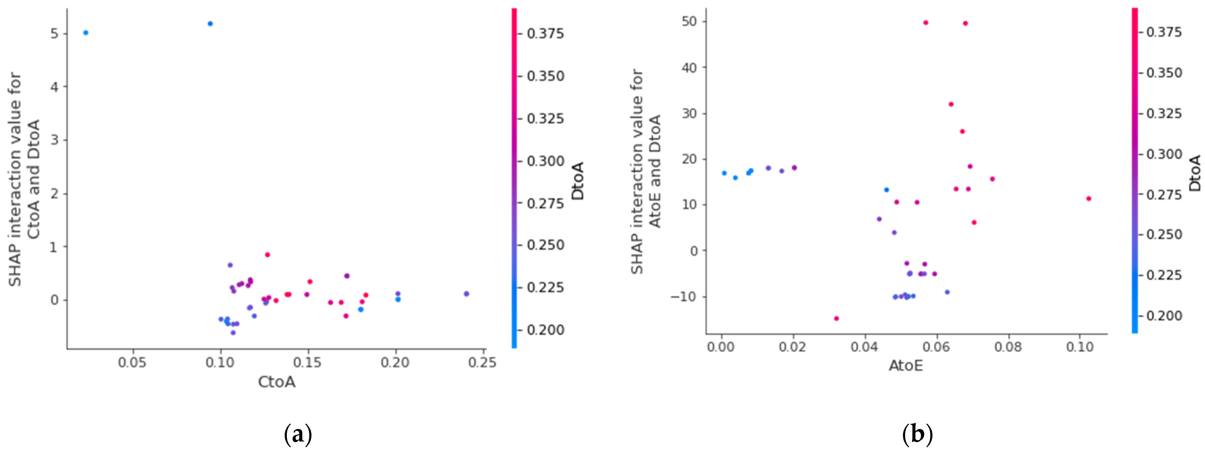
We use the SHAP method to calculate the interaction value, which refers to the interaction attribution value between features, and mainly extract the interaction effect between each feature. Take AtoE and CtoA migration index as the basic object of interactive analysis, and introduce DtoA as another interactive analysis object. The results are shown in Figure 17. Taking AtoE as an example, when the corresponding value is in the interval [0.04, 0.06], the greater the value of DtoA, the corresponding shake interaction value will increase accordingly, which will push up the prediction results of the model. In practice, this interaction relationship can be expressed as that when the number of people moving out of City A to City E is within a certain range, the more people moving in from City D to City A, the number of new infections in City A will increase, and the two characteristics have a certain interaction.
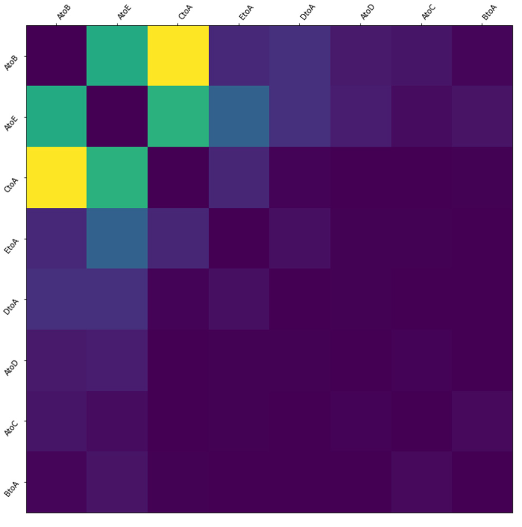
In addition, we can describe the interaction between two migration indexes through the thermodynamic diagram, as shown in Figure 18. It can be seen from the figure that AtoE has strong interaction with AtoB, CtoA and EtoA, while it has weak or no obvious interaction with DtoA, BtoA and AtoD. This way of showing the interaction between the characteristics of infectious diseases by means of thermal map can intuitively view the relationship between different characteristics, which is conducive to the interpretability analysis of the prediction results of the model.
5. Conclusions
Our data set is very comprehensive, covering almost a series of characteristics that lead to the spread of the virus. Based on this, our model takes into account the temporal and spatial characteristics, and uses attention mechanism to enhance the model’s attention to important characteristics, thus improving the prediction level of the number of infected people from all aspects of data and methods, according to the results of the experiments, we can see the best accuracy and the smallest error compared with other time or spatial-temporal series models.
Through our research, it is proved that spatial characteristics have an important influence on epidemic prevention and control, and how to effectively reduce spatial mobility is the key to reduce the number of infected people. Therefore, through interpretable analysis of migration index, we pointed out the direction and suggestions for spatial prevention and control from the perspective of scientific analysis, and provided scientific guarantee for perfecting the epidemic prevention and control management mechanism.
However, our method still has some shortcomings. From the data point of view, we do not take into account the incubation period of the virus and the special migration situation in various holidays. Methodologically, we only applied the attention mechanism to the characteristics of time dimension, but the more important migration matrix did not do this, and could not get the arrangement of urban areas with serious epidemic situation. In the future, we will improve from these two directions to further optimize the forecasting ability.
Author Contributions
Conceptualization, Q.L. and Q.P.; methodology, Q.L., Q.P. and L.X.; software, Q.L. and L.X.; validation, Q.P.; writing-original draft preparation, Q.L. and L.X.; writing-review and editing, Q.P. All authors have read and agreed to the published version of the manuscript.
Funding
This research was funded by the National Key RD Program of China under Grant 2019YFE0190500.
Institutional Review Board Statement
Not applicable.
Informed Consent Statement
Not applicable.
Data Availability Statement
Not applicable.
Conflicts of Interest
The authors declare no conflict of interest.
References
- Pan, Y.; Zhang, M.; Chen, Z.; Zhou, M.; Zhang, Z. An ARIMA based model for forecasting the patient number of epidemic disease. In Proceedings of the 2016 13th International Conference on Service Systems and Service Management (ICSSSM), Kunming, China, 24–26 June 2016; pp. 1–4. [Google Scholar]
- Mekparyup, J.; Saithanu, K. A new approach to detect epidemic of DHF by combining ARIMA model and adjusted Tukey’s control chart with interpretation rules. Interv. Med. Appl. Sci. 2016, 8, 118–120. [Google Scholar] [CrossRef] [PubMed]
- Anwar, M.Y.; Lewnard, J.A.; Parikh, S.; Pitzer, V.E. Time series analysis of malaria in Afghanistan: Using ARIMA models to predict future trends in incidence. Malar. J. 2016, 15, 556. [Google Scholar] [CrossRef] [PubMed] [Green Version]
- Roy, S.; Bhunia, G.S.; Shit, P.K. Spatial prediction of COVID-19 epidemic using ARIMA techniques in India. Model. Earth Syst. Environ. 2021, 7, 1385–1391. [Google Scholar] [CrossRef]
- Woo, H.; Cho, Y.; Shim, E.; Lee, J.K.; Lee, C.G.; Kim, S.H. Estimating influenza outbreaks using both search engine query data and social media data in South Korea. J. Med. Internet Res. 2016, 18, e177. [Google Scholar] [CrossRef] [PubMed] [Green Version]
- Chekol, B.E.; Hagras, H. Employing machine learning techniques for the malaria epidemic prediction in Ethiopia. In Proceedings of the 2018 10th Computer Science and Electronic Engineering (CEEC), Colchester, UK, 19–21 September 2018; pp. 89–94. [Google Scholar]
- Setti, E.; Liuzzi, P.; Campagnini, S.; Fanciullacci, C.; Arienti, C.; Patrini, M.; Mannini, A.; Carrozza, M.C. Predicting post COVID-19 rehabilitation duration with linear kernel SVR. In Proceedings of the 2021 IEEE EMBS International Conference on Biomedical and Health Informatics (BHI), Virtual Conference, 27–30 July 2021; pp. 1–5. [Google Scholar] [CrossRef]
- Chen, X.; Wang, Z.X.; Pan, X.M. HIV-1 tropism prediction by the XGboost and HMM methods. Sci. Rep. 2019, 9, 9997. [Google Scholar] [CrossRef] [PubMed]
- Dharmawardana, K.G.S.; Lokuge, J.N.; Dassanayake, P.S.B.; Sirisena, M.L.; Fernando, M.L.; Perera, A.S.; Lokanathan, S. Predictive model for the dengue incidences in Sri Lanka using mobile network big data. In Proceedings of the 2017 IEEE International Conference on Industrial and Information Systems (ICIIS), Kandy, Sri Lanka, 15–16 December 2017; pp. 1–6. [Google Scholar]
- Li, X.; Xu, X.; Wang, J.; Li, J.; Qin, S.; Yuan, J. Study on prediction model of HIV Incidence based on GRU neural network optimized by MHPSO. IEEE Access 2020, 8, 49574–49583. [Google Scholar] [CrossRef] [PubMed]
- Fu, B.; Yang, Y.; Ma, Y.; Hao, J.; Chen, S.; Liu, S.; Li, T.; Liao, Z.; Zhu, X. Attention-based recurrent multi-channel neural network for influenza epidemic prediction. In Proceedings of the 2018 IEEE International Conference on Bioinformatics and Biomedicine (BIBM), Madrid, Spain, 3–6 December 2018; pp. 1245–1248. [Google Scholar]
- Sartorius, B.; Lawson, A.B.; Pullan, R.L. Modelling and predicting the spatio-temporal spread of COVID-19, associated deaths and impact of key risk factors in England. Sci. Rep. 2021, 11, 5378. [Google Scholar] [CrossRef] [PubMed]
- Doni, A.R.; Sasipraba, T. LSTM-RNN based approach for prediction of dengue cases in India. Inf. Syst. Eng. 2020, 25, 327–335. [Google Scholar] [CrossRef]
- Wang, S.; Cao, J.; Yu, P. Deep learning for spatial-Temporal data mining: A Survey. In Proceedings of the IEEE Transactions on Knowledge and Data Engineering, Chania, Greece, 22 September 2020; p. 1. [Google Scholar]
- Song, C.; Lin, Y.; Guo, S.; Wan, H. Spatial-temporal synchronous graph convolutional networks: A new framework for spatial-temporal network data forecasting. In Proceedings of the AAAI Conference on Artificial Intelligence, New York, NY, USA, 7–12 February 2020; Volume 34, pp. 914–921. [Google Scholar]
- Diao, Z.; Wang, X.; Zhang, D.; Liu, Y.; Xie, K.; He, S. Dynamic spatial-temporal graph convolutional neural networks for traffic forecasting. In Proceedings of the AAAI Conference on Artificial Intelligence, Honolulu, HI, USA, 27 January–1 February 2019; Volume 33, pp. 890–897. [Google Scholar]
- Yan, S.; Xiong, Y.; Lin, D. Spatial temporal graph convolutional networks for skeleton-based action recognition. In Proceedings of the AAAI Conference on Artificial Intelligence, New Orleans, LA, USA, 2–7 February 2018; Volume 32, pp. 7444–7452. [Google Scholar]
- Li, Y.; He, Z.; Ye, X.; He, Z.; Han, K. Spatial temporal graph convolutional networks for skeleton-based dynamic hand gesture recognition. EURASIP J. Image Video Process. 2019, 2019, 78. [Google Scholar] [CrossRef]
- Derr, T.; Ma, Y.; Fan, W.; Liu, X.; Aggarwal, C.; Tang, J. Epidemic graph convolutional network. In Proceedings of the 13th International Conference on Web Search and Data Mining, Houston, TX, USA, 3–7 February 2020; pp. 160–168. [Google Scholar]
- Heo, J. Epidemiological Prediction Using Deep Learning; Ulsan National Institute of Science and Technology: Ulsan, Korea, 2020. [Google Scholar]
- IKCEST. Second “One Belt, One Road” International Big Data Contest: The Prediction of the Spread Trend of Highly Pathogenic Infectious Diseases. Available online: https://aistudio.baidu.com/aistudio/competition/detail/36 (accessed on 12 November 2021).
- Xu, B.B.; Cen, K.T.; Huang, J.J.; Shen, H.W.; Cheng, X.Q. Overview of graph convolution neural networks. J. Comput. Sci. 2020, 43, 755–780. [Google Scholar]
- Velickovic, P.; Cucurull, G.; Casanova, A.; Romero, A.; Lio, P.; Bengio, Y. Graph Attention Networks. In Proceedings of the International Conference on Learning Representations, Vancouver, BC, Canada, 30 April–3 May 2018. [Google Scholar]
- Ariyo, A.A.; Adewumi, A.O.; Ayo, C.K. Stock price prediction using the ARIMA model. In Proceedings of the 2014 UKSim-AMSS 16th International Conference on Computer Modelling and Simulation, Cambridge, UK, 26–28 March 2014. [Google Scholar]
- Zaremba, W.; Sutskever, I.; Vinyals, O. Recurrent neural network regularization. arXiv 2014, arXiv:1409.2329. [Google Scholar]
- Yu, B.; Yin, H.; Zhu, Z. Spatial-Temporal Graph Convolutional Networks: A Deep Learning Framework for Traffic Forecasting. In Proceedings of the Twenty-Seventh International Joint Conference on Artificial Intelligence, Stockholm, Sweden, 13–19 July 2018. [Google Scholar]
- Khan, F.M.; Gupta, R. ARIMA and NAR based prediction model for time series analysis of COVID-19 cases in India. J. Saf. Sci. Resil. 2020, 1, 12–18. [Google Scholar] [CrossRef]
- Chimmula, V.K.R.; Zhang, L. Time series forecasting of COVID-19 transmission in Canada using LSTM net-works. Chaos Solitons Fractals 2020, 135, 109864. [Google Scholar] [CrossRef] [PubMed]
- Giuliani, D.; Dickson, M.M.; Espa, G.; Santi, F. Modelling and predicting the spatio-temporal spread of COVID-19 in Italy. BMC Infect. Dis. 2020, 20, 700. [Google Scholar] [CrossRef]
- Guzzi, P.H.; Tradigo, G.; Veltri, P. Spatio-Temporal Resource Mapping for Intensive Care Units at Regional Level for COVID-19 Emergency in Italy. Int. J. Environ. Res. Public Health 2020, 17, 3344. [Google Scholar] [CrossRef] [PubMed]
- Wang, P.; Zheng, X.; Ai, G.; Liu, D.; Zhu, B. Time series prediction for the epidemic trends of COVID-19 using the improved LSTM deep learning method: Case studies in Russia, Peru and Iran. Chaos Solitons Fractals 2020, 140, 110214. [Google Scholar] [CrossRef] [PubMed]
- Lundberg, S.M.; Lee, S.I. A Unified Approach to Interpreting Model Predictions. Adv. Neural Inf. Process. Syst. 2017, 30, 4–8. [Google Scholar]
Figure 1.
Geographic figure (each circle represents a city, each city is divided into area rectangles, and each area is divided into grids.
Figure 1.
Geographic figure (each circle represents a city, each city is divided into area rectangles, and each area is divided into grids.

Figure 2.
Spatial–temporal structure of the data (Each circular node represents an area, and the color of the node indicates the development of infectious diseases in the area. The darker the color, the more serious the infectious diseases in the area. The edges between nodes represent the strength of the association between the infectious disease areas, the redder the edges, the correlation is stronger; the greener the edges, the correlation is weaker).

Figure 3.
(a) Connectivity between different regions (Different squares represent different regions, and connectivity between regions is represented by color. The darker the color, the stronger the connectivity between the two, and the lighter the color, the weaker the connectivity between the two.); and (b) adjacency matrix thermograms.

Figure 4.
The frame structure of STAGCN model.

Figure 5.
The frame structure of ST-Block.

Figure 6.
(a) is the frame structure of TAGCN layer, (b) is the Attention block.

Figure 7.
The frame structure of SGAT layer.

Figure 8.
The frame structure of Output layer.

Figure 9.
RMSLE values of different models.

Figure 10.
RMSLE values of different model ablation.

Figure 11.
The number of new infectors in region 12, city C in the next 15 days (The black curve represents the truth data, the green curve represents the results predicted by the STAGCN model).
Figure 11.
The number of new infectors in region 12, city C in the next 15 days (The black curve represents the truth data, the green curve represents the results predicted by the STAGCN model).

Figure 12.
The influence of each migration index on the predicted value of the model (single sample) (base value) represents the average value of the model output after inputting the training set, Red indicates that positive push up. Blue indicates that reverse pull down.
Figure 12.
The influence of each migration index on the predicted value of the model (single sample) (base value) represents the average value of the model output after inputting the training set, Red indicates that positive push up. Blue indicates that reverse pull down.

Figure 13.
Local SHAP value of each migration index (single sample) ( on the horizontal axis represents the average value of model output after inputting the training set, and the left vertical axis represents the name and value of each input feature).
Figure 13.
Local SHAP value of each migration index (single sample) ( on the horizontal axis represents the average value of model output after inputting the training set, and the left vertical axis represents the name and value of each input feature).

Figure 14.
The distribution of input variables affecting the predicted value of the model output (each color point corresponds to the input migration index, the feature value of the vertical axis represents the value of the migration index, and the color represents its value). If the color is blue, it means its value is small, and if the color is red, it means its value is large. The horizontal axis represents the SHAP values of different input variables.

Figure 15.
Dependence analysis of CtoA migration index (partial dependence graph method) (the horizontal axis represents the value of migration index, and the vertical axis represents the number of new infections).
Figure 15.
Dependence analysis of CtoA migration index (partial dependence graph method) (the horizontal axis represents the value of migration index, and the vertical axis represents the number of new infections).

Figure 16.
Dependence analysis of migration index AtoE (individual conditional expectation method, the horizontal axis represents the value of migration index, and the vertical axis represents the number of new infections).
Figure 16.
Dependence analysis of migration index AtoE (individual conditional expectation method, the horizontal axis represents the value of migration index, and the vertical axis represents the number of new infections).

Figure 17.
(a) is the SHAP interaction value between AtoE, CtoA; (b) is the SHAP interaction value between AtoE and DtoA.
Figure 17.
(a) is the SHAP interaction value between AtoE, CtoA; (b) is the SHAP interaction value between AtoE and DtoA.

Figure 18.
The interaction thermodynamic diagram between two migration indexes.


Table 1.
This is a table as data format of the data features.
| Date | Region Name | Features (F) |
|---|---|---|
| 20200501 | A_0 | temperature |
| A_1 | Migration scale index | |
| …… | …… | |
| E_33 | Transfer intensity | |
| 20200502 | A_0 | temperature |
| A_1 | Migration scale index | |
| …… | …… | |
| E_33 | Transfer intensity | |
| …… | A_0 | temperature |
| A_1 | Migration scale index | |
| …… | …… | |
| E_33 | Transfer intensity | |
| 20200629 | A_0 | temperature |
| A_1 | Migration scale index | |
| …… | …… | |
| E_33 | Transfer intensity |
Table 2.
This is a table of the data format of the correlation matrix e.
| Area\Area | A_0 | A_1 | … | E_33 |
|---|---|---|---|---|
| A_0 | 0 | … | 0 | |
| A_1 | 0 | … | 0 | |
| … | … | … | … | … |
| E_33 | 0 | 0 | … | 0 |
Table 3.
This is a table as error evaluation comparison of different models.
| Period | Evaluate | Models | |||
|---|---|---|---|---|---|
| ARIMA | LSTM | STGCN | STAGCN | ||
| 5 days | RMSE | 20.62 | 18.94 | 17.07 | 16.67 |
| RMSLE | 3.2137 | 2.1308 | 1.8613 | 1.7015 | |
| 10 days | RMSE | 20.78 | 19.44 | 18.99 | 18.71 |
| RMSLE | 3.4992 | 2.2152 | 2.0870 | 1.9251 | |
| 15 days | RMSE | 22.68 | 20.52 | 19.28 | 18.93 |
| RMSLE | 3.6209 | 2.4595 | 2.3393 | 2.0515 | |
Table 4.
This is a table as error evaluation comparison of model ablation.
| Period | Evaluate | Models | ||
|---|---|---|---|---|
| STAGCN without Attention | STAGCN without GAT | STAGCN | ||
| 5 days | RMSE | 17.87 | 18.31 | 16.67 |
| RMSLE | 1.8366 | 1.9059 | 1.7015 | |
| 10 days | RMSE | 18.78 | 18.84 | 18.71 |
| RMSLE | 1.9907 | 2.0192 | 1.9251 | |
| 15 days | RMSE | 19.38 | 19.57 | 18.93 |
| RMSLE | 2.1290 | 2.2026 | 2.0515 | |
Table 5.
Benchmark list.
| Comparison Point | Benchmark#1 [27] | Benchmark#2 [28] | Benchmark#3 [30] | Proposed |
|---|---|---|---|---|
| Handling time series data | ||||
| Handling space series data | ||||
| Considering the impacts of different features | ||||
| Considering the complex data | ||||
| Score | 25 | 50 | 50 | 100 |
| Difference | 75 | 50 | 50 | / |
Table 6.
Meaning of each migration index (city A).
| Parameters | Quantity |
|---|---|
| AtoB | Migration index from city A to city B |
| AtoC | Migration index from city A to city C |
| AtoD | Migration index from city A to city D |
| AtoE | Migration index from city A to city E |
| BtoA | Migration index from city B to city A |
| CtoA | Migration index from city C to city A |
| DtoA | Migration index from city D to city A |
| EtoA | Migration index from city E to city A |
Publisher’s Note: MDPI stays neutral with regard to jurisdictional claims in published maps and institutional affiliations. |
© 2022 by the authors. Licensee MDPI, Basel, Switzerland. This article is an open access article distributed under the terms and conditions of the Creative Commons Attribution (CC BY) license (https://creativecommons.org/licenses/by/4.0/).
Share and Cite
MDPI and ACS Style
Li, Q.; Pan, Q.; Xie, L. Prediction of Spread Trend of Epidemic Based on Spatial-Temporal Sequence. Symmetry 2022, 14, 1064. https://0-doi-org.brum.beds.ac.uk/10.3390/sym14051064
AMA Style
Li Q, Pan Q, Xie L. Prediction of Spread Trend of Epidemic Based on Spatial-Temporal Sequence. Symmetry. 2022; 14(5):1064. https://0-doi-org.brum.beds.ac.uk/10.3390/sym14051064
Chicago/Turabian StyleLi, Qian, Qiao Pan, and Liying Xie. 2022. "Prediction of Spread Trend of Epidemic Based on Spatial-Temporal Sequence" Symmetry 14, no. 5: 1064. https://0-doi-org.brum.beds.ac.uk/10.3390/sym14051064
Note that from the first issue of 2016, this journal uses article numbers instead of page numbers. See further details here.